
Summer 2017
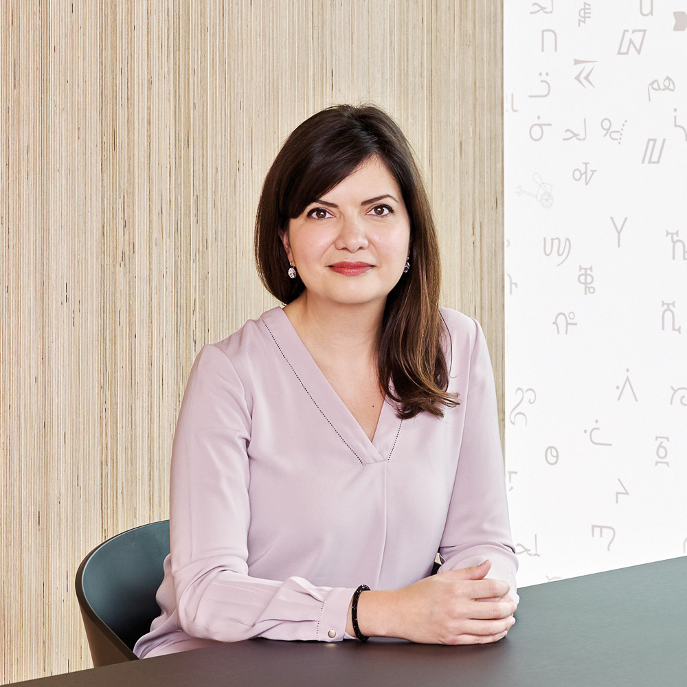
Reputations: Nadine Chahine
‘I wanted to discover if there was any value in simplification, in terms of legibility, and only research could tell me. This is where the science comes in; I needed numbers!’
Nadine Chahine is one of the most prolific and vocal contributors to the field of contemporary Arabic type design. She was among the first of a new wave of trail-blazing type designers who, in the early 2000s, made a concerted effort to move the discipline forward. Her work – which over the past fifteen years has grown to encompass both Arabic and Latin type design and academic legibility research – is significant in both practical and ideological terms.
Chahine was born and raised in Lebanon. Having originally planned to follow her father’s footsteps into architecture, she made a last-minute decision to study graphic design, and gained her degree from the American University of Beirut. There, she discovered a passion and aptitude for type design that spurred her to pursue an MA in Typography at the University of Reading (2002-03) and, later, a PhD at the University of Leiden in the Netherlands. During her studies at Reading she created her first typeface, Koufiya. Featuring both Latin and Arabic, it was the first face for which both scripts were designed simultaneously by the same person.
Chahine was recruited by Linotype in Germany as its Arabic Specialist in 2005 and has worked for the company ever since, becoming a Monotype employee after its rebranding of Linotype in 2013, and rising to the role of UK Type Director in 2015, where her team includes type designers Malou Verlomme and Toshi Omagari. During her first years at Linotype, alongside a role in the marketing department, she designed the official Arabic script counterpart to Frutiger (2007), which gained the approval of Adrian Frutiger himself.
Since then she has gone on to design Arabic counterparts to several typefaces, among them Neue Helvetica Arabic (2009); Palatino Arabic (2008) on which she worked closely with Hermann Zapf; Univers Next Arabic (2011); and Zapfino Arabic (2015). The last two earned her awards for Excellence in Type Design from the Type Directors’ Club in New York.
Chahine’s work to resolve the qualitative disparity between Arabic and Latin typography is an embodiment of her own politics: growing up during the Lebanese civil war, she has a keener sense than most of the imperative to foster dialogue between disparate factions. In the dialogue between typographic research and practice, she is a vocal advocate for scientific enquiry and the practical implementation of its findings. In 2012, after completing her PhD (which investigated the impact of complexity on legibility within Arabic typography), she began a programme of legibility research with MIT AgeLab in conjunction with Monotype.
She was part of the team that designed Dubai Font, released by Microsoft in May 2017, with a publicity campaign that claimed the public domain typeface to be ‘the voice of our brave new world … a new global medium for self-expression’. This attracted much criticism in conventional and social media; the Washington Post pointed out that the UAE was ‘a place where free expression can actually be dangerous’. Nevertheless, the emirate’s crown prince Sheikh Hamdan regards the typeface as an important step in Dubai’s ‘efforts to be ranked first in the digital world’.
Chahine lectures frequently about her research at conferences and events worldwide. This interview took place in Monotype’s Shoreditch office.
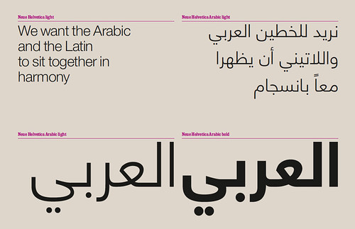
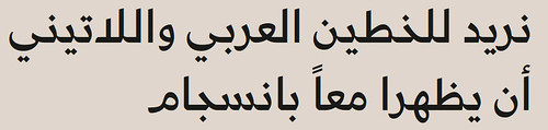
Neue Helvetica Arabic (2009) was designed by Nadine Chahine for Linotype. Though generally well received, Chahine’s design provoked debate in certain circles regarding the extent to which Arabic counterparts to existing typefaces should follow the formal and geometric characteristics of their Latin forbears.
Anna Lisa Reynolds: Was there anything in your early education that propelled you towards a career in design?
Nadine Chahine: I grew up thinking I had no real artistic talent – my drawing skills are not good, I couldn’t sing or dance, and I wasn’t musical. Maths and sciences were my strengths. My dad is an architect, so I was exposed to architecture from an early age and had thought of going into architecture myself. But at the last minute I decided to study graphic design instead. For the first couple of years, I wasn’t sure that it was the right degree for me. But by the spring semester of the second year, we had Arabic typography as a module, and I loved it. That’s what made me stay. It clicked with me very quickly, the understanding of how black and white interacts, and the tension you need to look for between two shapes. I was hooked. And the teacher, Samir Sayegh, was unbelievably inspiring; he’s been my mentor ever since. If it hadn’t been for him, I was going to leave and do marketing.
ALR: What was it about Sayegh’s particular teaching style that sparked your interest?
NC: At that time in the 1990s there weren’t many good Arabic typefaces, and we all knew that. Sayegh taught us that we could do better, and unchain ourselves from the calligraphic heritage – he taught us that the heritage is there to guide us, but that we should try to create something new. That connection between where we were and where we wanted to go mapped itself out quite nicely. It was inspiring.
ALR: What do you think caused that disparity between Arabic calligraphy and Arabic typography?
NC: There was a lack of understanding of what type design is, a lack of type designers with the specific skillset required, and a lack of technological support. We are in a completely different world now. For a long time, there had been a disconnect between the understanding of the script and the understanding of how we design typefaces. That’s why the tradition of Arabic type design is not as developed as Latin. We had amazing calligraphy, unsurpassed by any other script in terms of styles and variation and aesthetic output, but that transition into type was where things floundered.
The problem is that basic Arabic text scripts are quite fluid and organic, and for many years, printing technology could not support that. In the early years, the founders in Europe didn’t have access to many Arabic manuscripts, so the early Arabic typefaces they designed did not get a good reception within the Arab world, especially when compared with the beauty of Arabic calligraphy. Eventually, things did improve when foundries in the Middle East began to create Arabic typefaces in the eighteenth century. That really was the turning point, because it needed to come from within the Arab world, or you need at least to have access to good examples of the scripts.
ALR: Was there a moment when Arabic type design reached critical mass?
NC: It came a couple of years after I graduated. Of course, at that time there were Arabic type designers, but there weren’t many who really understood what type design is. I would say that things became interesting for Arabic type design between 2005 and 2010, as more people were starting to study both at Reading and at The Hague [KABK], and were then beginning careers in Arabic type design. I think it also helped that a few years later I was employed by Linotype and got to design the Arabic companions to Frutiger and Helvetica. That allowed us to reach a larger audience. When foundries in Europe and the US saw that a very big foundry was interested in Arabic type design, it gave a sign that Arabic was becoming a more important script.
Dubai Font (2017) was designed by a Monotype team led by Nadine Chahine with consultation from Microsoft. Last May the typeface was launched by the Executive Council of Dubai with an extensive marketing campaign that employed the social media hashtag #Expressyou.

Freely available for download online, Dubai Font is one of a relatively small number of typefaces including both Latin and Arabic script styles that is available for public use without a licensing fee. Chahine hopes that, despite the controversy surrounding the launch campaign, the Dubai Font will help communication both within and beyond the Arab world, and help contribute to ‘a more global conversation’.
ALR: It must have been an exciting way to start your career?
NC: Yes! By the time we released Frutiger Arabic, we had big clients waiting eagerly for it to happen, and we had to rush production because they wanted to use it right away. At the same time, the graphic design field within the Middle East was developing very quickly. Lots of international branding agencies and design agencies were stationed in the Gulf, and they were willing to pay for fonts. Font piracy was a big problem before in the Middle East, so things picked up when suddenly there was a market willing to pay.
We needed both: the creative expertise and the market. When Linotype first employed me, I worked in marketing for five years with little side projects in Arabic type design before I could switch to type design full time. It took a while for us to build that market and have enough work to justify having a full timer dedicated to Arabic. The willingness of the market is what drives success.
ALR: How did your work on Frutiger Arabic come about?
NC: The American University of Beirut asked me to design an Arabic typeface that would match with Frutiger, so they could use it in the signage at the University. I was waiting for my visa to come through to work at Linotype, and asked the managing director there if I could do it. He suggested that we could go one step further and make it the official Frutiger Arabic, with the blessing of the master.
And at that time there was – and I’m not exaggerating – no other major international type foundry doing Arabic. It is hard to imagine, now that there’s demand for such a range of scripts. Because of communication online there is no barrier any more; you need to be consistent irrespective of the language you speak. The consistency of typography across various scripts became very important. That trend was not just limited to Arabic.
ALR: Did the approach you developed with Koufiya, your first typeface from 2003, feed directly into what you were doing with Frutiger Arabic?
NC: The relationship and dialogue between the two scripts definitely influenced it. Almost everything else that I’ve done since Frutiger Arabic has been about the relationship between Arabic and Latin. It’s built on the understanding that we need to give equal importance to both scripts, and that we cannot sacrifice the aesthetics of one for the other. It doesn’t mean that we make one look like the other, we just need to design them in a way that they can live together on the same page without conflict, respecting the integrity of each.
With Koufiya, people just felt that they were comfortable together. It feels like the same wind blows through both scripts because they were designed for one another.
Some projects are more successful than others, definitely. Each time, I try a slightly different thing, just to see what works. Because if you try the same solution every time you are not learning or moving anything forward. There is no formula.
When I started out working on Koufiya, there was nothing for me to refer to. Normally with a typeface, you have good reference points to draw upon, but I had nothing to look at and no guidance. Nowadays, people who want to design Arabic type to match with Latin have good examples to look at.
ALR: You’ve set a precedent there!
NC: It was a challenge at the time. Now it’s much easier for me – I’ve done it before, I can do it again!
ALR: Do you build up a kind of toolbox for yourself?
NC: You come up with solutions and then with the next typeface you refine them, and you just keep trying to improve. I always say that – especially with the typefaces that are companions to sans serifs – they’re hybrids between two calligraphic styles in Arabic, the kufi and the naskh, and that is a very experimental thing. Frutiger Arabic was a model for that, it did not exist until I made it. At the time, I wasn’t even sure that people would accept it, but they did! And I’ve been trying to refine that model, to work out how we mix the two and come up with something that is readily acceptable.
The design of Koufiya Latin and Koufiya Arabic (2007) began during Chahine’s MA studies at the University of Reading, from 2002-03. She has described the typeface as ‘an ideology’.
Designing the Arabic and Latin scripts in tandem allowed her to devote equal attention to each, not placing either character set in a position of dominance or deference. Their visual parity was, in part, achieved by Chahine’s decision to try to match not only their visual style but also their underlying forms, ‘bringing the structures into dialogue’.
Liberating technology
ALR: In terms of the technological progress in recent years, is there anything that’s made your job easier?
NC: For sure, the software we use, Glyphs. It’s amazing, such a liberation! When technology was being developed for typefaces it was always made for Latin, and everything else was secondary.
But Glyphs is made to work for every script. It’s also important to be able to see what you’re designing, and with Glyphs you are able to design a letter in the context of a word. It’s really helpful for Arabic, especially with typefaces that are calligraphic – and I have a few of those – which needed to be drawn together. I wouldn’t have been able to design Zapfino Arabic without Glyphs, and I was stuck until I switched.
ALR: It’s a democratising force, then – one piece of software that can open so many doors …
NC: It’s a lesson for all of us. If you want to build new technology, you need to think of accessibility for a larger audience. Georg [Seifert, Glyphs’ creator] spent so much time making Glyphs work for Arabic. It cut my design time in half.
ALR: We’re still navigating the relationship between Arabic culture and Western culture in general. Do you feel there’s a political element to your work?
NC: There are clear parallels between my approach to type design and my political views. In my work I deal with opposing entities that are very different from one another, but you do not need to make one into the other to establish a dialogue and allow them to live in harmony. This is political; this is not type design.
If you have one model in your head of how things need to be, then you are driving towards a wall. But if your worldview accepts that there are differences and the important thing is to establish dialogue, then suddenly your worldview is richer. There is less reason to be conflicted, because then you can easily say, ‘OK, you do it differently, that’s totally fine –let’s just coexist, in harmony.’ These days it’s almost impossible for me to talk about design without talking about politics. Only in my legibility studies does it stop, because that’s really more technical.
It’s an example of how design can engage with a political point of view – that’s something that is on a lot of people’s minds.
We all have that angst, right? We want to say more and do more. Design is a tool, and it seems a shame not to utilise the talents and skills we have to engage in a broader conversation. We need a little bit less talk about serifs, a little more talk about what happens on the street.
ALR: Do we need to break out of the design bubble?
NC: Look what’s going on in the world on a day-to-day basis. It’s more pressing on a global scale now, because in Europe and in the US we are in a political dilemma, so the question of politics has recently become more relevant. But in the Middle East, conflicts have been going on for so long that politics has always been relevant there.
One of the most inspiring speeches I’ve ever heard – and something that set me on my approach to design – was given at my graduation ceremony by the late Edward Said, a Palestinian humanist philosopher who used to teach at Columbia University. Two of his points resonated: firstly, that we cannot hide behind our professions and forget that we are citizens, and secondly that politics is not something that is left to the politicians because it affects all of us. Our engagement with larger political and social conversations is a duty.
ALR: How do you take the methodologies you develop as a designer beyond your own profession and put them to best use?
NC: Our job is communication: to bring messages to a wider audience and to give voice to important ideas. So sometimes our job is commercial, but I would always hope that there is an aspirational aspect to what we do, where we are able to support and spread the ideas that need to be shared. It’s not like I have a solution, but I am extremely interested in politics.
ALR: Thinking of typography as a tool for change, was there a similar spark for your PhD?
NC: Oh yes, totally. At the end of my MA I was doing a review of simplification of the Arabic script, and the conclusion at the time was that there are many different ways in which we can design: we can have complex scripts like we had in the manuscripts, and we can have the simplified versions like we have in the newspapers. I wanted to discover if there was any value in that simplification, in terms of legibility, and only research could tell me. We have personal preferences, but at the end of the day it’s all subjective and I wanted to measure things. This is where the science comes back in; I needed numbers!
So that’s how the PhD started. I wanted to see what affect the complexity of Arabic type had on legibility. And it turns out that the simple type is more legible. It’s important, because literacy and reading habits are big areas for improvement in the Arab world. There was a study that said the average amount read in the Arab world per person per year is four pages. I’m not sure how scientific that study was, but even if they miscalculated by a factor of one hundred, it would still only be one book per year. We are a young demographic, and if you’re not reading while you’re growing up, what kind of cultural progress will you make? If the design of typefaces can help engage the reader so that they want to read, then this is amazing.
ALR: How have you managed the shifts between research and practice within your career? Does it comes easily, or is it something that you struggle with?
NC: No, I enjoy it. I get bored if I do the same thing all the time, so I’ve been very lucky that my job has changed; that’s what allowed me to stay in the company for twelve years. My motto is always, ‘if there is nothing left to learn, then there is no reason left to stay’. When you grow in a company like Linotype or Monotype, you benefit from so much expertise. When I first joined, I was hanging on every word and taking notes in my head. When I was doing marketing, I enjoyed it because it teaches you to step out of the bubble of design, in order to talk about design. There’s a difference between being a good designer and being able to talk about your work. We all need to talk about our work, but not all of us do it well.
ALR: Do you think there’s a connection between that skill in the context of marketing, and the academic processes of research and presentation that might come with the PhD?
NC: There are definitely relationships there. The PhD was five years of work on the side of the Linotype job. I had one day a week when I could study, but instead of being exhausted I was energised, because I was learning. It made the way I work and how I live more interesting. I don’t look at design just with the eyes of a designer any more, I also have the eyes of a legibility researcher, so my own participation within this field has changed. I’ve always been a nerd, in any case. I love studying. I was at one point doing Arabic type design, marketing, and a PhD, which was tough. Type design is just about you and the outlines, but with marketing there are lots of other people involved, and the communication is more hectic. The PhD gave me calmness and I loved it.
An organised approach
ALR: So you enjoyed having different facets to your work?
NC: Actually, I would always recommend doing a PhD part-time, because when you have the luxury of time, you have the luxury of getting lost. If you don’t have much time, then you put limits on yourself. At least, it worked for me! And I was very structured about how I would approach the PhD; I actually had a month-by-month schedule for what I needed to do, and when. It’s very German, that approach.
ALR: When you moved from Germany to London for your current role as type director with Monotype UK, did you notice a big difference in the design culture between the two workplaces?
NC: The thing that really changed for me was not the approach to design but rather the scope of the work. In Germany I was working only on Arabic typefaces, but when I switched to the UK and was promoted to Type Director, I became responsible for other scripts as well.
I also had to learn how to direct a design team, which I had not done before. That brings its own challenges, but also lots of fun. I have my team, Malou Verlomme and Toshi Omagari, who are extremely talented. I’ve improved as a designer because I sit there and work with them all day.
ALR:Was it a steep learning curve?
NC: Being a manager was; I needed to apply myself. I would like the team to have a greater degree of creative freedom, so I take on the less fun part of the projects – the communication and coordination, talking to clients and our other teams – and leave them the space to design.
ALR: How does your background in Arabic type design influence your approach to work in Latin? Is it different?
NC: I’m interested in the conceptual approach to design, not just the actual implementation. And my view of Latin type design is very much influenced by my experiences as an Arabic type designer, so I sometimes take quite a different approach to things. When I discuss Latin type design with Malou or Toshi, I’m talking about energy and movement, and structure, and I’ve rarely heard Latin type design discussed in those terms.
Maybe it’s because the movement of the pen hasn’t been a concern within Latin typefaces for so long, and not everyone in the type design world subscribes to the idea of the influence of calligraphy on type design. (See ‘Pleasure in the process’ about MuirMcNeil’s typeface design in this issue, pages 44-53.)
ALR: Written and typeset Latin scripts are so far removed from one another now. Do you think we’re losing that connection to the Western written traditions?
NC: We look at Latin as quite static in form, but if we want to expand our world we need to think differently. By now, there are so many Latin typefaces, and some are so close to one another that we have people arguing whether there is even a point to designing more typefaces in Latin. So how do we expand our design space? We do it by looking at things with fresh eyes and describing typefaces by structure, by energy levels, by movement... not just by preconceived labels of what a typeface can look like. If you choose to design a ‘geometric sans serif’, then 90 per cent of your design decisions have already been made; you’ve already drawn four walls around yourself. But if you decide you want to design a typeface that will have a particular energy or sense of movement, or form, or contrast, then you give yourself more options.
ALR: So is Latin type design becoming too self-referential?
NC: It’s about focusing more on what a typeface is supposed to do: identifying a need and designing in response to that. The source of inspiration for a typeface is not inside the design world, it’s inside the life we live. You often read that typefaces are inspired by other typefaces. I would like to read about a typeface that was inspired by a song, or by a car, or by something from life, not from an old specimen book.
The science of legibility
ALR: How did your post-doctoral work with the MIT AgeLab come about?
NC: Coincidence! A very smart colleague at Monotype’s headquarters in Woburn had hired the MIT AgeLab for us, to discover whether Eurostile or Frutiger was more legible in the context of automotive HMI [Human-Machine Interface]. I was finishing my PhD at the time and he emailed me to ask if I was interested, and of course I was!
Now, there are three or four of us who are principal researchers: myself from Monotype and the others from MIT. The reaction to that first study was phenomenal, and it showed us that people were interested in finding scientific answers and objective measures for legibility. We now do two or three studies per year, sometimes more. It’s been running for more than five years now.
ALR: It must be very satisfying when scientific evidence backs up the instinctive design decisions you make.
NC: It’s really gratifying. There’s so much that we can discover about the reading process, about vision, about the eye, which can inform how we design and help us mature our instincts. Also, we keep getting surprised. We’ve had studies where the results were not what we expected. Some of what we learn in design school is incorrect. I think it’s a shame to not include more scientific research in design education – you’d think that we would need to know how reading works, right?
ALR: Is there anyone else in particular in the field who is pushing this forward?
NC: One of the best things to happen to the type design world is Kevin Larson [see ‘The science of word recognition’ in Eye 52], the lead researcher at Microsoft’s Advanced Reading Technologies programme. He was my PhD supervisor. I remember his talk at AtypI in Vancouver, in 2003 – it was like a bombshell. He was challenging assumptions that type designers had made for decades, and sharing the science that showed why they were wrong and what it meant. We need that challenge; we need to be continuously kept on our toes. Often, when we are designing, we focus on the design elements, when what we actually need to focus on is the visual stimulus, the person who is seeing it, and the total environment within which it is happening.
ALR:Do you find that you’re bringing the results of your research to bear in what you’re doing with Monotype?
NC: Yes, always. Sometimes, in design conversations I will step in and put my researcher hat on, and say, ‘OK, actually the research tells us this or that …’.
ALR: How do you think we can encourage further dialogue between research and design, to make sure that they don’t live in their separate bubbles?
NC: We try to do as much as possible – interviews, public speaking, writing articles – but I think what we really need is a change in the design curriculum. This needs to happen in universities. I think even when it comes to graphic design, a bit of vision science within a degree course would not go amiss.
ALR: Do you ever consider getting more involved with teaching?
NC: I used to teach in Lebanon and then in Dubai, before I moved to Germany. Now that I’m in the UK it could be an option again. I would love to teach more, but it’s not just one school that needs to change – it’s all the design schools.
ALR: Talking of Dubai, you have just completed work on the controversial Dubai Font …
NC: Yes, it’s an Arabic and Latin [typeface] designed at the same time, and the design is about the harmony between them. So if you’re a start-up, and you want to have good typography, you don’t have to pay for the license. It’s enabling communication in ways that we’ve never really seen before. It’s a different style, not just naskh, it’s a mix of naskh and muhaqqaq, so specifically the Arabic brings a flavour that we didn’t have before, contemporary in feel but building on the heritage and on the idea that we want the Arabic and the Latin to sit together in harmony. I had to travel to Dubai and stay there for two weeks at the beginning: they wanted it designed ‘on the ground’. I was very scared – I remember sitting in meetings, thinking ‘I have to do a good job!’ – so I hope people will like it. I struggled to find a contemporary voice for an Arabic text face that would be easy to read and would still carry the vision for Dubai itself. It took many months to find the right solution; the final result is surprisingly simple in appearance.
ALR: How did the project come about, and who was involved in its development?
NC: We were approached by Dubai’s Executive Council and I flew to Dubai to pick up the design brief. We were joined by Simon Daniels from Microsoft. I was supported by Malou (Verlomme) from Monotype; and Ralph du Carrois, Pilar Cano, Ferran Milan as external contractors for Monotype. Toshi (Omagari) was the eagle eye who reviewed the outlines.
ALR: How did your previous experience of blending Arabic and Latin scripts and the findings of your legibility research influence the design process?
NC: This project is the culmination of everything I did before … the harmony between Latin and Arabic that began with Koufiya, as well as my PhD. I would not have been able to do this had I not designed so many other typefaces before and had not had the ten years of legibility research behind me. It completed the circle.
ALR: The typeface will be included in [future] Microsoft products, so it’s available to an enormous global audience. Did this affect your approach?
NC: Yes of course! Microsoft helped shape the design in big ways. The typeface needed to be used on MS Office and sit with the other fonts there. Millions will use it.
ALR: There has been some controversy in the international press surrounding the typeface, highlighting a potential contradiction between the focus on self-expression throughout the launch campaign, and Dubai’s known suppression of free speech and its censorship of the media. There was also controversy about the font’s terms and conditions – in which users originally agreed to ‘irrevocably submit to the jurisdiction of the Courts of the Emirate of Dubai’ – which were quickly removed. Was it something that you and the team at Monotype had anticipated?
NC: The articles raising this point were complaining about a marketing slogan and not the project itself, or the value that type and design can bring to communication. There are so few Arabic typefaces available that bring a modern voice to Arabic communication. This typeface builds upon the Arabic calligraphy and typography heritage that we have, and it is a project celebrating the coming together of Arab and Western cultures. It sets an example of what a modern Arab voice can be like. We have so many conflicts on those fronts, but this is a typeface for use by everyone.
Outside the designer’s studio
ALR: It’s been a year and a half since you began in your current role at Monotype UK. How have you found it so far? Did you come into the job with a set of objectives that you wanted to achieve?
NC: I wanted us to take a slightly different approach to type design, and we do – a little bit more applied, a little less traditional in terms of starting points and sources of inspiration, trying to be more experimental and focusing on quality. I wanted to focus on the enjoyment of type design as well, for the team. Toshi and Malou and I, we take turns cooking for one another every once in a while.
ALR: A community feeling then, as well as a workplace?
NC: Yes. We work together, we give feedback to one another, we talk about design, we talk about issues. Some of these are abstract and some are related to the actual project.
ALR: What’s next on the list, then, in terms of your own ambitions and aspirations?
NC: First, for the team, I would like Toshi [Omagari] and Malou [Verlomme] to get the industry recognition that they deserve, because they are brilliant designers. My wish for myself as an Arabic type designer is to work on a few more display fonts – I still haven’t done many fun, expressive display fonts, and the market needs them. I try to challenge myself as a designer and always think I’m not good enough yet.
ALR: It’s a common feeling!
NC: A lot of designers have that – they think they’re not good enough, and feel like they’re frauds. I read about that somewhere and thought: ‘Thank God, it’s not just me!’ I also want to get more involved in politics. It’s a pressing task for anyone with a moderate voice, who can help make conversations happen through which we can get to know one another and discover the humanity in one another. I want to do more literacy-related educational work, too, and more design activism in general.
ALR: Is there anyone you can look to, who is doing particularly interesting work in that area?
NC: There are designers doing resistance posters or pins, but this is on a small scale and my ambitions are bigger. The interventions need to be not just within the design world, otherwise you’re just preaching to the choir. It’s about the breaking down of important, complex thoughts and topics into simpler ideas that can be easily communicated to people who don’t have the inclination to sit down and read the newspaper, you know?
Maybe the medium needs to be different; it needs to be part of a real-life conversation, on the street, or in the coffee-house, or in the living room – not in the designer’s studio. I’m not interested in designing something that only other designers will find interesting. I want to reach a wider audience, and we have that capacity – we do it for our clients all the time.
But how can we as designers come together? I have some ideas, but let’s see. In the short term, I want to inspire other designers to start thinking that way as well. That’s why I speak about politics in almost all my presentations now, because you can open people’s eyes to the idea that there are more pressing topics to discuss than serifs.
Anna Lisa Reynolds, design writer, Brighton
First published in Eye no. 94 vol. 24, 2017
Eye is the world’s most beautiful and collectable graphic design journal, published quarterly for professional designers, students and anyone interested in critical, informed writing about graphic design and visual culture. It is available from all good design bookshops and online at the Eye shop, where you can buy subscriptions, back issues and single copies of the latest issue. You can see what Eye 94 looks like at Eye before You Buy on Vimeo.