Winter 1998
Reputations: Terry Jones
‘I’m a creative director. I work with photographers. Years ago I said design is a piece of piss. Design is something that shouldn’t be complicated.’

Terry Jones (b. 1945) studied graphics at the West of England College of Art at Bristol but left – as a matter of principle – before qualifying when a favourite tutor [Richard Hollis] was ‘dismissed’.
He married Tricia (who makes occasional interventions in this interview), in 1968 and they have two children, Kayt and Matthew, both professional photographers. His first job was as Ivan Dodd’s assistant and in 1972, following stints at Good Housekeeping and Vanity Fair, he became Art Director at English Vogue for five years.
In 1980 Jones launched i-D, whose subject matter and graphic style have had a huge influence on magazine and advertising design. Starting as a home-produced, stapled-together fanzine with a rough-and-ready approach to ‘instant design’, i-D has evolved into a fat glossy, acting on the way as a training ground for young journalists, designers and photographers. His work has been documented in Instant Design: A Manual of Graphic Techniques (Phaidon, 1990) and Catching the Moment (Booth-Clibborn Editions, 1997). In 1984 Jones enlisted the help of Time Out publisher Tony Elliott to turn i-D into a more commercial newsstand product. In 1996, after several years spent concentrating on advertising art direction, Jones decided to take a more hands-on approach to i-D, and has subsequently steered the design-led monthly back towards fashion, while retaining a puckish, punkish originality in style and content, throwing material together quickly in the manner of a low-budget film. Jones has just applied some of the i-D ethos to the Florence Biennale 1998 (theme: Fashion/Cinema), presenting ‘2001 (minus 3)’, a collaboration between 22 designers and 22 photographers in a cavernous old disused railway station. Jones insists that ‘fashion is a game’, and a playful, competitive spirit informs his work, his life and his conversation.
John L. Walters: I asked my thirteen-year-old daughter to come up with a question for you and she said: “Were you a fashion victim at school?”
Terry Jones: I never thought of myself as a fashion victim. At school I didn’t want to wear the uniform like everyone else – I always wanted my jacket longer, so I used to inflate my chest when I was being measured, which meant my jacket would be about three sizes larger – more like a drape jacket. I used to turn my tie upside down so it was like a slim tie with a long jacket. But I never considered myself a victim of fashion until they tried to throw me out of college for not looking like a design student – they said I looked like an art student. I was trained as a commercial artist, so when I was hand painting and lettering I’d wipe my brush on my jeans, which never got into the washing machine. They were skin-tight, so they got older and better… together with not cutting my hair, wearing a jacket which had mould on it and um…
Tricia Jones: And odd socks.
Terry Jones: There was a fur coat that I used to wear inside out with the lining ripped out so you could see the numbers of the pelts.
JLW: Was this a time when art students were allowed to be smelly, but commercial artists were supposed to be respectable?
Terry Jones: Yes. We had an external lecturer called Ron Ford who had his own design studio, who came in wearing a button-down blue shirt with a knitted tie. His first talk was about how you would have to talk to people who were in business – who would have a problem talking to you if you were too extreme. When he came back the following week I made an effort by wearing a clean shirt. We’d both compromised, because he was wearing an open-neck shirt and no tie – the minute he walked in we both laughed. I trace i-D back to that moment.
JLW: The concept of what ordinary people wear?
Terry Jones: How people are summed up by the way they look. I wanted to do a magazine that got under the skin of fashion. Fashion for me was always a game, so it was necessary to get underneath that façade.
JLW: Did it occur to you that you should be on the art course rather than commercial art?
Terry Jones: I didn’t really know the distinction between design and art. I think I was in line for a career in the RAF as a draughtsman.
JLW: Is this because you were good at drawing?
Terry Jones: I was actually not very good at technical drawing, but I showed some interest in art. But the teaching of art in school is very destructive: when I had to go to Bristol for an interview I was asked to bring ten pieces of work. All of my work had been destroyed, so I had to do ten pieces of work the night before the interview. (I actually got eight done.)
JLW: Could you have gone into something completely different and made a go of that?
Terry Jones: If chance hadn’t played a part . . . you know I’m very much a believer in going moment by moment. But chance is something which you create. I think you make things happen.
JLW: You’ve ended up as a leader and organiser, someone who makes things happen. Is that something you learnt to do?
Terry Jones: In commercial art you had to learn to put colours down flat, and how to do lettering from six point to six foot. I found that that skill was something I had worked out within a year. Then other students would come and ask: “What do you think of these colours?” But there was a point where I saw these biscuit painters and cigarette box designers working in the kind of packaging company for which we were being prepared to go for life.
JLW: This was a career option, painting biscuit boxes?
Terry Jones: Yes, we were introduced to the “best biscuit box painter in the world”, a 60-year-old man. At that point I decided I would employ a photographer. I’d get the best person possible. And I stopped doing anything that wasn’t for print, so I did most of my course outside the course … the magazine, posters, things I could physically print.
JLW: You did college concert posters, like this Zoot Money one with the blown up dot screen …
Terry Jones: I was going through a British period – all my colours were red, white and blue. (I had a white room with a Union Jack as a curtain.) Silk-screen was one thing I was able to do in the college. I took a photograph of the flag and screened it, a very primitive screen, and we had a PMT enlarger, so I did a full-colour PMT enlargement and printed it.
JLW: Were you trying to copy things you had seen?
Terry Jones: I was really into the whole Op thing for awhile.
JLW: Was that Victor Vasarely, Bridget Riley?
Terry Jones: Actually more like South Americans – Jesús-Rafael Soto. I went to a Soto exhibition at a gallery called Signals and met the man. He’d been working on this stuff for twelve years. I decided at that point I’d quit any attempt to be an artist.
JLW: But was there a lingering feeling that you should still be an artist with paint-splattered jeans?
Terry Jones: To be honest I never really thought about the distinction between being an artist and doing something commercial. Yet I saw somebody who had really taken one idea through for twelve years and done it so brilliantly. My ideas were temporary – I’d always be on to the next thing. There was a guy called John Sharkey (see Eye no.20 vol.5) who was a poet and I was producing a concrete poetry magazine for him. We did an exhibition in Oxford where I was painting these six-foot letters and I was discussing with him my idea of Nuclear Art…in space. We had this huge argument…I was more into the debate of art than seriously living it.
JLW: Do you still feel the same way?
Terry Jones: I don’t consciously get to shows the way I should. There are a lot of shows that I miss. The Rauschenberg exhibition at the Whitechapel was a big influence on what one could do with found material and that influenced my thinking. Warhol’s block colouring definitely influenced the design projects I was doing.
JLW: What was actually new at the time?
Terry Jones:The newest thing was Univers, which Richard Hollis brought to the college. Before then, anything other than Gill was serif … Clarendon was considered a modern typeface! I’d never heard of Gestalt until Richard arrived. That Anna Pavlova poster – I was looking for a design that looked like it was thrown on the page but still had a Gestalt relationship. Hollis was a great mentor for me.
JLW: Richard’s piece about Germano Facetti (Eye no. 29 vol. 8) dealt with that idea - finding a single, representative image …
Terry Jones: He had great patience … I respected him. Richard was the person who persuaded me to stay on. I left in sympathy when he was manoeuvered out.
JLW: How do you make use of new technology?
Terry Jones: What interests me about technology is that it creates something of now … and I like the toys. Video cameras were brilliant because I could operate them myself.

JLW: You used video for some of the i-D covers…
Terry Jones: That started because we began filming the fashion shoots. I had the idea of making covers using the graphic structure of the television screen – a kind of contemporary version of the silk-screen.
JLW: And it gave you a different approach to colour.
Terry Jones: Colour was something you could experiment with. It’s one of the reasons I put up video and also Polaroid in the Instant Design book. Graphic design I always saw as being like carpentry. It’s a trade. I wasn’t an illustrator and I wasn’t interested in applying myself to an aesthetic that was already established. I was interested in creating an aesthetic through experimenting, like blowing up lines or using other methods of graphic manipulation.
JLW: But what about the actual graft of learning a new technique, or coming to grips with a piece of gear. Do you look to other people to teach you or take you through?
Terry Jones: I always get frustrated because computers are constantly going wrong. I try to hire the fastest technician I can, though I have had people who were too fast – so much into the game of the machinery that the thought processes go out of the window.
JLW: When we spoke at Total Publishing (London, July 1998) you talked about the challenge of steering your magazine back towards fashion.
Terry Jones: i-D started as a fashion fanzine for people who were interested in getting beneath the skin of fashion. We now meet designers who have grown up with i-D who have infiltrated the mainstream.
I had stepped back from day-to-day operations and was happy that it was ticking over while I worked in creative direction for advertising. The partnership with Tony Elliott and Time Out had stabilised the financial operations. But at a certain point I realised it was not the magazine I wanted to produce. I needed to bring i-D back to its original principles.
JLW: That sounds like a big task, when everything is running along smoothly, and your staff are established in their jobs.
Terry Jones: There obviously was initial resistance because people didn’t really know what was going on in my mind. Today I’m probably quite dictatorial as opposed to democratic. There was a point where I saw the magazine as a school. Now it’s not there as an experiment. It’s an expensive production and I’m not able to finance it by doing other things as I was when I started it. But it was time for a change. The team I have now is more than 80 per cent new.
JLW: So how did you go about reinventing i-D?
Terry Jones: I say what I want. I’m a creative director in the sense that I work with photographers; I work with teams of people. Design for me is the icing. Years ago I said “design is a piece of piss” … design is something that shouldn’t be complicated. When I did the Catching the Moment book I put in the spreads of the last issues of Vogue and the spreads that we were doing of i-D at the time and the “design ethic” of doing them was almost the same. The image has to come over much more strongly than the design. It’s back to simplicity.
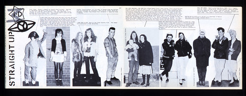
JLW: You still have the “straight up” shots.
Terry Jones: Yeah. That’s stayed since the beginning.

JLW: So is creative direction all about choosing the right photographer?
Terry Jones: The point where I choose a photographer is the point where I can place trust and not be around when they’re pressing the button. The process of collaboration is such that I don’t want to be standing behind them on an editorial shoot.
JLW: Are there still times when you feel you have to do that to make sure it’s right?
Terry Jones: On a commercial shoot I will. On editorial, no. If I can’t get it right before, then I haven’t got the right team. I’ve chosen them because of their view, not because I want them to carry out my bidding. There’s an attitude going through i-D and the fact that they’ve been chosen is because I felt their attitude is right as part of a package for an issue. I have a theme for each issue which is an added focus – the October issue had a futuristic, “forward” vision. The next issue we’re working on is the “cheeky” issue. There will often be a word like that which can be used in a wide range of ways. I keep my ear to the ground – listen to what our network of contributors want to put in.
JLW: Do you find you can hold several issues in your head at one time?
Terry Jones: Yes…it’s something I learnt at Vogue. April and March were double issues and I did a beauty book as well so there were five issues going through my head at a time. I’m always thinking ahead. I try still to make a magazine that’s like a film. It’s figuring out what I’ve got going into a package … I try to get all the content in and then I’ll cut it.
JLW: That implies you do all your editing together in quite a short space of time.
Terry Jones: It’s set up so that all the words and visuals are collated so the stories are pieced together in the computer. Then, in a day – sometimes a few hours – I’ll come in and get a sequence together.
JLW: So until that point you don’t have a conventional flatplan?
Terry Jones: No.
JLW: That’s pretty different to most of the other magazines on the newsstand.
Terry Jones: The way that I work frustrates a lot of people.
Tricia Jones: The flatplans are extremely late.
Terry Jones: I try to explain to my editorial and advertising departments that that’s how I like to work. It’s not how most magazines like to work.
Tricia Jones: You’ve got a team now who are really …
Terry Jones: … behind it.
Tricia Jones: They can see it working … he puts everything out on the table …
Terry Jones: I still think physically…
JLW: Do you work with colour printouts?
Terry Jones: No, just black and white, 50 per cent, 25 per cent…
JLW: How hands-on are you with the regular sections?
Terry Jones: We restructured that over the past couple of issues and made this section called “Eye” which is the minestrone if you like … always the “what’s up” section. We’ve updated that section and pushed the visual side of it more because I found that it was getting too boxy.
JLW: How do you approach the pieces that are not led by visuals? You told me that your approach is that the words are always subservient to the pictures.
Terry Jones: I do think words are really important, they’re graphically important. And if journalists came up with the words on time it would be fine, but they don’t. I always saw the magazines as something for the lazy readers. People who don’t want to have to read through reams and reams of jargon. That was part of the intention when we started, which was just a vox pop. “What do you like? Where do you buy your clothes, what music do you listen to?” But we will commission and run 3000-word features on things that are worthwhile.
JLW: What about running pieces with no pictures, such as the piece about sex and drugs (“Just Say Yes! Yes! Yes!”, i-D, September 1998)?
Terry Jones: I like to have at least one “think” piece in an issue. It has to be a good read. If what’s in the article is strong enough, it doesn’t need an illustration. I always took the broad view that fashion is not just about clothes, it’s about how you think.
JLW: Do you enjoy seeing the influence of i-D’s experiments in other people’s work?
Terry Jones: We went through the stages of perfecting the art of illegibility. I think that was part of our history. Ray Gun and the magazines David Carson was producing were inspired by some of our graphic mistakes. Notably yellow on a four-colour half-tone. I think at that points some of our writers were beginning to give up.
In any process of communication you stretch the boundaries and you go to the edges and I think we did that with i-D just for the fun of doing it. I think that at the point where those ideas were entering the mainstream you started seeing advertising campaigns and all kinds of stuff. We did a lot of “video mashes”, producing videos for the fashion show period when we’d take a stand at Olympia. To get noticed I’d go in about two days before with a bunch of tapes given to me by Dylan Jones and videos of our latest fashion shoot and we’d mash that with the previous one and consequently ended up with what we called the “i-D mash”. That influenced the layered graphics we were doing so well.
JLW: What do you think when you see other work that is influenced by you?
Terry Jones: I often see things where people have done the idea better than we did – they’ve refined it more. But sometimes they have refined it too much. I still like an original idea coming from the original source. Historically I don’t think we always developed the idea. We would always move on to the next idea. Now we stay more constant.
I’ve fixed the typefaces. Typography should be to the point – it shouldn’t be the decorative element. I want the photography to communicate, because I want to reach a global audience very quickly. There was a time when I only used Univers, and we’re now using Univers, Avenir and, I think, Century Schoolbook as well. I limit the palette periodically. There have been periods where it’s gone too “good taste”… we’re probably nearing that again.
JLW: i-D is principally about fashion, which itself cycles between good and bad taste. Is your cycle related in any way to the global fashion cycle?
Terry Jones: Fashion is something I enjoy because it’s transient. It’s something that marks a moment in time and it takes on a level of importance because the time in your life is important, whether it’s to do with music or smell or taste or clothes. Clothes are the outward expression.
This period of grunge, the destroyed background, people looking like victims… that wasn’t what the magazine was about. It was about aspiring to something better and it was intended that you could do better. You didn’t have to keep your feet in the shit, you could actually step out of it. You had that option. My intention with the magazine was to say: “You don’t have to wear a suit to work. You don’t have to look like people are telling you to.” You can be successful in your own right by expressing yourself. It was about making decisions for yourself. Putting in people who were doing interesting things – and looked interesting – but didn’t look like victims of the environment.
JLW: Is there a moral element to your direction?
Terry Jones: We respect a wide range of opinions, but the filtering process is quite strong. We wouldn’t have Nazi skinheads. But we have a skinned monkey photographed by Nick Knight in the next issue [November 98]. I asked Simon Foxton, who was on the shoot, what it was about and he said: “Fur. Makes you think.” And that was enough reason to run it.
JLW: The fashion and style press has been attacked for its approach to lifestyle: drugs and dieting. Is that something you have to make decisions about?
Terry Jones: We’ve always tried to present a broad view. Trish has a stronger parental teacher ethic than I do …
Tricia Jones: I feel that we actually have a responsibility. We had a huge family argument last week in Florence about the whole question of using fourteen-year-old models.
Terry Jones: The point of producing a magazine is open people’s eyes, to make them think. The whole idea of the magazine was that: “this is the street, these are the different views, these are different people that dress in different ways and they have different ideas and you have to respect each person and you come to your own ideas.” This was quite a different approach to The Face, which said “this is trendy and this is not trendy” and at the end of the year would say “this is in, this is out”. We never did that with i-D because the ethic of the magazine was “this is the range of choice. These are the things you can pick up on. This is the supermarket. You can decide if you want to eat cereal – or fruit.
JLW: So do you perceive a strong divide between i-D and its rivals?
Terry Jones: Yes. The focus of the magazine is presenting fashion which is more in the business world of fashion. We’re presenting a spectrum of fashion which is nothing to do with price, but to do with looks. We don’t include prices. We’re not expecting that someone who doesn’t have £3000 will rush out and buy that particular outfit, because they will look for a “look” and they’ll go to Top Shop or Jigsaw and buy something they can afford. But there are people who have been buying i-D for ten to fifteen years who have disposable income – who don’t have kids – and I think that people like Bjork will spend serious amounts of money.
JLW: Did it have to be about fashion? Could you have done this sort of thing with a different field?
Terry Jones: My attitude to fashion is that it gave the broadest spectrum. If I’d chosen food, or gardening, it would have been far more limiting. But music is part of fashion. We always had this tag – “fashion, people, clubs, ideas”. Those were the topics we covered because everything is interrelated.
JLW: But fashion is still the engine that drives it?
Terry Jones: Yeah, but fashion is more than clothing.
JLW: Could i-D be more than a fashion magazine?
Terry Jones: It has become other things in an experimental way. The Biennale project was more like a three-dimensional magazine, bringing fashion designers into something which had to be moving. In the future, that could happen more. Video i-D was something I played around with. I got into TV around 01 for London. The global vision of the magazine has become more important because visual communication is what I’m interested in.
JLW: At our Total Publishing discussion you said you were just about to get to grips with a brand new piece of technology. Has that happened?
Terry Jones: Um.
Tricia Jones: In his dreams.
Terry Jones: Um. Well I couldn’t have done the Biennale Fashion/Cinema catalogue without this G3 [Apple]. I didn’t want to have advertising, so I produced a 24-page section for Estee Lauder, and for the exhibition I did these metre-wide prints – from huge files on the G3. There were six exhibitions altogether. For the “2001 (minus 3)” installations I put 22 designers together with a different photographer for each designer. They were made with the team from Cinecitta in Rome.
JLW: Did you approach this in a similar way to an i-D issue – sticking it up on the wall?
Terry Jones: Yes
Tricia Jones: And we managed to get the wink in.
Terry Jones: Cary Grant and Irene Dunne [from the film The Awful Truth] and De Niro in Taxi Driver.
JLW: You said the concept for i-D came to you back in the early 1960s …
Terry Jones: I traced it back to then. That art school poster includes the credit “Informat Design”, which was my company. Playing around with logos, as you always do – I.D. was always a constant. In the 1960s doing initial logos was very popular.
Tricia Jones: But you were still at college, you didn’t have Informat Design then.
Terry Jones: I did. Just look at the poster. It says Informat Design, Terry Jones.
Tricia Jones: Is that where the name came from?
Terry Jones: Yeah.
Tricia Jones: I never knew that.
JLW: What was the point where you realised the i-D logo made a winking face?
Terry Jones: Because we were published by Better Badges, we made a button that said “Seen in i-D” with this logo like a winking Black and White Minstrels face. We used to give the badge out to each person we photographed so they became walking ads for the magazine. So the cover was a face, and that was intentional from the beginning. I didn’t want to do a photograph until the fifth issue when we had a composite with Lady Di on the i-D cover, the month she got married in 1981.
JLW: And that led to the commissioned photograph?
Terry Jones: From then on we commissioned photographs … 170-odd winks since then.

JLW: How do you manage to combine what appears to be quite a normal family life – not to mention all your other work – with this difficult, innovative and sometime experimental magazine?
Terry Jones: Genius wife! Trish was long-suffering in the early days when people came into the office and she’d throw them out at three o’clock.
Tricia Jones: It was actually nearer one o’clock. It has always been a juggling act.
Terry Jones: It was done like a hobby outside of commercial projects. It was just working with creative people. Nick Knight walked in because he’d seen Not Another Punk Book and was interested in me doing his skinhead book. I wasn’t, but I asked him to do pictures for the magazine, so his first published work was of the students down in Bournemouth. Mark Le Bon I met through working at Bow Street Studios when I was at Good Housekeeping.
JLW: And a network built up very quickly, which continues today. Have you had dark moments?
Terry Jones: There have been big debates about “was it worth the time”? Tricia has been long-suffering on that one because it was like doing two jobs for years – and it wasn’t done for good money. It was done … as a baby.
JLW: Did you feel you were in it for the long haul?
Terry Jones: I don’t know. I think I always saw it as surviving but at the point where I could see it was going completely wrong it was like seeing my house crumble away…
Tricia Jones: It was going in the wrong direction.
JLW: So you made a decision to spend more time – stop the other things and spend more time on i-D?
Terry Jones: That’s why we remortgaged. It has paid off now.
JLW: What’s your view of the way the industry sells and distributes magazines? Do you enjoy the great proliferation of new titles?
Terry Jones: People are buying magazines because they want access to the information that magazines give. They thought the Internet would kill off magazines but the reverse has happened. With i-D we’ve got a slice of the cake. But I’m not trying to make a McDonald’s.
I’m interested in the cream of ideas. I’m interested in readership more then selling vast quantities of things I’m not happy with. The types of magazines that are going down that route are more international. I don’t feel an affinity with magazines that are compromised and aimed at a mass audience. I’m not interested in mass thinking. I’m interested in people thinking for themselves.
JLW: Do you think the way magazines look is shifting because of all the other rival technologies?
Terry Jones: How you present a magazine is definitely part of fashion so you have to be aware of that all the time to the point where you become stale in a market which is expecting something which reflects that moment.
JLW: And when you’re hiring or recruiting designers, how do you go about choosing someone?
Terry Jones: Chance.
Tricia Jones: It’s haphazard.
Terry Jones: I follow my gut. People walk through the door.
JLW: I imagine people seek you out.
Terry Jones: It seems to happen when I need somebody. I’m often looking for people who have a technical ability, absolute control. The guy that worked on the Biennale [Christoph Steinegger] was the right person. He wasn’t locked in. We could work as a partnership.
JLW: Was it really a partnership?
Tricia Jones: No!
Terry Jones: I see it as a partnership.
Tricia Jones: Ask Christoph!
Terry Jones: The way that I see it is that I have a creative palette. You look at the pages – I had very definite ideas of how I wanted it done…
Tricia Jones: Exactly. You had very definite ideas and he refined it.
Terry Jones: It’s finding people you can work on.
Tricia Jones: I used to know another designer whose flat was full of references…he collected everything, and you could see everything in his work. But Terry’s stuff comes from somewhere else. He doesn’t buy other magazines. He’s a completely lateral thinker.
i-D no. 3.

John L. Walters, writer and editor, London
First published in Eye no. 30 vol 8, 1998
Eye is the world’s most beautiful and collectable graphic design journal, published quarterly for professional designers, students and anyone interested in critical, informed writing about graphic design and visual culture. It is available from all good design bookshops and online at the Eye shop, where you can buy subscriptions and single issues.