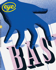
Summer 2010
Scribble and strum
The layout and art direction of music magazines reflect and champion a wide spectrum of tastes and genres.

The Journal of Popular Noise
The moment you see it, you know this is something unusual. The music that comes with TJPN matches its esoteric look and feel, but you don’t start with that: you start by carefully unfolding the beautiful, letterpress-printed object in your hands, and sliding out the three vinyl sleeves tucked inside its corners. Once the vinyl has been removed, the entire thing blossoms into a single large sheet, on which abstract graphs and careful phrases describe, and at the same time avoid describing, the aural delights provided. By interacting with this magazine, you enter its world, in which the music is just one element of strangeness. Well worth tracking down, at least once.
Loops
This relatively new, independent-minded journal of music writing comes from an unlikely pairing: Faber and Faber and Domino Records. The writing is mostly well crafted and nostalgic, presented within a smart template created by designers Wallzo. The headlines and logo are in Braid, a special font created by Wallzo for the magazine, making the words themselves into decorative, yet low-key page elements. Aimed shamelessly at an older crowd, the design feels just literary enough without being off-putting or old-fashioned.
The Stool Pigeon
Influenced more by Viz than the NME, The Stool Pigeon takes non-conformism to extremes. Yet beyond its arch in-jokes and rude cartoons lies an intelligent piece of design and editorial, by turns stirring up confusion and excitement, then generating calm and admiration. Some pages feel up-to-the-minute; others as if they’ve been put together with Letraset and Cow Gum. If you get it, you really get it. The Stool Pigeon showcases music it likes, in a way that is all its own, wringing every drop out of the possibilities offered by its newsprint format.
Alarm
Everything about Alarm makes you want to read it, from its weighty, book-like format to its beautifully printed, understated covers. Then you open it and see the artist-designed endpapers, beyond which the articles – printed on matt paper – slide into a design that’s almost Dutch in its straightforwardness. Intelligent stories and strong photography finish the mix. Though there are times when this Chicago-based magazine’s pacing and humour could do with a lift, there’s no doubting that when you pick up a copy of Alarm you know you’re getting your money’s worth.
Wax Poetics
This Brooklyn-based journal is quite simply very cool. It uses smart, witty photography to accompany its intelligent, fresh articles, and puts them together in a clean, accessible design, the sum total of which is intended to ‘educate the masses about the origins of their musical interests’. Wax Poetics’ focus is vintage and contemporary soul, funk, jazz, reggae, R’n’B and hip-hop: calm, cool and very collectable.
Bearded
From 2007-09, Bearded was a small, really lovely, alternative music print magazine, supporting both independent musicians and upcoming illustrators and photographers. Its design was distinctive and playful, yet articles were always easy to read. To save money, many pages were one-colour, printed on different coloured stocks, so it felt deliberate. It used to support itself through events, known as Beardaid. The print version had a short life (six issues, 2007-09), but Bearded continues as a readable and content-packed website.
The Wire
Between 2001-05, Non-Format (aka Kjell Ekhorn and Jon Forss) designed The Wire as if they were DJ-ing a mix of the music on its pages. Already album cover designers of some renown, they would blur typography across the pages, splash their designs across spreads and play intelligently with type and ideas. Yet it never felt overbearing in the pages of what was always a relatively text-heavy magazine. Their covers were memorable, bold and distinctive, while always standing out for their calm confidence. The Wire’s ongoing design and art direction (by James Goggin until 2007 and now Ben Weaver) remains strong.
Ray Gun
From 1992 to 2000, Ray Gun shouted loud; louder in fact than most of the musicians on its pages. Its typography and design, most famously by David Carson, danced around the page and off the page, backwards and sideways, starting onthe inside and ending on the front cover. The design was usually more out of control than the artists it featured, ignoring their style or look, and instead adapting them to its own. Ray Gun’s over-excitement got a little tiring in the end, but it remains an important artefact from an era – even if nobody remembers these days that it was about music at all.
Sniffin’ Glue
I could have chosen pretty much any punk fanzine of the late 1970s – Sideburns, The Suss, Ripped and Torn, Chainsaw, Jammin’ … This was a rare moment of a design aesthetic and a musical genre appearing almost simultaneously, and matching each other scream for scream. Cheap, handmade (out of necessity), rebellious, jokey, angry – anyone could scribble, type and photocopy reviews, photos, obscenities, critiques of modern society, just as anyone could shout into a microphone. Nobody wanted the music to be slick, and nobody wanted the publishing to be professional, to the bemusement of the mainstream. Mark Perry’s Sniffin’ Glue was probably the first punk fanzine, and it proved its commitment to punk ideals by ceasing publication after a year.
First published in Eye no. 76 vol. 19.

