
Spring 2009
Sean Adams
‘Capricorn speaks to where we are as a culture’
Sean Adams is co-founder of the LA design studio AdamsMorioka. He is national president of the American Institute of Graphic Arts and teaches at Art Center College of Design in Pasadena, CA.
I’m typically a stick-in-the-mud when it comes to typeface options. I tell my students that the latest and grooviest font may turn out to be like that once cool haircut in old photos that is now so terribly embarrassing.
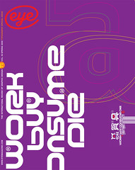
But I have made an exception for Jens Gehlhaar’s Capricorn (2007). Like all his typefaces, it is about craft and proportion. It also speaks to where we are now as a culture. We spend less, we are vigilant about resources, and we are looking for order. If we are at a place where we want to retreat, retrench, and face carefully upcoming challenges, Capricorn reflects such a stance.
Although Capricorn is compact, efficient and clear, however, it still has those odd quirks that keep it from being purely rational and point to its human touch. If we need to maintain a restrained and simpler lifestyle, then we can at least do it with a touch of style.
First published in Eye no. 71 vol. 18 2009
Eye is the world’s most beautiful and collectable graphic design journal, published quarterly for professional designers, students and anyone interested in critical, informed writing about graphic design and visual culture. It is available from all good design bookshops and online at the Eye shop, where you can buy subscriptions and single issues.