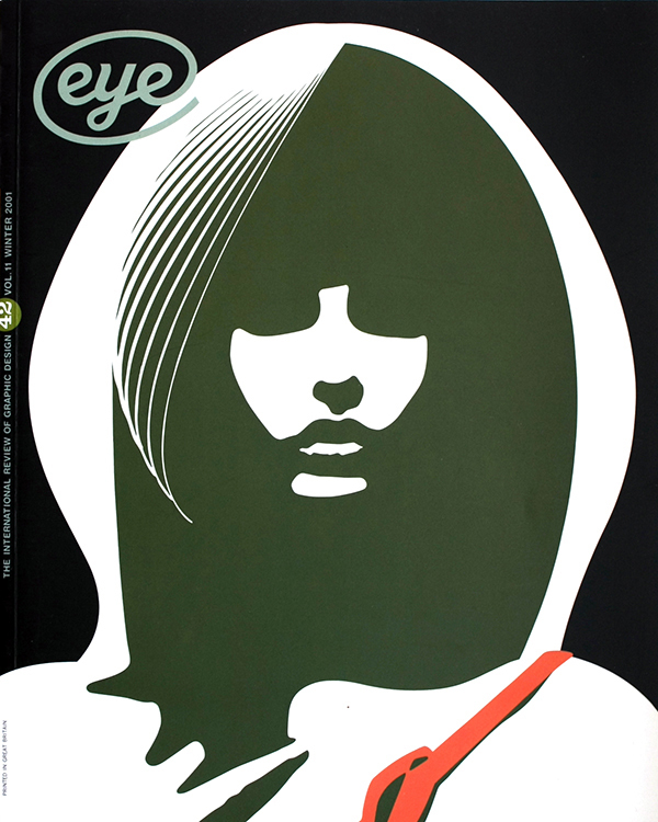
Winter 2001
Stephen Byram: art&design
A New Yorker opts for content, tactility and the sound of surprise
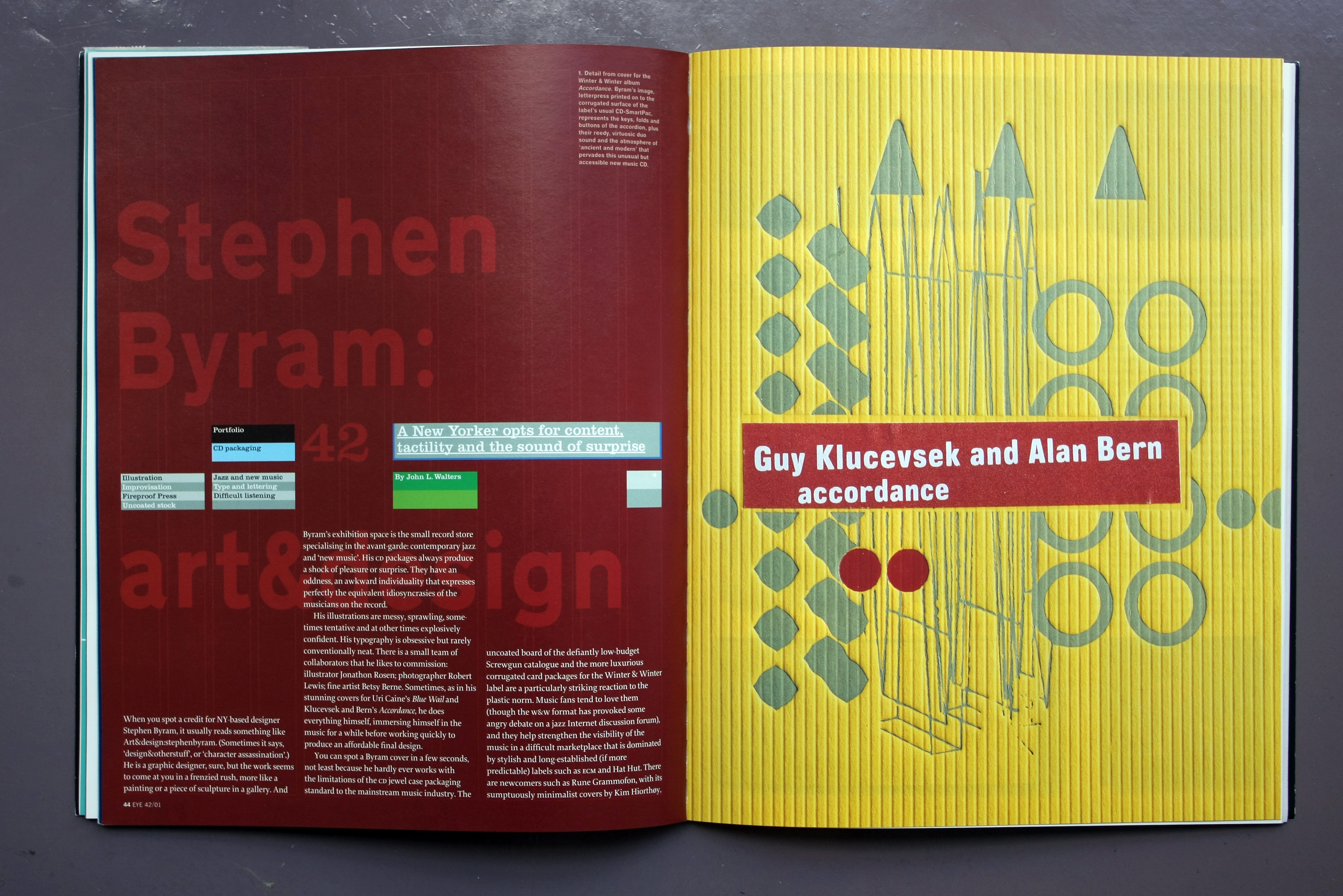
When you spot a credit for NY-based designer Stephen Byram, it usually reads something like Art&design:stephenbyram. (Sometimes it says, ‘design&otherstuff’, or ‘character assassination’.) He is a graphic designer, sure, but the work seems to come at you in a frenzied rush, more like a painting or a piece of sculpture in a gallery. And Byram’s exhibition space is the small record store specialising in the avant-garde: contemporary jazz and ‘new music’. His CD packages always produce a shock of pleasure or surprise. They have an oddness, an awkward individuality that expresses perfectly the equivalent idiosyncrasies of the musicians on the record.
His illustrations are messy, sprawling, sometimes tentative and at other times explosively confident. His typography is obsessive but rarely conventionally neat. There is a small team of collaborators that he likes to commission: illustrator Jonathon Rosen; photographer Robert Lewis; fine artist Betsy Berne. Sometimes, as in his stunning covers for Uri Caine’s Blue Wail and Klucevsek and Bern’s Accordance, he does everything himself, immersing himself in the music for a while before working quickly to produce an affordable final design.
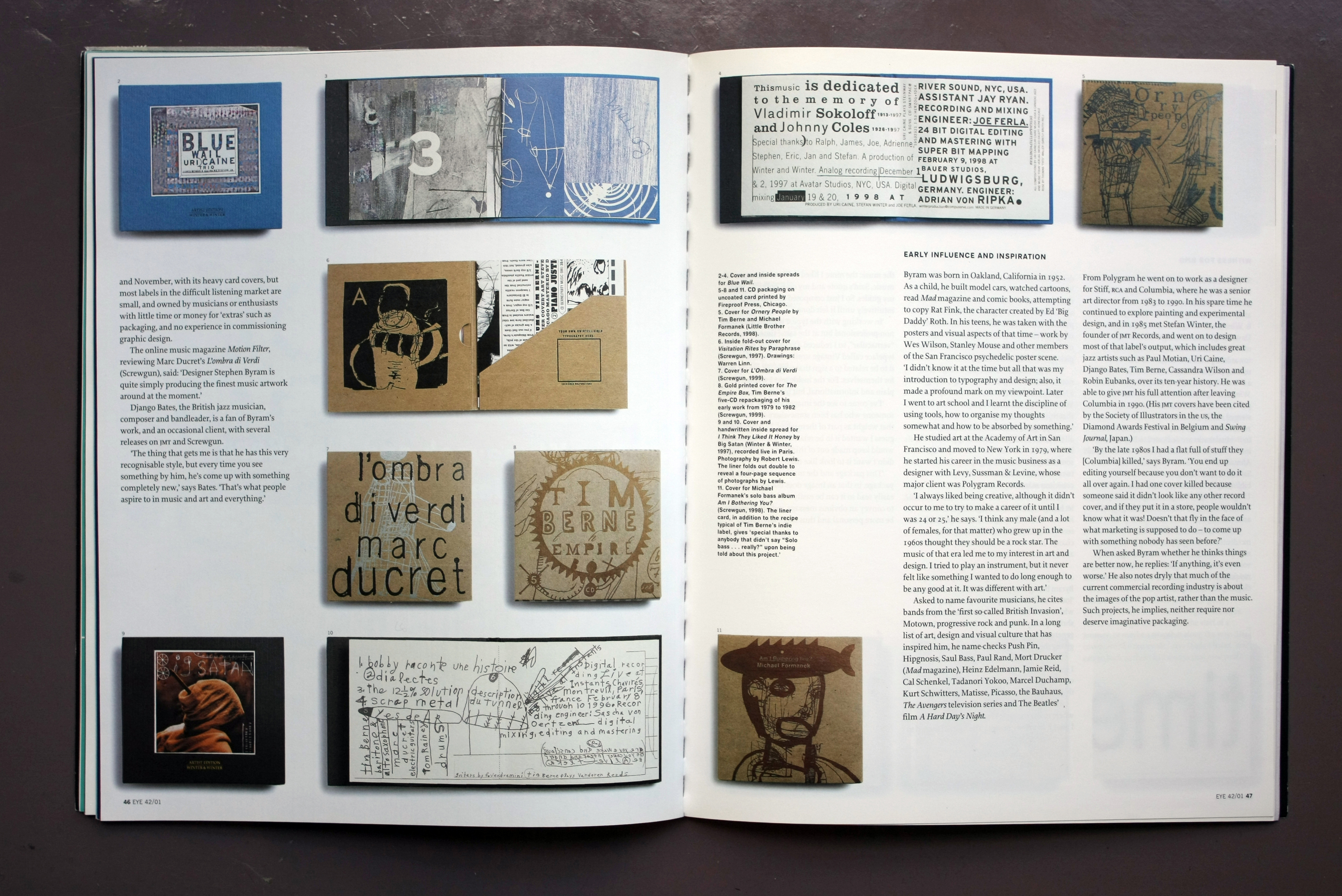
You can spot a Byram cover in a few seconds, not least because he hardly ever works with the limitations of the CD jewel case packaging standard to the mainstream music industry. The uncoated board of the defiantly low-budget Screwgun catalogue and the more luxurious corrugated card packages for the Winter & Winter label are a particularly striking reaction to the plastic norm. Music fans tend to love them (though the W&W format has provoked some angry debate on a jazz internet discussion forum), and they help strengthen the visibility of the music in a difficult marketplace that is dominated by stylish and long-established (if more predictable) labels such as ECM and Hat Hut. There are newcomers such as Rune Grammofon, with its sumptuously minimalist covers by Kim Hiorthøy, and November, with its heavy card covers, but most labels in the difficult listening market are small, and owned by musicians or enthusiasts with little time or money for ‘extras’ such as packaging, and no experience in commissioning graphic design.
The online music magazine Motion, reviewing Marc Ducret’s L’ombra di Verdi (Screwgun), said: ‘Designer Stephen Byram is quite simply producing the finest music artwork around at the moment.’ Django Bates, the British jazz musician, composer and bandleader, is a fan of Byram’s work, and an occasional client, with several releases on JMT and Screwgun. ‘The thing that gets me is that he has this very recognisable style, but every time you see something by him, he’s come up with something completely new,’ says Bates. ‘That’s what people aspire to in music and art and everything.’
Byram was born in Oakland, California in 1952. As a child, he built model cars, watched cartoons, read Mad magazine and comic books, attempting to copy Rat Fink, the character created by Ed ‘Big Daddy’ Roth. In his teens, he was taken with the posters and visual aspects of that time – work by Wes Wilson, Stanley Mouse and other members of the San Francisco psychedelic poster scene.
‘I didn’t know it at the time but all that was my introduction to typography and design; also, it made a profound mark on my viewpoint. Later I went to art school and I learnt the discipline of using tools, how to organise my thoughts somewhat and how to be absorbed by something.’
He studied art at the Academy of Art in San Francisco and moved to New York in 1979, where he started his career in the music business as a designer with Levy, Sussman & Levine, whose major client was Polygram Records.
‘I always liked being creative, although it didn’t occur to me to try to make a career of it until I was 24 or 25,’ he says. ‘I think any male (and a lot of females, for that matter) who grew up in the 1960s thought they should be a rock star. The music of that era led me to my interest in art and design. I tried to play an instrument, but it never felt like something I wanted to do long enough to be any good at it. It was different with art.’
Asked to name favourite musicians, he cites bands from the ‘first so-called British Invasion’, Motown, progressive rock and punk. In a long
list of art, design and visual culture that has inspired him, he name-checks Push Pin, Hipgnosis, Saul Bass, Paul Rand, Mort Drucker (Mad magazine), Heinz Edelmann, Jamie Reid, Cal Schenkel (see Eye 53), Tadanori Yokoo, Marcel Duchamp, Kurt Schwitters, Matisse, Picasso, the Bauhaus, The Avengers television series and The Beatles’ film A Hard Day’s Night.
From Polygram he went on to work as a designer for Stiff, RCA and Columbia, where he was a senior art director from 1983 to 1990. In his spare time he continued to explore painting and experimental design, and in 1985 met Stefan Winter, the founder of JMT Records, and went on to design most of that label’s output, which includes great jazz artists such as Paul Motian, Uri Caine, Django Bates, Tim Berne, Cassandra Wilson and Robin Eubanks, over its ten-year history. He was able to give JMT his full attention after leaving Columbia in 1990. (His JMT covers have been cited by the Society of Illustrators in the US, the Diamond Awards Festival in Belgium and Swing Journal, Japan.)
‘By the late 1980s I had a flat full of stuff they [Columbia] killed,’ says Byram. ‘You end up editing yourself because you don’t want to do it all over again. I had one cover killed because someone said it didn’t look like any other record cover, and if they put it in a store, people wouldn’t know what it was! Doesn’t that fly in the face of what marketing is supposed to do – to come up with something nobody has seen before?’
When asked Byram whether he thinks things are better now, he replies: ‘If anything, it’s even worse.’ He also notes dryly that much of the current commercial recording industry is about the images of the pop artist, rather than the music. Such projects, he implies, neither require nor deserve imaginative packaging.
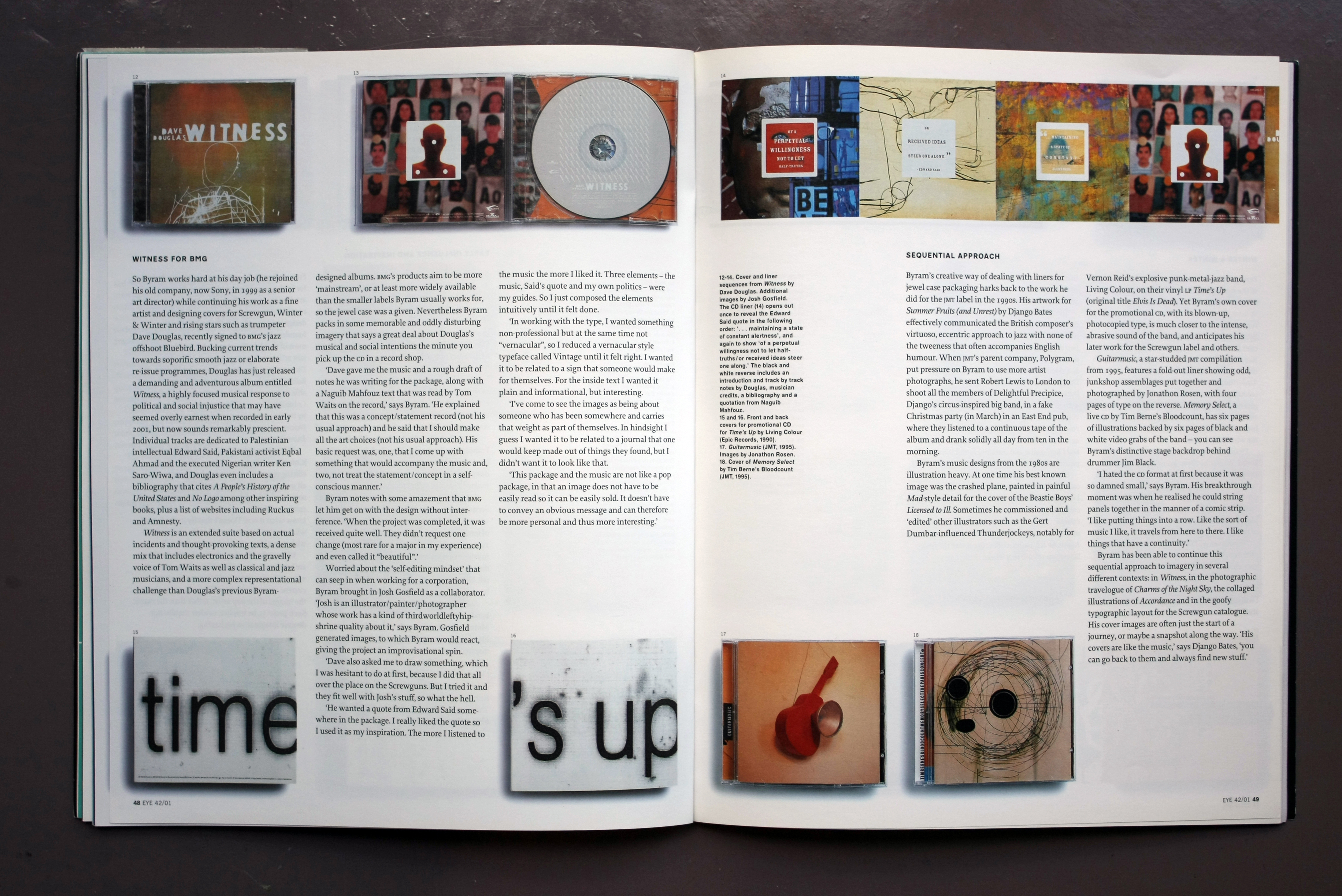
So Byram works hard at his day job (he rejoined his old company, now Sony, in 1999 as a senior art director) while continuing his work as a fine artist and designing covers for Screwgun, Winter & Winter and rising stars such as trumpeter Dave Douglas, recently signed to BMG’s jazz offshoot Bluebird. Bucking current trends towards soporific smooth jazz or elaborate re-issue programmes, Douglas has just released a demanding and adventurous album entitled Witness, a highly focused musical response to political and social injustice that may have seemed overly earnest when recorded in early 2001, but now sounds remarkably prescient. Individual tracks are dedicated to Palestinian intellectual Edward Said, Pakistani activist Eqbal Ahmad and the executed Nigerian writer Ken Saro-Wiwa, and Douglas even includes a bibliography that cites A People’s History of the United States and No Logo among other inspiring books, plus a list of websites including Ruckus and Amnesty.
Witness is an extended suite based on actual incidents and thought-provoking texts, a dense mix that includes electronics and the gravelly voice of Tom Waits as well as classical and jazz musicians, and a more complex representational challenge than Douglas’s previous Byram-designed albums. BMG’s products aim to be more ‘mainstream’, or at least more widely available than the smaller labels Byram usually works for, so the jewel case was a given. Nevertheless Byram packs in some memorable and oddly disturbing imagery that says a great deal about Douglas’s musical and social intentions the minute you pick up the CD in a record shop.
‘Dave gave me the music and a rough draft of notes he was writing for the package, along with a Naguib Mahfouz text that was read by Tom Waits on the record,’ says Byram. ‘He explained that this was a concept / statement record (not his usual approach) and he said that I should make all the art choices (not his usual approach). His basic request was, one, that I come up with something that would accompany the music and, two, not treat the statement / concept in a self-conscious manner.’
Byram notes with some amazement that BMG let him get on with the design without interference. ‘When the project was completed, it was received quite well. They didn’t request one change (most rare for a major in my experience) and even called it “beautiful”.’
Worried about the ‘self-editing mindset’ that can seep in when working for a corporation, Byram brought in Josh Gosfield as a collaborator. ‘Josh is an illustrator / painter / photographer whose work has a kind of thirdworldleftyhipshrine quality about it,’ says Byram. Gosfield generated images, to which Byram would react, giving the project an improvisational spin.
‘Dave also asked me to draw something, which I was hesitant to do at first, because I did that all over the place on the Screwguns. But I tried it and they fit well with Josh’s stuff, so what the hell.
‘He wanted a quote from Edward Said somewhere in the package. I really liked the quote so I used it as my inspiration. The more I listened to the music the more I liked it. Three elements – the music, Said’s quote and my own politics – were my guides. So I just composed the elements intuitively until it felt done.
‘In working with the type, I wanted something non-professional but at the same time not “vernacular”, so I reduced a vernacular style typeface called Vintage until it felt right. I wanted it to be related to a sign that someone would make for themselves. For the inside text I wanted it plain and informational, but interesting.
‘I’ve come to see the images as being about someone who has been somewhere and carries that weight as part of themselves. In hindsight I guess I wanted it to be related to a journal that one would keep made out of things they found, but I didn’t want it to look like that.
‘This package and the music are not like a pop package, in that an image does not have to be easily read so it can be easily sold. It doesn’t have to convey an obvious message and can therefore be more personal and thus more interesting.’
Byram’s creative way of dealing with liners for jewel case packaging harks back to the work he did for the JMT label in the 1990s. His artwork for Summer Fruits (and Unrest) by Django Bates effectively communicated the British composer’s virtuoso, eccentric approach to jazz with none of the tweeness that often accompanies English humour. When JMT’s parent company, Polygram, put pressure on Byram to use more artist photographs, he sent Robert Lewis to London to shoot all the members of Delightful Precipice, Django’s circus-inspired big band, in a fake Christmas party (in March) in an East End pub, where they listened to a continuous tape of the album and drank solidly all day from ten in the morning.
Byram’s music designs from the 1980s are illustration heavy. At one time his best known image was the crashed plane, painted in painful Mad-style detail for the cover of the Beastie Boys’ Licensed to Ill. Sometimes he commissioned and ‘edited’ other illustrators such as the Gert Dumbar-influenced Thunderjockeys, notably for Vernon Reid’s explosive punk-metal-jazz band, Living Colour, on their vinyl LP Time’s Up (original title Elvis Is Dead). Yet Byram’s own cover for the promotional CD, with its blown-up, photocopied type, is much closer to the intense, abrasive sound of the band, and anticipates his later work for the Screwgun label and others.
Guitarmusic, a star-studded JMT compilation from 1995, features a fold-out liner showing odd, junkshop assemblages put together and photographed by Jonathon Rosen, with four pages of type on the reverse. Memory Select, a live CD by Tim Berne’s Bloodcount, has six pages of illustrations backed by six pages of black and white video grabs of the band – you can see Byram’s distinctive stage backdrop behind drummer Jim Black.
‘I hated the CD format at first because it was so damned small,’ says Byram. His breakthrough moment was when he realised he could string panels together in the manner of a comic strip. ‘I like putting things into a row. Like the sort of music I like, it travels from here to there. I like things that have a continuity.’
Byram has been able to continue this sequential approach to imagery in several different contexts: in Witness, in the photographic travelogue of Charms of the Night Sky, the collaged illustrations of Accordance and in the goofy typographic layout for the Screwgun catalogue. His cover images are often just the start of a journey, or maybe a snapshot along the way. ‘His covers are like the music,’ says Django Bates, ‘you can go back to them and always find new stuff.’
Perhaps it is just as well that the cover is only part of the story, given the small amount of space to fill within the ‘CD-SmartPac’ used by Winter & Winter. This format, together with the company’s typographic logo, is a source of irritation to Byram. ‘Stefan [Winter] and I argued like hell over that – he said, “I want a package that looks like a book”,’ says Byram, who is not officially art director of the label, as he was with JMT.
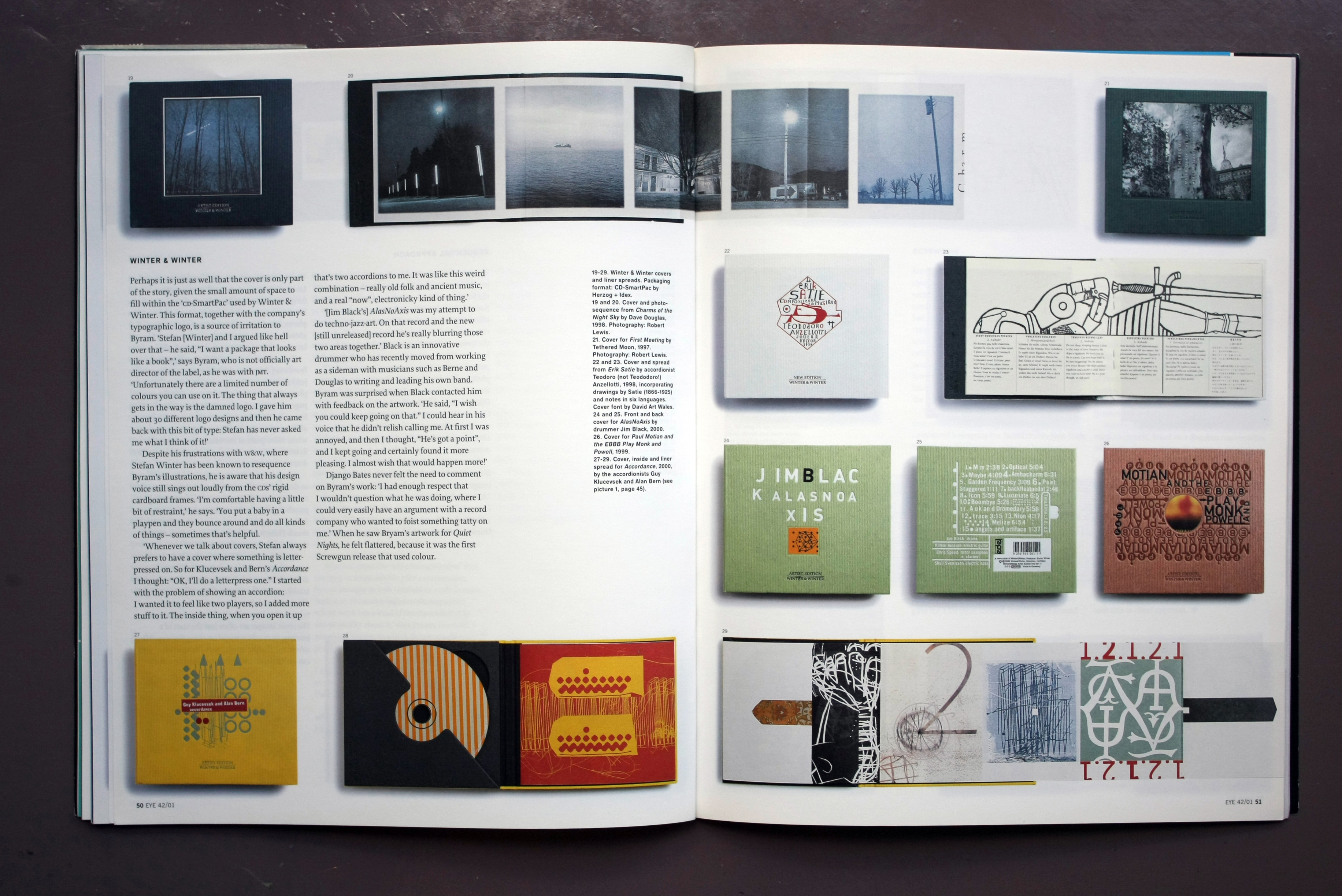
‘Unfortunately there are a limited number of colours you can use on it. The thing that always gets in the way is the damned logo. I gave him about 30 different logo designs and then he came back with this bit of type: Stefan has never asked me what I think of it!’
Despite his frustrations with W&W, where Stefan Winter has been known to resequence Byram’s illustrations, he is aware that his design voice still sings out loudly from the CDs’ rigid cardboard frames. ‘I’m comfortable having a little bit of restraint,’ he says. ‘You put a baby in a playpen and they bounce around and do all kinds of things – sometimes that’s helpful.
‘Whenever we talk about covers, Stefan always prefers to have a cover where something is letter-pressed on. So for Klucevsek and Bern’s Accordance I thought: “OK, I’ll do a letterpress one.” I started with the problem of showing an accordion: I wanted it to feel like two players, so I added more stuff to it. The inside thing, when you open it up that’s two accordions to me. It was like this weird combination – really old folk and ancient music, and a real “now”, electronicky kind of thing.’
‘[Jim Black’s] AlasNoAxis was my attempt to do techno-jazz-art. On that record and the new [still unreleased] record he’s really blurring those two areas together.’ Black is an innovative drummer who has recently moved from working as a sideman with musicians such as Berne and Douglas to writing and leading his own band. Byram was surprised when Black contacted him with feedback on the artwork. ‘He said, “I wish you could keep going on that.” I could hear in his voice that he didn’t relish calling me. At first I was annoyed, and then I thought, “He’s got a point”, and I kept going and certainly found it more pleasing. I almost wish that would happen more!’
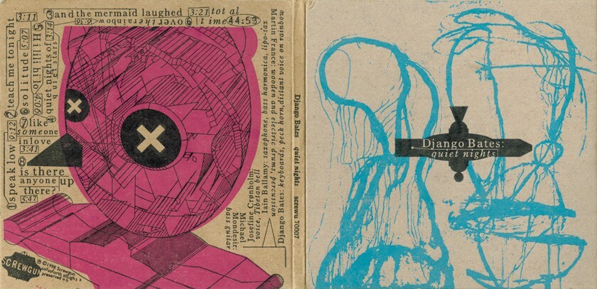
Django Bates never felt the need to comment on Byram’s work: ‘I had enough respect that I wouldn’t question what he was doing, where I could very easily have an argument with a record company who wanted to foist something tatty on me.’ When he saw Bryam’s artwork for Quiet Nights, he felt flattered, because it was the first Screwgun release that used colour.
Screwgun is the label formed by New York saxophonist Tim Berne, a prolific improviser and record-maker. Berne, who didn’t learn the saxophone until he was twenty, has made up for lost time by releasing a slew of records in a wide range of line-ups: first for his own Empire label and then for Columbia (where he met Byram), JMT (where he was an unofficial artistic adviser) and now his own label again, taking advantage of a low-cost, word-of-mouth marketing approach that takes in internet and mail-order sales, drawing on the self-help ethos of his mentor, Julius Hemphill.
The look and feel of the Screwgun CDs was determined by budget: Byram and Berne considered letterpress but found that in New York the practice had become ‘a kind of boutiquey thing’ that was out of their price range. Their problem was solved when they discovered Fireproof Press in Chicago, a small printing outfit run by musician John Upchurch, who also plays with a band called The Rachels.
The first few covers, starting with an unedited triple live CD set by Bloodcount, were printed in black only, on uncoated board. ‘I wanted it to look like if you took an old LP and peeled off the paper,’ said Byram. He discovered that the best way to work with Fireproof was to work in Illustrator. ‘The drawings were scanned in, reworked and combined in the program, which gave me a lot more control: moving type around and doing things to it was much easier than in Quark.’ When the final designs had been checked and proofread, he converted everything to outline and sent the file to Upchurch.
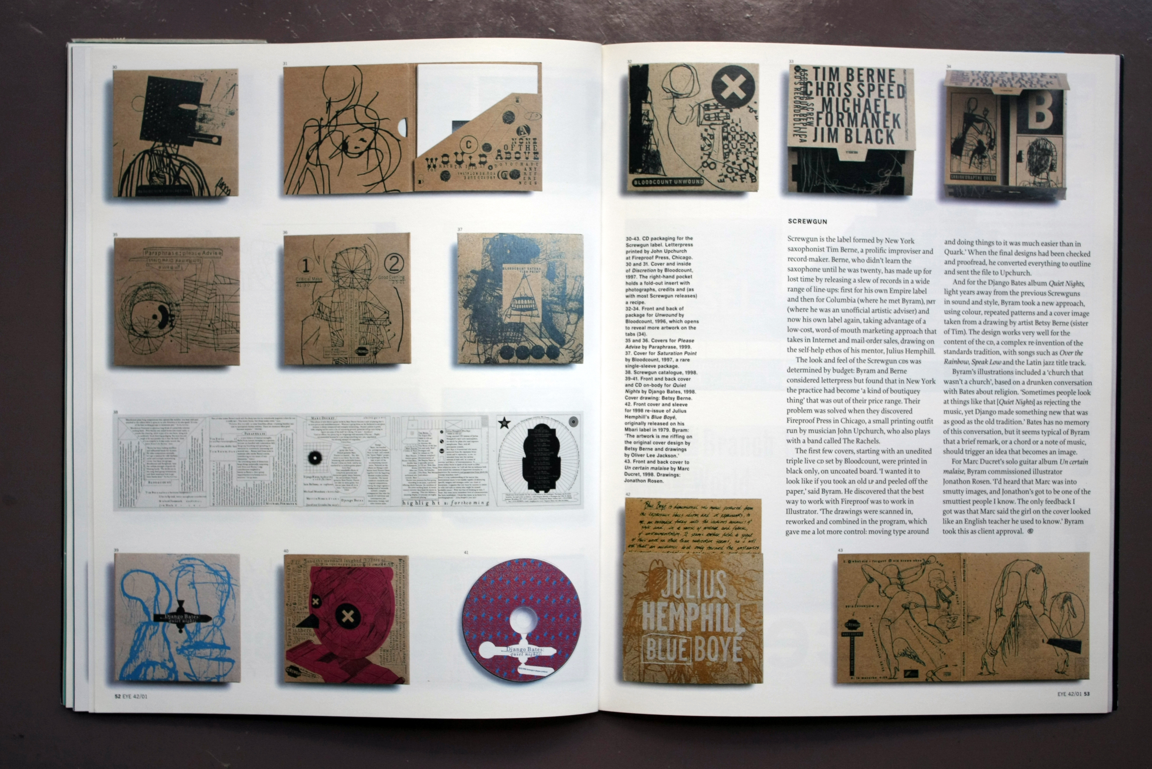
And for the Django Bates album Quiet Nights, light years away from the previous Screwguns in sound and style, Byram took a new approach, using colour, repeated patterns and a cover image taken from a drawing by artist Betsy Berne (sister of Tim). The design works very well for the content of the CD, a complex re-invention of the standards tradition, with songs such as ‘Over the Rainbow’, ‘Speak Low’ and the Latin jazz title track.
Byram’s illustrations included a ‘church that wasn’t a church’, based on a drunken conversation with Bates about religion. ‘Sometimes people look at things like that [Quiet Nights] as rejecting the music, yet Django made something new that was as good as the old tradition.’ Bates has no memory of this conversation, but it seems typical of Byram that a brief remark, or a chord or a note of music, should trigger an idea that becomes an image.
For Marc Ducret’s solo guitar album Un certain malaise, Byram commissioned illustrator Jonathon Rosen. ‘I’d heard that Marc was into smutty images, and Jonathon’s got to be one of the smuttiest people I know. The only feedback I got was that Marc said the girl on the cover looked like an English teacher he used to know.’ Byram took this as client approval.
John L. Walters, Eye editor, London
First published in Eye no. 42 vol. 11, 2001
Eye is the world’s most beautiful and collectable graphic design journal, published for professional designers, students and anyone interested in critical, informed writing about graphic design and visual culture. It is available from all good design bookshops and online at the Eye shop, where you can buy subscriptions and single issues.

