
Spring 2018
The colophon
This is the page whose small gestures reveal who’s who, says John Morgan

Person A: Where am I sitting? Just don’t say next to Finance or the Account Director.
Person B: Don’t worry, they have their own table in the next room with the Publishing Director and his PA.
Person A: Who’s that at the top of the table next to the Editor?
Person B: The Associate Editor or the Creative Director.
Person A: I thought I was the Creative Director.
Person B: No, you’re the Designer.
Person A: No, I’m the Art Director. So where am I?
Person B: You’re somewhere down there, after the Editorial team but before Production. Next to the Operations Executive.
Person A: Some mistake I think. I’ll move my name label. Who’s that group standing in the corner avoiding eye contact?
Person B: That’s Subscriptions.
Person A: Do they even need to be here?
A ‘colophon’ is a wonderfully obscure archaic word that we inherited from the once mysterious black art of printing. And, although its function is now conflated with that of an ‘imprint’, many of us still prefer to use the more lofty sounding word.
The term colophon derives from the Greek, meaning ‘summit’ or ‘finishing touch’ and while its position at the end of a publication may have changed, its function remains the same. Typically it is the place where ‘credit’ for roles in production is given. Magazines rely on big gestures – the speed of production and consumption often demands it. The colophon, however, is a pace for small gestures and detailed typography, a place to consider out-hanging the copyright symbol, letter-spacing the small capitals of ISBN and distributing the vertical space to define groupings or to prevent tedium.
The colophon can also contain the legal or copyright disclaimer – a modern-day version of the ‘book curses’ that were rumoured to sit on the colophon and warn people who might steal of copy a publication: ‘ Let him be struck with Palsy, and all his Members blasted. Let him languish in Pain, crying aloud for Mercy … Let Book-worms gnaw his Entrails.’ Except that these words are from a famous 1909 hoax by librarian and writer Edmund Pearson. Maybe it’s safer to switch to: ‘All rights reserved. Reproduction in whole or in part without written permission is strictly prohibited.’
Does where you sit on a colophon signify your social importance, or how you are valued? The place of honour is at the top of the table, reserved for the Editor-in-chief. Do designers know their place? As the designer is often typesetting this page, they can influence the social order and change the ‘placement’. Do they aspire to sit closer to the Editors, or feel more solidarity alongside the Printers? Either way, some eblow room, a half-line space before their name, will make it more comfortable and provide a degree of separation. Occasionally after the initial thrill and excitement of a re-design I’ve returned to a table to see my name moved down from the top to a more lowly position. (No matter. By then I will be tired of the talk at that end of the table.)
While few readers even glance at this unloved page, we should never forget that colophon consciousness matters.
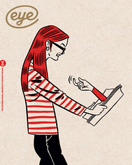
Top: Illustration by Jason Ford.
John Morgan is principal of John Morgan Studio, London
First published in Eye no. 96 vol. 24, 2018
Eye is the world’s most beautiful and collectable graphic design journal, published quarterly for professional designers, students and anyone interested in critical, informed writing about graphic design and visual culture. It is available from all good design bookshops and online at the Eye shop, where you can buy subscriptions and single issues. You can see what Eye 96 looks like at Eye Before You Buy on Vimeo.