
Autumn 2023
The creative anarchist

Printer, poet, designer and publisher Dennis Gould interweaves the personal with the political in his clamorous, intuitive letterpress work. By Rick Poynor.
Soon after moving to Stroud in Gloucestershire, I was exploring the town, famous for alternative living and thinking, when I noticed an intriguing building next to a roundabout. Its front garden was scattered with children’s toys – it turned out to be a kindergarten – and through the windows I could see shelves and papers suggesting some kind of printing workshop. I resolved to find out more. Soon after this, in a conversation with Simon Esterson and others at New North Press in Clerkenwell, I heard about an eccentric letterpress printer from Stroud called Dennis Gould, who was the subject of a recent documentary (The Last Cuckoo, see review in Eye 103). It was obvious that the printing paraphernalia I had seen must belong to him.
As I soon discovered, if you live in Stroud, it would be hard not to know about Gould. It is no exaggeration to call him a local legend, and people do. Now in his mid-80s, he has been living in the town since 1990, having discovered the area’s beauties while visiting a friend. Every Saturday he can be seen in the Shambles market selling second-hand books and copies of his letterpress prints. Made in Stroud, a shop for local makers, has racks full of his broadsides, posters and self-published booklets of poetry. Gould comes in regularly, bringing more. He must have infiltrated homes in every street in the town.
Gould has exuberantly recited his own poetry and that of his favourite writers at pubs and venues throughout the area. He would cycle every Sunday to The Woolpack pub in nearby Slad, celebrated by Laurie Lee, author of Cider with Rosie. They have baskets of his prints for sale. The virtues of growing one’s own vegetables (he is a passionate allotment holder) and bicycles – ‘Your Curves / Your Gears / Your Dynamo / Your Frame’ – are recurrent subjects.
Gould’s workshop in Stroud, with a scrapbook showing samples of cards he has designed and printed. Top. Portrait by Julian Anderson.
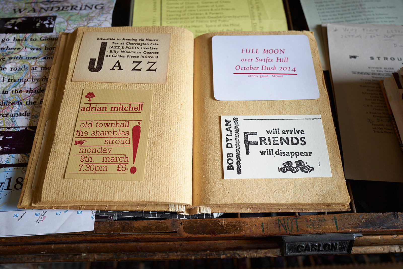
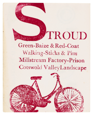
One of Gould’s postcards. The town and surrounding area are frequent subjects of his poetry and printing.
Gould has lived a life remarkable for its dedication to principle. He is a pacifist and an anarchist. ‘I don’t think that anarchists or pacifists necessarily have the answer, but they’re the two philosophies that still hold water,’ he says. He doesn’t believe in democracy and the illusion that we exercise it in a rigged system of voting every five years. He holds to ‘the Quaker idea of discussing through an issue until you reach a consensus.’ He supports radical concepts such as voluntaryism – ‘taking part in campaigns, being quite political but not voting’ – Peter Kropotkin’s mutual aid, voluntary poverty and the ‘gift economy’ (giving without expecting a reward). These precepts permeate everything Gould writes, designs and prints, as well as the way he lives. His decision to become a letterpress printer at the age of 54 was entirely consistent with his belief in ‘creative anarchy’. These ideas and ideals, along with glimpses of his life story, are threaded through the huge body of work he has produced in the past 30 years.
I have never encountered anyone as trusting as Gould. After meeting a couple of times, he left me alone in his flat, a short walk from his workshop, to look through his posters and prints for as long as I liked. Piled high with books and rare publications, every wall plastered with posters and photos, his home provided a vivid insight into his enthusiasms, obsessions and formative influences: radical poetry (Lawrence Ferlinghetti, Adrian Mitchell), anarchist thinkers (Paul Goodman, Herbert Read), folk, blues and jazz musicians (Bob Dylan, Ida Cox, Miles Davis) – to name only a few. When I had finished my immersion in his world, I let myself out.
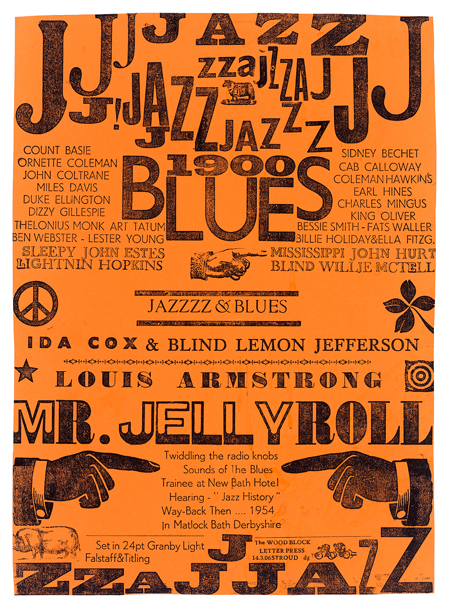
Music has always been an essential inspiration for Gould. In this typographic meditation on his youthful musical discoveries, while ‘twiddling the radio knobs’, woodblock letters jump and jive to express the excitement of sound. Printed on a Farley proofing press, 2006.
Poetry and activism
To reach Gould’s workshop in End Street, you go through the kindergarten to the last room on the ground floor. Any visit is likely to take place against a chorus of children’s voices. On the day of our interview, a little boy comes in to remind Gould politely that his breakfast is ready in the neighbouring Star Anise community café (he decides to let it wait). The workshop is like his flat, every centimetre crammed with books, audio cassettes (many featuring Dylan), prints drying, bundles of prints stored in plastic bags, wooden letters, cases of type and two small hand presses, which he uses to run off hundreds of inky prints on paper, fabric and sections he cuts from old maps.
Gould launches into his story. A genial presence and a lively talker, he radiates a benign kind of energy. As photos show, he kept the same look for decades – thick beard and a mane of wild hair sometimes topped off with a beret. (There is a glimpse of him in the early 1980s, selling copies of Freedom magazine and Peace News at Glastonbury, in Julien Temple’s documentary about the long-running music festival.) He was born in 1937 and grew up in Burton-on-Trent. His father was in the Navy. He recalls there were few books in the house and he left school at sixteen without any qualifications. After a spell as a trainee hotel manager, he joined the Royal Engineers and learned map-making at the Royal School of Military Survey, near Newbury. Gould was in Cyprus in 1956 at the time of the Greek Cypriot War of Independence and enjoyed meeting locals at a nearby village during leave – an early sign of his social engagement.
He put in a year of voluntary service overseas after leaving the army and began to read the pacifist paper Peace News. When he was 23, he applied for a year-long course at Woodbrooke college in Selly Oak, Birmingham, a residential institution of learning founded by Quakers. ‘Being at Woodbrooke gave me the opportunity to read seriously for the first time – everything by Tolstoy, Gandhi, Thoreau, Dostoyevsky, pacifists and libertarian writers. I think reading Tolstoy was a big influence because he might be described as a Christian pacifist and anarchist.’ Tolstoy set up communities on these principles, which were applied worldwide, including at the Whiteway Colony near Stroud, which still exists. Gould wrote an essay a week for his tutor and started a Campaign for Nuclear Disarmament group. Reading D. H. Lawrence’s essays and letters encouraged him to start writing. He composed his first poem, about a jazz musician, for Woodbrooke’s journal.
Gould designed this poster, based on several of his own poems, during the anti-nuclear protests of the early 1980s. The target of the action here is the American occupied airbase at Upper Heyford in Oxfordshire. Published by the Freedom Editorial Collective and typeset and printed by Aldgate Press in Whitechapel, 1983.

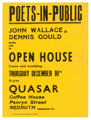
While he was living in Redruth in Cornwall, Gould performed regularly at the Quasar Coffee House. A local printer designed this forerunner of his later event posters, 1970.
In 1961, Gould took part in a ‘Ban the Bomb’ demonstration at Wethersfield air base in Essex; he was arrested and spent four months in Stafford Prison. After his release, he took a job as circulation manager of Peace News, produced behind the radical bookshop Housmans (which can still be found in King’s Cross) and became involved with the Committee of 100 anti-war group. He discovered anarchism through his experience of the peace movement. He bought a copy of Anarchy magazine about prisons (no. 4, June 1961), but found the writing hard going ‘because I wasn’t very articulate then’. He loved Rufus Segar’s cover designs for the title. ‘I found out that I was an anarchist. I didn’t know what the term meant at the time.’
For Gould, poetry and activism were closely connected and he has always been committed to what we now call DIY culture. He sent his poems to publications, but they were all returned to him until Tribune, the socialist magazine, published one in 1965. Perhaps because Gould regards the role of poet as being ‘as important as priest or teacher or guru’ (though he dislikes that term) he was too modest to proclaim himself as a poet, ‘although I did write a lot of poetry’. As an alternative to conventional publishing channels, he created postcard poems and then poster poems inspired by the work of another favourite poet, Christopher Logue, whose ‘Crime One’ poster poem – designed by Germano Facetti – hangs on his workshop wall (see portrait). Gould would design the postcards himself, tapping out the words on a typewriter and sticking them onto a photo, illustration or collage before getting them printed. His later letterpress work was built on deep foundations as a self-publisher.
In 1966, Gould arranged a national tour of teacher training colleges to give readings of his poetry. This led to an invitation to read poems at secondary schools. Other speaking opportunities came from people who saw him performing at demonstrations and folk clubs. Poetry had become a very public cultural phenomenon; in 1965, 7000 people attended the ‘International Poetry Incarnation’ at the Royal Albert Hall, London. Gould’s love of poetry led him, in 1968, to edit and publish Love & War Poems by the American writer Kenneth Patchen as an inexpensive pamphlet. In 1969, Gould reviewed Michael Horovitz’s Penguin collection, Children of Albion: Poetry of the ‘Underground’ in Britain, for the UK edition of Rolling Stone. ‘The uprising of poetry in these islands is only ten years old,’ he wrote. ‘Poetry came off the bookshelves into the pub and café’, and blossomed from ‘something boring and irrelevant into today’s pop and folk songs’.
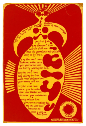
Punch ’n’ Judy, a psychedelic poster poem by Gould addressed to a lover and dedicated to the American poet Kenneth Patchen and his wife Miriam. The poster was no. 5 in a series published by Books & Things, Gould’s bookshop in Redruth. Designed locally by Red Crab Design, early 1970s.
Gould, proprietor of Books & Things, in Penryn Street, Redruth, early 1970s.
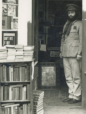
He moved to Redruth in Cornwall and for five years ran a bookshop called Books & Things, giving performances in the Quasar coffee house next door. His philosophy, then and now, was defiantly local and hands-on. ‘Don’t wait for someone else to print your words and your songs,’ he wrote in Peace News in 1970. ‘Go out and have them copied or duplicated into pamphlet form. Go out and find the other like-minded people … Create your own world within your own streets and let propaganda be about philosophies and poesies not slogans and programmes.’
In 1970, Gould formed the Riff-Raff Poets with fellow poets Jeff Cloves and Pat West, and they toured and performed together until West’s death in 2008. For a time in the 1980s, they published a magazine that looked like a punk fanzine. They organised a poetry sideshow every year at the Glastonbury Festival. Gould was involved in anti-nuclear protests such as Greenham Common. He lived in Leicester, Oxford (where he was homeless for a time) and Bristol. He survived by doing casual work and by selling books from his market book stall. In 1990, with Cloves and the anarchist graphic artist Clifford Harper, he edited Visions of Poesy: An Anthology of 20th Century Anarchist Poetry – ‘This book is dedicated to the spirit of revolt’.
In a ‘blues’ poem published in the anthology, written to mark his 49th birthday, Gould pictures his life until then:
‘You’re not still travelling?’
Yes, from town to town; gig to gig: poets’ performance:
To fair and festival: reading words of dance and celebration
Making songs and singing Blues: attempting to engage
The Listener in Peace Camp Movement and
Subversive Anarchy!
Gould at work next to his Charlton-Cope proofing press.
Letterpress apprenticeship
After relocating to Stroud, Gould asked a local printer, John Grice, to print one of his postcard poems by offset litho. In 1991, when Gould returned with another poem for setting, titled ‘Eyeview Blues’, Grice was too busy and suggested Gould did it himself using letterpress. ‘It took me seven hours to set fourteen lines because I kept dropping the letters,’ recalls Gould. ‘It was only 10 point. I don’t know why I set it in 10 point and not 12 point, but I did.’ Two weeks later he bought a Vandercook flatbed press for £50 (nobody wanted them then) and Grice let him install it in his Piccadilly Mill workshop on Lower Street.
This was less of a jump than it might appear. The Royal Engineers had six-colour litho presses for map-making and Gould was given the task of de-graining zinc printing plates. Working at Peace News, he would go to the printer Goodwin Press to do proofreading. ‘So I’d been around printing presses, but I’d never done it. You know when you observe a craft it always looks more complicated than it is and the great thing about letterpress is that it’s not back to front, as everyone thinks. It’s upside down as it’s spelt.’
As well as designing his own postcards, Gould had designed political pamphlets since 1963 when he edited Non-Violent Resistance: Men Against War. He always appreciated design, but now that he owned the Vandercook press and had somewhere congenial to work, he began to read about design and typography more purposefully. On his shelves, I spotted books by Ruari McLean, John R. Biggs’s An Approach to Type, copies of Alphabet and Image, Sebastian Carter’s Twentieth Century Type Designers, Phil Baines’s studies of Penguin and Puffin books, John Lewis’s Printed Ephemera, Max Gallo’s The Poster in History, and many more. ‘I was interested, but my knowledge was almost nil,’ he says. ‘Technically I was illiterate. I still am, I think, but I have obviously learnt a little out of respect for the fine printers,’ he laughs. ‘But I still use these proofing presses. I like the simplicity and the fact that it is handwork, although I love electric machines as well. I just prefer the hand – William Morris’s ideal.’
Gould was three years into his ‘letterpress apprenticeship’ when he designed this confidently constructed poster for an evening of readings in which anyone could take part. Printed on a Vandercook flatbed press, 1994.
Gould was hooked on printing, and so began what he likes to call his ten-year apprenticeship, quickly commemorated (of course) in a poem written and printed at Piccadilly Mill. It begins:
I’m a Letterpress Apprentice in a pretty perfect Printshop
Driven by a TypeSetter’s curse. I stand all day with my
Compositor’s Stick setting up Mad Lines of Verse.
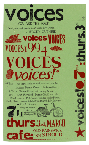
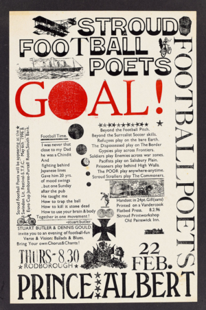
Gould named his set-up The Woodblock Letterpress. The first poster he designed – he thinks for Glastonbury in 1992 – he recalls as very ornate (‘It’s got masses of type on it’) and that applies to many of the posters from his ‘apprenticeship’ phase. In the ‘Voices’ poster, for a poetry evening at the Old Painswick Inn in Stroud in 1994, he sets the word in seven different typefaces, piling them up to form a clamouring crowd of voices. In a device he would use again and again, he scatters the surface with blocks of illustration, including a printing press to declare his craft allegiance, and a bicycle to remind the audience how to get there. His ‘Stroud Football Poets’ poster (football is another Gould obsession), for an evening at the Prince Albert pub in nearby Rodborough in 1996, casually matches display types to form a partial frame around poems by Gould and Stuart Butler, both performing. Designs like these have tremendous vitality. They are not perfect, in the sense of being flawlessly resolved by a tutored eye, but they project a powerful and engaging spirit: local passion and creative energy made visible for the community that the design helps to create.
The posters convey an impression that Gould was feeling his way, finding out what would work, and piecing the designs together through the act of handling the type. ‘It very much was intuitive. I would have the poem, or the prose, or the words I wanted to set by my side and would play with the furniture and the letters and place them where I felt they should be. It was such an intuitive thing. It wasn’t necessarily the best design, but it was my design.’
His improvisations have even extended to the writing process. ‘I do actually write poems as I’m setting because it’s slow. I’m a slow compositor. I wouldn’t pretend or even try to be fast.’ This produces work of great immediacy and a feeling that the writer / designer / printer is engaging the reader in an intimate conversation. Many of Gould’s admirers in the Stroud area will know him personally from his market stall, or from his performances. His body of work feels like someone living through the fibres of his visual poetry, imbuing the paper’s surface with everything he cares about and knows.
Poster for an evening event staged by the ‘Stroud Football Poets’. A keen football player in his day, Gould regularly celebrated the game in his pieces. Printed on a Vandercook flatbed press, 1996.
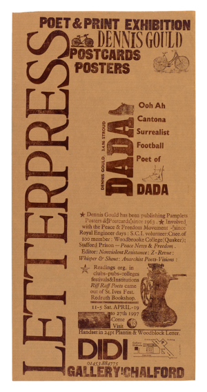
Poster for an exhibition of Gould’s poetry and printing at a gallery in Chalford village, near Stroud, 1997.
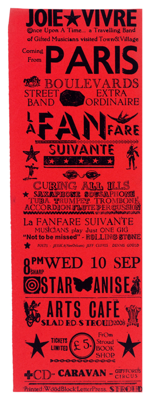
In 2008, Gould organised a performance by a band of French street musicians, La Fanfare Suivante, at the Star Anise café in Stroud. His design promoting the event is a riotous assembly of typefaces piled up in a tower like his own take on Victorian poster design.
Apart from their content, Gould’s posters and prints communicate with such vibrancy and ease because his clamorous style is already familiar from the graphic broadsides of Dada, countercultural graphics and punk. A poster for an exhibition of his work in 1997 features a design-within-a-design, forming a kind of personal emblem, that reads ‘Ooh Ah Cantona Surrealist Football Poet of DADA’, and he has used this motif elsewhere. The casualness of his designs, their seeming unconcern with textbook niceties, is often close in spirit to Dadaist typography, though Gould’s zestful, warm-hearted embrace of everyday experience never becomes negative or nonsensical. He was hitting 40 when punk happened and his musical tastes were formed in the more lyrical 1960s. His congenially chaotic layouts frequently resemble those seen in the pages of the underground press. In the ‘messthetics’ of punk and countercultural graphics, the desire to bypass convention led to comparable stylistic decisions and defaults. For similarly free-thinking reasons, Gould has travelled a parallel visual path.
The imperfections seen in some pieces have attracted attention. Gould has sometimes substituted letters from other typefaces when his supplies petered out. On a Shakespeare poster he made for Glastonbury, he needed the word ‘music’. ‘I had this lovely typeface, which I used for most of the letters.’ But he ran out of a couple characters. ‘So for the “i” and “c”, I had to use these really clumsy serif letters. Obviously it’s the same height, but when you look at these beautiful hand-carved letters – the “mus” – it looks horrible, but I had no other option.’ Viewers still assume that the effect was deliberate. ‘I think people have misunderstood,’ he says. ‘Mostly out of necessity I have used other letters, not because I was being perverse.’
Details of this kind can appear to be the essence of his style. ‘People love it. That’s the irony. They love the fact that it’s imperfect with all the faults, though I try and get rid of most of them.’ He voices the same reservations about a tendency to over-ink his prints. ‘For many years, I didn’t realise I was using too much ink because of my background and not having had that technical teaching. So I have overcome it, I hope, just about.’ He concedes that he is probably still over-inking, although it isn’t something he wants. ‘I get the work out and then when I look at it I’m horrified and will throw away the worst examples of over-inking and slapdash work.’
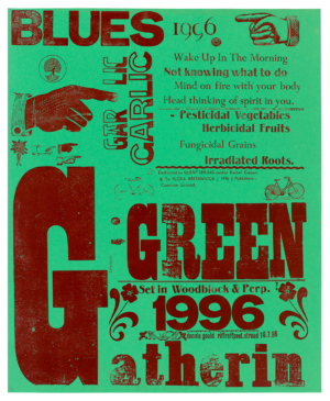
An exuberantly ripe response to the Green Gathering environmental festival – first held in 1994 – which grew from the Glastonbury music festival. Printed in 1996.
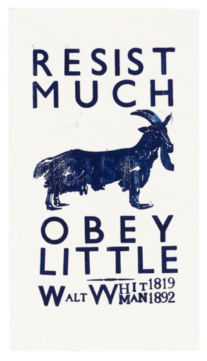
Gould’s designs of recent years are often based on quotations from favourite writers and lyricists that enshrine essential ideas. Walt Whitman’s famous words of caution to American citizens in his epic poem ‘Leaves of Grass’.
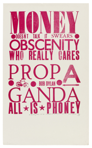
Three lines from Bob Dylan’s song ‘It’s Alright, Ma (I’m Only Bleeding)’. The print was a limited edition of 50 for the Glastonbury Festival in 2014.
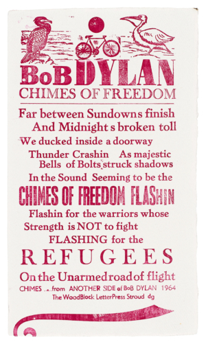
The opening six lines of Dylan’s ‘Chimes of Freedom’ freely rearranged by Gould.
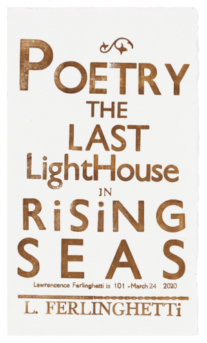
The final line of What is Poetry?, Lawrence Ferlinghetti’s frequently reprinted set of aphorisms about poetry composed in free verse, 2020. A double syllable has crept into the poet’s name.
The key consideration for Gould is that the form should reflect the content because the content reflects his unwavering beliefs. ‘The content, for me, always determines the design,’ he says. As a bookseller, he was sometimes prepared to give away books – an example of the gift economy in action. ‘If people came into the shop and didn’t have any money, I’d give them a book rather than get them to leave. I didn’t have much money, but I wanted to pass on the ideas. That’s been a driving force.’ Gould writes and performs, prints and publishes with the same desire to make meaningful connections and the same generosity of spirit. After decades of living so precariously, he still hopes to encourage others to follow his example and write poetry, make letterpress prints, or find some other way to express their natural reserves of creativity.
Rick Poynor, writer, Eye founder, professor of design and visual culture, University of Reading
First published in Eye no. 105 vol. 27, 2023

Eye is the world’s most beautiful and collectable graphic design journal, published for professional designers, students and anyone interested in critical, informed writing about graphic design and visual culture. It is available from all good design bookshops and online at the Eye shop, where you can buy subscriptions and single issues.