
Autumn 2021
The Nebiolo legacy
Marta Bernstein
James Clough
Alessandro Colizzi
Riccardo De Franceschi
Massimo Gonzato
Riccardo Olocco
Aldo Novarese
Alessandro Butti
Giacomo Narizzano
Giovanni Nebiolo
various designers
Though Italy’s most renowned type foundry closed its doors more than four decades ago, its influence endures. By the Nebiolo History Project
Nebiolo of Turin was Italy’s greatest type foundry on both a national and an international level for most of the twentieth century until its closure in 1978. Exactly 100 years earlier in 1878, Giovanni Nebiolo founded the company that took his name when he bought the small type foundry established by Giacomo Narizzano in 1852.
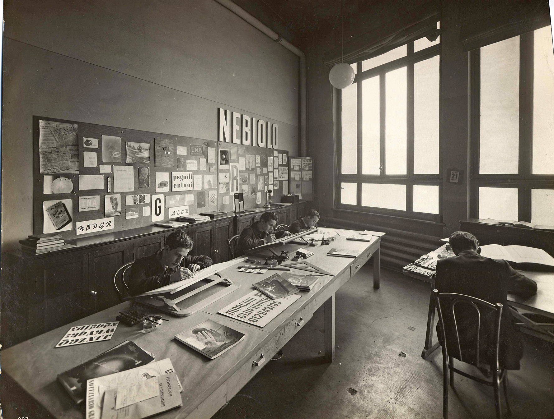
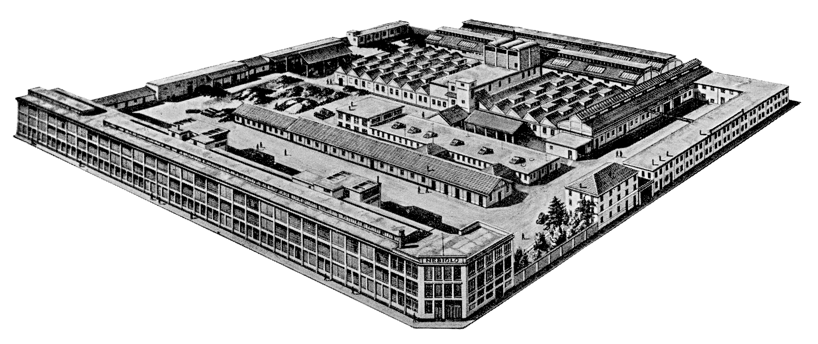
View of the Nebiolo factory in Via Bologna, Turin, ca. 1928, taken from a Nebiolo specimen book of the early 1950s. Top: Photo of the Nebiolo type design office, ca. 1936. Image taken from a Nebiolo specimen book of 1939.
By the turn of the century, Nebiolo expanded as a printing press manufacturer. Its 1908 merger with the Urania company of Milan enabled Nebiolo to dominate the Italian market for printing machinery and type for handsetting until the end of commercial letterpress in the 1970s. Nebiolo was then known for the quality and variety of its printing machines; today the company is best remembered for its contributions to type design.
Humanist roman types in the so-called ‘Elzevir’ style, similar to those of Deberny & Peignot of Paris, were cast at Nebiolo as far back as the 1880s. By the turn of the century, its catalogue was mostly made up of Art Nouveau display typefaces – cast from matrices probably acquired from German and French foundries – as well as fleurons, borders, ornaments and vignettes. An early revival of a fifteenth-century Venetian type, called Inkunabula, was produced in 1911. The moving spirit responsible for this revival of Renaissance type was the printer / scholar Raffaello Bertieri, who later collaborated with Nebiolo on the production of two other revivals, Ruano and Sinibaldi.
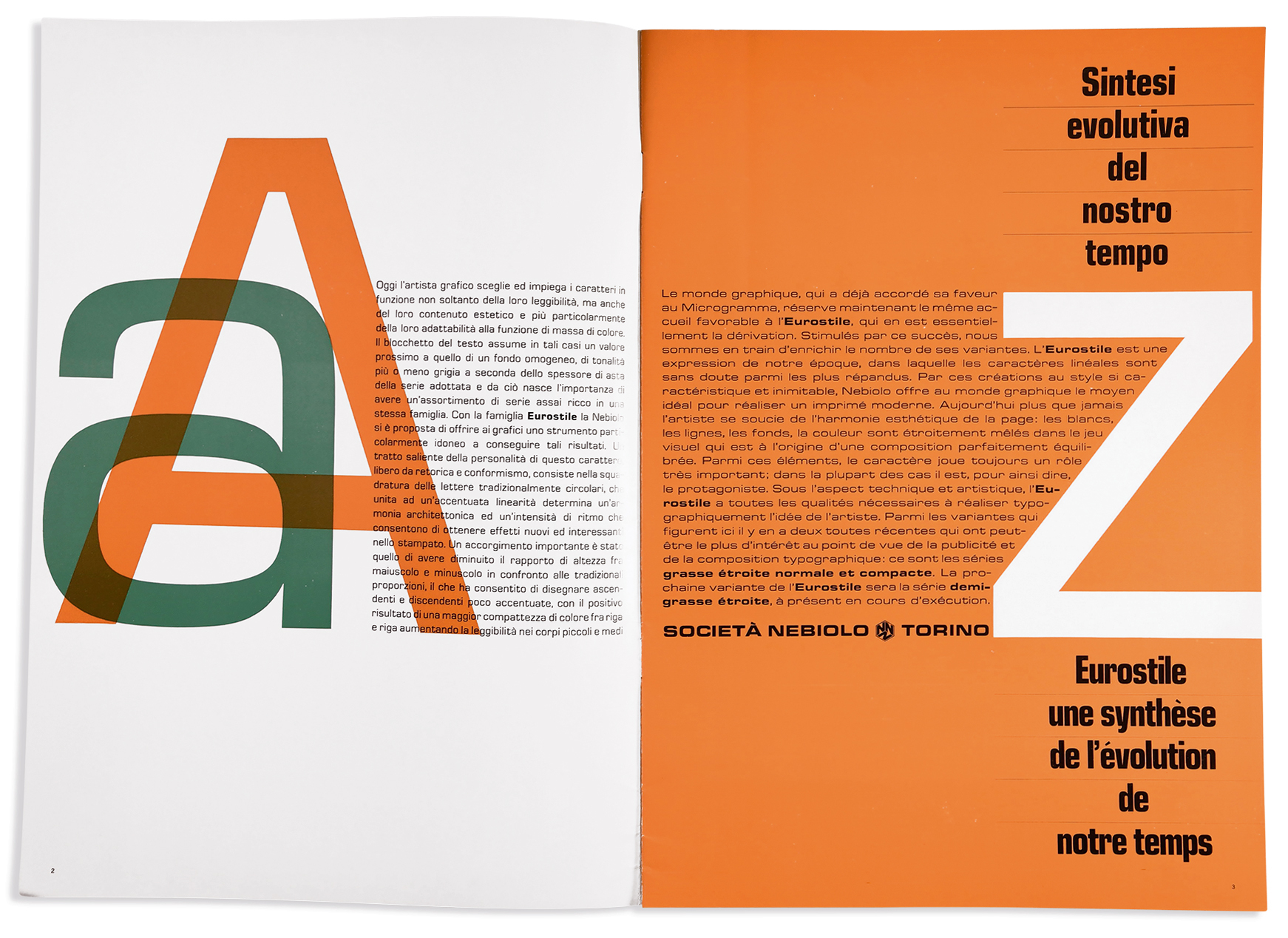
Nebiolo specimens for Eurostile, 1962-68. Eurostile was drawn by Aldo Novarese.
Making metal type exclusively for handsetting meant progressive exclusion from the newspaper, book and magazine industries, which started using typesetting machinery early in the twentieth century. Nevertheless, Nebiolo was able to compete successfully in the international and domestic markets for advertising and other types used by jobbing printers.
At about the same time as the release of Paul Renner’s Futura, Nebiolo came up with a similar geometric sans called Semplicità, which was much appreciated by Italian printers; Bertieri himself used it for Il Risorgimento Grafico. Later, in 1933, an in-house design studio, Studio Artistico, was officially opened and entrusted to Giulio Da Milano (1895-1991), who created two interesting and unusual rationalist sans serifs: Razionale and Neon.
Alessandro Butti (1893-1959) became director three years later and opened up a particularly fruitful period for type design at Nebiolo, with a team of draftsmen that included the young Aldo Novarese (1920-95). Under Butti’s direction Nebiolo released many original typefaces – including Quirinus, Fluidum, Hastile, Athenaeum, Augustea and Microgramma – that gradually went on to rid Nebiolo’s catalogue of the older imported typefaces while ‘shaping the history of Italian twentieth-century print’, as printer / publisher Enrico Tallone aptly suggests.
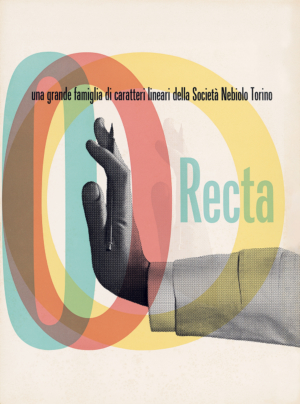
Specimen for Recta, 1963. When Aldo Novarese followed Alessandro Butti as artistic director of Nebiolo in 1952, he inherited Butti’s working drawings for Recta, a yet unpublished neo-grotesque sans serif, which demonstrates Butti’s ability to anticipate market trends. Recta was released, with many later additions by Novarese, as a response to the success of Helvetica and Univers.
Following an ill-advised adventure into the production of textile looms and other mechanical equipment, in 1951-52 the company ran into financial difficulties and had to reorganise and return to its core business of printing machinery and foundry type. The ensuing reduction of the workforce meant that, in 1952, Butti was made redundant and replaced by Novarese as the foundry’s artistic director.
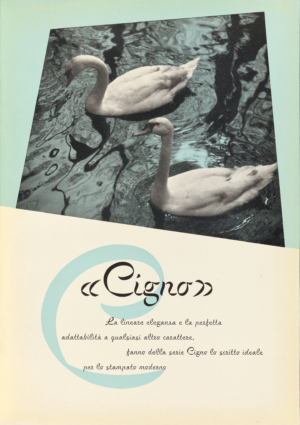
Specimen for the typeface Cigno, 1954. This rather formal script type, with few striking similarities to earlier or contemporary typefaces, appears to have been inspired by the use of a flat brush, rotated suddenly to generate contrast variation. ‘Cigno’ is Italian for swan.
Stop (1970), originally designed for hot metal and in one case only, became internationally popular for the creation of ‘instant logos’ after it was added to the Letraset catalogue in 1973. The typeface has acquired further popularity as a digital font from a variety of foundries.
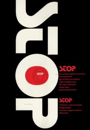
The quantity and variety of typefaces designed by Novarese is remarkable. Some of them, such as Nova Augustea and the internationally successful Eurostile, built on Butti’s heritage. With the assistance of his team (which included Piero De Macchi and Umberto Fenocchio), Novarese cemented Nebiolo’s reputation for distinctive display typefaces. One of the last typefaces released by Nebiolo was the extraordinary Stop (1970), a mix of heavy upper and lowercase letters, simplified to the bare essentials necessary for recognition, which became internationally popular for the creation of ‘instant’ logos.
By the mid-1960s Nebiolo’s catalogue seemed to have little appeal to the emerging professionals working in advertising. Under growing pressure, Nebiolo set up a team of prominent figures from Milan’s design scene to sit beside Novarese. Pino Tovaglia, Franco Grignani, Giancarlo Iliprandi, Bruno Munari and others agreed to consult pro bono, and over a decade devised two original typefaces, Forma (1968) and Dattilo (1972). An uneasy relationship with the designers contributed to Novarese’s retirement in 1972, after which he pursued a freelance career that gave him some international recognition.
Forma was Nebiolo’s belated response to the Swiss neo-grotesque trend. Designed collectively by a team of Milanese designers and Novarese, it was initially released in 1968 in metal only.

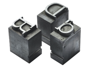
Dattilo, overseen by the same committee, was released in 1972 as a slab serif companion to Forma.

Dattilo: original Nebiolo founder’s metal type for hand composition, courtesy Tipoteca Italiana Fondazione.
Part of Nebiolo’s catalogue went on to be adapted to dry transfer technology by Letraset, Mecanorma and the Italian company Reber R41. While a few typefaces were also released as Linotype matrices, no investments nor strategic alliances were made to embrace phototypesetting – a delay that would prove critical to the foundry’s slow decline and inevitable demise in 1978.
The Nebiolo company remained active in the printing presses business until it closed down in the late 1990s. Over the past two decades there have been digital revivals of varying quality. Historical research has been piecemeal due to the dispersal of the company’s archives, but critical assessment of the Turin type foundry will one day provide a valuable addition to typographic history.
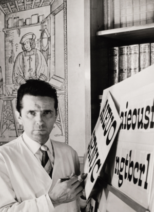
Aldo Novarese with artwork for Estro (1961), an informal, spirited, reverse-contrast face, which was to become a staple of popular Italian graphics in the following decades.
The Nebiolo History Project is a research team set up by Marta Bernstein, James Clough, Alessandro Colizzi, Riccardo De Franceschi, Massimo Gonzato and Riccardo Olocco to investigate the archival and oral history of Italy’s most renowned type foundry.
An international conference took place in Turin on 16-17 September 2021, whose proceedings are due to be published in 2022. An illustrated monograph is planned for the future.
First published in Eye no. 102 vol. 26, 2021

Eye is the world’s most beautiful and collectable graphic design journal, published for professional designers, students and anyone interested in critical, informed writing about graphic design and visual culture. It is available from all good design bookshops and online at the Eye shop, where you can buy subscriptions and single issues.