Autumn 2010
Two wheels good
Designers have always been attracted to bicycles. A new breed of cycling mags shows just how deep that love runs
 Andrew Diprose loves bikes. ‘I remember eyeing up a single-speed track bicycle when they started becoming fashionable. I was overjoyed by the simplicity of the thing, its pure form: there were no shifters, no derailleurs. And if you get rid of a brake – lever, cable and calliper – that’s another three things gone. What else can you get rid of? It’s the same with a Dieter Rams radio or a Converse pump – the less there is to it, the more designers love it.’
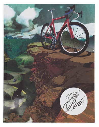
Art director of Wired UK by day, Diprose designs The Ride in his spare time. This is a substantial 170(ish)-page journal of stories, photography and illustration, contributed by bike enthusiasts from all over the world, and edited by his brother Philip. In contrast to Wired UK, which is consciously pushing forward in both content and design, The Ride sets out to be a relaxing experience, all about craft and soulful tales. ‘It is the yin to Wired’s yang,’ Diprose says, ‘the wholemeal bread to Wired’s bagel.’
Below: Cover of The Ride, no. 3 (November 2009) produced by ilovedust, an East London / Hampshire-based ‘multi-disciplinary design boutique’.
Top: ‘Riders: Dave Watson leads Robbie Bourdan. Location: Ilhabela, Brazil’, from ‘Green’, John Gibson's photo feature about mountain biking, no. 4 (May 2010).
He likes to keep the design simple. Full bleed images face articles with a fixed, single-speed layout: ‘Two columns, a drop cap, a centred headline – I designed it to look like a bible or hymn book.’
A traditional, classic feel is emphasised by typefaces such as ITC Golden Cockerel (a redrawing of a typeface Eric Gill designed for Golden Cockerel Press).
The Ride is part of a recent growth in well designed bike magazines that ditch tech specs and product reviews in favour of high-quality photography, illustration and personal stories.
One of the latest on the scene is Boneshaker – a British quarterly edited by James Lucas and designed by John Coe. Where The Ride goes for stylistic consistency, Coe tries to give each article its own visual personality: ‘I try to design for each article individually – I might look at the colours and imagery on a subject’s website, for example, and use similar styles in my design.’
Since its launch in May 2006, racing magazine Rouleur has set the tone for this new breed of bike magazine. Much of the practical information once found in specialist print magazines – price lists, racing fixtures and results, product comparisons, etc. – has moved online. Magazines such as Rouleur fill a different niche, with an emphasis on narratives, beautiful imagery and boutique production values.
Below: Cover of Rouleur, no. 19 (2010). Photograph by Nadav Kander.
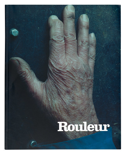
‘I like that good design and the bicycle both get the job done without too much song and dance,’ says Rouleur’s art director, Jonathan Bacon. Its grid and typographic treatment are ‘bookish’, he explains. ‘Folio and running heads and the like are not “big things”, nor are captions and photo credits. Our references were as much books from the 1950s and 60s as magazines, posters and catalogues.’
Perhaps tellingly, book publishing is another of Rouleur Ltd’s activities. As well as nineteen issues of the magazine, it has published three photography annuals and Le Métier, a book by Michael Barry, who rides with Sky’s pro cycling team. A book of portraits by cycling photographer Timm Kölln is in the pipeline and Privateer, described as a ‘Rouleur for off-road cycling’, launches this Autumn.
But while Rouleur is part of an established commercial publishing company, many of the smaller publications are put together with the resources of a fanzine.
Below: Cover of Milwaukee-based COG, no. 1 October 2007. Photograph by Pater DiAntoni.
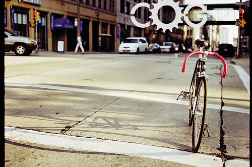
The US magazine COG started life in the offices of Breakaway Bicycle Couriers in Milwaukee, and its editor, former messenger Peter DiAntoni, laughs when I ask if the magazine is his main occupation: ‘Well, it’s a full-time passion, that’s for sure.’ He is a freelance photographer; the rest of COG’s staff have day jobs dodging Milwaukee traffic to make deliveries. It’s a small operation but DiAntoni, who also does the design, aims to produce a world-class product. ‘Being in the Midwest we’re lucky to have an incredible array of world-class printers at our disposal. We use stochastic printing – which really brings the photographs to life.’
Pride in the craft of publication is something that all these magazines share. ‘We want people to smell the soya-based ink, feel the stock,’ says Diprose. And being ‘spare-time’ editors and art-directors means they have a lot of freedom. COG, for instance, will never use manufacturers’ standard hi-res pictures to illustrate a review, and if the imagery for a story doesn’t work, it won’t run.
The Ride does not have many ads to begin with and none of them is allowed to include prices; offers involving product placement are respectfully declined. The first issue of Boneshaker had no ads at all and, according to Coe, it will stay that way, for at least the first three issues.
For small enterprises with a seemingly specialist audience, these publications have a readership well beyond the bicycle elite. They are stocked in bike shops and ‘cycle cafes’, but you can also find them in design bookshops such as Papercut (Stockholm), Do You Read Me?! (Berlin) and Magma (London), and The Ride sells in London fashion shops. The first Boneshaker, with a print run of 1000 copies, sold out in five weeks. ‘Our first cover didn’t mention bikes,’ says Coe. ‘It didn’t even have a direct image of one.’
Even people who aren’t that into cycling are hooked by the imagery, the enthusiasm of the writing and the feel of these magazines. There is something about bikes that makes them perfect for visual, graphic treatment.
‘We are not just fanatical about riding bikes,’ says Diprose. ‘Aesthetics are a big part of it. You can appreciate everything from the transfers to the lugwork and dropouts – I’ve resprayed brand-new bikes just because I wanted a particular colour. Designers are tied up with craft; bikes are such a feast from fabrication to decoration. They are a real gift.’
First published in Eye no. 77 vol. 20, 2010
Eye is the world’s most beautiful and collectable graphic design journal, published quarterly for professional designers, students and anyone interested in critical, informed writing about graphic design and visual culture. It is available from all good design bookshops and online at the Eye shop, where you can buy subscriptions, back issues and single copies of the latest issue. You can also browse visual samples of recent issues at Eye before You Buy.