
Feature: Typography
The work must be read
Lawrence Weiner’s art is a kind of sculpture made of language, free from excess or embellishment and strangely familiar from its far-reaching influence on graphic designers
A New York state of mind
The design of The New Yorker has nearly always taken the approach that ‘if it ain’t broke, don’t fix it’, with a familiar layout and masthead. Does a face-lift jeopardise its relationship with its readers? Time to call in the Type Police
Compare and contrast
With a CD-ROM based on its legendary lettering archive, Central Saint Martins has created a new tool and resource
Word art
In post-war art the visual and the literary have blurred. Typography is the point at which they meet
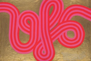
Day-Glo mind blow
Psychedelia hit late 1960s London in an explosion of silk-screen colour
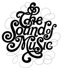
Up close and tight
The legendary Herb Lubalin brought humour, sensuality and a contemporary flourish to complex typographic arrangements.
If the image of the text … has more value than its content …
With visual culture triumphant and content marginalised, how can typography be defined?
Face lift: new cuts at The Times
When technological developments at The Times demanded a change in the newspaper’s typography, a brand new typeface was commissioned, prompting a new analysis of the font’s long and complex history
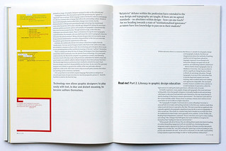
Read me! Part 2. Literacy in graphic design education
‘Relativist’ debates within the profession have extended to the way design and typography are taught. If there are no agreed standards – no absolutes within design – how can one teach? Are we heading towards a state of ‘institutional ignorance’ as tutors have less knowledge to pass on to their students?

Read me! Part 1. Literacy in graphic design
Graphic designers are responsible for the communication of ideas through words, signs and pictures. Yet experimentation and new aesthetics cannot emerge without a thorough understanding of reading and writing: if we accept that language is important, we must be prepared to protect it