
Feature: Typography
Pichação [EXTRACT]
The architecture of São Paulo, Brazil, is covered by a unique form of calligraphic graffiti
Typostalgie
Nostalgia for Germany’s old East has led to renewed interest in certain pre-1989 typefaces
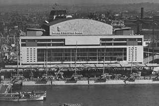
South Bank show
The Royal Festival hall has regained the thoroughly English lettering of its origins in the Festival of Britain – on one side only
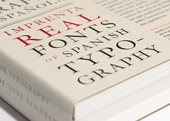
Memory of books
An elaborate, tactile catalogue – and a digital typeface – pay tribute to a golden age of Spanish typography.
Set the letters free
Australian artist Rosalie Gascoigne turned discarded packaging type into ‘stammering concrete poetry’
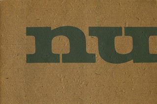
Willem Sandberg: Warm printing
The Dutch pioneer’s catalogues for the Stedelijk show a tactile use of sensual materials and experimental typography
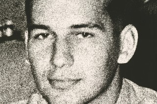
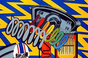
Reputations: George Lois
‘You can’t research a big idea. The only ideas that truly research well are mediocre ideas. In research, great ideas are always suspect.’
Malcolm, Peter … and Keith
The British New Wave was born at a boys’ school near Manchester
Pouchee’s lost alphabets
Ornament is no longer a crime and there is a
growing enthusiasm for decorative display.
Few contempory display alphabets equal those of Louis John Pouchée for vivacity and invention