
Feature: Typography
Art and art direction (text in full)
imply two separate worlds, yet artists who use text employ the techniques of graphic design. And so for the pharmaceutical type pastiches in \'The Last Supper\', a series of screenprints, Damien Hirst employed designer Jon Barnbrook.
Marked by time
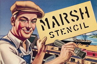
Two catalogues reveal much about stencil-making in Germany and the US in the mid-twentieth century, while offering clues to the industry's future in the decades following their publication.
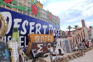
Las Vegas tangle
A junkyard is home to the stylish chaos and discarded carcasses of a golden age of signage
Penguin crime
Romek Marber’s 1960s paperback identity is a landmark of independent British design

Reputations: Jean Widmer
‘Signage reflects both the complexity of space and the way a place is organised. And it is very satisfying’
Why Helvetica?
Despite the changes provoked by the digital ‘revolution’, designing a typeface for serious reading remains a time-consuming task. For the designer, choosing and setting a body text font can be equally daunting, resulting in some inspired, eccentric and provocative choices
The image as evidence
The career of Germano Facetti is exceptional in its range. As art director of Penguin Book covers in the 1960s and as a designer, he was a powerful influence on book and information design, throwing a special light on Modern Movement aspirations and on attitudes to illustration. Facetti has maintained the concept of “documentary” and diagrammatic illustration to induce understanding, to express emotion, or to accumulate information in a more memorable way.
Dr Leslie’s type clinic
Through its publications and gallery, the Composing Room promoted the new American design
Mr Roughcut
or: how graphic designer Pablo Ferro learned to split the screen, cut the crap and tell the story (in the time it took to run the titles)
Revolutionary language
“A revolutionary graphic language must seek to expose the meaning by presenting a chain of ideas, images, structures in as much of their complexity as is economically feasible.” Robin Fior in The Designer, journal of the society of industrial artists and designers, London, May 1972.