
Feature

Visual systems of life and death
In this appendix to ‘The pandemic that launched a thousand visualisations’, Paul Kahn outlines more of the dynamic visual systems that help our understanding of Covid-19
Face lift: new cuts at The Times
When technological developments at The Times demanded a change in the newspaper’s typography, a brand new typeface was commissioned, prompting a new analysis of the font’s long and complex history
Sculptured letters and public poetry
Sculptor Josep Maria Subirachs and poet Joan Brossa had little in common but a fierce pride in the city and culture of Barcelona, where their open-air letterforms grace the streets, squares and parks
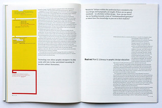
Read me! Part 2. Literacy in graphic design education
‘Relativist’ debates within the profession have extended to the way design and typography are taught. If there are no agreed standards – no absolutes within design – how can one teach? Are we heading towards a state of ‘institutional ignorance’ as tutors have less knowledge to pass on to their students?

Read me! Part 1. Literacy in graphic design
Graphic designers are responsible for the communication of ideas through words, signs and pictures. Yet experimentation and new aesthetics cannot emerge without a thorough understanding of reading and writing: if we accept that language is important, we must be prepared to protect it
Picture books: luxury and meaning
The design of lavish illustrated tomes often shows a lack of confidence, or perhaps a confident lack of understanding, in the marriage of words and images. Yet the best books are poetic: a minimum of means produces a maximum of meaning
Kicking complacency in the ass
In the late 1960s, the underground press was a spontaneous and primitive rebellion against the status quo, with visual and verbal obsecnity as its most potent weapons. Sex stimulated sales, but ultimately sapped its creative radical energy
Controlled passion: the art of Fernando Gutiérrez
In post-Franco Spain, a cool Catalan breeze blows through the often humid, overheated world of professional magazine design and art direction
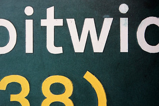
A design (to sign roads by)
As an exemplary rational design programme, the road signs of Jock Kinneir and Margaret Calvert demand careful study. Despite poor application, inconsistent additions and muddle over the past four decades, their robust, flexible system – with its humane typeface and quirky pictograms – still functions throughout the length and breadth of Britain