
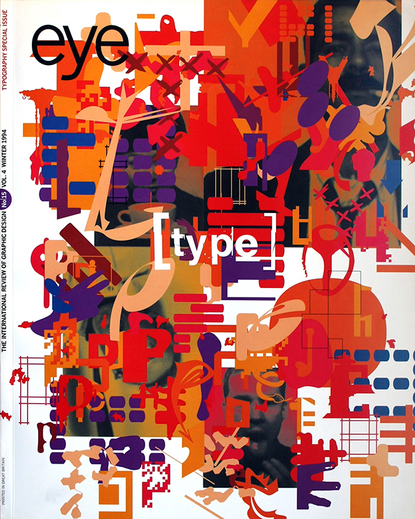
Winter 1994
Ugliness is in the eye of the beholder
Steven Heller’s essay, ‘Cult of the ugly’, was greeted by a storm of protest. Who said what, and what conclusions can be drawn?
In May 1993, Eye published an essay entitled ‘Cult of the ugly’ (no. 9 vol. 3) by the American writer Steven Heller, a prolific and well-respected contributor to this and many other graphic design publications. Heller’s purposefully controversial polemic provoked a remarkable response over the ensuing months, particularly in the US – its principal focus – where it cut deep into a very raw nerve. It is unusual for a single article to make such a sustained impact within the sometimes hard to perturb field of graphic design and for this reason it seems worthwhile to trace the way in which the debate has developed, to draw together some of the main strands, and to see what they have to tell us.
It is clearly not possible here, or necessary, to summarise all of Heller’s essay. Contrasting ‘ugly design’ with the classical qualities of balance and harmony, he defines it as ‘the layering of unharmonious graphic forms in a way that results in confusing messages.’ He criticises Output, a student project produced at the Cranbrook Academy of Art (‘the word experiment has come to justify a multitude of sins’) and a design conference brochure by the Chicago designer Carlos Segura (‘a catalogue of disharmony in the service of contemporaneity’). Edward Fella’s work is rejected as a model for commercial practice – a ‘dead end’ – and design schools are accused of pushing their experiments out into the world, where they will be reduced by thoughtless imitators into style without substance, furthering the cause of ambiguity and ugliness.
The reaction to this polemic was immediate and came initially from some of the people involved. Output was robustly defended as the educators close ranks. Eye received long letters from Katherine McCoy of Cranbrook, from Joani Spadaro, who initiated the Output series at Herron School of Art, and from Teal Triggs, whose Ravensbourne students were later contributors to the project (see no. 10 vol. 3). All three have returned to the subject elsewhere, in Design Statements, the AIGA Journal, and Emigre.
Emigre itself had been criticised in passing by Heller – ‘a blip … in the continuum of design’ – and it is strongly identified with several of the designers taken to task. In spring 1994, Emigre devoted half an issue, ironically titled ‘Fallout’ to a response. Editor Rudy VanderLans at first planned to publish an essay, but ended up running a series of interview by Los Angeles art director Michael Dooley (who has written sympathetically about Emigre in Print magazine) with Heller, Fella, Jeffrey Keedy and David Shields, one of the Cranbrook students responsible for Output.
This was perhaps a pity. An essay would have allowed a tighter focus on the issues at stake and would have amounted to a much clearer statement of Dooley’s (and Emigre’s?) position. As it is, the interviews ramble. Some excellent questions and revealing replies get lost among the digressions and chat. Both Fella and Shields come across a slightly bemused by Heller’s attack rather than troubled by it or eager to mount a counter-offensive so why give them so much space? Only a few of the points made by Heller are dealt with directly in the questions they are asked. Shields makes fewer claims for Output than Spadaro and Triggs and one is left thinking that too much attention is being given to one of the weaker contributions to the continuing project. This suspicion receives unexpected confirmation in the next Emigre, when another of the Cranbrook Output designers, Brian Smith, now a teacher himself, writes to say it is a ‘(non) issue’ and he didn’t like the project anyway.
Keedy
is more combative and states the heart of the case against Heller’s
‘ugly’ thesis: ‘You can no longer make these quick and easy
calls. Simple ideas of good and bad, ugly and beautiful, are just not
useful.’ He also makes the American geographical politics at work
in this argument explicit – something it is easy for the
non-American reader untroubled by such local considerations to miss.
But if New York-based Heller is guilty, as Keedy claims, of a bias
against ‘anything past the Hudson,’ it is hard to avoid the
suspicion from the tenor of these comments that the bias also
operates in reverse.
Selective commentary
Emigre’s use of the interview format has some significant effects. By asking the writer to account for what he wrote rather than simply analysing it on its own terms, then perhaps rejecting it, it switches attention from the original arguments – whatever their strengths or shortcomings – to the critic’s personality and motivations for writing. Sure enough, in the next issue of Emigre (no. 31, ‘Raising Voices’), the letters received by the magazine focus, sometimes abusively, on Heller and his responses in the interview. Meanwhile, an essay by Andrew Blauvelt, titled ‘The Cult(ivation) of Discrimination: The Taste-making Politics of Steven Heller,’ sets out to address and seemingly condemn Heller’s entire practice as a critic of contemporary graphics, with ‘Cult of the ugly’ see as the ‘summation’ (Blauvelt's emphasis) of his thinking. For Blauvelt, ‘the real debate is not simply about ugliness, “theory” or Cranbrook but about the role that education plays, or fails to play, in the practice of graphic design.’ Like the other prominent voices in the debate, Blauvelt writes from the standpoint of teacher.
The forcefulness and articulacy of the educational defence is only to be expected, and many of the points strike home. But this should not blind us to the fact that this commentary is also highly selective. Heller’s central example of what he sees as dubious mainstream practice is Carlos Segura’s ‘Creative Vision’ conference booklet. This is as important to his argument as Output – the inclusion of three illustrations underscores this – and possibly more so, since it moves the discussion away from the Cranbrook-Emigre axis. Heller attempts to show how signature styles that may be perfectly valid as ‘personal research’ or ‘personal art’ within a design school will be take up and ‘misused’ in the marketplace.
This is problematic. Is Heller really saying that talented people should not experiment in case less talented people copy them? It is an idea which Keedy, among others, rejects: ‘[Heller] doesn’t want a bunch of people imitating them with “Style without substance” because that will “diminish all design”. That way of thinking about the evolution of style in culture – as a controlled linear progression of mostly “great white men” is too simplistic.’ But Keedy’s analysis stops short with this somewhat misleading assertion (Heller at no point mentions race or gender). Keedy could have developed this idea with reference to the Segura project, but he does not mention it. Not, despite its obvious centrality to Heller’s essay and argument does Dooley ask any questions about it in any of his four Emigre interviews. If Emigre’s aim was to give those criticised by Heller the right of reply, then it would have been more revealing to interview Segura rather than both Keedy and Fella, who represent broadly similar points of view and have talked to the magazine before.
What
are we to make of this exclusion? It would be going too far to
conclude that the various debaters agree point for point with Heller
in his assessment of Segura’s piece. But clearly none of the
respondents to Eye or
Emigre cared
enough for it, or about it, to mount even a passing defence (this was
left to Carlos Segura himself in a letter to Eye
no. 11 vol. 3).
For Heller’s critics, it just wasn’t part of the argument.
Instead, they concentrated – with relentless particularity in the
case of Output
– on areas where they felt themselves to be under attack.
Good work … is good work
The implication of Segura’s exclusion is that even within the ostensibly open and non-judgmental field of experimental design a value system obtains. ‘Simple ideas of good and bad, ugly and beautiful’ may be dismissed as inadequate, but some alternative, unstated yardstick is clearly being used by the experimentalists to distinguish between cases and to decide who, for instance, is worth of inclusion in Emigre and who isn’t, which work merits a defence and which doesn’t. But what exactly is it? The language is no clearer on the experimentalists’ side than they claim it is on Heller’s. ‘Good solid work is always good solid work,’ Fella tells Dooley before, only moments later, seeming to contradict himself, ‘I don’t like to use terms like “good”, “bad”, “beautiful”, “ugly”, because they continually take on different meanings.’ Few people would seriously argue with the last point; the briefest visit to a museum confirms it. The unaddressed question is how, when the culture changes, as it is so clearly doing now, we decide what the ‘good solid work’ is? The new conventions which are emerging within education and the profession do not in themselves constitute a set of critical standards, however much some of Heller’s critics would like to think they do.
Heller himself seems to acknowledge this problem. ‘It is possible,’ he writes, ‘that the most convention-busting graphic design … could become the foundation for new standards based on contemporary sensibilities.’ But it is a weakness of his essay that he does not pursue this, leaving readers with the inaccurate impression that he rejects all theory-driven experimental design. In their acute defensiveness, Heller’s critics also miss the chance to develop this line of thought. It serves no one except the mediocre, confused and intellectually dishonest to pretend that much of the new typography and graphic design is not intensely problematic, challenging us to begin a complex and sometimes painful process of re-evaluation as we rethink, revise and perhaps abandon our existing models of what graphic design should be, and also, when necessary, our failed experiments. Yet only one of the letters or contributions published by Eye or Emigre was prepared to concede in plain language so much as a hint of difficulty. ‘There are so many good reasons to make a message offensive (visually or otherwise),’ writes Gunnar Swanson in Emigre. ‘But a considerable amount of graphic design seems to say “fuck you” without really meaning it. Is this merely faddishness, a desperate desire to stay “on the edge”, or some sort of visual Tourette’s Syndrome … Form makes a claim and designers are responsible for the claims their work makes.’
Implicit in Swanson’s remarks is a larger issue, also touched on by Heller. What are the cultural catalysts for the current wave of ‘ugly’ design and what is its meaning? Heller expresses doubt that the ‘current social and cultural condition’ requires such ‘critical ugliness’. And he is not alone among critics of recent work in suggesting that radical form without radical content is little more than a ‘stylish conceit’. Robin Kinross, writing on postmodernism in Modern Typography, argues that, ‘Forms that once carried a charge of social criticism become domesticated in the comfortable circumstances of western design culture.’ Measured by these demanding standards, plenty of contemporary experimentation looks frivolous. But is it too sweeping and strangely blinkered to imply that while Dada was a perfectly legitimate and necessary response to the First World War, there is nothing about out present cultural condition that justifies anything other than orderly, harmonious work. Moreover, Heller’s insistence on the marketplace as ultimate arbiter is at odds with his own politics and would effectively foreclose the possibility that radical form might still be put to radical uses beyond, in spite of, and sometimes within the compromised arena of the marketplace.
Gunnar Swanson is right: form makes a claim. ‘Ugly’ work can be authentic. ‘Beautiful’ work can lie. And the opposite is also the case. Now that the shouting has died down, the real critical task – and nobody said it would be easy – is to decide which is which.
Rick Poynor, Eye editor, London
First published in Eye no. 15 vol. 4 1994
Eye is the world’s most beautiful and collectable graphic design journal, published for professional designers, students and anyone interested in critical, informed writing about graphic design and visual culture. It is available from all good design bookshops and online at the Eye shop, where you can buy subscriptions and single issues.