
Friday, 5:00pm
9 October 2015
Dancing glyphs
Franchise Animated – a collaborative project from Dutch foundry Animography – uses the skills of 110 motion designers. By Sarah Snaith
Kinetic typography is not new — it is used in advertising, for film and television title sequences, infographics, music videos and logos – but it is rarely sold as a complete product, as a pre-animated typeface for commercial use, writes Sarah Snaith.
Franchise Animated, a project initiated by Jeroen Krielaars, the founder of animated type foundry Animography in the Netherlands, is a kinetic typeface that was nominated in the graphics category for the Design Museum’s Designs of the Year 2015 awards.
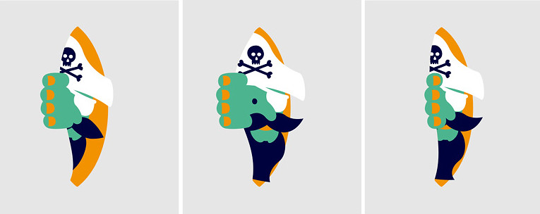
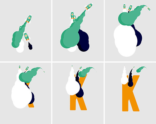
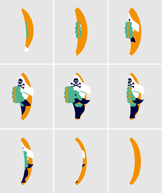
It uses Texas-based type designer Derek Weatherbee’s typeface Franchise Static as its base and draws upon the motion design skills of 110 designers for the typeface’s 110 glyphs – uppercase and small caps, numbers and punctuation. Each glyph is a 25-frame animation that arrives in its final legible configuration. Using up to four preset colours (which are changeable by the end user), the letterforms, number and punctuation marks begin as an animated smiley face, faucet, pirate, smoke stream, bumble bee or more geometric shape.
These minimal constraints – colour and timeframe – attempt to ensure the typeface as a unit remains coherent, ‘but in animation’ says Krielaars, ‘this can also mean that things become predictable. The intention was to experiment with a variety of styles to add an element of surprise. I repeatedly asked the questions: How many different elements can we bring in the mix, and what rules do we need to keep it from spinning out of control?’
‘K’ designed by Oliver Sin.
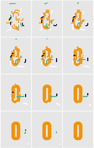
Top: A selection of frames from James Curran’s design for ‘)’.
‘)’ designed by James Curran.
While few of the animated glyphs (apart from uppercase ‘G’ and ‘P’ and small caps ‘g’ and ‘u’) show a deep understanding of type design and how letterforms are constructed, Krielaars’s constraints ensure that Franchise Static has its own logic.
Franchise Animated is more of a showcase project, a series of animations that arrive as a letterform. The typeface acts as a vehicle and as a platform to bring together the skills of the motion designers involved. ‘It’s nice to work on a project from time to time that does not have a fixed goal. It is from and for the motion design community,’ says Krielaars. ‘These projects happen all the time in the motion design scene. This one ended up in a product that people can learn from and brands can use.’
Small cap ‘o’ designed by Nicola Destefanis.
Small cap ‘z’ designed by Cento Lodigiani.
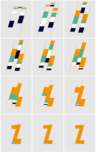
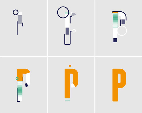
Stand-out characters include the small cap ‘O’ designed by Nicola Destefanis, motion designer at Smoke & Mirrors in London, and small cap ‘Z’ designed by New York-based Italian designer / animator Cento Lodigiani. These animations appear to be informed by the letterforms: the ‘O’ is created with pipes that are circular in nature, the corners are rounded and make snaking motions that foreshadow the letterform. The ‘Z’ is animated in a three-part diagonal, with slicing, fast-moving colours that stack up before arriving in the final configuration. From the uppercase alphabet, the wireframe, grid-like ‘G’ (Studio Donbe); the stacked and rotated blocks that form the ‘M’ (Carmen Angelillo); and the popping ‘P’ (Bran Dougherty-Johnson) are highly effective, as is Italian motion designer Erik Righetti’s full stop, which is formed from a single-colour, dynamic puddle droplet.
‘P’ designed by Bran Dougherty Johnson.
Franchise Animated promotional clip on Vimeo.
Sarah Snaith, design writer, editor, London
Eye is the world’s most beautiful and collectable graphic design journal, published quarterly for professional designers, students and anyone interested in critical, informed writing about graphic design and visual culture. It is available from all good design bookshops and online at the Eye shop, where you can buy subscriptions and single issues.