Winter 2006
Electrifying the alphabet
Gerard Unger
Herb Lubalin
Jan Tschichold
Piet Schreuders
Zuzana Licko
Timothy Epps
Herbert Bayer
Adrian Frutiger
Anthon Beeke
Wim Crouwel
Peter Saville
At the dawn of the computer age, new functions ushered in new forms for type design
The rapid advances in data-processing that revolutionised office work from the mid-1960s onwards – and later invaded everyday life – created special challenges for type designers. With electronic typewriters and microcomputers came the need for electronic fonts, both to translate data into electrical signals understandable by machines, and to transmit information between humans and machines via electronic displays.
Typefaces created by engineers for early electronic devices reflected the limited technical capacities of the machines. Scanning lines caused television type to flicker, while video screen letters appeared rough and irregular due to the difficulty of displaying curves. The monospacing of typewriter fonts created awkward gaps between narrow letters and unsightly fusions between wide ones. Dot-matrix and LED (light-emitting diode) typefaces faced even greater technical limitations, as the mechanical components of displays restricted the actual size of dots and trapezoids arranged on the matrix. Although smaller elements would have enabled precise shapes and harmonious letterforms, they also required a disproportionately large amount of storage space.
Meanwhile, phototypesetting and digital typesetting, which required mass digitisation of fonts, were transforming the print industry. While some professional typographers refused to acknowledge the validity of digital fonts, others, fascinated by the possibilities offered, experimented with completely new shapes or set out to test the adaptability of traditional letterforms. In 1975, type designer Gerard Unger (see Reputations, Eye no. 40 vol. 10) created a font for Rudolf Hell’s Digiset phototypesetting machine, assembling fairly small pixels on a constructed grid to prevent the distortion of letterforms; his Demos is now considered one of the first entirely digital typefaces.
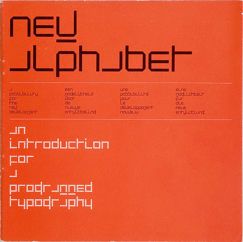
Below: New Alphabet, 1967, published in the twentieth edition of Pieter Brattinga’s Kwadraadbladen series (Quadrat Prints).
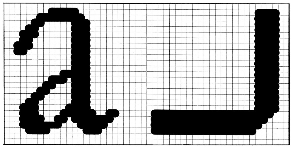
Top: Spread from Steendrukkerij de Jong’s Quadrant Print, demonstrating the Crouwel CRT alphabet and comparing a scanned Garamond ‘a’ with a scanned ‘a’ from the New Alphabet.
Electronic alphabets
One of the greatest challenges that the developers of communication and computing devices faced was to find a system that would enable machines to recognise typefaces and handwriting. In this way, texts could be processed without the need for them to be laboriously typed typed by hand. Both optical and magnetic ink character recognition technology (OCR and MICR) promised automated, electronic solutions not only for the newspaper industry, but also for sorting mail, library research and translation purposes.
Machine-readable typefaces carrying data in magnetic ink included CMC7, developed by the European Computer Manufacturers Association (ECMA) in the early 1960s; and E13B, a font commissioned by the American Bankers Association in 1958, which is still used on cheques today. In a highly sophisticated method employed by IBM, which even allowed for misalignment and missing sections, E13B characters were partitioned into a specified number of squares and then scanned by reading heads. If a square contained a specific amount of magnetic ink, an electrical signal was generated. By 1962, IBM machines were capable of processing up to 1100 E13B characters per second, but the font did not comply with standard notions of aesthetically pleasing type, and was often quite difficult to decipher.
Several approaches to these problems were suggested. Timothy Epps of the National Physical Laboratory in Middlesex, England, identified three possible approaches. One was to build machines for text recognition and at the same time develop character symbols to be recognised by humans.
The second aimed at creating machines capable of recognising different typefaces and styles of writing, since it was commonly thought that technology would always progress faster than people’s habits would change.
The third was to design a whole new set of symbols to replace traditional letterforms, though, as Epps admitted, this would require ‘extensive programming of both hardware and humans’. His own alphabet for machine recognition, devised with his NPL colleague, the computer scientist Christopher Evans (author of The Mighty Micro) in 1969, was intended as a first step in this direction, very consciously referring to existing shapes, but altering them to suit machine handling.
The OCR-A (‘optical character recognition’) standardised alphabet made in the US in 1966 seemed to encapsulate all the errors that Epps had identified. The font’s strongly contrasted letterforms enabled a superior recognition rate by machines but aesthetically pleasing or legible it was not. Two years later, the ECMA commissioned type designer Adrian Frutiger (see Reputations, Eye no. 31 vol. 8) to rework the font, considering the seemingly irreconcilable aesthetic and technical demands. The resulting OCR-B typeface was released in the public domain and used for optical machine recognition worldwide.
Characters on a screen
Other typefaces catered to the new CRT (cathode ray tube) control systems used by the new phototypesetting machines, which generated characters by focusing microscopic electron beams on a screen.
For example, type designer Wim Crouwel put forward the experimental New Alphabet (1967), consisting of radically simplified letterforms, with unusual ideas about case sensitivity and orthography. This proposal was to be seen only as an initial step towards further research made necessary by the increasing quantity of printed material. ‘We need to move on to a completely different form of letter,’ he explained. ‘The typeface that is to emerge will be determined by contemporary man, who knows the computer and also how to live with it.’
Basing his letterforms on the concept of computer memory as an assembly of cells, corresponding to the composition of organisms and structure of society, Crouwel conceived new communication symbols, purposely placing them in stark contrast to digitised, screen-adapted typefaces, which he strongly disapproved of. Aware that the readability of his alphabet might be questioned, he was nevertheless certain that in time, people could familiarise themselves enough to be able to read his letterforms comfortably.
Nearly two decades years later, with the introduction of the first Apple Macintosh in 1984, the software FontEditor for the first time allowed non-specialists to design their own typefaces.
PostScript, introduced by Adobe in the same year, made complete device-independence in typesetting possible. Though limited at first, personal computers gave users an increasing amount of control over digital type designs. Type designer Zuzana Licko (see Reputations, Eye no. 43 vol. 11), excited and encouraged by the potential of the Macintosh system, set out to develop screen fonts using an experimental, modular approach. The novelty and perceived crudeness of the Macintosh was crucial to this process. ‘The most successful experimental typeface designs are often those that address the possibilities or limitations of a yet uncharted technology,’ she attests. The advent of platform-independent typesetting also helped to democratise type.
New Alphabet designed by Wim Crouwel, 1967.
For man and machine
Although most discussions about electronic alphabets among typographers and designers centred on aesthetic issues, underlying these was a basic uncertainty about how best to deal with the technological advances. The gradual acceptance of devices displaying electronic type – radios, microwaves, game consoles, video recorders and later, computers – into the homes and lives of people marked the beginning of an extraordinary shift in consciousness as machines became an indispensable part of human life. Perhaps it was not so terribly far-fetched to attribute equal status to man and machine, and to ask whether instead of making machines adapt to historic letterforms, humans should instead accustom themselves to the shapes generated by machines.
The comparison between humans and machines however fell short when considering the computer’s ‘reading behaviour’: machines did not recognise words as entities, but scanned letter by letter. Human beings focus on the complete shape of words, and experience can quickly compensate missing letters or their false positioning. As alphabetic characters have evolved with time, and are stored subconsciously, it is difficult to adapt to new letterforms. Radical proposals such as Epps’s or Crouwel’s alphabet could also be seen a continuation of the ideas and concepts of Modernism.
Bauhaus instructors Herbert Bayer and Jan Tschichold, for example, searched for ways to develop universal type, and experimented with geometrically simplified, modular shapes. Concurrently there were demands for spelling reform in order for alphabets to be used globally (the so-called Weltalfabet). Bayer, like Crouwel after him, believed that typography and type should correspond to the contemporary demands of ‘an age of science’, rather than those of history.
A machine aesthetic
Despite these early notions of a ‘machine aesthetic’, the 1960s and 70s saw several designers protesting against the supposedly ‘dehumanising’ and thoroughly ‘indecipherable’ mechanistic alphabets. Dutch designer Piet Schreuders, for example, complained that Crouwel’s New Alphabet was impossible to read, that it required subtitles to be understood, and that it was carried out in the ‘so-called Martian style’. His fellow countryman Anthon Beeke garnished his critique with a huge dose of irony and created an alphabet consisting entirely of photographed nude girls, which subsequently found its way into the final edition of Avant Garde (no. 14, 1971), edited by Ralph Ginzburg and art directed by Herb Lubalin.
In the following decades, as character recognition technology improved to enable the recognition of most print typefaces and even handwriting, the ethical discussions surrounding electronic typefaces, and the technology they came with, eventually died down. Nowadays, these engineered and experimental machine typefaces are no longer considered shocking or revolutionary; since their original function has lost its relevance, they remain odd vestiges of an age of electronic innovation.
Contemporary graphic design and typography has developed a rather nostalgic affection for these alphabets, as symbols of mid-century ideas of progress and modernity, evoking a more innocent and optimistic era. The E13B, one of the few engineered ‘typefaces’ still performing their original function today, had already by the mid-1960s entered the art and design world: Ed Ruscha incorporated E13B numerals into his paintings in 1967; eight years later, an extended version featuring alphabetic characters was used in the film title sequence of Sydney Pollack’s thriller Three Days of the Condor.
Subsequently, the work of designers such as Peter Saville, who resurrected Crouwel’s New Alphabet for the cover of the Joy Division album Substance, clearly ascribes significant formal and stylistic importance to electronic typefaces. However, full recognition will not be achieved until such typefaces are no longer used as a simplistic references to the ‘computer age’, a handy and popular cliché as a plethora of science fiction and computing book covers still demonstrates.
Symbols of a new modernity
Electronic alphabets were very much a product of their time, heralding a new age of electronically controlled communication, symbols of a new modernity. As results of both technological innovation and successful collaborations between engineering and design fields, they inspired and helped to advance typography into a new age: contemporary screen typefaces would be unimaginable without them. Perhaps it is now time for contemporary experimental typography to make a similar, lasting contribution.
Sarah Owens, designer, researcher
Augsburg, Germany
First published in Eye no. 62 vol. 16 2006
Eye is the world’s most beautiful and collectable graphic design journal, published quarterly for professional designers, students and anyone interested in critical, informed writing about graphic design and visual culture. It is available from all good design bookshops and online at the Eye shop, where you can buy subscriptions and single issues.