
Tuesday, 9:00am
22 December 2015
Classic Collections – Type and lettering
Nick Bell
Simon Esterson
John Maeda
Chris Ware
Abbott Miller
Marian Bantjes
Graphic design
Illustration
Magazines
Typography
For a limited time, you can buy a bundle of Eye typography issues – at a bargain price
This ‘Type and lettering’ bundle contains issues 37, 45, 50 and 72: all have a special interest in designers and examples of typographic design and lettering forms. Although these issues do not focus solely on type, we have chosen them for what they reveal about the relationships between design, illustration and typography.
Sometimes, there are tensions between creative expression and formal typographic design methods where the two are seemingly held together by a taut wire, but there are times when illustration, design and typography meld seamlessly to produce brilliant graphics and powerful messages.
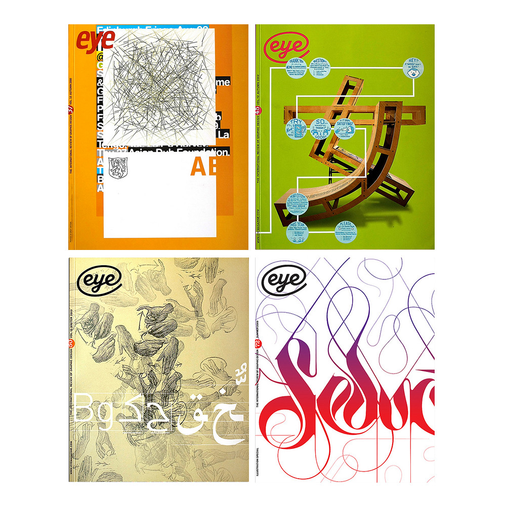
Cover of Eye 37: (background) detail from a poster by 8vo. Foreground top image by John Maeda.
Eye 37 (2000) looks at the language of design and typography, from what a logo says about a business and its identity, to poetry and sculptured letters in the public spaces of Barcelona. There’s an early interview with MIT Media Lab legend John Maeda about the beginning of his teaching career and his criticisms of the creative limitations of web design. A profile of British design practice 8vo looks at their magazine Octavo (1986-1992) which had a heavily typographic aesthetic.
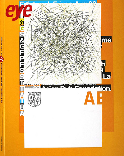
Cover of Eye 45: (background) 3D Chinese character from the exhibition Village Works: Photography by Women in Chna's Yunnan Province’, Wellesley College. Design: J. Abbott Miller. (Foreground) extracts from Chris Ware’s ‘Tales of Tomorrow’.
In Eye 45 (2002), Deborah Burnstone visits Morecambe Bay to see a typographic sculpture by Gordon Young and Why Not Associates based on the migratory bird population, Steven Heller profiles cartoonist and letterer Chris Ware, and Phil Baines writes on the rise of the OpenType format.
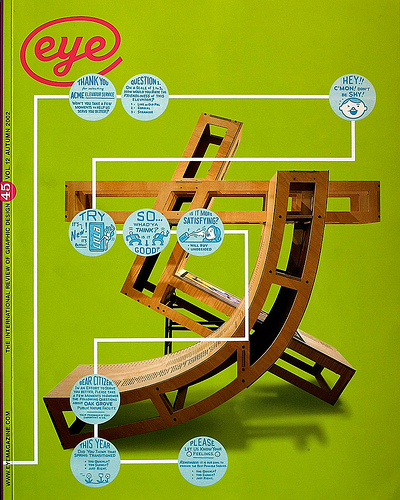
Cover of Eye 50: woodblock printed sign language symbols (including the signs for ‘work’, ‘delight’, ‘beauty’ and ‘miracle’) from František Štorm, plus diagram showing Yassar Abbar's font Abbar in relation to Latin type and Arabic calligraphy.
Eye 50 (2003) features an article on the covers of Oxford University Press’ ‘A Very Short Introduction’ series painted by Philip Atkins. There is also a profile of film titles designer Marlene McCarty who has worked on Far From Heaven, The Ice Storm, American Psycho and many other blockbuster and independent films. ‘Abbar: building bridges’ discusses the challenges of breaking away from a traditionally calligraphic written language and the process of digitising the typeface on Latin-based computer systems.
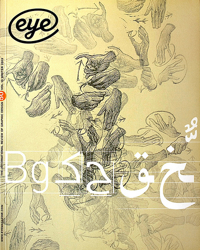
Cover of Eye 72: detail of custom type by Marian Bantjes from a poster for the Yale symposium ‘Seduction: Form, Sensation and the Production of Architectural Desire’.
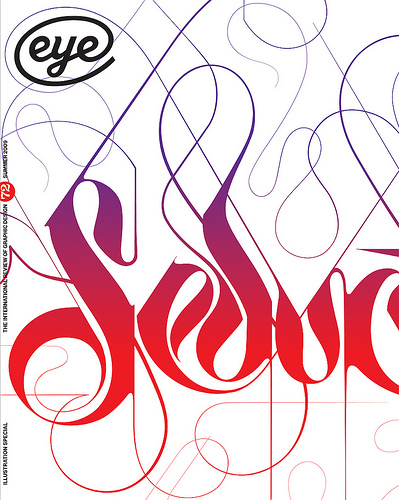
Eye 72 focuses on the subject of illustration and the points where it intersects with graphic design. A feature on tattoo magazine Sang Bleu looks at the use of typography in body art alongside B&P Typefoundry, who designed the different typefaces used throughout the publication. The tensions between graphic design and illustration are revealed in articles about James Joyce who worked for the Conran Design Group and Exposure, while Christoph Niemann blurs the lines between illustration and graphic design.
You can buy all four issues for the bargain price of £45. There are also four other bundles in the ‘classic collections’ including ‘Back to the 1990s’, ‘On and Off the Wall’, ‘The Big Picture’ and ‘Storytelling’.
Please go to the Eye shop on the ESco website here and order your bundle while stocks last.
Eye is the world’s most beautiful and collectable graphic design journal, published quarterly for professional designers, students and anyone interested in critical, informed writing about graphic design and visual culture. It is available from all good design bookshops and online at the Eye shop, where you can buy subscriptions and single issues.