
Monday, 12:00pm
11 February 2013
Noted #49
Scroll down; paper time capsule; Typography Summer School in two cities; design activism at the V&A; Sketchnotes; icons for data
A few objects, images and forthcoming events that caught our attention in recent weeks …
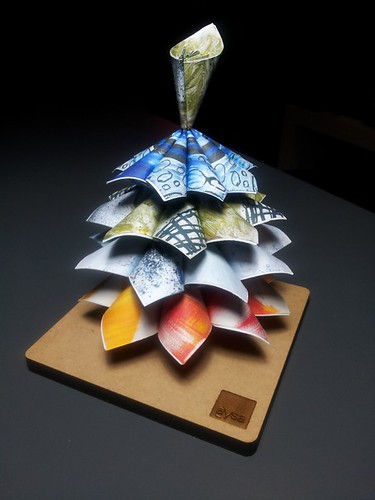
Arjowiggins Creative Papers has launched The Blank Sheet Project Time Capsule, and is calling for art and design contributions with a vision of ‘design and creativity in 2023’. The website’s gallery will take submissions until the end of June 2013. All projects must start with a blank sheet of paper but can take any form (see below).
Perezdiseño: una navidad sustentable, by AYSA from the time capsule gallery.
Typography Summer School (founded by Fraser Muggeridge) has a new website to mark the launch of its New York edition, which runs from 12-16 August 2013. The London versions take place on from 22-26 July & from 29 July to 2 August 2013.
The next instalment of the V&A’s Design Culture Salon on 27 February has the title ‘Design activism: how does it change things?’ Noel Douglas of Occupy Design (see ‘Whose space?’ in Eye 66) will be on the panel alongside Jody Boenhert (EcoLabs), Jonathan Chapman (University of Brighton) and Paul Mickelthwaite (Kingston University).
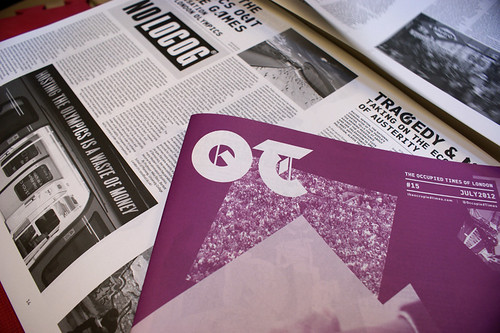
Occupied Times. Designed by Tzortzis Rallis.
Mark Barratt recently reviewed the Design of Understanding (DoU) conference at St. Bride Library for the Eye blog (read ‘Work to make it simple’), which included sketchnotes by Eva-Lotta Lamm.
Sketchnote from DuU2013 by Eva-Lotta Lamm on Flickr.
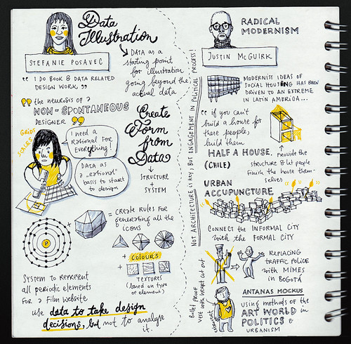
Her book Sketchnotes 2011, which documents more than 100 talks by speakers such as Michael Beirut, Christoph Niemann and Chip Kidd, is available on online. Sketchnotes 2012 will be available later this year.
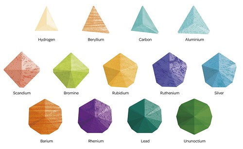
At the DoU event, speaker Stefanie Posavec spoke about the images she is making (above) for the website 94 Elements (in beta). The icons represent the shape, colour and texture of the chemical elements and were created, says Posavec, using ‘their unique electron shell data and periodic table data … an example of using meaningful data to shape a piece of graphic design.’
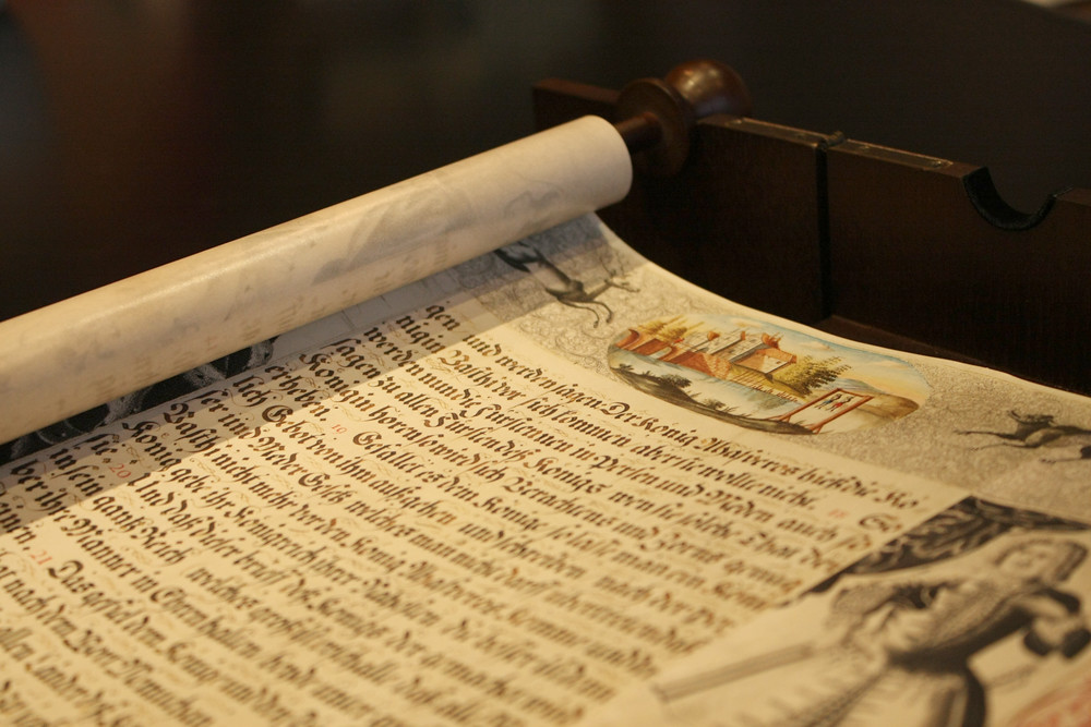
Right, top and below: The Esther Scroll, manuscript scroll in wooden display with commentary volume by Falk Wiesemann.
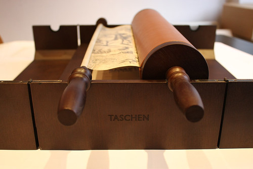
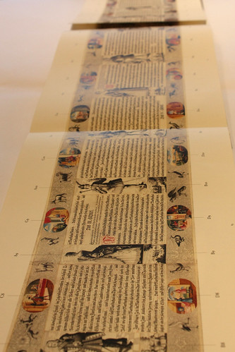
Taschen’s Esther Scroll is a facsimile of a manuscript dating back to 1746. Unfurled, it measures more than six metres wide, and tells the story of Queen Esther – which is customarily read on the feast of Purim.
The Esther Scroll is produced in a limited edition of 1746 items. A hardback book of commentary (incorporating a gatefold reproduction of the scroll, below, for people with limited elbow room) is slotted into its elaborate wooden container.
Eye is the world’s most beautiful and collectable graphic design journal, published quarterly for professional designers, students and anyone interested in critical, informed writing about graphic design and visual culture. It is available from all good design bookshops and online at the Eye shop, where you can buy subscriptions and single issues. Eye 83 is out now, and you can browse a visual sampler at Eye before You Buy.