
Wednesday, 10:00am
13 September 2017
Robin Broadbent interview
In this follow-up to ‘Obsessive meditations’ in Eye 94, art director Richard Krzykak interviews photographer Robin Broadbent about his practice
Here follows a transcription of art director Richard Krzyzak’s interview with Robin Broadbent earlier this year.
Richard Krzyzak: What prompted you to relocate from London to New York? How did the magazine and advertising culture there differ to the one you abandoned?
Robin Broadbent: As I don’t like flying, I had never been before but I went to New York by mistake for family reasons.
As soon as I got there I fell in love with the city, its visual energy and the structure of the buildings, the light was great. I was amazed how fantastic the galleries and art scene was, not just the museums but also how numerous the commercial and photographic galleries were.
In London I was a little frustrated as a still life photographer because things were changing in the late 1990s. I spent a long time thinking about what I enjoyed about taking pictures and being in the studio. What I really loved was having time to make something beautifully lit and considered with a 8x10 camera. That pushed me towards New York where I had seen great magazines, among them Harper’s Bazaar edited by Fabien Baron and W. It seemed as if fashion accessories, beauty products and cosmetics could be shot in an abstracted way and made interesting and strong. Lighting and shooting objects beautifully seemed to be appreciated in New York. Having made the decision to go, it took me a couple of years to do the rounds with my book and find an agent who could facilitate my move there.
RK: When did black and white and abstraction become such an integral part of your aesthetic? How did clients greet it?
RB: Since leaving art school I had always made black and white photographs for myself and through printing and cropping I learned a lot about abstraction.
Commercially I was doing more general advertising work but annual reports were an opportunity to abstract and play with shape. Through black and white printing I learned about tonality, texture and form and particularly about the crop; everything is about cropping. With 8x10 Polaroids there was the enjoyment of seeing how things fit within the frame.
I had two lives: the commercial work, with the exception of annual reports, was exclusively colour, while my own work was continuing in black and white. During that time, before moving to New York I made two black and white books: Marmalade and Minus Sixteen. In those, through abstraction I was able to create a world that people can enter, without the ‘abstraction guessing game’.
RK: You have talked in the past about how art directors are less likely to come to the studio to collaborate, and instead rely on emailed jpgs. You’ve also described how commercial work was predetermined by agencies, and that you were just manifesting their ideas. Has that changed?
RB: The situation with art directors, in my commercial work, has improved. In the last few years I have resolutely pursued the endless search for lighting and photographing things beautifully. I now do better editorial work with more interesting imagery. In the past people appeared to be worn down and exhausted by the demands of clients; now they are much more passionate and excited and want to produce great pictures. I have clients in Paris, London and New York who want to do great pictures, and in those situations I work with talented and visually concerned art directors and creative directors who want to be involved and want to be in the studio. Now
there are almost too many people coming to the studio.
With editorial there’s no-one in the studio. It’s down to me and my thoughts and what I want to do. You have conversations beforehand or propose ideas to magazines and then you’re left to play. It’s great to work with magazines creative directors where you’re all speaking with a similar voice or vision. But you’re left to fend for yourself trying to get great pictures.
What I do now is so simple and strong that I don’t get many jobs that aren’t what I do. Often people will see an editorial story and that can determine an advertising campaign where I might revisit my editorial references. Shooting editorial pictures is a much more meditative process.
In the book the images of the seeds and their shadows were originally for a story for Numéro and it took us days moving little seeds around, comparing prints, looking how they sat compared to previous arrangements, extending the shadows. The process is meditative and exciting in its tranquillity.
It’s different on advertising days when there might be art directors, clients and stylists and so the meditation disappears a little. On commercial jobs there will be at least two assistants while for editorial work I’ll usually work with my main assistant so that I can stay by the camera to think and look while they can tweak the lights or move things.
In the past assistants always had dark slides to load but the manufacture of film and Polaroid ceased some time ago. Once 8x10 Polaroids were discontinued I had to stop using film as there was nothing to show the clients.
I now work with a baby 5x4 camera, for all the camera movements, with a digital back connected up to a monitor so I can see what I’ve shot. It’s like looking at a Polaroid but it’s not as much fun as you can’t use croppers. The Polaroid was slower and allowed pondering which took the image to another level. 60-70 per cent of the pictures in the book were shot on film. I was initially bitter and grumpy working digitally as the work flow was geared up to producing more shots for the client to see, but creatively I’ve now got over that.
RK: In the context of the pictures in your book the recent Port NY architectural story could be seen as a different photographic approach?
RB: It was a dream assignment, in that buildings allow you to play with shapes and forms, structure and light, without having to create it all yourself. It was shot on film with contact sheets, which, like a Polaroid, are exciting, and the quality of black and white on film is different to that of digital. I have worked for Port for some time, and Kuchar Swara, the creative director was aware (through Instagram) of my fondness of architecture.
RK: The book, unencumbered by any text displays your work in a pristine environment. You’ve mentioned your interest in how images work on the page. How did you determine the sequence of images?
RB: Having done a lot of editing first, I worked with the designer Doug Lloyd, with whom I’ve done a number of advertising campaigns. We made lots of dummies and turned a lot of pages. I chose a lot of monochromatic images and as with Marmalade, I wanted little pockets of colour; it’s about surprises. Having worked through sequences of too many pictures and the wrong sort of pictures we were then able to narrow the selection down to what’s in the book.
RK: Many of your images have a logo-like reductive simplicity. Are you trying to capture the pure essence of an object or are you discovering what its graphic potential is?
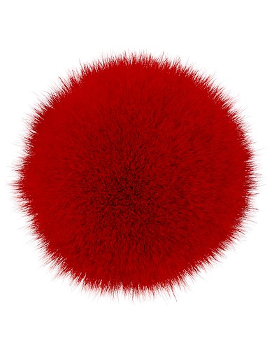
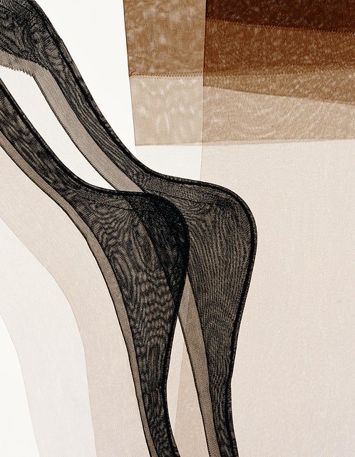
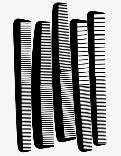
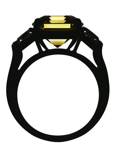
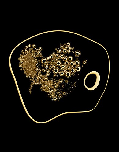
RB: The essence has to be there to start with but within that you have to try and make a strong picture. I do like black lines and there are a lot of black lines in the book. I like both their order and their randomness. Some pictures are messy and some are very clean. It is about line but I like to feel I capture, or keep, a little bit of each item in the picture. It’s not abstraction for the sake of pure abstraction. I spend a lot of time trying to get rid of stuff from a picture, trying to minimise any distraction from it. Sometimes I feel that even the lines have a sense of moving; they’re contained within the crop or the frame but they have the potential to move; as in the set of three black rod pictures, short bendy and curvy, where they are contained but could move around.
RK: Your work often transcends scale. Do you find the page format restrictive? How does the size of reproduction affect your images?
RB: I’m happy as long as I have a full page or a spread in a magazine. But I think it’s about how you fit it in the space. As long as there are edges to play with, then you can fill it until it’s full. My work has appeared on billboards which are big and exciting but I get more pleasure from turning a page in a magazine with a really great editorial story.
I have exhibited my earlier black and white work, and now that I’ve put this book together I’d like to see how I could print and make images out of these pictures and see how they relate to being on a wall or in a gallery.
Cover for The photographic work of Robin Broadbent, Damiani, €45.
All photographs © Robin Broadbent.
Richard Krzyzak, art editor, designer, London and Hampshire
Eye is the world’s most beautiful and collectable graphic design journal, published for professional designers, students and anyone interested in critical, informed writing about graphic design and visual culture. It is available from all good design bookshops and online at the Eye shop, where you can buy subscriptions and single issues.