
Monday, 10:00am
19 August 2019
(Typographic) Noted #94

various designers
Robert Baxter
Rick Landers
Rob van Leijsen
Mike Meyer
Jeremy Tankard
Abbie Vickress
Book design
Graphic design
Typography
Visual culture
Toulouse Letters; Brick Index; Jeremy Tankard’s Brucker; Morgue File 1 & 2; Reinventing Print: Technology and Craft in Typography
Here is a selection of type-related things – a new typeface and several typographic books – that have caught our attention in recent weeks.
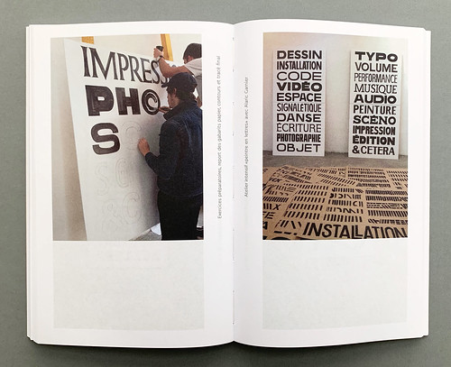
The small, A5 format, Toulouse Letters (Éditions B42, €18) is a selected catalogue of the ‘collective experiments’ produced in the field of type design at the Institute Supérieur des Arts de Toulouse in collaboration with the city of Toulouse, France. Alongside showcasing the outcomes of workshops, courses and exhibitions, the book includes a series of essays and interviews with ‘guest’ type designers, sharing pedagogical thoughts on the design of letterforms at the start of the 21st century.
Cover and spreads from Toulouse Letters: Teaching Experiments in Letter Drawing (Published by Éditions B42 and the Institut Supérieur des Arts de Toulouse) with contributions from by Alejandro Lo Celso, François Chastanet, Thomas Huot-Marchand and Hans-Jürg Hunziker. Design by François Chastanet.


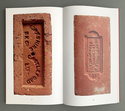
Patrick Fry’s Brick Index (CentreCentre, £20) is a carefully curated, intimate survey of the form of bricks. Viewers are invited to observe the minutia of brick, from typographic treatment to the remanence of machine production. As David Kitching notes in the introduction, ‘Not all bricks are created equal.’ In addition to the 155 images reproduced, in life-size, the book features Kitching’s insightful introduction as well as an engaging essay, ‘Brick Haikus’ by Eye’s ‘writer at large’ Rick Poynor.
Spread and cover from Brick Index (CentreCentre), designed by Patrick Fry, edited by Patrick Fry with contributions from David Kitching and Rick Poynor.

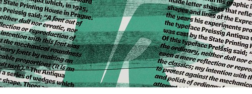
Brucker is the newest typeface designed and published by Jeremy Tankard Typography. Brucker is inspired by the expressionistic forms of early twentieth century type designers such as Rudolf Koch and Vojtěch Preissig and their ‘energetic and uncompromising approaches to letter shapes’. The Brucker type family includes four weights (from Light to Black) in regular and italic styles.
Type specimens for Brucker, designed by Jeremy Tankard.

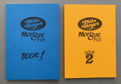
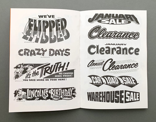
The sign painter Mike Meyer’s two Morgue File books are capsules of rescued typography – the kind that Meyer has collected from vintage magazines, newspapers and numerous visits to flea markets and thrift stores across the US and in Europe. The first book, Book 1, is categorised by the typographic styling of its examples – such as ‘Big and Blocky’ or ‘Loose Letters’ – while Book 2 is organised by location. Both, however, are equally impressive in range and scale. As Better Letters founder Sam Roberts writes in his introduction to Book 1, Meyer’s collection is akin to Pinterest, before Pinterest.
Covers and spreads from Mike Meyer’s Morgue File 1 & 2. Design by Alice Mazzilli, Peabody Press.
David Jury’s Reinventing Print: Technology and Craft in Typography (Bloomsbury Press, $44.95) is a well rounded take on the revival of post-digital craft. Beginning at the start of the twentieth century – excluding his ‘preamble’ on perceptions of technology in the nineteenth century – Jury charts the shifting relationship between emerging technologies and typographic design, from Italian Futurism to touch screen handwriting recognition. For those attempting to track the resurgence of traditional techniques through a landscape dominated by digital production, Jury’s book may prove a useful guide.
Cover and spread from David Jury’s Reinventing Print: Technology and Craft in Typography (Bloomsbury Press).

Eye is the world’s most beautiful and collectable graphic design journal, published quarterly for professional designers, students and anyone interested in critical, informed writing about graphic design and visual culture. It is available from all good design bookshops and online at the Eye shop, where you can buy subscriptions and single issues. You can see what Eye 98 looks like at Eye Before You Buy on Vimeo.