
Thursday, 10:00am
23 April 2020
Where do ideas come from?
A mischievous book by Claes Oldenburg showed me the importance of realising an idea physically, writes Andy Martin
I first came across Notes in Hand in the mid-1970s, when I was a freshly enrolled graphics student trying to make visual sense of the world, writes Andy Martin.
Paperchase (then a real store) had one display copy and I spent my imaginary money on it.
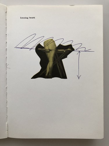
Ironing board. Example of the cheekiness of much of Oldenburg’s work. Evidence of process as image.
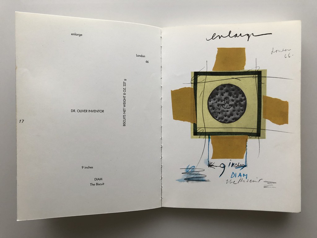
Top. The Biscuit. Typeset notes appear alongside the images providing a kind of poetic counterpoint.
The book showed Claes Oldenburg at his mischievous, mid-1960s best. A book offering a world of big ideas, writ small. Reproduced pages reduced to a quarter-size from a selection of loose ring-binder sketchbook plates and recoloured using CMYK values, the reduced and tinted pages took on a bone-china-fine quality. Beautiful. The facing pages echo the notes in set type forming a kind of poetic counterpoint. It came with the advice to ‘be taken out to be looked at under changing circumstances’ recalling the type of book Oldenburg used to make his notes and sketches. This I duly did but to no immediately discernible effect.
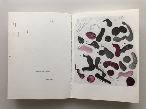
Mundane materials revived with process and suggestion.
Book cover. Claes Oldenburg, Notes in Hand: Miniatures of my Notebook Pages, Petersburg Press, 1971.

It was beginning to look like I was going to have to get some ideas of my own – walking around gazing at this book yielded little.
Except now, looking back I can see that the book had a huge effect, showing me the importance of play and on some level, colour and representation. It showed me how to imagine. How to dream big and the importance of sketching ideas out physically.
Oldenburg tells of recolouring black and white photostats using CMYK values, and his surprise and subsequent acceptance of the results.
This becomes That. If I imagine it. Imagine if that went there. Imagine the mundane elevated to the epic.
I’d seen similar hints of process at an earlier V&A Paolozzi show where his late 1940s scrapbook pages also offered tantalising glimpses into the area marked ‘Where Ideas Come From’. The inner workings of the artist were something of a mystery back in the mid-1970s, the business of ‘sketchbook process media’ lay way off in the future but here, as with Paolozzi’s collages and sketches, Oldenburg’s include extraneous details roughly torn from their origins, adding background noise and suggestion. This crossing-out and semi-legibility opened the doors to life-affirming imperfections.
I still leaf through its pages occasionally, and rarely leave without the spark of an idea. I’m just glad I stumbled upon this little gem when I did.
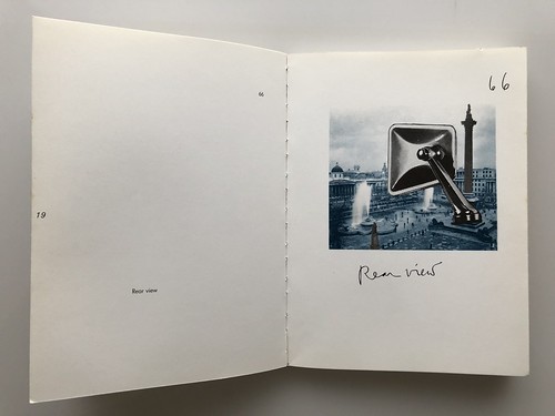
Rear view. The now familiar technique of juxtaposition – the mundane elevated to the epic.
Andy Martin, illustrator and designer, Kent
Eye is the world’s most beautiful and collectable graphic design journal, published quarterly for professional designers, students and anyone interested in critical, informed writing about graphic design and visual culture. It is available from all good design bookshops and online at the Eye shop, where you can buy subscriptions and single issues.