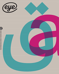
Summer 2015
Beyond Latin
John Hudson
Neelakash Kshetrimayum
Kamal Mansour
Pascal Zoghbi
Eye critics
Patrick Giasson
Tim Holloway
John Hudson
Neelakash Kshetrimayum
Kamal Mansour
Ian Party
Fiona Ross
Pascal Zoghbi
As digital tools liberate type design from arcane limitations, more people become free to communicate using their own alphabets and languages. Gerry Leonidas chairs a panel of designers discussing the global state of ‘non-Latin’ type

Writing shortly after Unicode was announced, and years before OpenType was adopted, Robin Kinross predicted that the non-Latin world – that is, the part of the world that does not use the Latin alphabet – would benefit most strongly from the then-new digital tools (‘The digital wave’, Eye no. 7 vol. 2, 1992). The past two decades have proved him correct.
The old First World type manufacturers, whose central business was selling typesetting machines with typefaces as an extra, have transformed, or given way to a wide field of small- and mid-size publishers, surrounded by a large number of independent contractors. And instead of being concentrated in Europe and the East Coast of the US, professional type design now happens everywhere from Argentina to Russia to New Zealand.
At the same time, our ideas about what the practice of typeface design implies have shifted. On one level, we have seen the concept of a type family evolve. As well as a greatly extended complement of weights and widths, type families often include stylistic variants that would have once been classified as stand-alone display typefaces.
The most interesting developments have been in extending the concept of the ‘type family’ across scripts. From newspapers to sign systems to user-interface applications, character sets often cover pan-European Latin, Cyrillic and Greek as a starting point, extending into Arabic, Hebrew and any combination of Indian scripts. International publications and globalised brands have been a visible driving force. But, with less fanfare, manufacturers such as Microsoft and Adobe have robust strategies to support most scripts well enough for most users, transforming assumptions about what any device can do out of the box. Just as typeface publishers now aim at a global market, a worldwide perspective has to be assumed in any discussion of typeface design.
This introduction begins a fourteen-page, heavily illustrated type panel with John Hudson, Neelakash Kshetrimayum, Kamal Mansour and Pascal Zoghbi chaired by Gerry Leonidas.
---
Type Design Panel
Gerry Leonidas (chair) Associate Professor, Department of Typography & Graphic Communication, University of Reading, UK.
John Hudson As one half of the Canadian foundry Tiro Typeworks, Hudson specialises in non-Latin typefaces and multi-script projects, with clients including Adobe, Brill and Microsoft.
Neelakash Kshetrimayum Originally from Manipur, but now based in New Delhi, Kshetrimayum is a graduate of the NID in India and the University of Reading, where he was awarded the Monotype Studentship and graduated with distinction. He works for clients including Adobe, Google, Tiro Typeworks and Dalton Maag.
Kamal Mansour A linguistic typographer at Monotype, Mansour is an Egyptian-born computer scientist, designer and linguist who has witnessed from the inside the transition of an industry from proprietary systems to software licensing under open standards.
Pascal Zoghbi A Beirut-based graduate of KABK, the Royal Academy of Arts in the Netherlands, Zoghbi is the founder of the Lebanese type foundry 29Letters (29LT), with a global client list that includes Google and Swatch.
---
Gerry Leonidas: Do we have a good idea now of the directions in which the market for typeface design is developing globally?
Kamal Mansour: Current technology allows designers to provide typefaces for truly global markets. The typical cycle for font development starts with basic coverage for a broad enough population; next comes the expansion into a variety of scripts according to demand. Cultural and commercial richness accelerates this development. With such global coverage, isolated nations soon stand out. For instance, it is only recently that the demand for Burmese (Myanmar) typefaces has registered, while neighbouring Thailand – a more connected country – has been having a typographic boom for more than a decade.
Neelakash Kshetrimayum: There has been rapid social and economic change in India in the past decade. More businesses are entering the Indian market and more people are exposed to a variety of brands. There has been a trend to extend global brands locally, and vernacular scripts are given due attention. As a result, typeface design is being considered more seriously. Typefaces such as Vodafone’s Devanagari extension [designed by Dalton Maag] maintain brand consistency, and show the way many brands will need to follow to address local markets.
However, even though designers are more aware of type issues, the guys who make the decisions – commissioning the typefaces – have often only superficial awareness. So there certainly is a growing demand for good typeface design in India, but there is room for improvement.
Pascal Zoghbi: During the past decade, the global market has grown dramatically in the Gulf area and in the Middle East as well. The demand for corporate Arabic typefaces and logotypes grew to complement the original identities, driven also by the legal requirement in the Gulf to have an Arabic companion to a western identity. This led to the international design firms opening branches in the region. Design instructors in Arab colleges, and especially in Beirut, responded by raising awareness of the need for contemporary Arabic typographic work, and a new generation of Arabic type designers and typographers is now making its mark.
Ten years ago, QuarkXPress was the only Arabic publishing environment. It had a limited set of traditional Arabic fonts, whereas graphic designers required contemporary Arabic typefaces to complement established Latin typefaces, mostly for bilingual publication design. The development of OpenType and the introduction of Adobe’s ME [Middle Eastern] versions for its design applications were the catalyst for the Arab design community to modernise publications. At the same time, type designers at KABK [the Royal Academy of Arts in the Netherlands] and the University of Reading were contributing new typefaces for the region. Nowadays, design schools in the Lebanon offer introductory type design courses, seeding a new generation of Arabic type designers. I am confident that the market for non-Latin typeface design will grow exponentially in the coming years, as will the number of type designers and type foundries active in the region.
John Hudson: Rather than speaking of a global market for typeface design, we should recognise the diversity of multiple markets, even within a single country or region.
This should not surprise us: there is a diversity of markets for type design in Europe and North America, too. For example, I have colleagues who specialise in the publication design market, working with magazine art directors, whereas I do a lot of work for the software developer market. We each know our own markets well, but not necessarily each other’s.
A distinction needs to be made between regional markets and script markets. I’ve spent much of the past few years working on typefaces for Indian writing systems, but only one of these is for a client based in India. Most have been for software developers or mobile phone companies based in North America or Europe. Obviously these companies have a regional market for their products in India, but the script market for type design that enables those products for that region is international.
Gerry Leonidas: As we move past minimum functionality requirements, are there any general rules we can follow to promote excellence?
Kamal Mansour: The cycle of moving past minimum functionality is proportional to demand for each particular script, while the drive to excellence is more delicate and harder to predict. So much depends on the stage of cultural and graphic development of each script. With so many people able to dabble in type design, we can hardly guarantee that the available fonts meet a particular standard. Of course, making available high-quality fonts for a particular script is the best way to lessen the effect of poorly made ones. The best new typefaces are innovative, while harking back to salient features of traditional style.
Pascal Zoghbi: I agree. Concerning Arabic and non-Latin scripts that are mostly based on calligraphic scripts, excellence is achieved through an understanding of the traditional roots of the calligraphic scripts, and the knowhow to modernise the typographic script, without imposing western characteristics.
Whether the Arabic typeface is designed as a single script or to complement a Latin typeface, it should always stem from specific calligraphic scripts.
Neelakash Kshetrimayum: With Indian scripts the challenge lies beyond the technical knowhow. Aesthetic excellence requires both designing in context and placing in context. By ‘designing in context’ I mean that typefaces need to be designed to serve a specific purpose, while having a unique voice. For instance, the complex hierarchy of information in newspapers demands a typeface with multiple weights and styles. Currently, there are a few typefaces that meet these criteria.
By ‘placing in context’ I mean that typefaces need to be used with sensitivity to their purpose. But because good designs are hard to find in the market, designers end up using anything available, with disappointing results.
As much as type designers need to be aware of the context of use, so the users need to be equally aware of a typeface’s intended purpose. This can only be achieved by educating designers as well as users.
John Hudson: What constitutes excellence in Latin type design? I think similar or parallel criteria apply to all writing systems, so one way excellence can be promoted is to encourage designers to consider consciously the processes and the kinds of decisions they make when designing for their native script, and to model these. But this must be done while observing the particularities of the individual writing system.
So, for example, any decent Latin type designer knows that the relative proportions of letters are critically important, and over time will have developed a ‘feel’ for these. When designing for another writing system, it is necessary to consider what constitutes good relative proportioning of the graphical signs of that system, within particular styles or idioms. That cannot be guessed at, or based directly on Latin proportions, but it is a parallel criterion of excellence.
I do a lot of research, and I don’t really know another way. It is certainly helpful if one can find native typographic experts to advise you, but you must also have a basis on which to evaluate their competence and the quality of the information they provide. There can be a clamour of voices, especially once a typeface is published and, inevitably, some people don’t like it. So who do you listen to? It takes time to build a network of experienced and reliable advisers, and all the while you have to be conducting your own research, asking questions, checking assumptions.
And what is to be researched? We can learn a lot about excellence in Latin type design by looking at historical typefaces, but often what we learn most about when looking at historical non-Latin types are the limitations of obsolete technologies and the faulty analysis or assumptions of previous designers. I strongly believe that you cannot understand a writing system without looking at writing. Even if you are designing the most extreme modular Modernist type, you need to know how the script was written, not just how other type designers have tried to represent it.
Gerry Leonidas: Does non-Latin typeface design present unique pitfalls, requiring specific design skills?
Neelakash Kshetrimayum: Yes! Understanding the script and the tools used for writing it is essential. The rules of thumb for quality remain the same for both Latin and non-Latin scripts: consistency of letterforms to form a cohesive family. To be clear: proportion, anatomical structure, nature of the stroke, spacing, how the letterforms are joined to form a word, and the relationship between them.
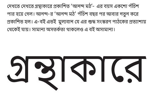
Making oneself fluent with the way the script is written is the key to these attributes. Understanding the traditional tools used to write a script and the technique of writing can lead to many ideas while designing a typeface for a script. The tool creates a unique pattern in the written text. Through the years readers develop a strong visual familiarity with this pattern, which informs their relationship with typefaces. For instance, the presence of the calligraphic ‘blob’ is a unique characteristic of Bengali typefaces, which influences the typographic texture in a distinctive way. It is quite a challenge to remove or alter this blob and yet retain the characteristics of the script.
Display typefaces are another story altogether. Sign-painted letterforms have inspired display typefaces without the blob that look perfect as a family. But as far as readability is concerned, especially for a newspaper or a magazine, setting long text without the blob remains questionable. And mixing letterforms with and without the blob in a family would look strange, too, like mixing Latin serifs and sans serifs in the same paragraph.
Having said that, there is huge scope for exploration within the typographic ‘elements’ of Indian scripts by questioning the traditional usage, and yet retaining their functionality. Besides history, observing local sign-painted letterforms can inspire us.
Pascal Zoghbi: I can be very brief: experience, practice, calligraphic understanding, professional type design education and creativity are all essential.
Kamal Mansour: I think the pitfalls are the same for Latin and non-Latin scripts. It just happens that Latin script is the most diffused around the world and appears in a broad variety of styles, allowing designers from all around the world to ingest and absorb its logic, spirit, proportions and aesthetic foundations. Moreover, Latin is a relatively small alphabet that is comparatively simple in structure. Scripts of higher complexity will naturally require more time and effort to learn.
Nonetheless, the primary pitfall in approaching a new script is the presumption of sufficient knowledge of the script. Learning a new language from one speaker of that language, one might absorb unusual speech patterns particular to the teacher. To speak a language well, one needs broad exposure to multiple speakers, in order to distinguish the common from the peculiar. Similarly, designing for a particular script requires visual immersion in a variety of styles and applications. The designer must understand what is common among a variety of seemingly contradictory styles in order to internalise the ‘kernel’ of the script.
Sufficient immersion, with an eye to a variety of styles and contexts, results in an understanding of the look and feel of a typeface within its native culture. Is it formal or casual? What impression does it leave on the reader? There’s no fixed formula for gaining such visual maturity, but it definitely requires a childlike openness and humility to learning something new. During the initial learning stage, it is most useful to have access to a mentor who is willing to discuss new designs and give advice. Once all the necessary elements are present for such immersion, the results will then vary by natural talent and experience.
John Hudson: I regularly see designers who produce refined and sophisticated Latin types struggling with even basic proportions in non-Latin types. They have a feel for the relationship of counter width between ‘m’ and ‘n’, but not for that between, say, the Cyrillic ‘п’ and ‘ш’. It takes a long time to develop that kind of feeling for a new script, and this is where expert advice can be most helpful. I have been designing Cyrillic type for fifteen years, and my adviser, Maxim Zhukov, is still able to suggest refinements and improvements to proportions.
The particular shape of a graphical sign, or the treatment of certain terminals, or the arrangement of thick and thin stroke modulation, are characteristic of specific styles or idioms. We know this with regard to Latin typeface design, and we don’t mix characteristics of Didot types with those of Aldine types, because we know the result will look like Frankenstein’s monster. But often designers approach another script without understanding the particularities of different styles, so they will tend to take interesting shapes they have seen in different specimens and mix them together.
Now, hybridisation can be a source of innovation and of exciting new designs, but you have to know what you’re doing and why it might or might not work for users of the script. A writing system is a culture: it has a history and, most often, a living community. It is not a playground.
Gerry Leonidas: Will the expansion of non-Latin typefaces make us re-evaluate the skills and knowledge required to be a typeface designer?
Kamal Mansour: Designing scripts outside one’s native expertise is definitely a challenge. It requires a deep understanding of the functionality of a foreign script along with its letterforms. More and more, fonts for complex scripts, or even simple scripts with rich OpenType features, require a team of people. A few highly gifted people are able to handle all the necessary tasks, but most designers will need to collaborate with others in bringing a new typeface to light.
Neelakash Kshetrimayum: As globalised brands drive translation into local languages and scripts, the future almost certainly lies in multi-script typeface design. There will be more collaborative projects, where the understanding of the local scripts is shared. And understanding different scripts will not only help one become an efficient designer, it will also provide new ideas and concepts for designing typefaces.
For example, a thorough understanding of the roots of Latin and Devanagari scripts – the stroke movements, their stresses, etc. – makes it easier to make them work well together. This does not necessarily mean that they should look the same, but rather, that the elements must complement each other and work in harmony. At the moment, many typefaces that extend across scripts show signs of the Latin influencing the non-Latin script.
Pascal Zoghbi: Today’s type designers need to combine technical skills with craftsmanship. This requires an understanding of the calligraphic roots of the script and the design problems of multilingual typography; the creativity to translate traditional scripts into modern typefaces; and a mastery of font production and the latest developments in technology.
John Hudson: This is the only kind of type design I know!
Gerry Leonidas: Are conditions maturing towards a good level of typographic support for the majority of complex scripts?
John Hudson: We’re getting there, but with the caveat that a ‘good’ level of typographic support does not imply an equal level, let alone universal excellence. Some scripts work extremely well in the OpenType Layout model, while others end up limited by it. The best example may be Arabic, where we have DecoType’s ACE [Arabic Calligraphic Engine] model against which to compare functionality. In that comparison, the OpenType Layout architecture comes up short in a number of areas. So I would say that OpenType provides a better-than-minimal level of typographic support for writing systems generally, but not necessarily the best support for a particular writing system.
Pascal Zoghbi: The level of Arabic typography and typesetting has recently increased considerably with modern technology, specifically InDesign ME with the Tasmeem plug-in, OpenType fonts with rich features and, gradually, OpenType support in Web fonts.
Neelakash Kshetrimayum: With the advent of OpenType, the quality of typographic expression certainly has been improved. However these new features can only be realised when publishers, designers and editors are well informed about the tools and their possibilities.
Kamal Mansour: In the past five years we have experienced a wave of new developments led by browsers and Web-based software. The ability to provide a Web-served font on a website has handed back the control over display to the provider. For instance, if you have an up-to-date browser, wherever you happen to be viewing the BBC World Service Arabic site, you will see the typeface they have provided for it. Just a handful of years ago, such control would have been unthinkable.
Conclusion by Gerry Leonidas
It is encouraging to see certain themes emerge with some consistency in this discussion: the need for an understanding of the historical development of a script, especially with regard to the tools used for writing it; the relationship between calligraphy and writing, which in many scripts are disciplines with considerable overlap; and the need to consider more prominently the typesetting environment, and especially the limitations it may have imposed on the design of a typeface.
We have also identified a key distinction between graphic design, which relies primarily on form-making skills, and typeface design, which is arguably the quintessentially research-based facet of communication design. An engagement with the history of a script, the technology of typesetting, and the development of design for texts are central to achieving high quality in practice.
Zoghbi and Kshetrimayum are graduates of the two longest-running postgraduate programmes in typeface design, but there is a growing number of dedicated typeface design courses beyond Reading and The Hague, most notably in Mexico and Argentina. Apart from accelerating the careers of their graduates, most of these institutions are actively contributing to research and publication. At the Open Educational Resources for Typography project led by professors from the University of Buenos Aires, for example, staff and students write about their practice as well as the research that goes into successful typefaces, building up a body of reference that allows other students, researchers and professionals to advance their work without covering the same ground.
A gradual redefinition of the type professional means we increasingly see typeface designers who read research, appreciate a wider context and contribute in their turn through research-informed practice. At the same time, echoing the old manufacturing environment, there is growing collaboration between designers: teams sharing work on a single family, to cover the required scripts as much as to meet the deadlines. Publishers are developing concrete identities for their font libraries, differentiating through target audiences and uses. And we have seen new foundries and spin-offs dedicated to non-Latin typefaces, as well as designers substantially building their careers on specific scripts.
Can we hazard a guess for the next twenty years? It is safe to assume that regions that are now emerging on to the global type scene, such as India, the Middle East and Thailand, will grow their own confident, outward-looking design communities. Similarly, countries that have been relatively isolated typographically, such as Armenia and Cambodia, will make more of a mark internationally. Access to scholarship and the expansion of formal education will remove a lot of the uncertainty of self-guided learning but will also raise the entry level for new career designers.
There is, however, one area in which I fear we will still not have made much progress: describing the global majority of scripts by a negative reference to a minority. Is it not time for ‘non-Latin’ to die as a term?
Sarkar. Design: Fiona Ross, Tim Holloway, Neelakash Kshetrimayum and John Hudson for Ananda Bazar Patrika, 2012.
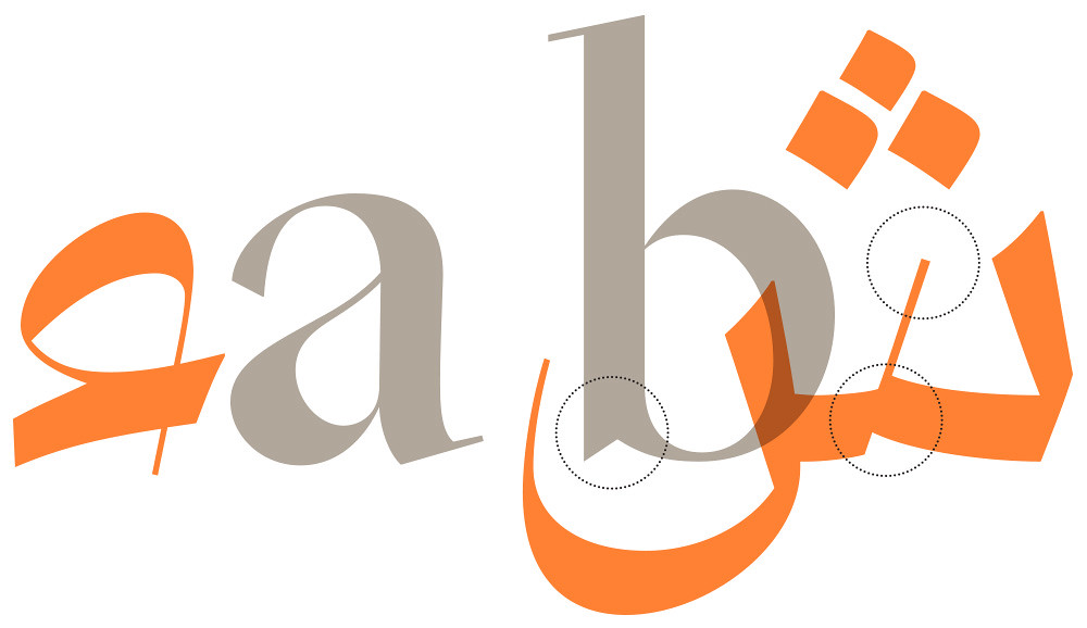
Top: Detail of 29LT Zeyn type anatomy from p.89. Design: Pascal Zoghbi of 29Letters and Ian Party of Swiss Typefaces.
29LT Zeyn is a contemporary typeface family designed by Pascal Zoghbi of 29Letters (29LT) and Ian Party of Swiss Typefaces, in which the Arabic and Latin letterforms were created simultaneously. Its name is taken from an Arabic word meaning ‘beautiful, graceful and elegant’.
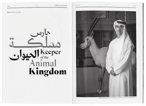
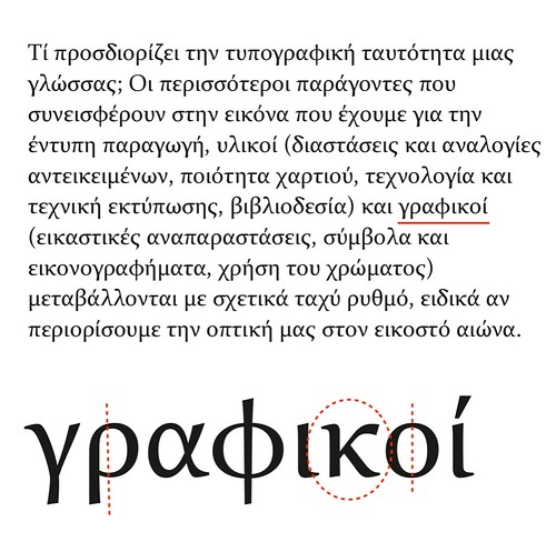
Constantia Greek. Design: John Hudson, 2003.
Constantia is one of Microsoft’s original typefaces, developed specifically for the ClearType rendering technology and shipped with Office 2007.
Gerry Leonidas, associate professor, University of Reading
John Hudson, type-maker, co-founder of Tiro Typeworks, Gabriola Island BC, Canada
Neelakash Kshetrimayum, type and graphic designer, New Delhi, India
Kamal Mansour, linguistic typographer, Monotype, Los Altos CA, US
Pascal Zoghbi, type designer, Beirut, Lebanon
First published in Eye no. 90 vol. 23, 2015
Eye is the world’s most beautiful and collectable graphic design journal, published quarterly for professional designers, students and anyone interested in critical, informed writing about graphic design and visual culture. It is available from all good design bookshops and online at the Eye shop, where you can buy subscriptions, back issues and single copies of the latest issue. You can see what Eye 90 looks like at Eye before You Buy on Vimeo.

