
Autumn 2021
Global type tour
‘Typographics 21’ was a ten-session, online journey that covered type and lettering from around the world – but with the explicit exclusion of Europe and North America. By Gerry Leonidas
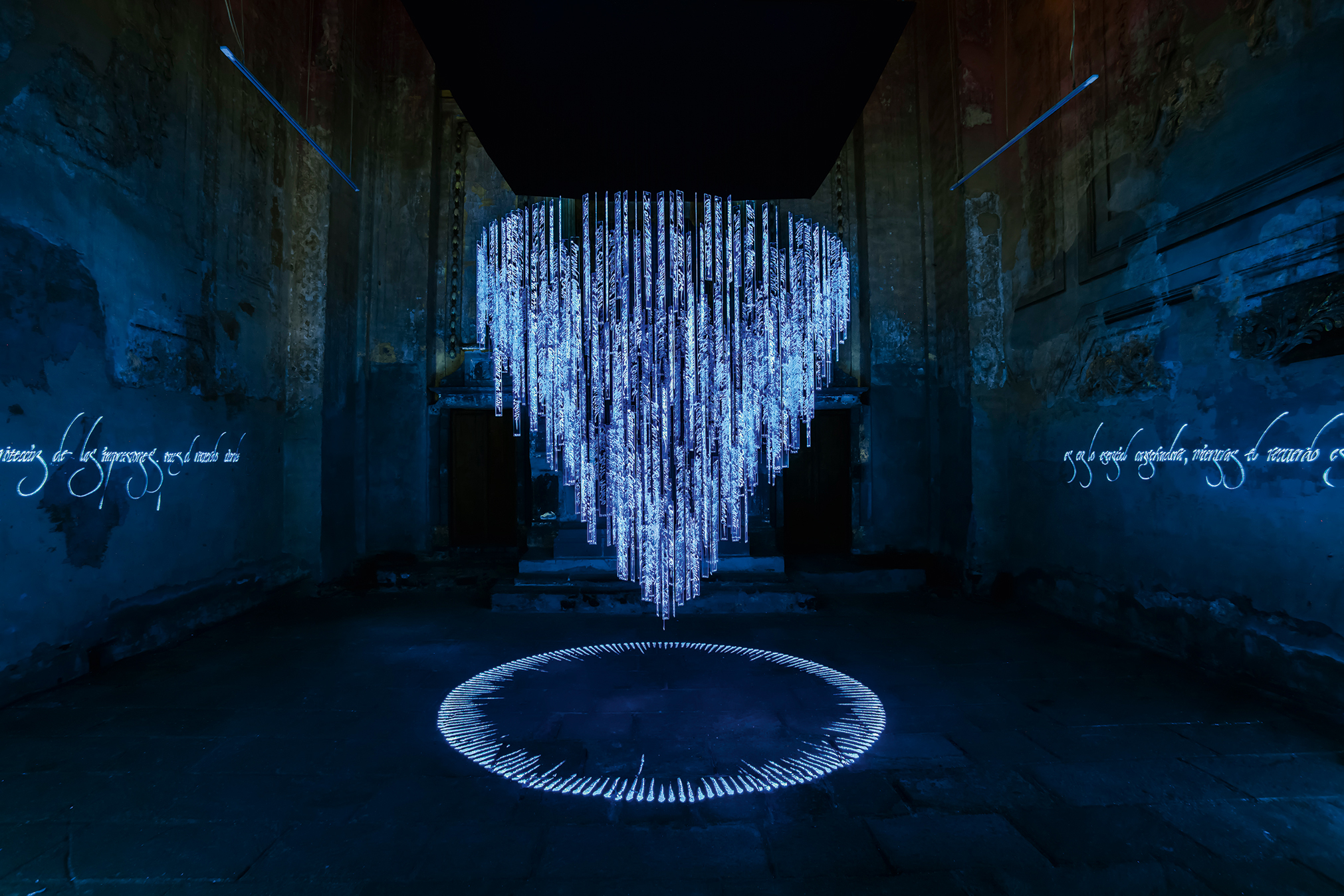
Apariciones, 2012-13, an installation by Said Dokins comprising 580 acrylic plates inscribed with the names of the political disappeared in Mexico from 1972 to 1998 – the inscriptions appear and disappear, depending on the intensity of the ultraviolet rays.
From its inception the team behind the annual ‘Typographics’ conference at Cooper Union in New York set themselves an expansive brief, aiming to be actively inclusive in terms of scope and speaker selection. However, the constraints of a US-based event made the event a large but somewhat awkward presence in a dense type calendar.
Happily, the move to online delivery made necessary by the pandemic has elevated the event to its natural space: a festival that can aim to be genuinely inclusive, ignore geographic limitations (and visa requirements), and attempt to balance time zones to enable global participation. The inclusion of ‘regional awareness’ sessions is a natural fit for this format, and makes good on intentions that ‘Typographics’ and other events have been working on for years, but with success limited by the assumption of in-person presence.
As for the dominance of English as a delivery language: while reliable real-time translation is the gold standard, those with an awareness of educational and employment environments at a global scale will not be offended. Most professional communities in Europe, the Middle East and Africa (EMEA) and Asia are mostly bilingual – as many speakers in the series demonstrated.
Having said that, the welcome increase in the number of speakers presenting in native languages foregrounds a fundamental bias in the platforms we use: while recent improvements in automatic captioning could provide a rough draft for volunteer-led translation, this is not available by default.
Beyond the specific projects showcased, the presentations point to a generation of emerging designers who defy easy categorisations along national, professional, location- or language-based trajectories. They bring considerable reflection to their work, with sensitivity to the complexity of their contexts. This ‘identity viscosity’ (to paraphrase Julian Baggini) is not only a characteristic of our field, but a source of inspiration and innovation, and one where easy assumptions and simple models fail to explain the diversity of our thinking and making.
Gerry Leonidas, professor of typography, University of Reading
Session 1
Reviewed by Elena Veguillas
Session 2
Reviewed by Anoushka Khandwala
Session 3
Reviewed by Ferdinand P. Ulrich
Session 4
Reviewed by Stephen Banham
Session 5
Reviewed by Indra Kupferschmid
Session 6
Reviewed by Ferdinand P. Ulrich
Session 7
Reviewed by Anoushka Khandwala
Session 8
Reviewed by Montserrat Miranda Ayejes
Session 9
Reviewed by Saki Mafundikwa
Session 10
Reviewed by Gerry Leonidas
---
Eye was a media sponsor of Typographics 21. Full details and YouTube video links to all ten sessions can be found at 2021.typographics.com/conference/
First published in Eye no. 102 vol. 26, 2021
Eye is the world’s most beautiful and collectable graphic design journal, published for professional designers, students and anyone interested in critical, informed writing about graphic design and visual culture. It is available from all good design bookshops and online at the Eye shop, where you can buy subscriptions and single issues.