Summer 2017
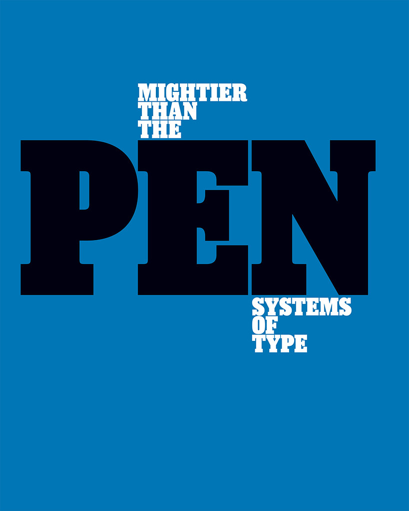
Mightier than the pen: systems of type

There’s more to type than head and hand. In their different ways, MuirMcNeil’s parametric designs, Rudolf Koch’s geometric Kabel (and its revivals) and Mark van Wageningen’s Novo Typo fonts are ‘constructed’ typefaces that challenge calligraphic conventions while celebrating the pleasure of looking. Words by John L. Walters, Madeleine Morley, Gerald Cinamon and Jan Middendorp.
See ‘Pleasure in the process’, ‘Expressive geometry’, ‘Colour is the new black’ in Eye 94.
First published in Eye no. 94 vol. 24, 2017
Eye is the world’s most beautiful and collectable graphic design journal, published quarterly for professional designers, students and anyone interested in critical, informed writing about graphic design and visual culture. It is available from all good design bookshops and online at the Eye shop, where you can buy subscriptions, back issues and single copies of the latest issue. You can see what Eye 94 looks like at Eye before You Buy on Vimeo.

