
Feature
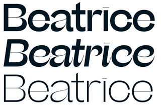
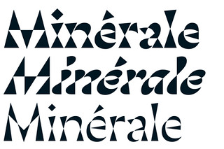
States of independence
The fragmentation of the type market has led to new ways of examining, acquiring and enjoying typefaces … and some confusion
The business of type design
The challenges of earning a living from type design, with honest, thoughtful responses from foundries worldwide
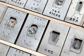
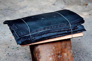
Last man casting
Rainer Gerstenberg is one of the few people in the world to cast foundry type, keeping alive a craft that was developed more than half a millennium ago
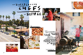
Tales from the West Coast
With its origins in ‘live journalism’ shows, The California Sunday Magazine achieves its narrative power through a cinematic approach to photography and type
The start-up that stopped
Over just ten issues, Peter Biľak’s Works That Work sought to rethink design, while exploring new models of distribution and finance
Surfers and divers
An innovative website tells the story of the Palestinian people in their own words, in two languages
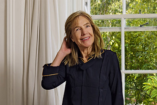
This woman’s work
Kate Hepburn’s design career, embracing pioneering magazines such as Spare Rib and Vole as well as comedy and rock’n’roll, is rooted in rigorous typography
The alternative viewpoint
The magazines in the stable of Jop van Bennekom and Gert Jonkers are as distinctive in their editorial voices as they are in their visual tone and design
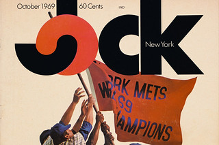
Lovable loser
A daring approach to sports journalism earned the short-lived Jock magazine a place in design history
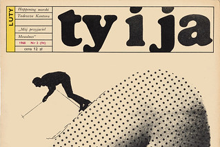
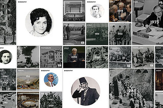
Pulling back the curtain
Published by the Communist Women’s League, Ty i Ja [You and I] was an ambitious 1960s title that brought the outside world to its Polish readers