
Blog: Information design
11 March 2013
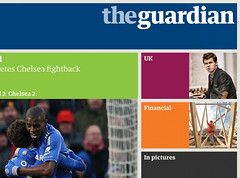
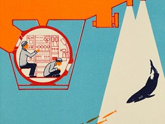
More platforms for editorial design
Art director Mark Porter is the main speaker at ‘The magazine now arriving at platform 15’ at St Bride
The Type Tuesday event at St Bride Library in London is a chance to hear…
24 February 2013

Deadline EDA
Get your skates on! Only a few days left to enter the 2013 European Design Awards
The submission deadline for the 2013 European Design Awards in Belgrade is fast approaching –…
11 February 2013
Noted #49
Scroll down; paper time capsule; Typography Summer School in two cities; design activism at the V&A; Sketchnotes; icons for data
A few objects, images and forthcoming events that caught our attention in recent weeks ……
6 February 2013
Work to make it simple
A review of this year’s Design of Understanding conference by Mark Barratt
‘Stuff that Max Gadney and his friends think is interesting’ would have been a more…
25 January 2013
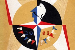
Back when the future looked bright
A printed guide to the 1951 Festival of Britain prompted Nigel Ball to consider the value placed on design by governments – then and now
Not seeing the value of investment in design is a folly of the current British…
22 January 2013

Coming to an Understanding at St Bride
The third annual DoU information design conference takes place in London this Friday
This Friday sees the third annual Design of Understanding conference at St Bride Library in…
15 January 2013

Ladies’ unmentionables
Shelley Gruendler is fascinated by the graphic language of feminine hygiene disposal bags
Twenty years ago, while in my second year at design school, I pilfered my first…
23 December 2012

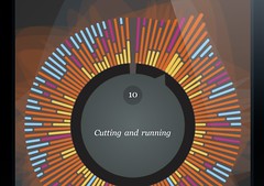
While the city Tweets
Brendan Dawes’s digital portraits visualise data drawn from the online chatter of British city-dwellers
To mark the arrival of the 4G mobile network in eleven cities across the UK…
5 December 2012

Sticky fingers
A new book by Marion Deuchars inspires children to get stuck in and make marks that are truly digital
Marion Deuchars’ Let’s make some great fingerprint art is the latest in her series of…
28 November 2012
Info design for children
The children’s books produced by Isotype combined child-centred focus with technical accuracy, writes Sue Walker
The Max Parrish Colour Books – described as ‘simple and vivid in colour’ in the…