
Friday, 8:00am
13 November 2026
Carnival of logos
Marianne Ashton-Booth
Yas Banks
Stanley Chow
Katy Cowan
Malcolm Garrett
Jessica Lee
Craig Oldham
James Wrigley
John Rooney
Bryan Edmondson
SEA
Holly Catford
Simon Esterson
Amy Henry
Reviews
Type Tuesday
Events and exhibitions
Identity
Type Tuesday North in Manchester brought together eight designers to talk about their favourite logos
‘My
favourite logo’, the
first ever
Type
Tuesday North, took place in the David Crow Lecture Theatre, Lowry
Building, Manchester
School of Art,
Manchester Met on 13 October 2026. The evening followed the format of Eye’s Type Tuesday events at St Bride Printing Library in London, and there
was a
full house, with students, designers and
friends
old and new.
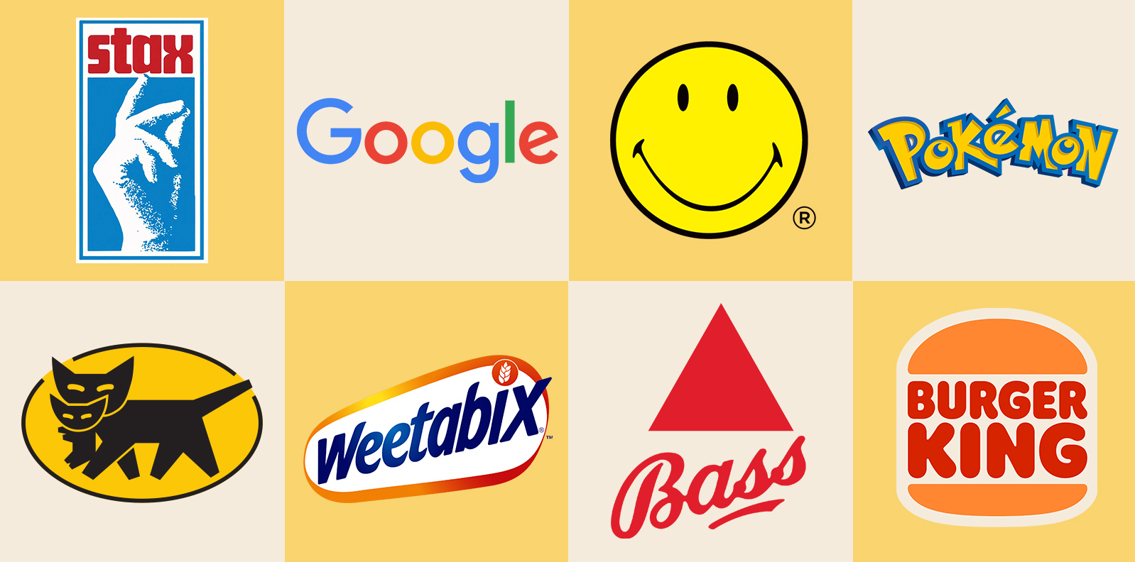
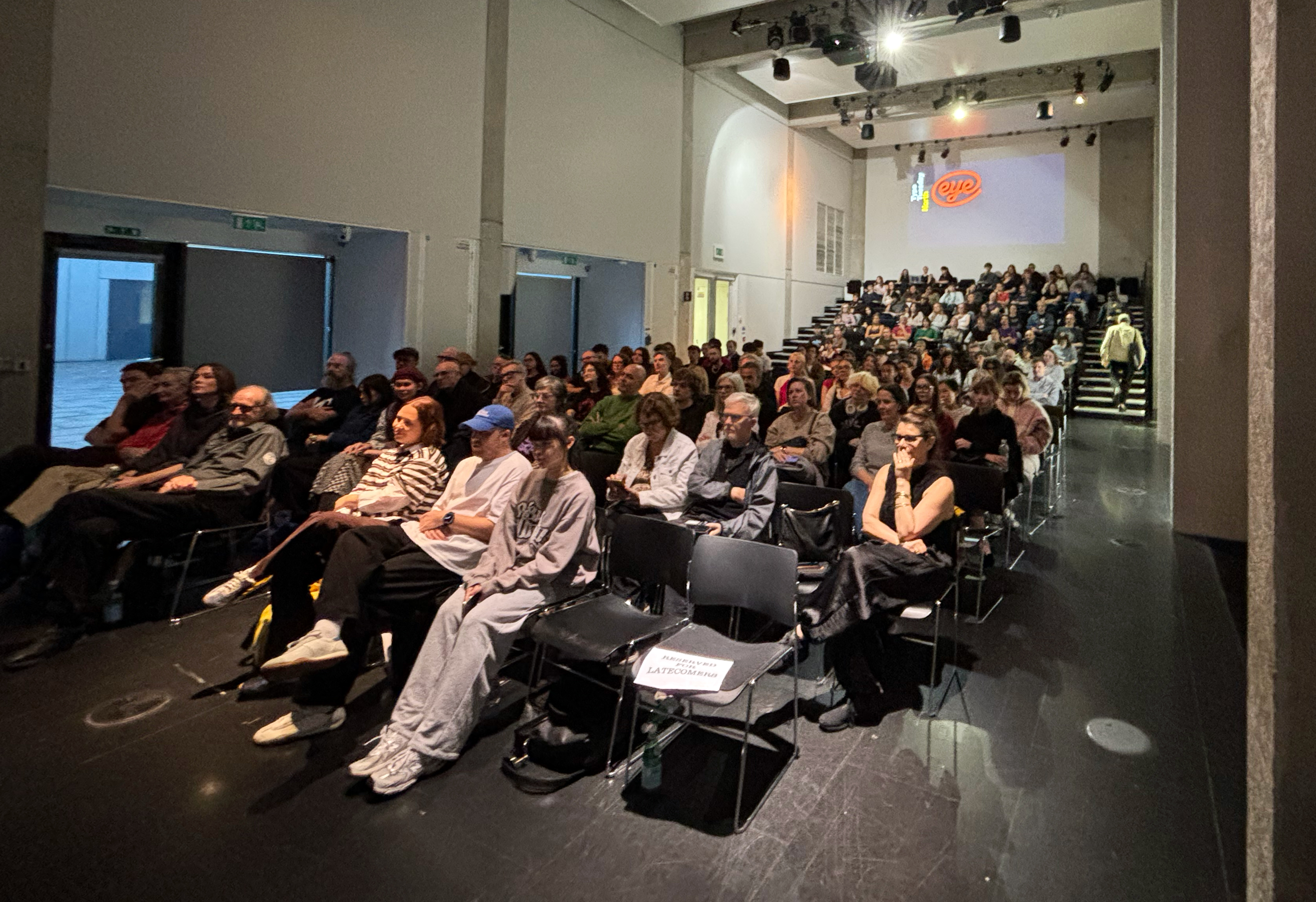
Audience at the David Crow Lecture Theatre. Top. Our panel’s favourite logos. Top row (left to right):Stax, Google, Smiley, Pokémon. Bottom row: Yamato, Weetabix, Bass, Burger King.
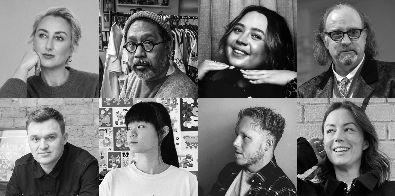
Type Tuesday North speakers, top row (left to right): Marianne Ashton-Booth, Stanley Chow, Yas Banks, Malcolm Garrett. Bottom row: Craig Oldham, Jessica Lee, James Wrigley, Katy Cowan.
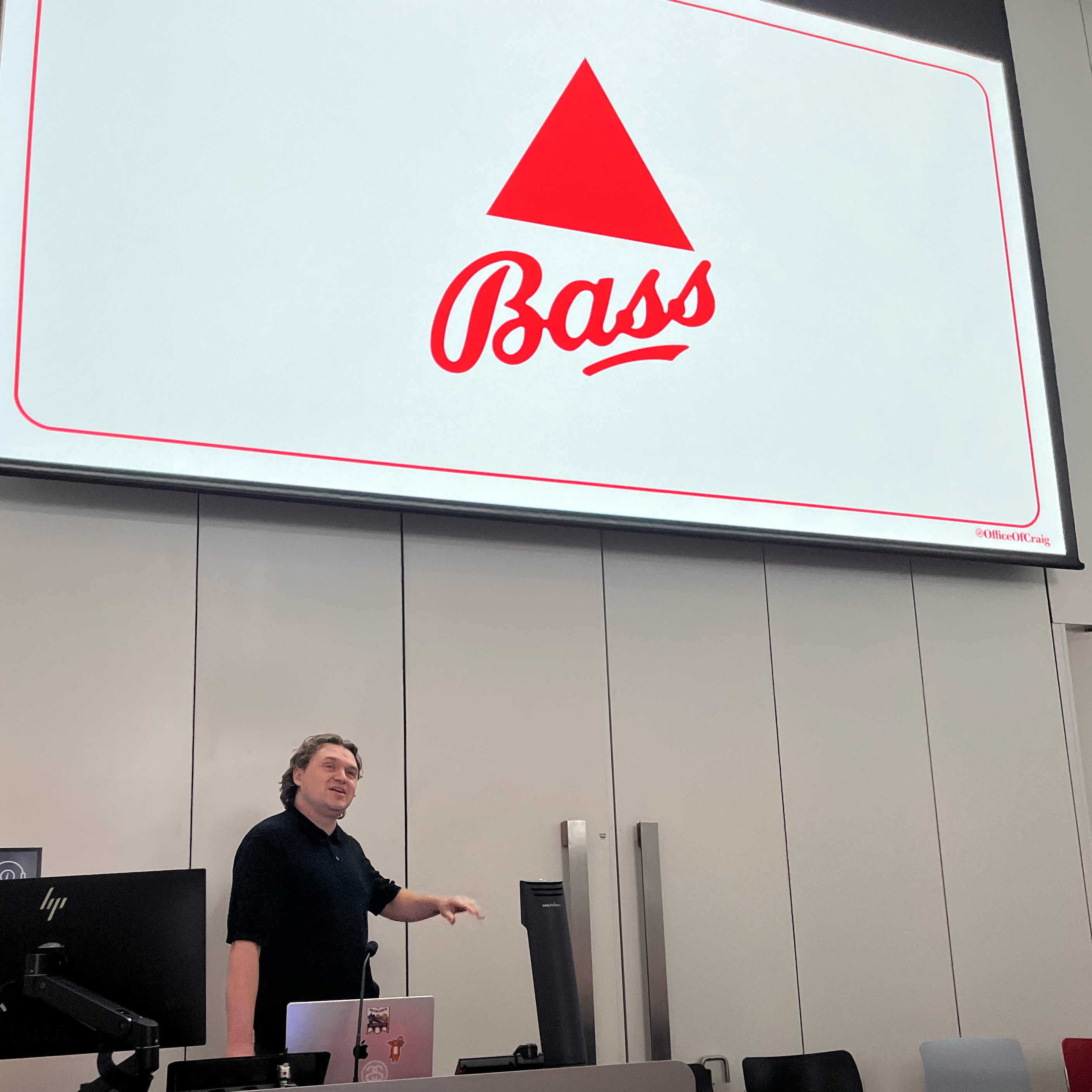
After introductions by John Rooney (Senior Lecturer on Graphic Design at MMU) and Eye editor John L. Walters, the evening began with a presentation from Craig Oldham, whose Office Of Craig is based in Manchester. Oldham took us through the history of the Bass brewery (founded in 1777), explaining that its triangular logo came from the pyramid shapes in which the beer barrels were stacked in the company’s Burton-on-Trent yards.
Slide about competing ‘red triangle’ marques from Oldham’s talk.
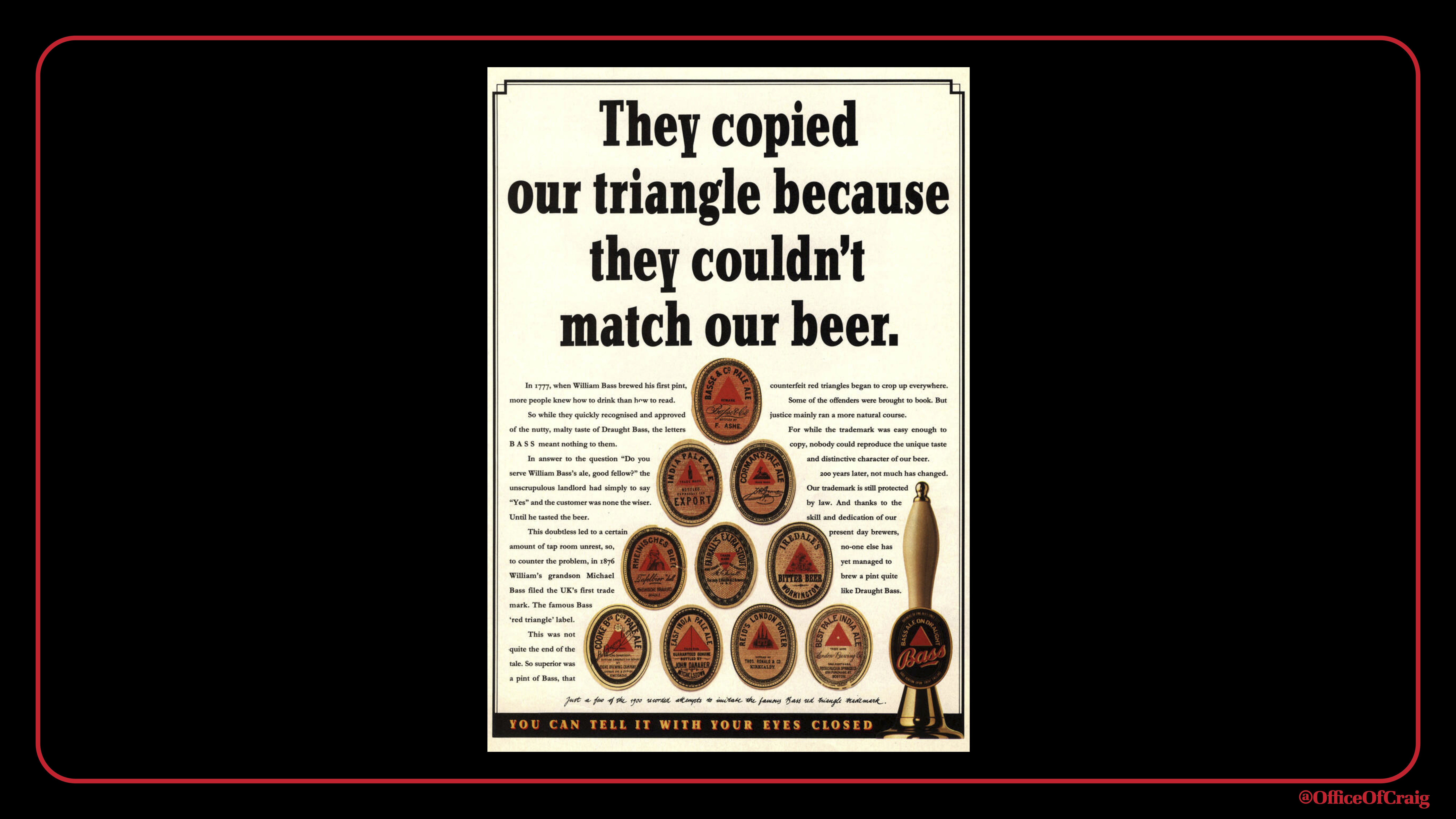
In 1876 the Bass logo became the UK’s first trademark, a legal step that it was obliged to make to prevent rival breweries from copying their marque. Oldham showed how the logo had ‘seeped into’ visual culture through cartoons, literature (Ulysses), ads and art – Picasso and the lower right corner of Manet’s mesmerising A Bar at the Folies-Bergère (1882). British beer was then seen as chic in Paris. For Oldman, the Bass logo is ‘Communication at its finest … no strategy, no marketing plans, no fucking spreadsheets, make a good product, make it recognisable and sell it.’
Craig Oldham and the Bass red triangle.
Jessica Lee and the unchanging Pokémon logo.
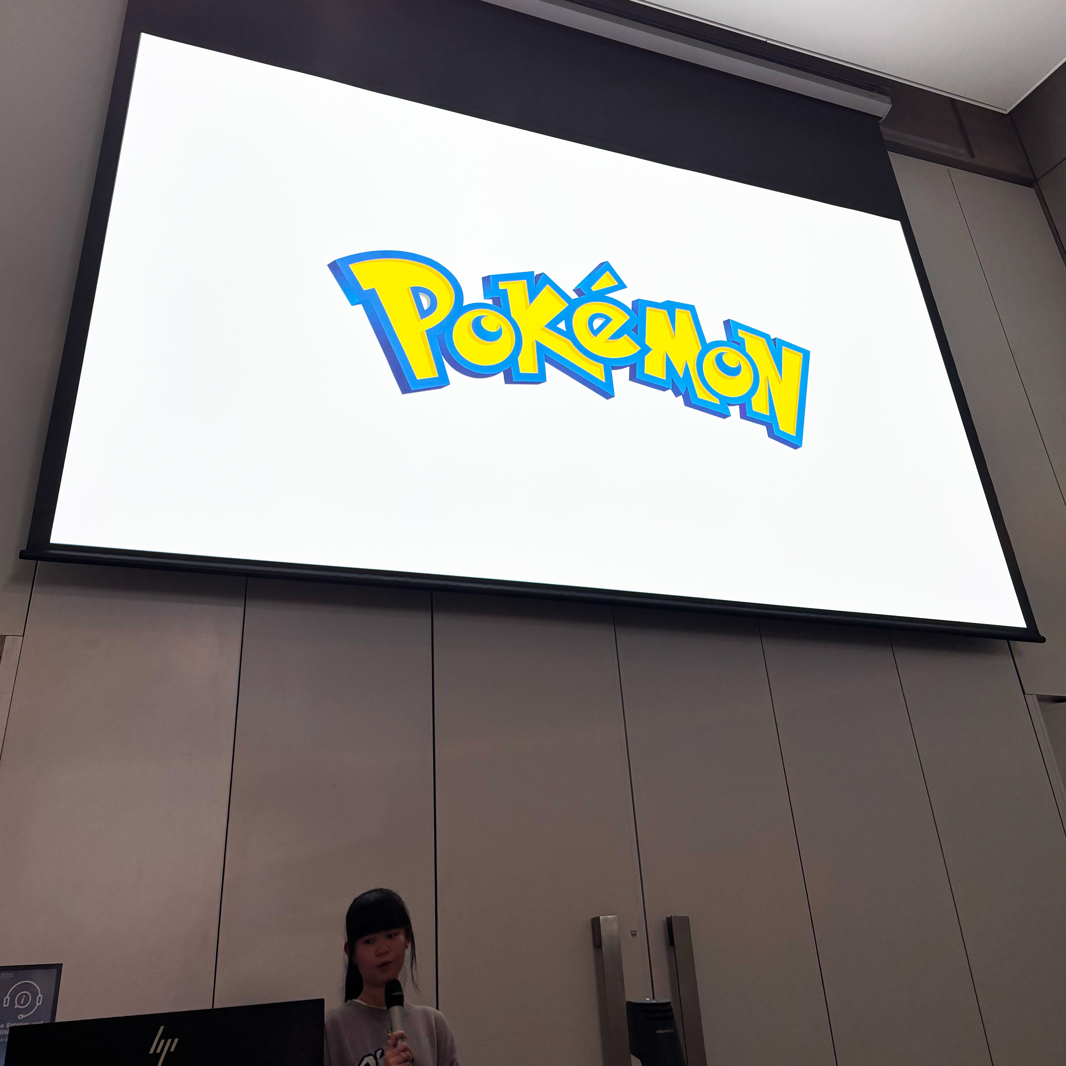
Illustrator Jessica Lee chose Pokémon’s logo as her favourite, and explained that in the late 1990s, Nintendo commissioned a Western adaptation of the game, which originated in Japan. ‘But why is it my favourite logo?’ asked Lee. ‘I was born in 2001, so I wasn’t the generation that traded Pokemon cards on the school playground and I didn’t play video games either, but I was a big collector of things.’ Lee and her brother collected first Crazy Bones and then ‘blind’ packs of Lego mini figures, which she illustrated in her slides.
Cards from Lee’s Pokémon collection.
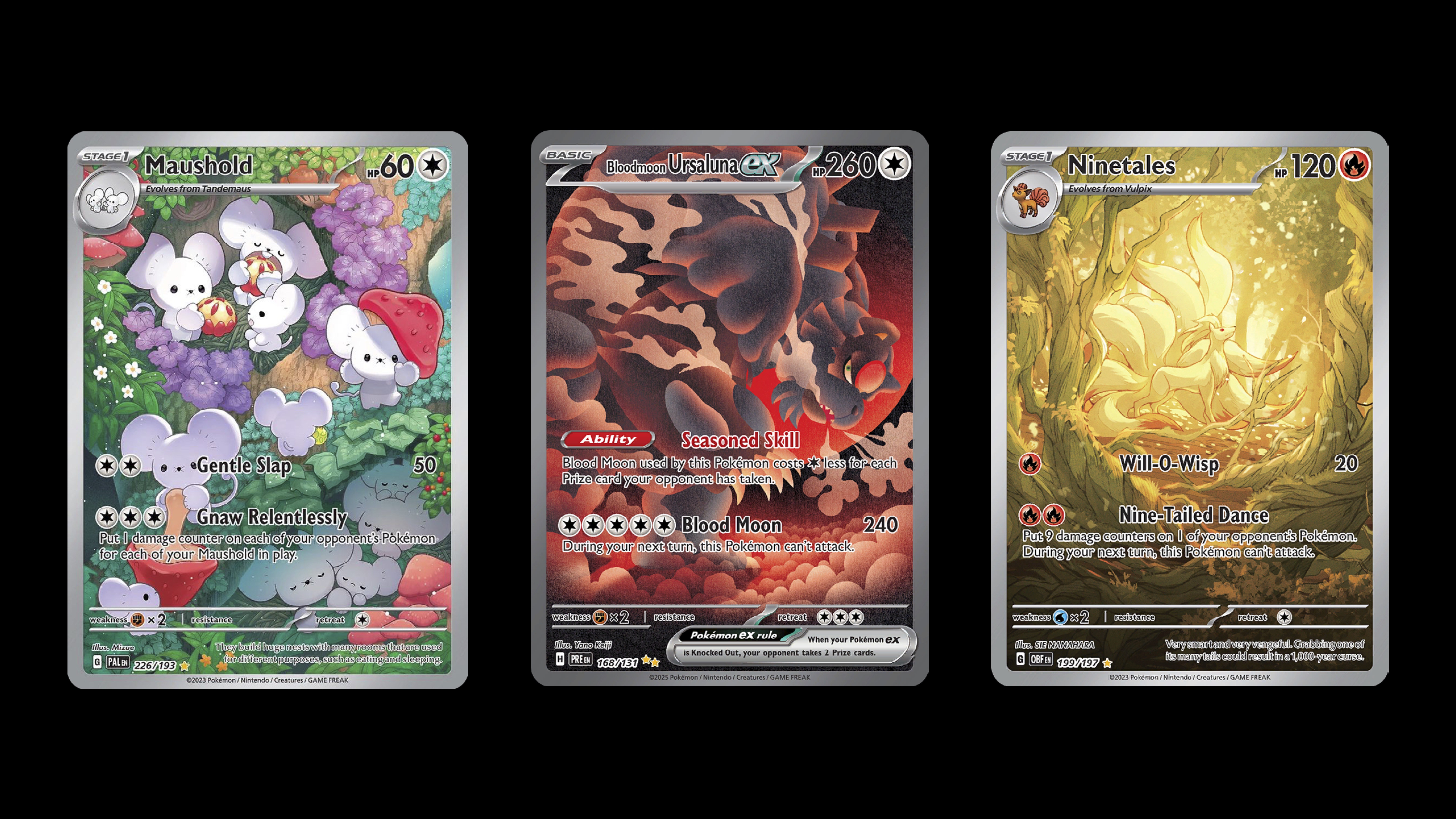
Lee explained that collecting Pokémon trading cards has now become her ‘obsession’, saying: ‘There’s so many beautiful cards to collect and they combine two things that I really love, which is character design and illustration. So I’m just seeing it as collecting artworks.’
Nostalgic Weetabix packaging from Katy Cowan’s presentation.
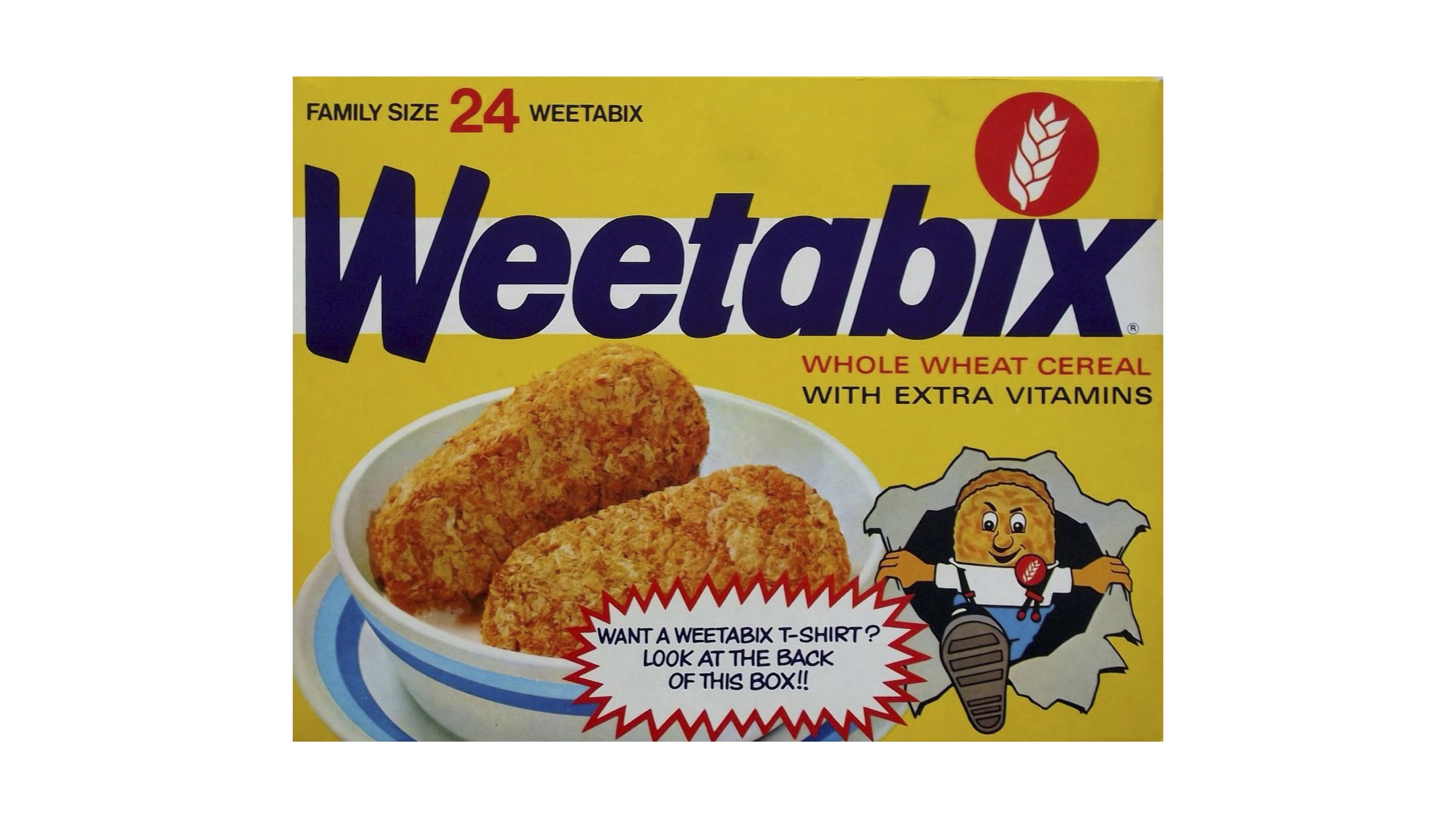
Creativeboom founder and editor Katy Cowan gave an entertaining account of her introduction to design via breakfast cereals, and chose the Weetabix logo as her favourite: ‘It gives me that feel of community … that warmth I always wanted to convey with my own magazine.’ As she grew up Cowan realised that the Weetabix characters were dressed as skinheads, a style sometimes co-opted by the (less lovable) far right.
Weetabix club offers, ca. 1980s, that thrilled the young Katy Cowan.
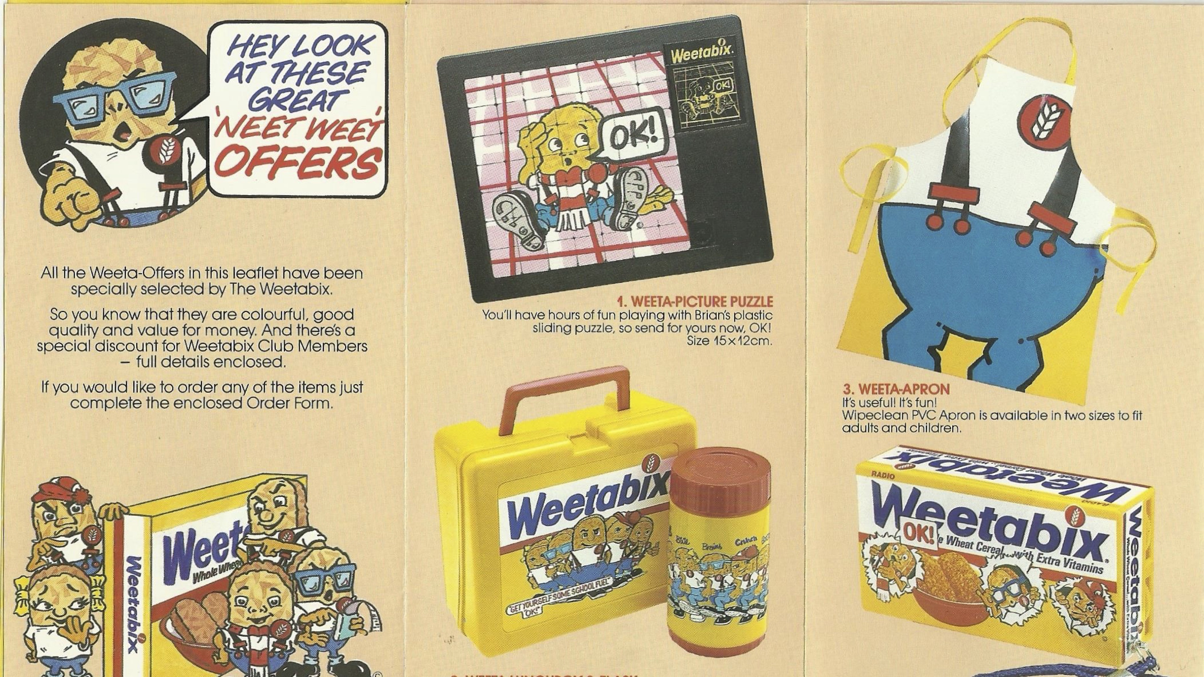
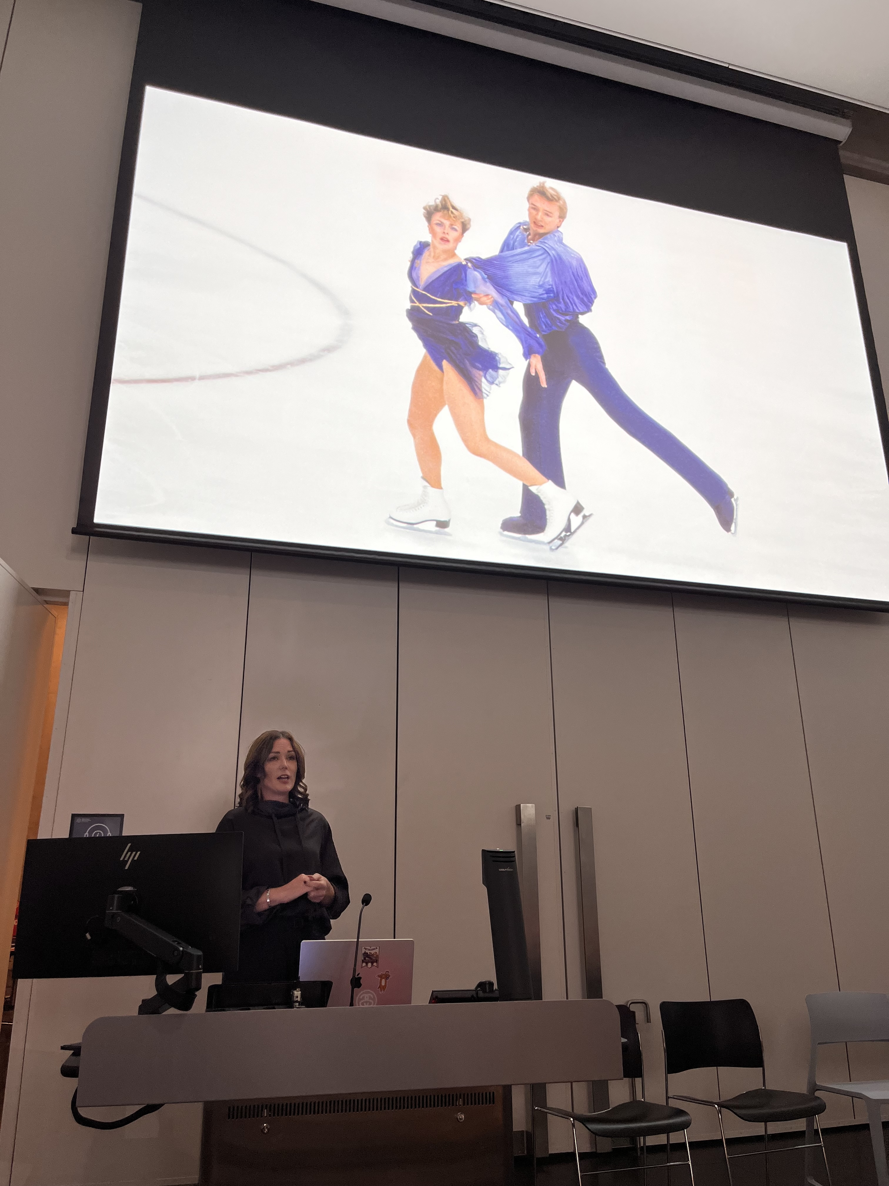
Cowan made a case for the pre-internet sense of belonging, and the fun of joining the Weetabix club with its associated merchandise: Frisbee, a ruler with a calculator, a T-shirt, and she drew connections between Weetabix’s ads and her love of Olympic gold-winning ice skaters Torvill and Dean. ‘A favourite memory how it made you feel, how it made you belong … You look at that and I’m three years old again, going around my living room with my socks and my poncho pretending to be Torvill and Dean.’ Cowan spoke these words while giving a slow twirl in the skaters’ honour.
Katy Cowan at Type Tuesday North with an image of Torvill and Dean.
James Wrigley and Google logo.
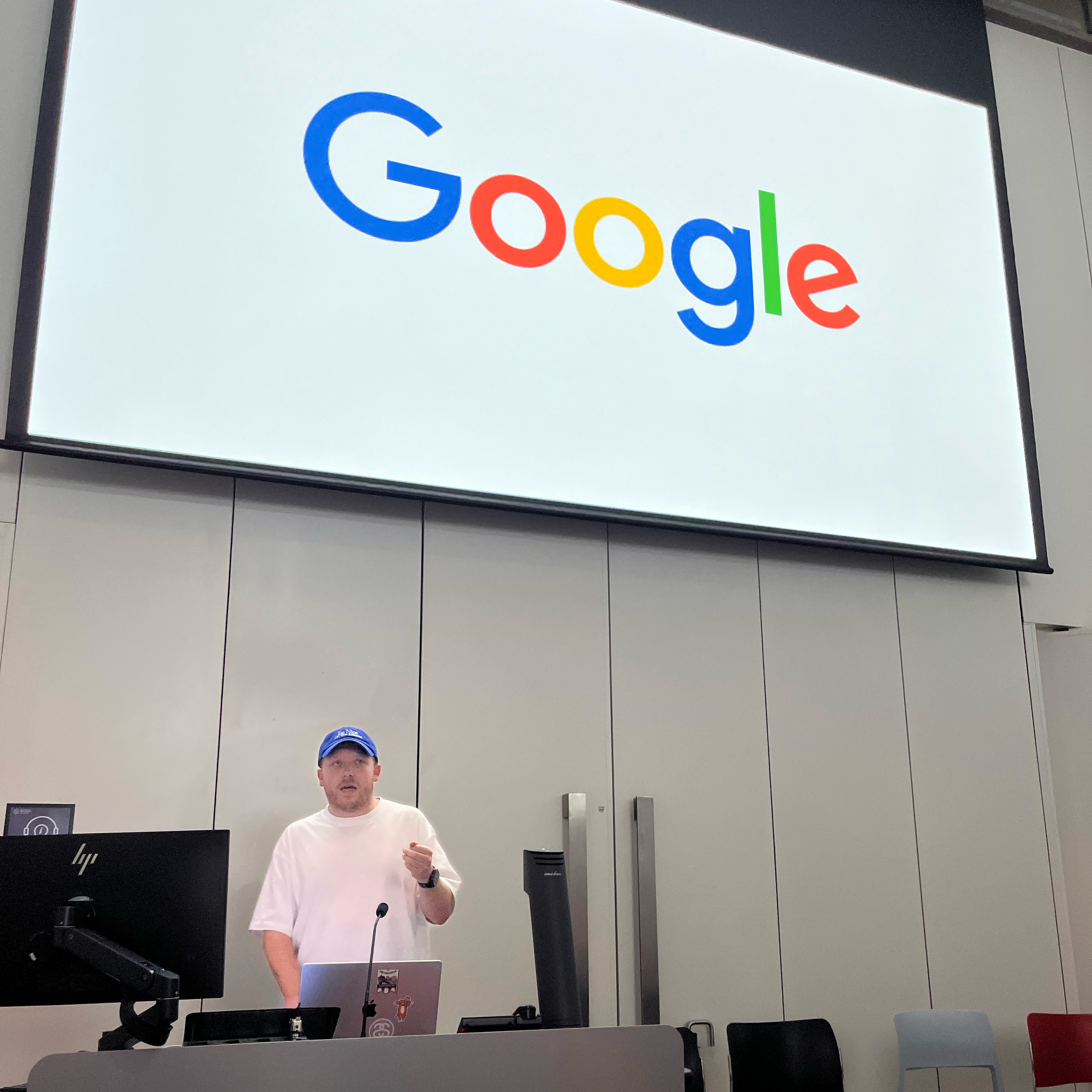
James Wrigley, a creative technologist who also teaches at MMU, began his presentation with a quick run through of famous marques: Herb Lubalin’s Mother & Child; The New York Times; modular MIT logos; multiple MTVs; and the Hillary Clinton 2016 Presidential campaign in the US (see ‘Type on the campaign trail’ on the Eye blog.
Google logo evolution, as shown in Wrigley’s detailed presentation.
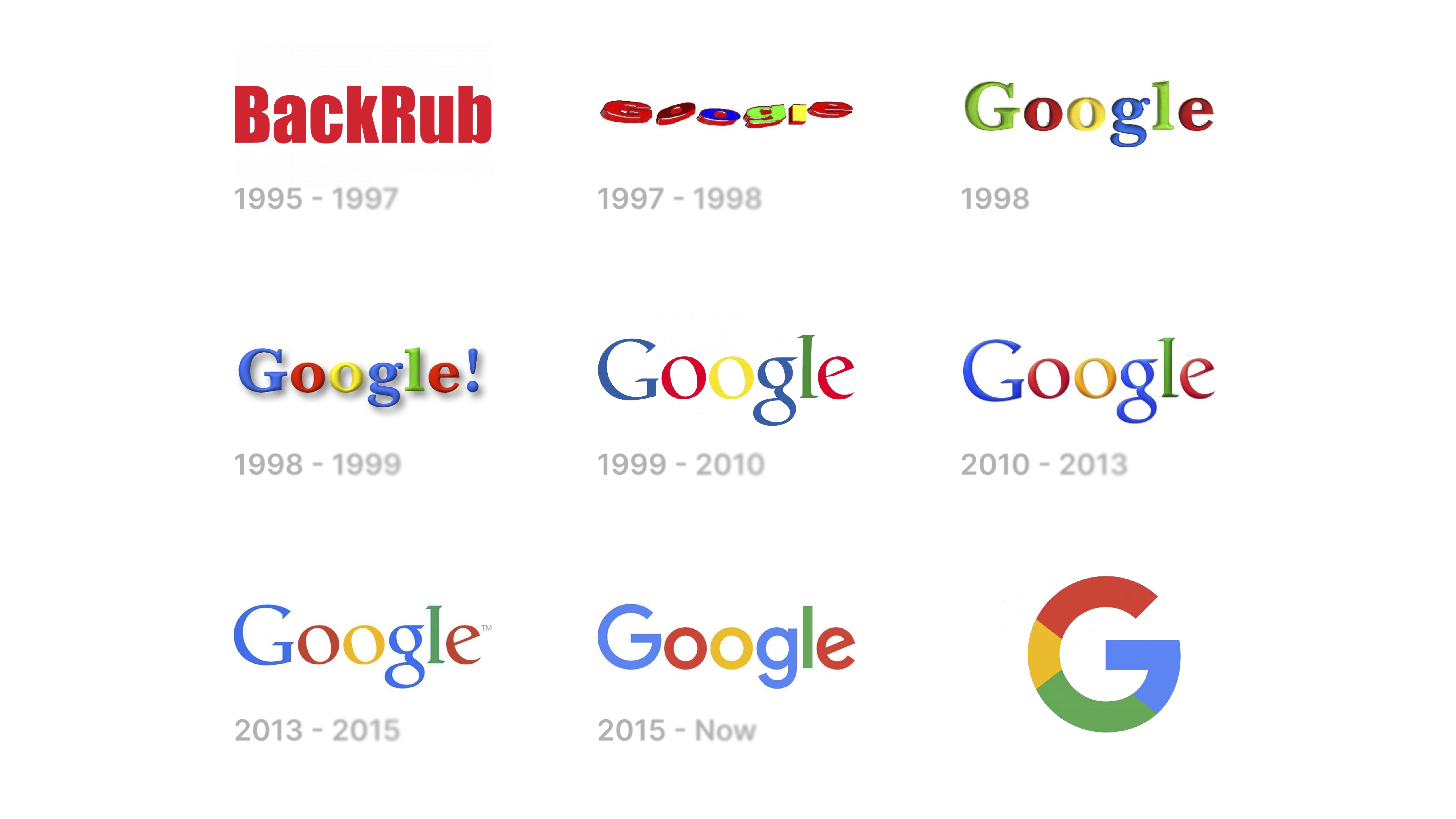
Wrigley’s talk showed that Google began as ‘BackRub’ (1995-97) before evolving through a succession of multicoloured ‘Google’ logotypes, which generally had red and yellow for the double ‘o’ (shades of Weetabix). When the co-founders drew a little doodle for the Burning Man festival, they started a series that ran to around 5000 ‘Google Doodles’.
Google Doodles, also from Wrigley’s presentation.
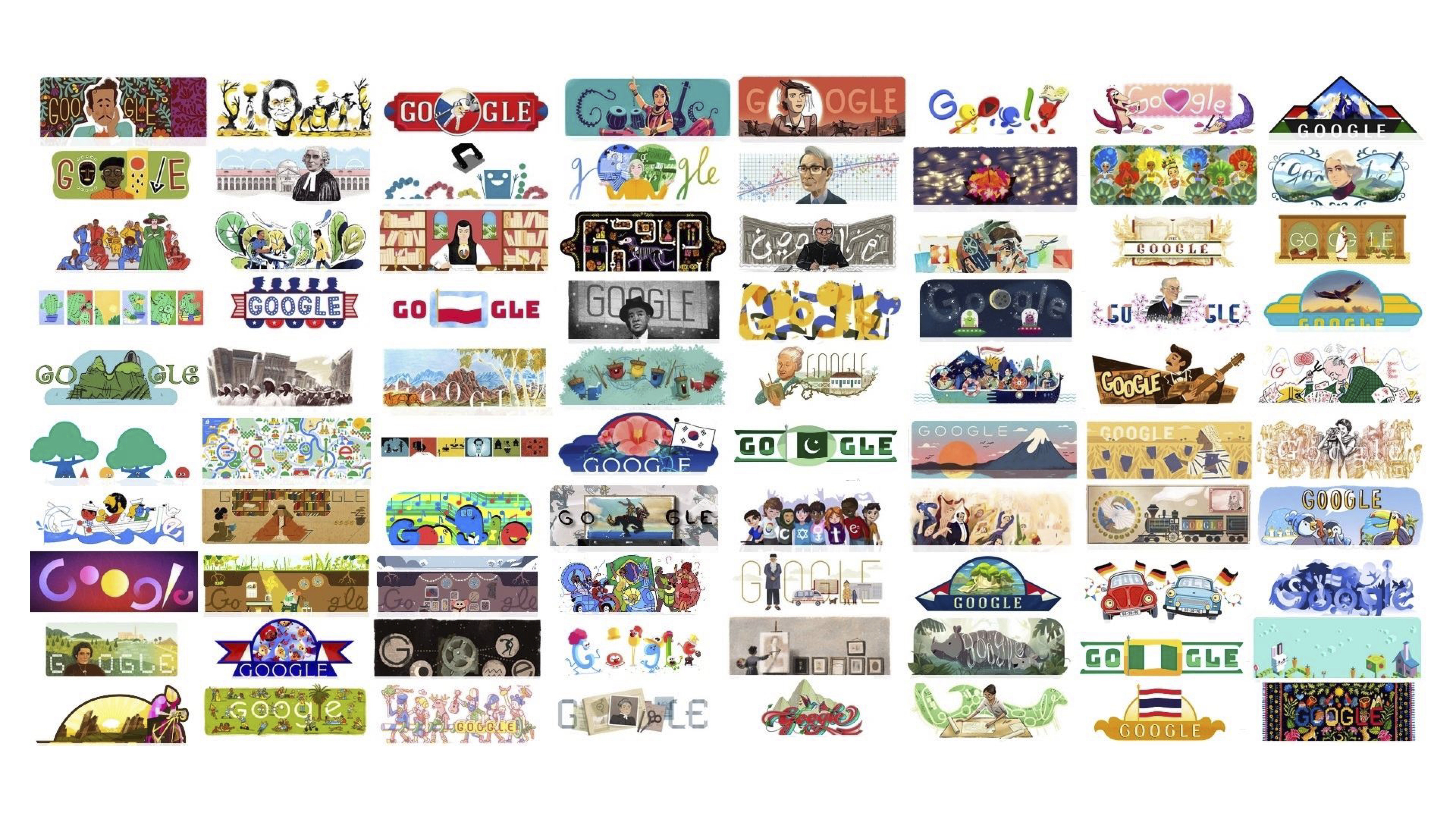
‘It represents going beyond the brand,’ said Wrigley, ‘it’s allowed creatives to pull meaning into the brand … it might not be my all-time favourite logo, but it’s something I respect, which is this idea of bringing stories, communities, and celebration into a logo.’
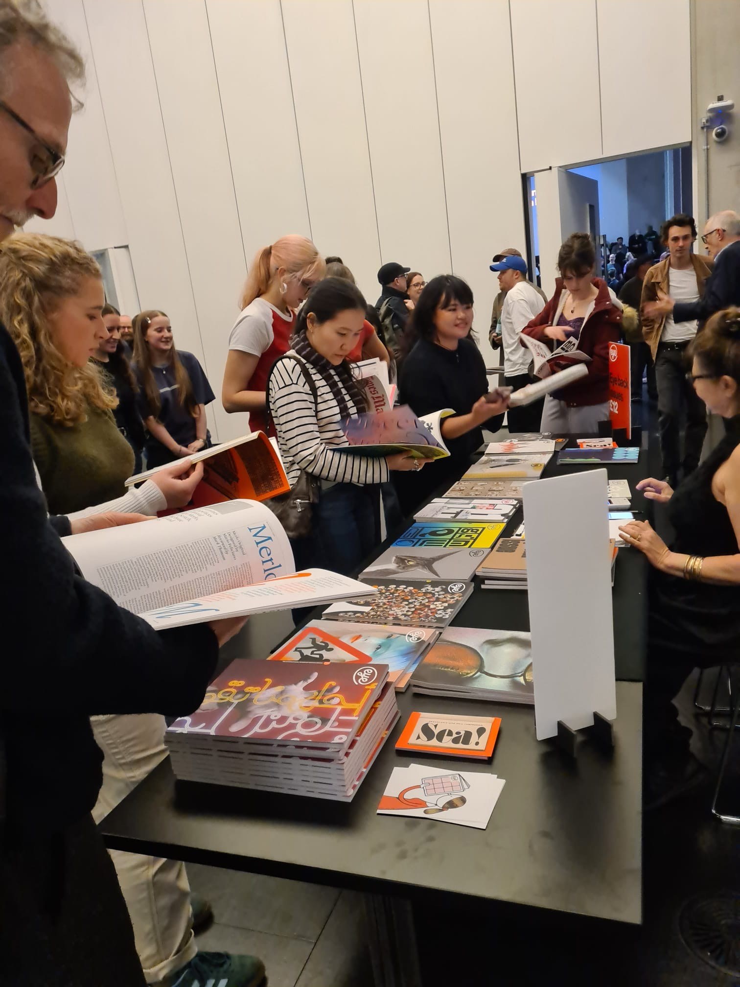
Attendees browse the Eye stall at Type Tuesday North at Manchester Met.
Type Tuesday North Posters designed by SEA, printed by Team Impression on G. F. Smith paper.
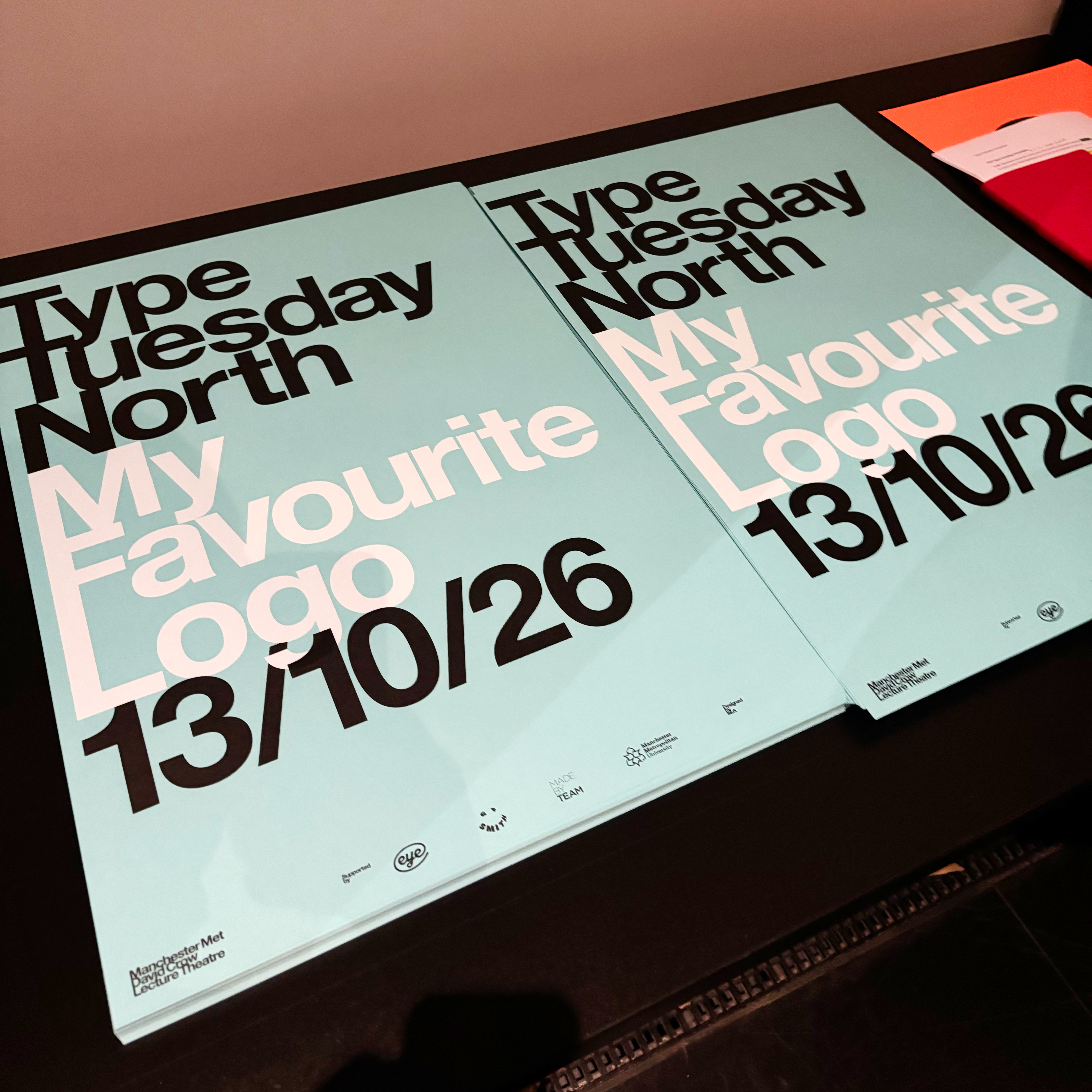
After a short break to chat, browse the back issues on Eye’s display table and collect a souvenir poster designed by SEA, the session resumed with Marianne Ashton-Booth (‘Maz’), head of product design at ITV.
She began with an amusing story about a viewer who mistook the ‘ITVX’ logo for that of an X-rated channel mistakenly installed on his smart TV. ‘From a behavioural science perspective,’ she said, ‘It’s not just the logo, it’s the associations with it.’
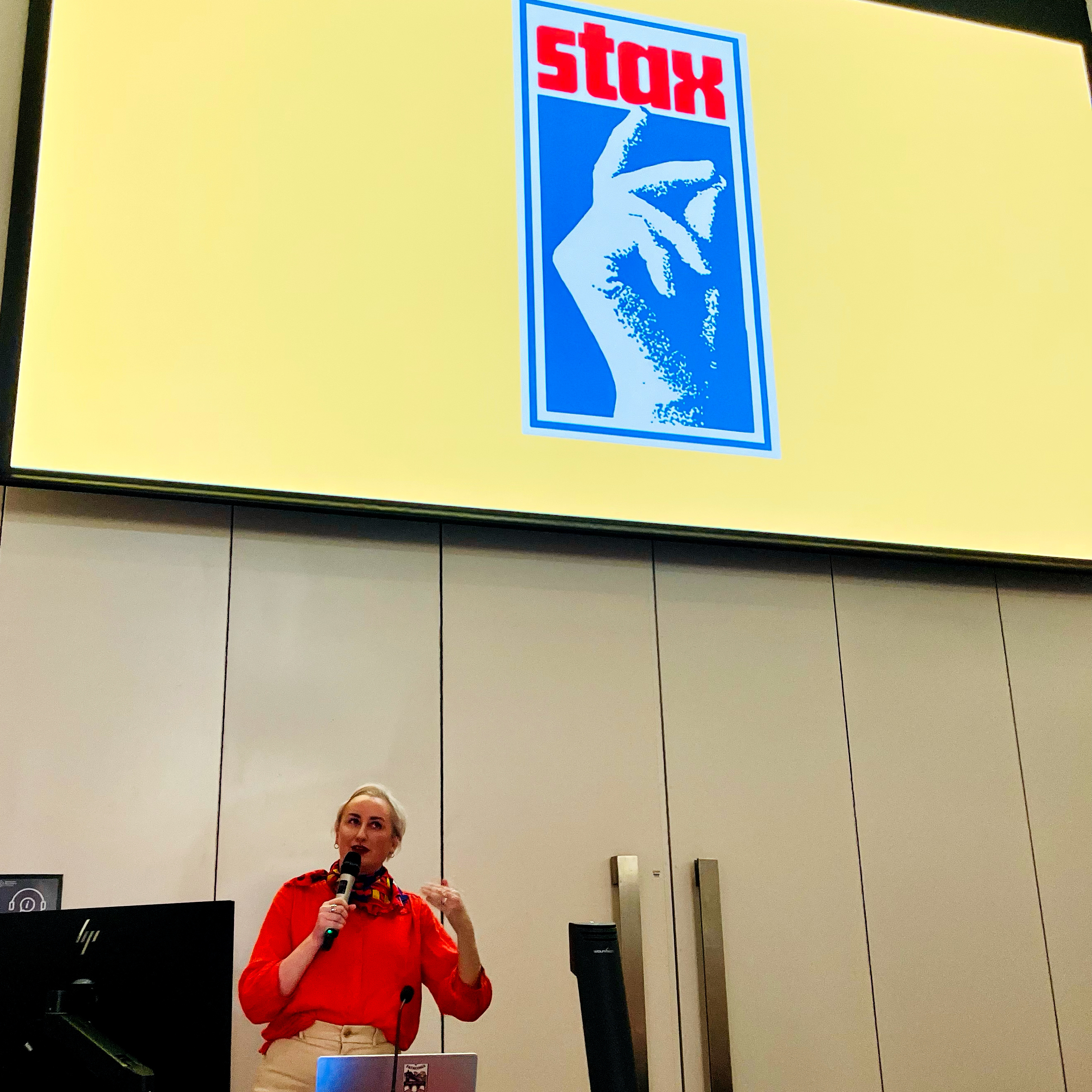
Stax logo, variations on a music label logo.
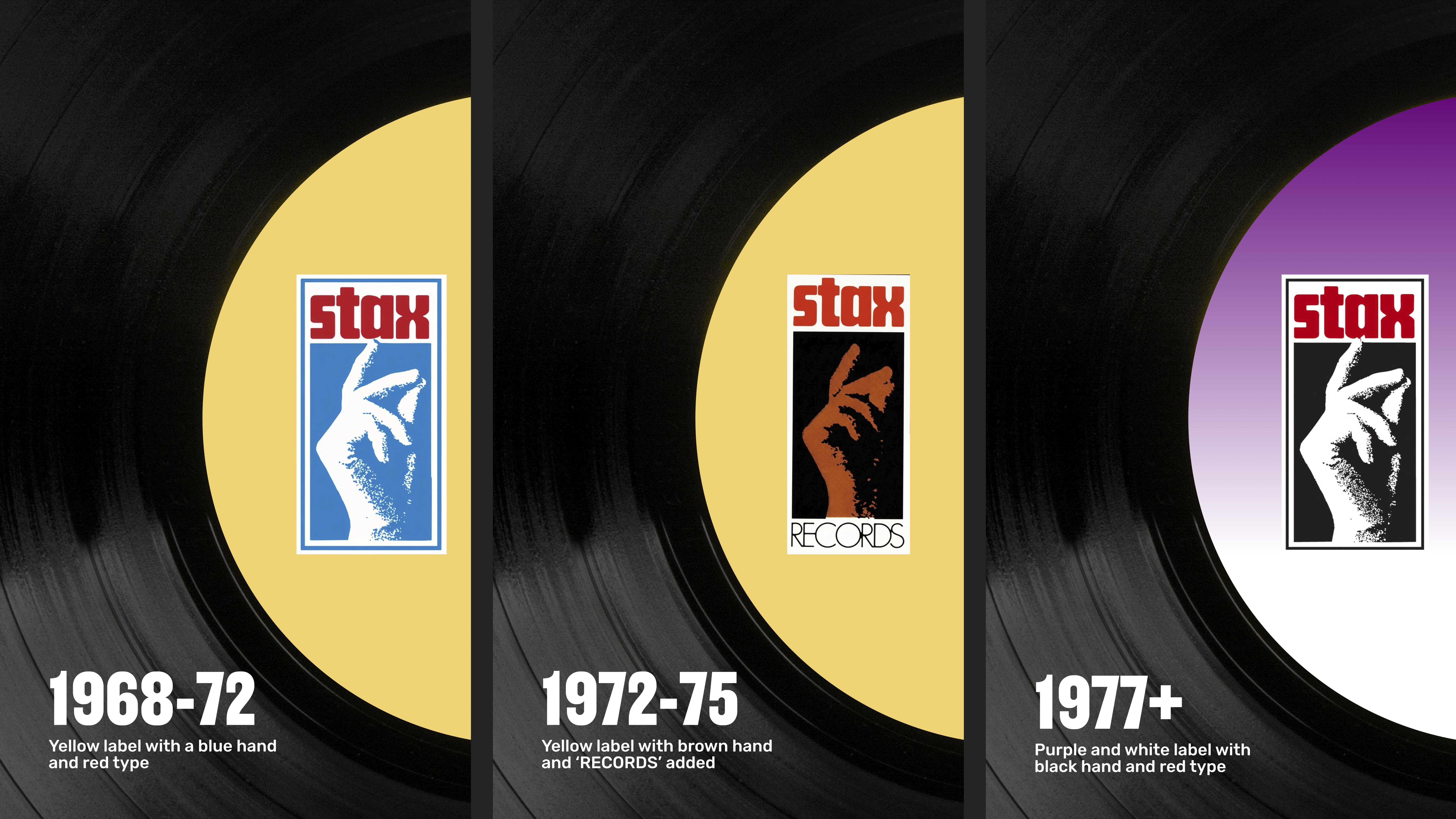
Ashton-Booth’s choice was the Stax Records ‘finger click’ logo. She explained that its name came from the first two letters of the surnames of its sibling founders: Jim Stewart and Estelle Axton. The logo, which had only small changes during the life of the company, dates from 1968, branding a long string of great Black music on record. ‘It’s human, it’s relatable,’ she said, ‘it’s fascinating to put something in a music logotype that’s so suggestive of movement.’ The finger snap image communicates the label’s dynamic dance music.
Great Black music on Stax records.
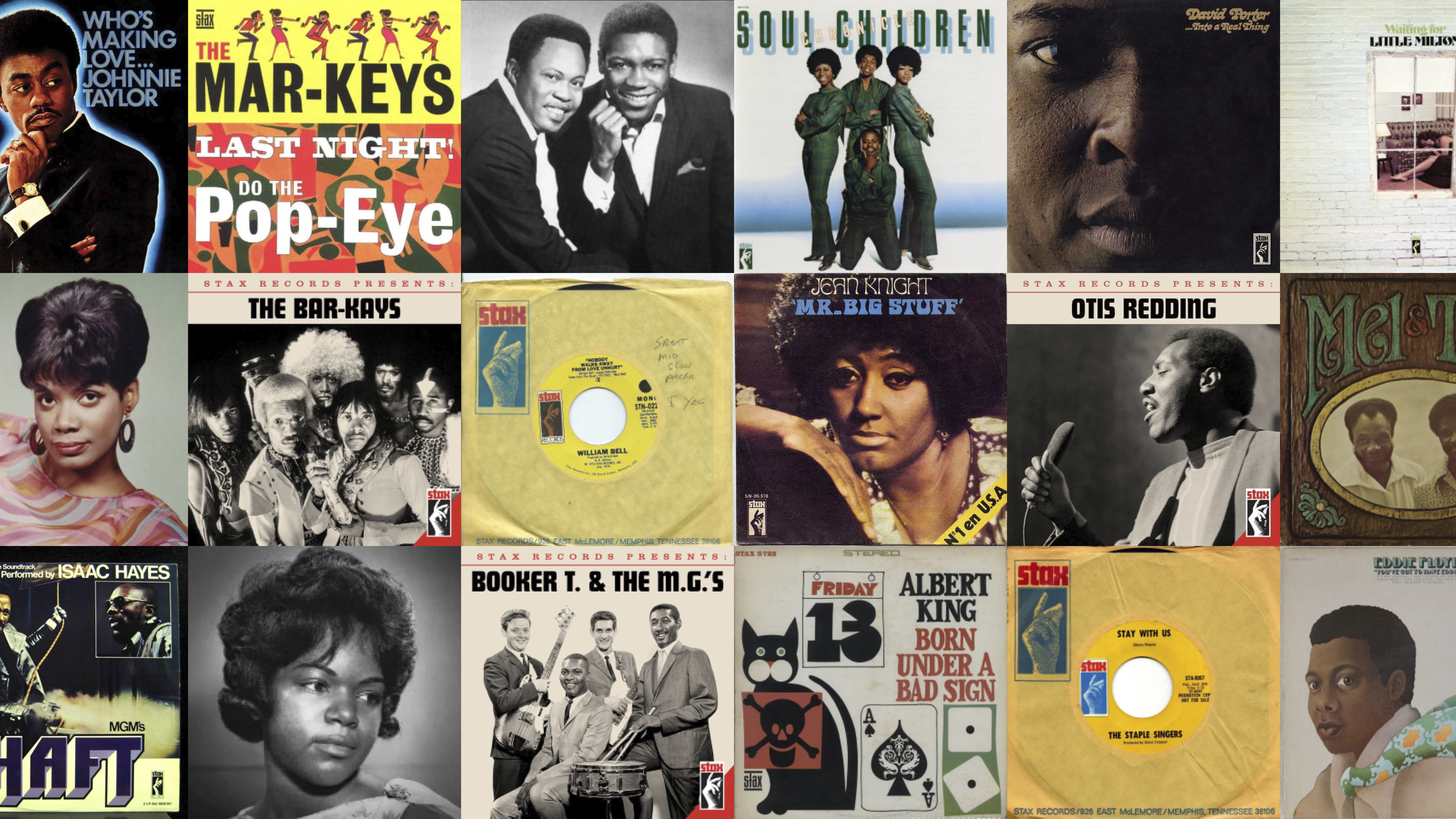
Typographically, Ashton-Booth compared the logotype to the famous ‘I Am A Man’ placard from the Memphis strike (see the cover feature ‘I am a poster’ in Eye 92).
Marianne Ashton-Booth, aka ‘Maz’, and the dynamic Stax logo.
Stanley Chow and the current Burger King logo (rebranded by design agency Jones Knowles Ritchie). ‘It just says: “Mmmmm.”’
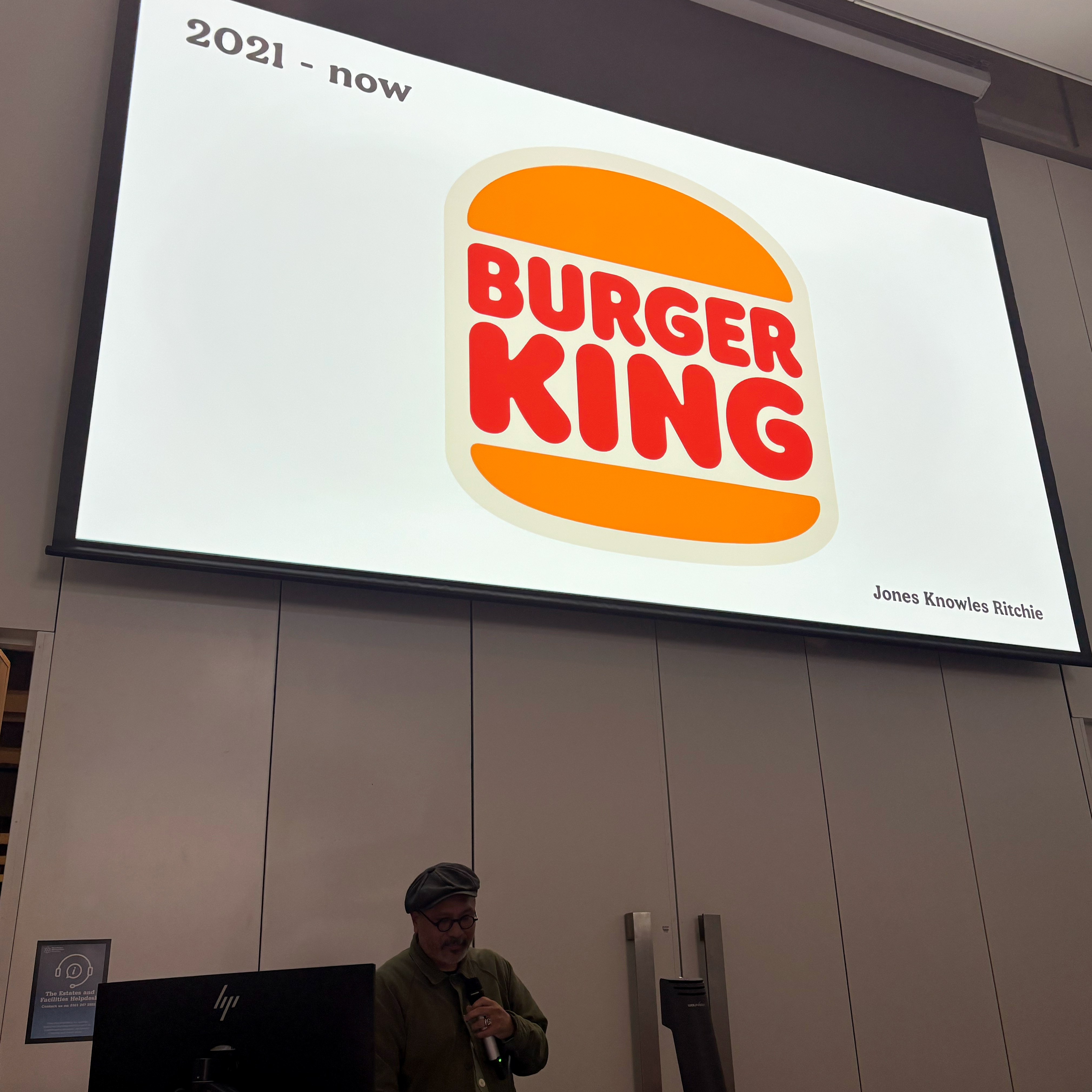
Stanley Chow chose the Burger King logo, specifically the latest version from 2021, which he said made him feel hungry.
Stanley Chow’s portrait of Andy Burnham, former mayor of Manchester.
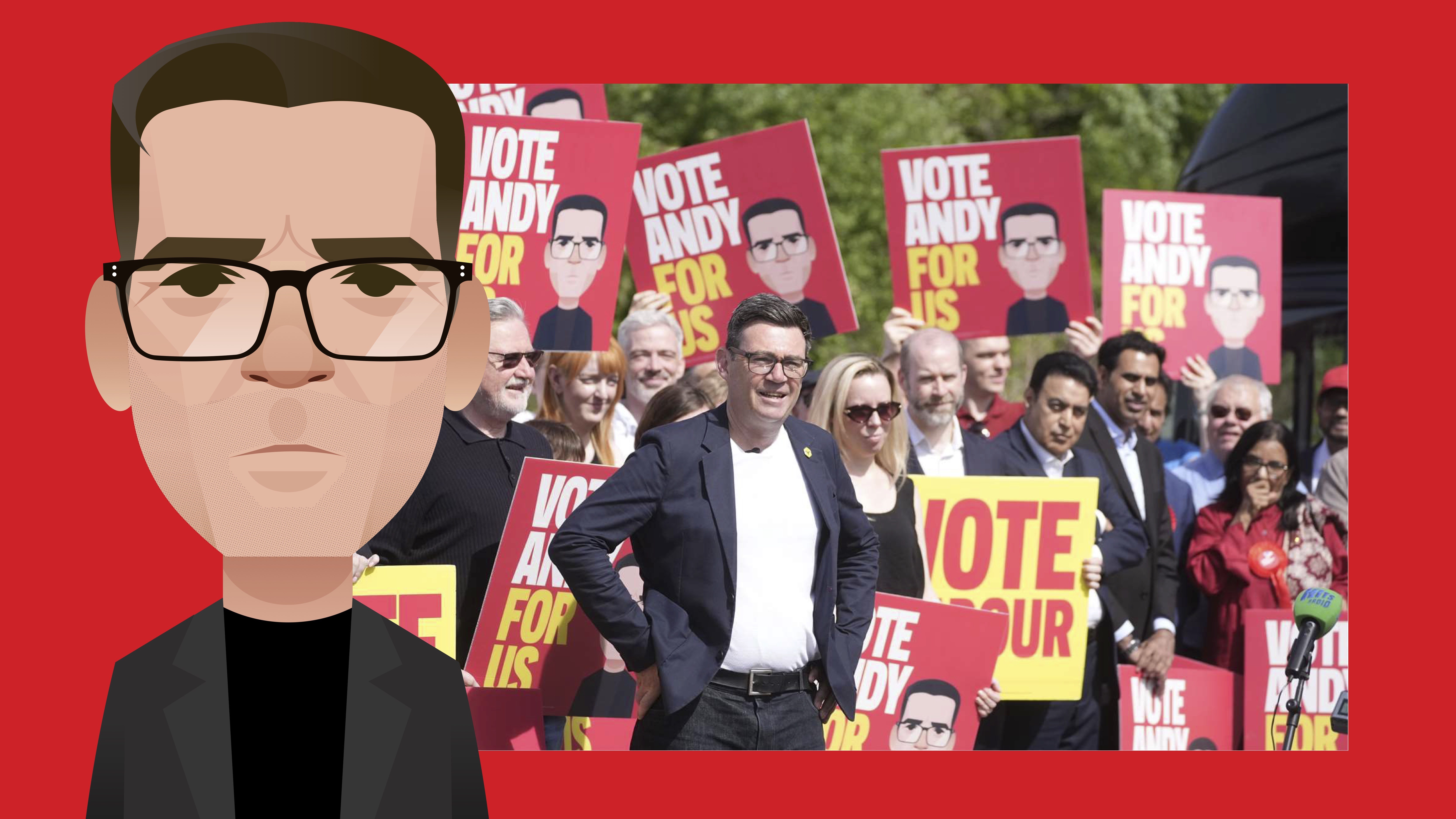
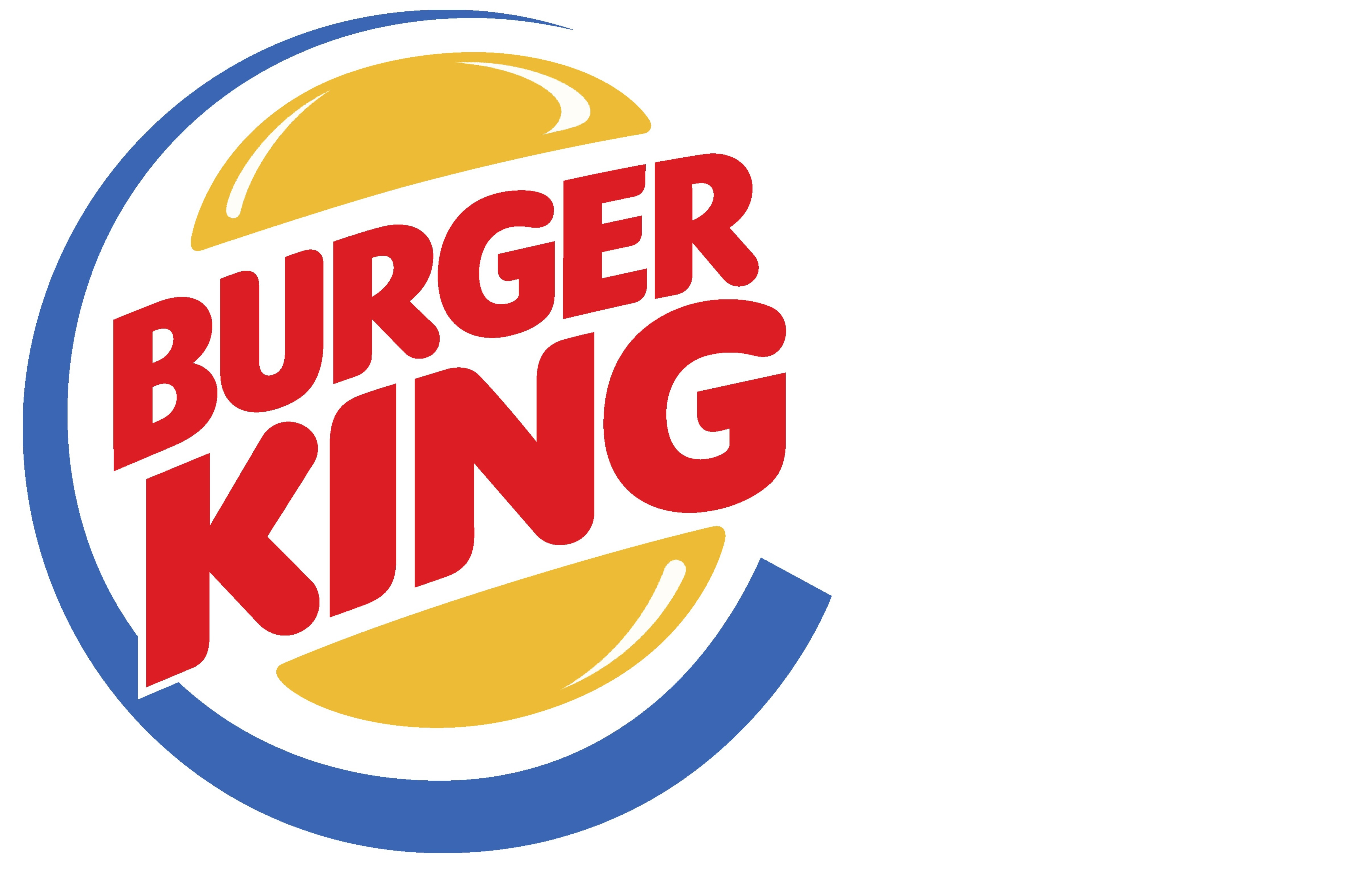
Chow started with a quick rundown of his work, including his portraits of New Yorker contributors and the famous (and often misappropriated) portrait of Andy Burnham, former mayor of Manchester, now the UK’s Prime Minister. Showing several Burger King logos, from a ‘sunrise’ version (early 1950s), through whimsical type and illustration, he explained that the classic logo dates from 1969. In 1999 the company unwisely rolled out a ‘modernised’ circular logo. ‘It felt corporate – it’s like what is that blue thing?’ asked Chow.
Burger King logo with ‘blue thing’, 1999.
Three versions of the ‘classic’ Burger King logo.
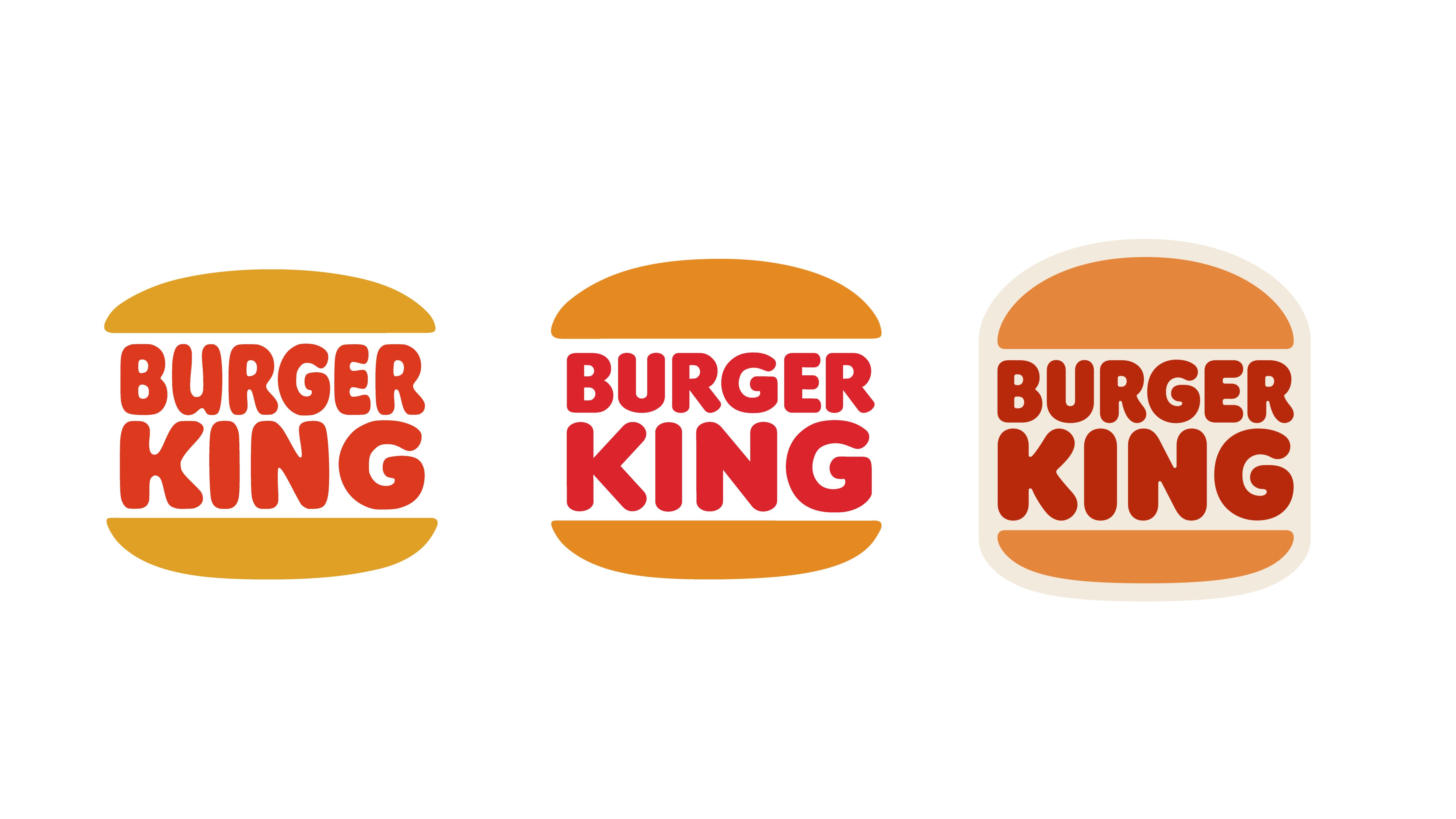
In
2021 the company returned to an ‘unashamedly
nostalgic’ rebrand by Jones Knowles Ritchie. ‘They kept the
original logo, and made the white background cream. It still feels organic and
it still makes me feel hungry,’ said Chow with genuine relish. ‘I
look at it and it's more than just a burger bun, it also looks like a
mouth to me. It just says: “Mmmmm.”’
Yas Banks with Smiley logo.
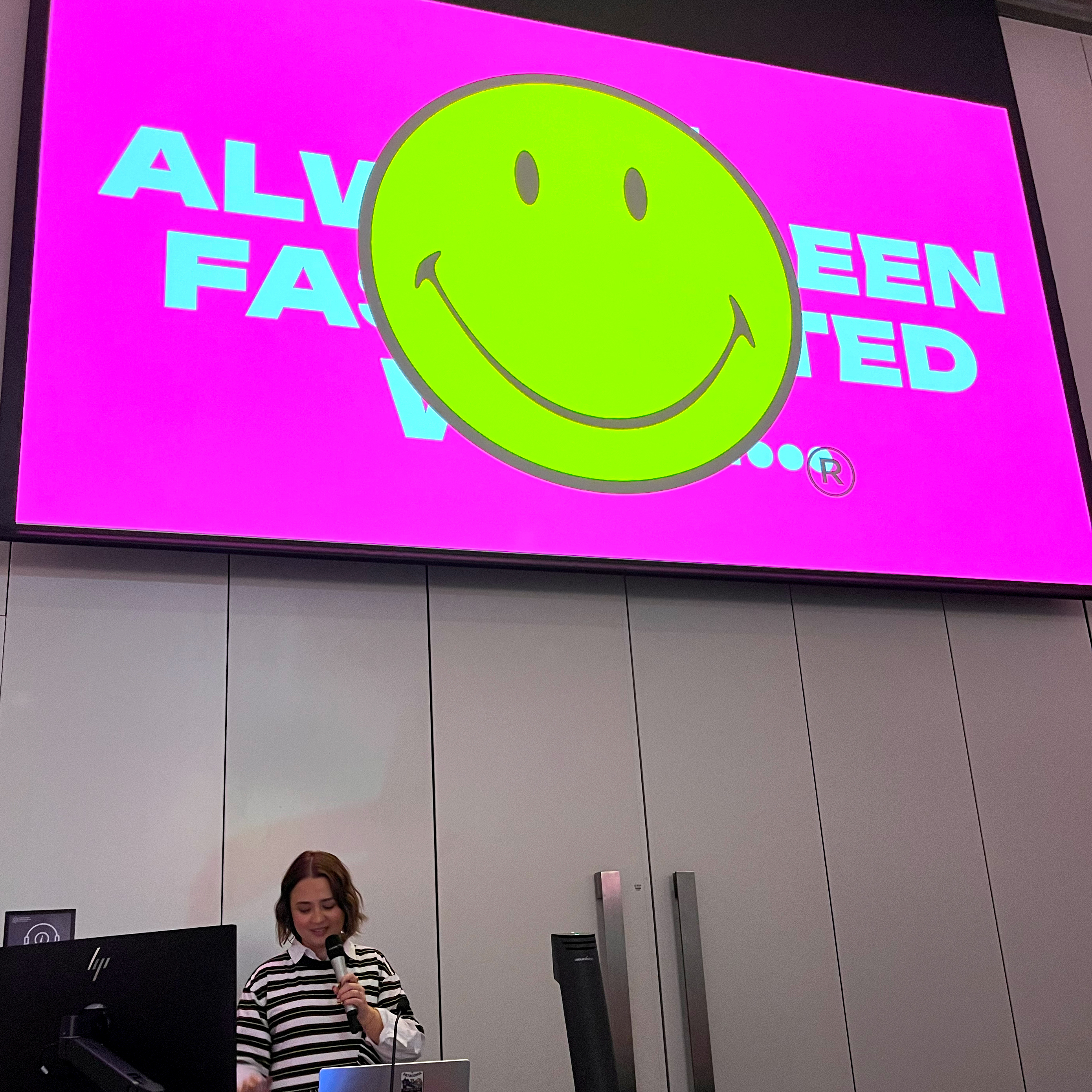
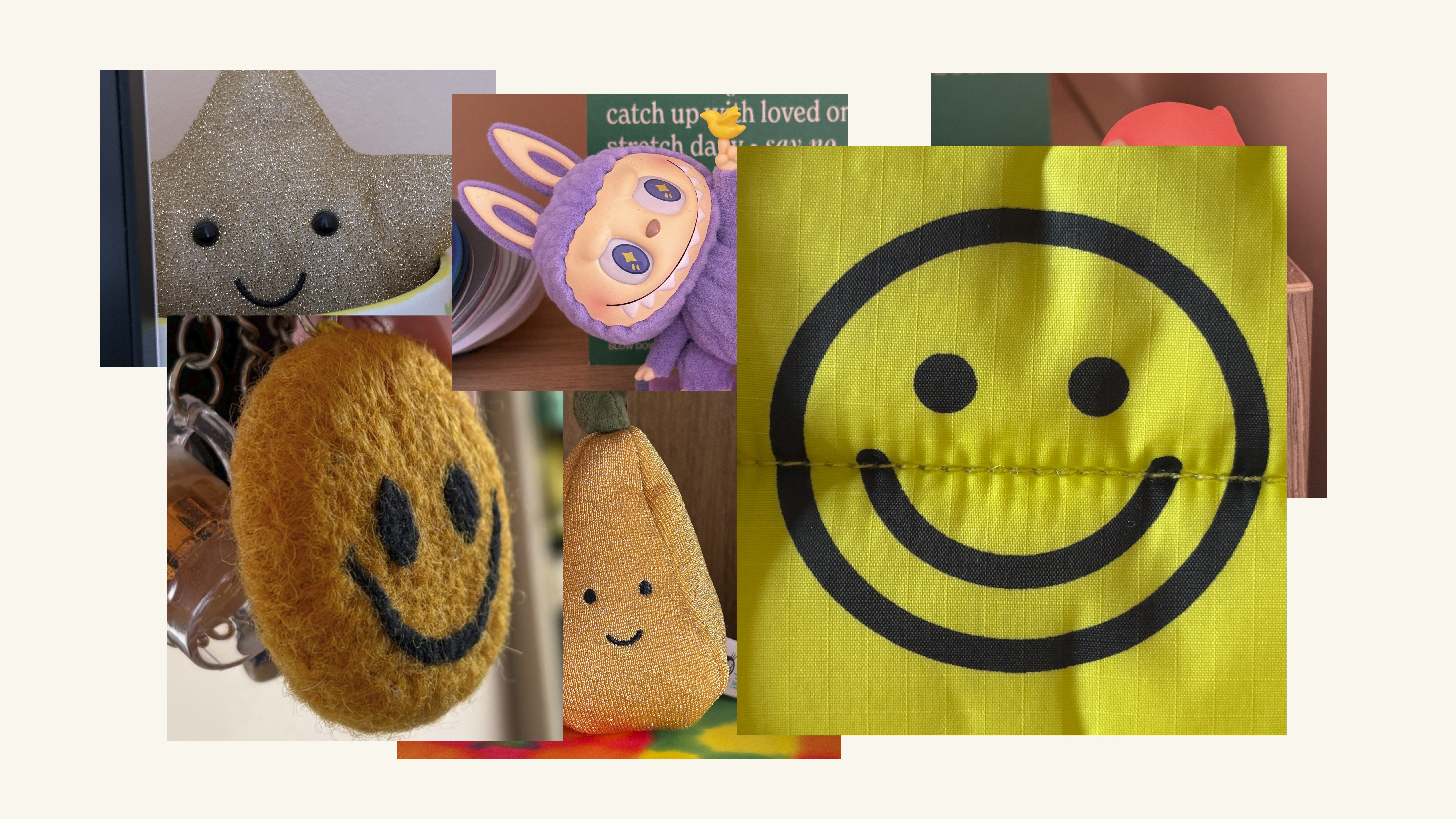
Yas Banks began by showing the audience a dazzling, overlapping succession of images – trinkets, plushies, tattoos and other artefacts that displayed her favourite logo, the Smiley. ‘There’s something so simple about two little dots and a curve, they’re recognisable across the board wherever you see it.’
Trinkets collected by Yas Banks.
Harvey Ball and the original 1963 smiley design, from Banks’s extensively researched presentation.
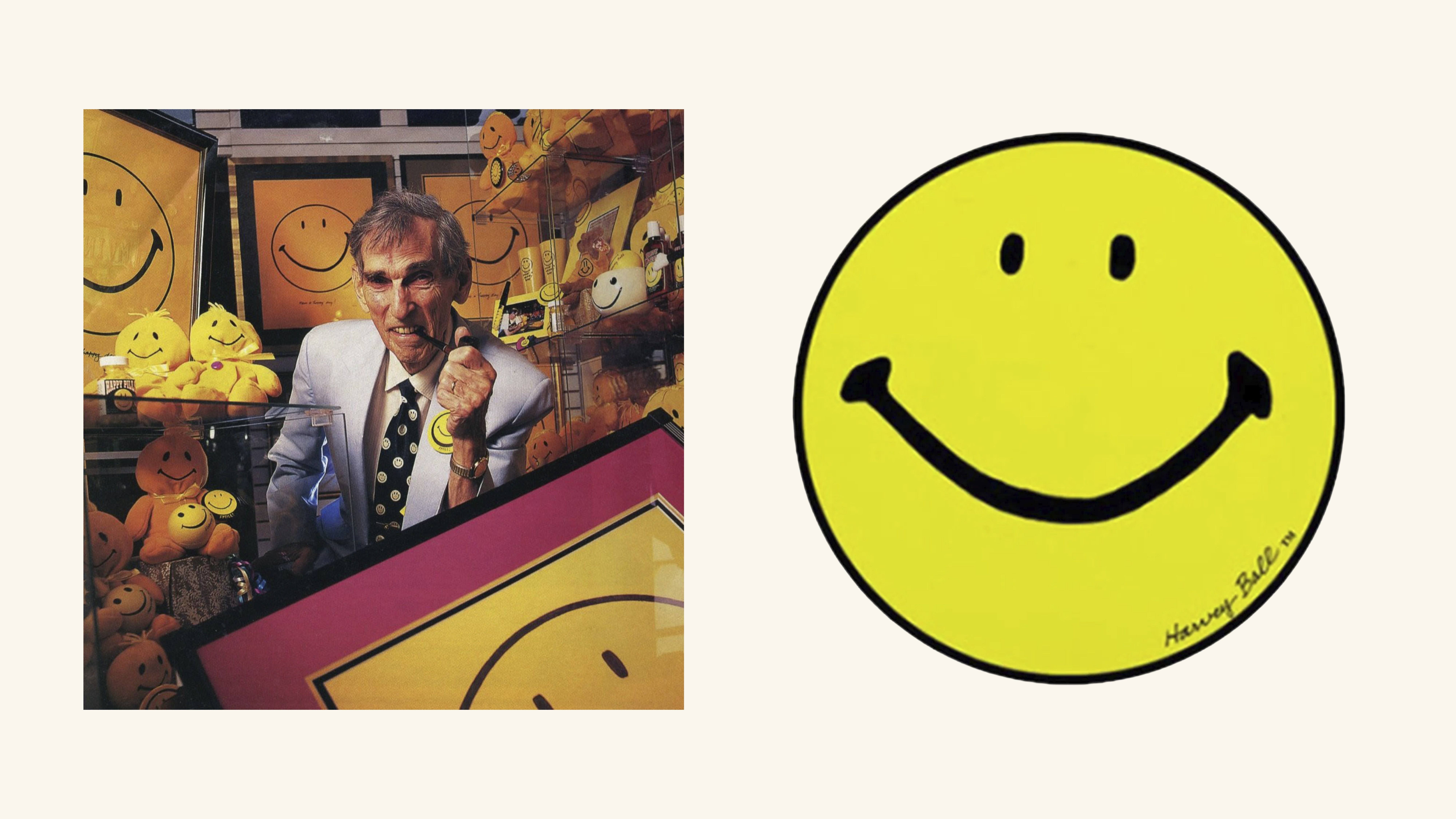
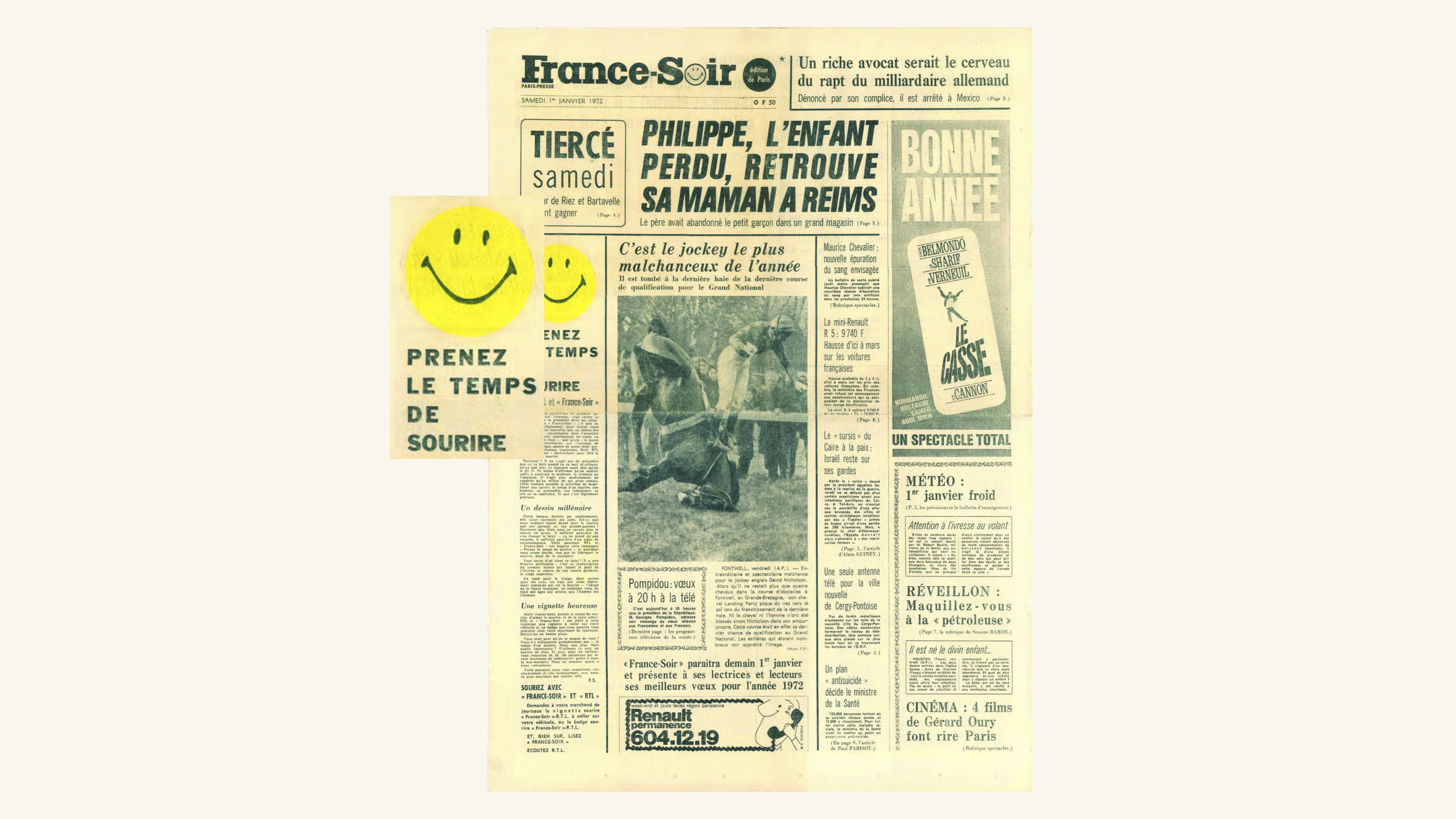
Banks traced the logos’s history to 1963, when Harvey Ball drew it (in ten minutes) for the State Mutual Life Assurance Company to serve as a morale booster on yellow lapel badges. She explained the Smiley’s 1970s evolution via French journalist Franklin Loufrani, who used it to highlight good news in France Soir (and later trademarked it), and the Acid House movement of the late 1980s and early 90s.
France-Soir‘s ‘good news’ branding introduced by Franklin Loufrani, from Banks’s presentation.
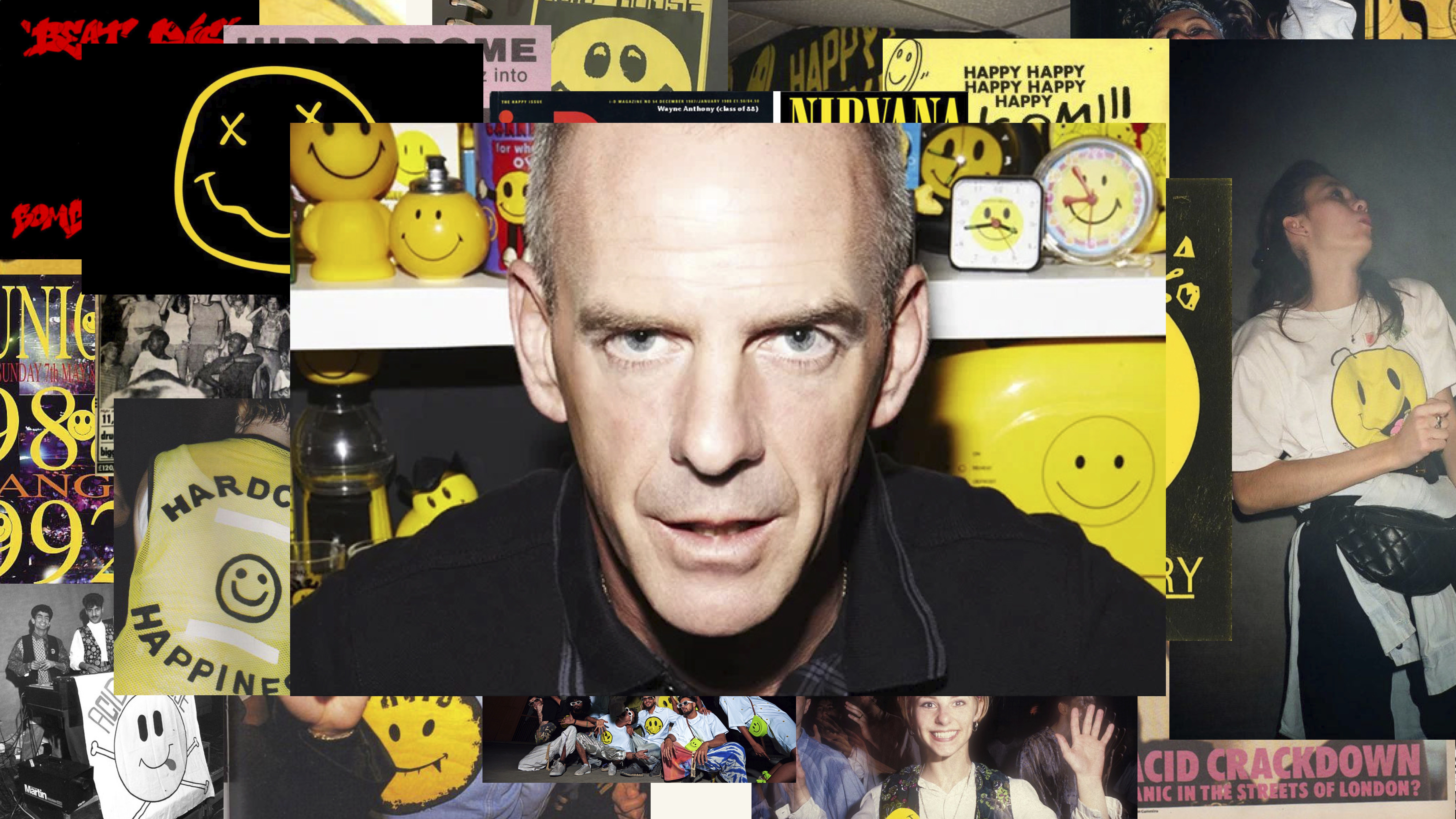
Banks showed an cheerful sequence of collaged slides showing raves, record labels, flyers, mag covers and T-shirts, ending on DJ Fatboy Slim (aka Norman Cook).
Acid House smileys and Norman Cook (Fatboy Slim, Freak Power) from Banks’s presentation.
‘It was everywhere,’ said Banks, ‘It appeared everywhere and continues to appear everywhere.’ For her the Smiley was both deeply personal and a universal language. ‘It was created to be a symbol of positivity, to take the time to smile, to be able to stop in a noisy world.’
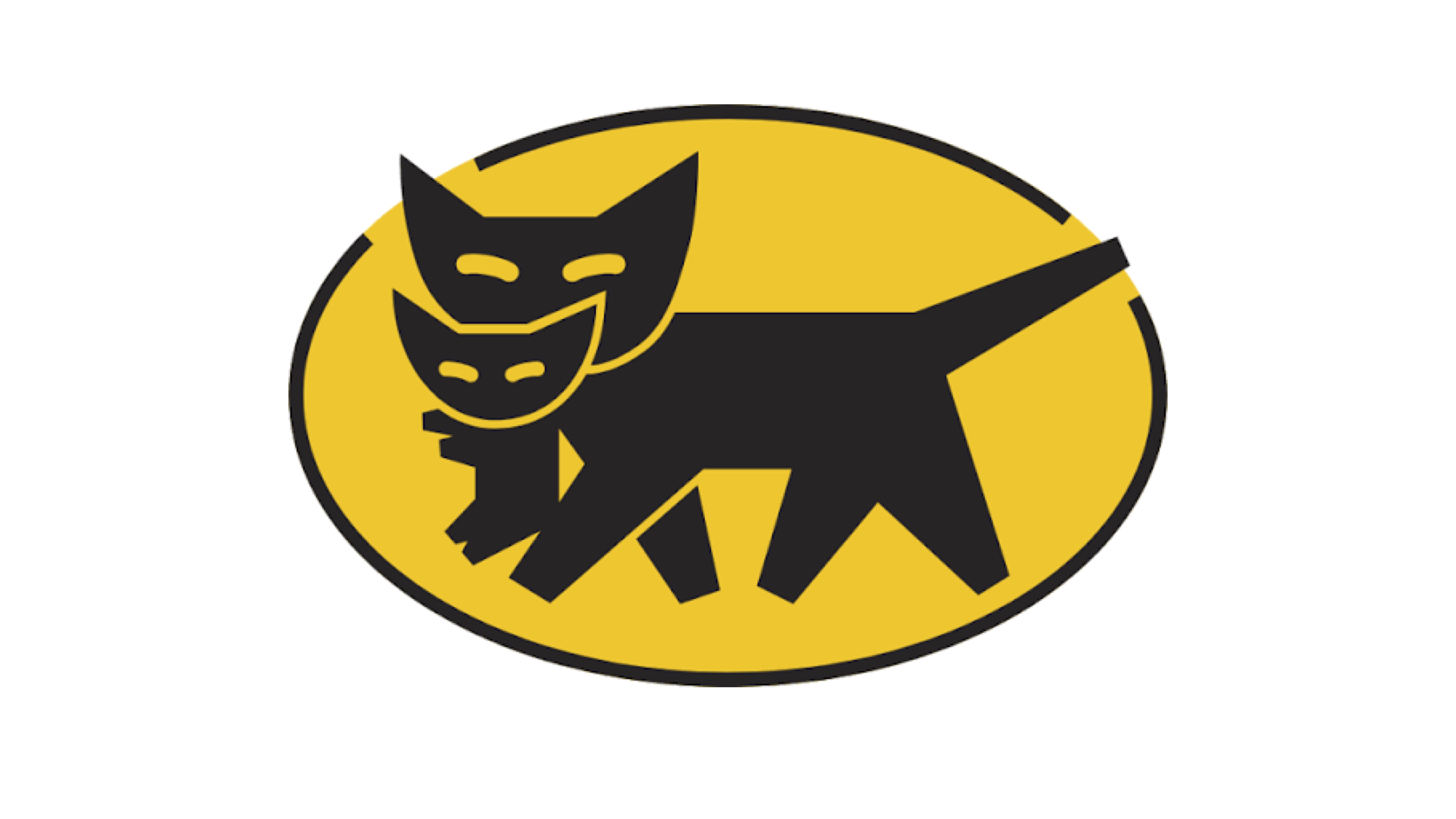
Malcolm Garrett and Yamato logo.
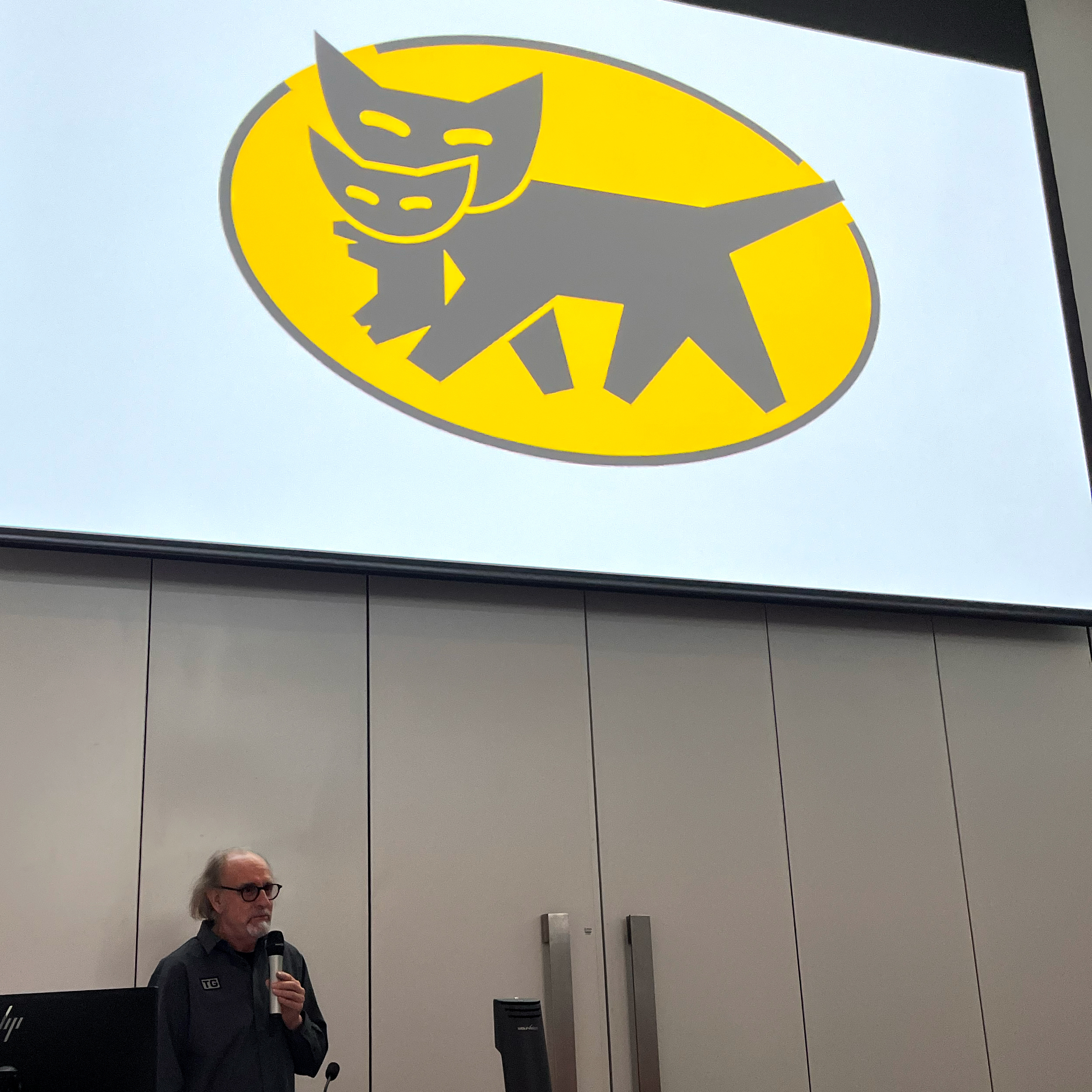
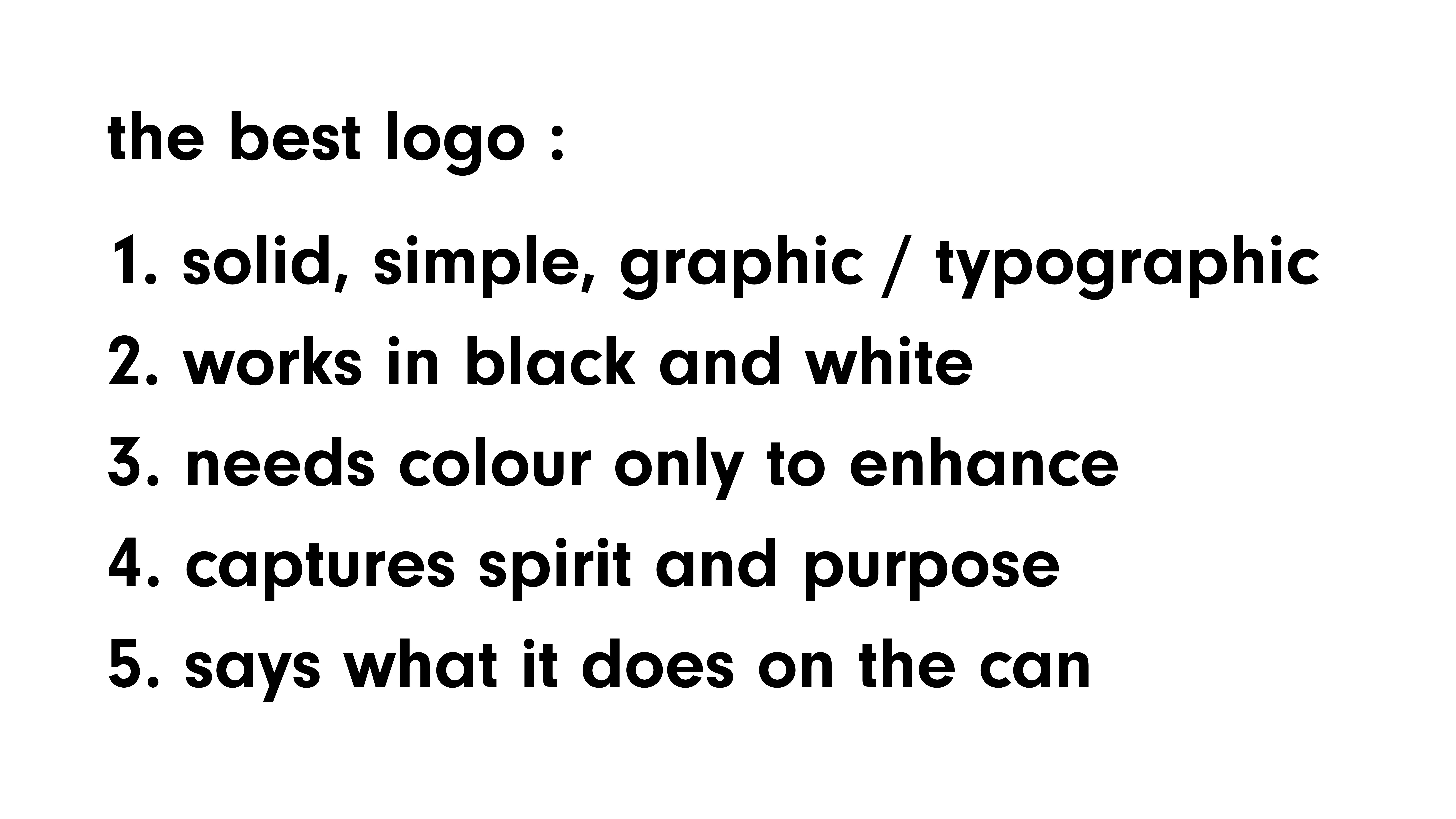
Malcolm Garrett chose the double-cat logo of Japanese removals company Yamato. Garrett began with a brief summary of logo design, explaining that the best are solid, simple and capture ‘spirit and purpose’.
Garrett’s rules for logos.
His examples included Joe Caroff’s James Bond logo (see feature in Eye 103), ICI, the NASA ‘worm’ logo, Gerry Barney’s British Rail ‘double arrow’, NatWest (which rhymes with the architecture of its headquarters), Spice Girls, and a famous anti-fascist logo. ‘The only way you can get away with putting the swastika into talk about logos is with this great Judy Blame logo, disposing of a swastika in a bin,’ said Garrett. ‘It’s a very well designed piece of work.’
Judy Blame’s anti-fascist logo.

The Yamato logo was inspired by Allied Van Lines, a US company that used animal imagery. ‘They’re trying to express the care with which this company will carry your stuff.’ A Yamato employee drew the black cat carrying a kitten inside a bright yellow oval, and the logo has been in use since 1957 (though Garrett expressed his disappointment at its 2021 restyling). ‘It tells you that this company will carry your stuff and treat it with the same level of care that a cat treats its own kitten.’
Yamato logo, 1957-2021.
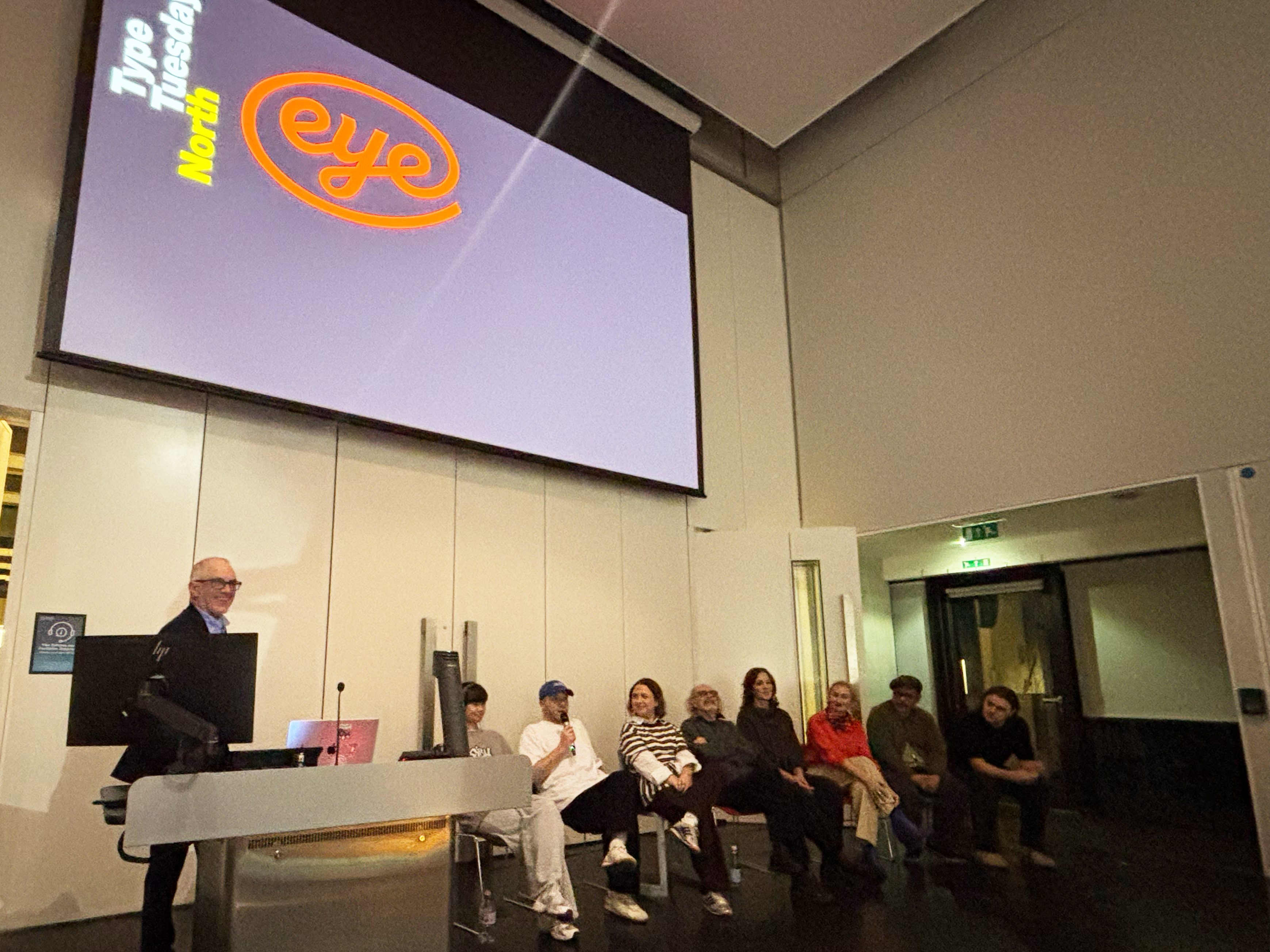
A panel Q&A with all eight participants brought up more interesting concepts and there were great questions from the audience. Discussing current branding, Oldham said: I think it’s really easy to be a designer and try and iron out and sanitise everything … you see it in a football club or a fashion label that has all this heritage history and then someone puts it in a sans serif and hopes for the best.’ (Elizabeth Glickfeld’s article ‘Normcore inferno’ in Eye 99 deals with this topic.) One member of the audience asked the panel: ‘If they had to design a logo using one letter, what letter would that be? Everyone had a good answer for this, and Chow chose an ampersand.
Type Tuesday North speakers’ panel. (The Eye logo was designed by Magnus Rakeng in 2021, commissioned by then creative director Nick Bell.)
Other issues that came up included logos that move, the use of sound, and nostalgia. Wrigley observed that a childhood logo ‘actually steals a small pocket of your brain.’
Garrett said: ‘It's not about the
marque, it’s what the marque is about … which may be something
that brings your childhood back to you.’
THANKS TO …
Special thanks are due to John Rooney, colleagues and students at Manchester School of Art, Manchester Met University. The souvenir poster was designed by SEA with paper by sponsors GF Smith, printed by Made by Team. Further thanks to the Eye team of Janet South, Simon Esterson, Amy Henry and Holly Catford.
Eye’s most heartfelt thanks of all go to the fantastic speakers: Marianne Ashton-Booth, Yas Banks, Stanley Chow, Katy Cowan, Malcolm Garrett, Jessica Lee, Craig Oldham and James Wrigley.
Eye is the world’s most beautiful and collectable graphic design journal, published for professional designers, students and anyone interested in critical, informed writing about graphic design and visual culture. It is available from all good design bookshops and online at the Eye shop.
Links
Marianne Ashton-Booth’s Instagram
yasbanks.co.uk
stanleychow.co.uk
Katy Cowan / Creativeboom
malcolmgarrett.com
Jessica Lee’s Instagram
Office of Craig
James Wrigley’s Present Standards
John Rooney at MMU
Type Tuesday: My favourite logo (2025)
SEA London website
Made By Team (printers)
G. F. Smith website
Articles by John L. Walters