
Thursday, 5:00am
11 October 2012
Don’t explain
Raymond Pettibon straddles the high / low culture divide, adding his seductive scrawl to the white cube of a London gallery
Raymond Pettibon’s latest series of drawings, investigating recurrent themes around American pop culture, film noir and baseball is currently on show at London gallery, Sadie Coles HQ, writes Liz Farrelly.
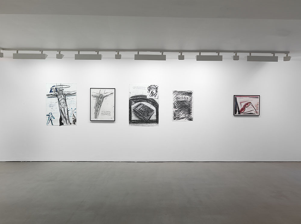
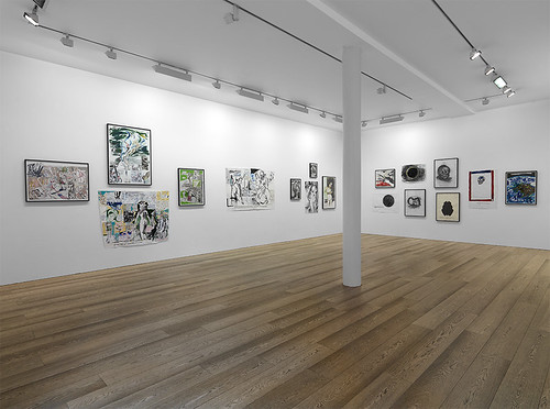
This mid-sized, commercial gallery, a two-floor white cube, was well populated for a rainy Friday afternoon – it is a treat to see these drawings (loosely termed) in the flesh.
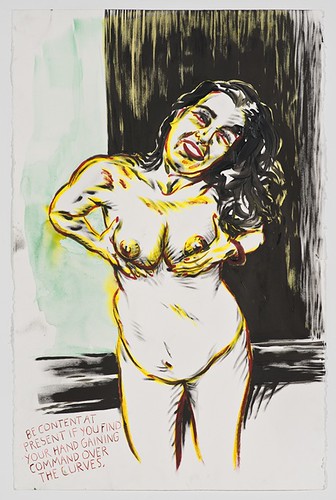
Raymond Pettibon, No Title (Be content at), 2012.
Pen, ink watercolour, gouache on paper, 102.2 x 66 cm / 40 ¼ x 26 in.
Top: installation view, Sadie Coles HQ, London.
Amalgams of (predominantly) black and white mark-making, Pettibon’s images can be appreciated in reproduction and on screen, but the materiality and ‘action’ of his making is lost. On the gallery walls, though, it is evident, and testimony to a rapid and considered (not a contradiction) approach. Cut up fragments are ‘edited’ and re-pasted, mixing textured and smooth paper stock; the brush, the pen, charcoal, pencil, ink, crayon, gouache, they’re all used.
Such deft handling of means and materials manages to avoid any hint of preciousness, and points to Pettibon’s biography, which straddles the high / low art divide. Yes, he’s represented by several major galleries, but he also makes zines and designs album covers; as bass player turned graphic designer, he ‘branded’ his brother’s band, Black Flag, and has collaborated with Sonic Youth, too.
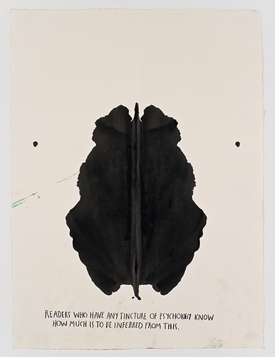
Raymond Pettibon, No Title (Readers who have), 2012. Ink and gouache on paper, 76.2 x 56.2 cm / 30 x 22.1 in.
Copyright the artist, courtesy Sadie Coles HQ, London.
What’s so interesting, for me, about these artworks is the mix of words and images. Quotes are pulled from books and Pettibon’s own head; figures are drawn (literally) from film and the TV set. Meanwhile he borrows cartoon and comic characters from earlier, more innocent times. Mixing it together, he disrupts the familiar, abstracts the figurative, plays with scale and ‘cuts up’ the picture plane.
Pettibon’s ‘over activity’ banishes the cool illusion of perspective by jumbling the viewer’s vision, along with their thoughts. Where to look, what to read, there is no designated way through, although a couple of pieces are more iconic; single, powerful word / image statements that bring you to a grinding halt.
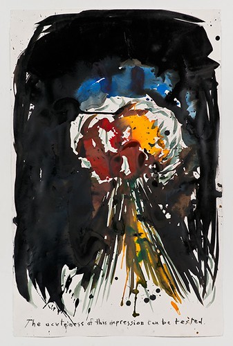
Raymond Pettibon, No Title (The acuteness of), 2012. Charcoal, ink, gouache, acrylic, and crayon on paper, 102.2 x 66 cm / 40.25 x 26 in. Copyright the artist, courtesy Sadie Coles HQ, London.
Dark and funny, juxtaposing cute pathos and lurid voyeurism, Pettibon’s artworks reflect the bright light and deep shadow of his Californian homeland, and the cultural mash-up generated by its mass media.
But, going beyond the seductive subject matter, by means of his method Pettibon questions that age-old need that artists and writers have pandered to, the wish to make sense. Instead, refreshingly, Pettibon’s work represents but doesn’t explain.
Raymond Pettibon
Sadie Coles HQ, 69 South Audley Street, London W1
Until 17 November 2012
Installation view, Raymond Pettibon, Sadie Coles HQ, London.
Eye is the world’s most beautiful and collectable graphic design journal, published quarterly for professional designers, students and anyone interested in critical, informed writing about graphic design and visual culture. It is available from all good design bookshops and online at the Eye shop, where you can buy subscriptions, back issues and single copies of the latest issue.