
Wednesday, 4:38am
26 September 2012
‘Shake hands with the devil’
The final hours of Graphic Design: Now in Production (the New York leg) provided a snapshot of contemporary practice, from the Stone Twins to Metahaven.
For the final Saturday of Cooper-Hewitt’s ‘Graphic Design: Now in Production’ exhibition in New York, a student and professional crowd massed for ‘The Final Hours’, writes Liz Farrelly. The temporary location (while the Carnegie Mansion is closed for renovation) was Governors Island, a breezy six-minute ferry ride from Lower Manhattan.
Lupton observed that the audience was a mix of ‘die-hard graphic designers, who’ve come over repeatedly, and other visitors who’ve known nothing about design before their visit.’ Walking around the show, the excitement was palpable. Enthusiastic children reported their finds to parents and cameras were clicking as visitors took photos of each other in front of favourite exhibits.
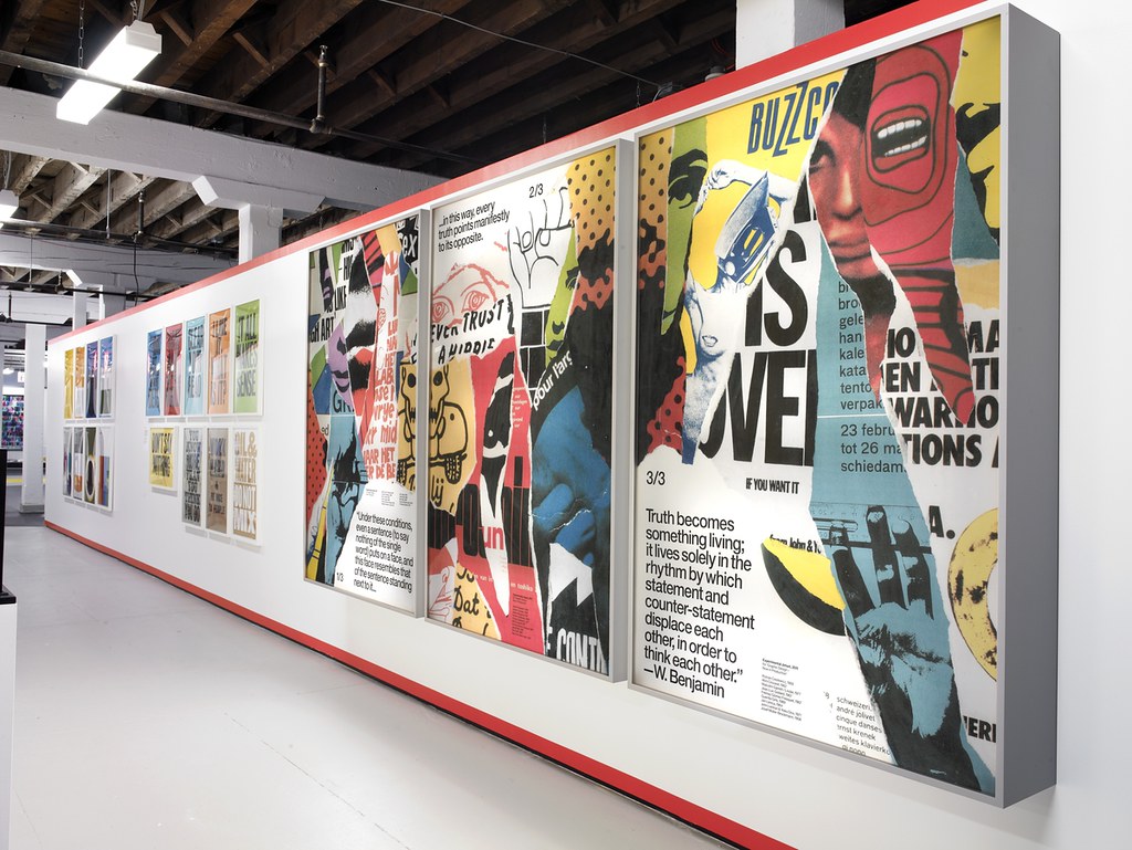
Both the familiar and the fantastical were on show: Google’s Doodles next to Keetra Dean Dixon and J. K. Keller’s multi-colour, wax-encased type specimen; a mum declared Daniel Eatock’s marker-pen posters a perfect ‘rainy day project’; and a low-tech rig (using poker-chips) attracted attention, while visitors voted on ‘before and after’ logo updates.
Daniel Eatock, Felt-Tip Print, 2006
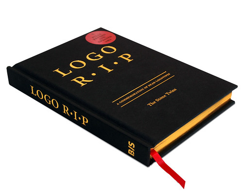
Later, there was a a ‘Pecha Kucha’-style event that aimed to ‘… consider the state of design now, this weekend, at this moment in history.’ The Stone Twins spoke first, shilling a second edition of Logo R.I.P. (BIS Publishers, 2012, see review of first edition in Eye 51), with a shout out to their mum in the audience.
With outfits reminiscent of Ian Dury’s ‘Sweet Gene Vincent’, Declan and Garech Stone presented their thesis on why we’ll never forget the very best decommissioned logos. (See also Garech Stone’s article about single-letter logos, ‘Chameleons’, Eye 67).
Kodak ‘K’ logo, 1971-2006. Design: Peter J. Oestreich (USA). From Logo R.I.P. (BIS) by the Stone Twins.

Flashing up Kodachrome family snaps, their anecdotes recalled logos lodged in our collective memory. They argue that the ‘wit and humanity’ of bygone logos guarantee their longevity; Paul Rand’s parcel tied with string will forever outshine any glossy new version of UPS. Presenting their argument via a perfectly packaged product, their own book layers on another level of irony, but The Stone Twin’s idiosyncratic take on design history was enjoyable and refreshingly non-elitist.
The Stone Twins, Logo R.I.P., 2012.
Elliott Earls, designer in residence and head of 2D at Cranbrook Academy of Art discussed his 2008 recruitment posters for the school’s ten departments. This man does not pull his punches; the unremitting weirdness of his massed-up aesthetic comments on our ‘pornographically saturated culture’ that manipulates our subconscious ID to ‘fuel a desire to consume’. His snappy ‘pornutopia’ label got us excited; as did a whistle-stop deconstruction of his image-making virtuosity, mixing drawing, photography and all manner of digital wizardry. But is his stance critical or celebratory, and how does it benefit the client? For Earls, Cranbrook is a ‘test bed’ and an ‘ethical safe zone’. He called on the audience to use design for social change by interrogating the world around us, while stating that the medium itself is immaterial. (See ‘A designer and a one-man band’, Eye 45).
A duo of Cranbrook graduates followed. Keetra Dean Dixon (a self-pronounced designer and artist) and Jonathan Keller (who studied interactive media and fine art), work separately and together on commercial and cultural projects. They offered guidelines and definitions for juggling personal and client work. Dixon explained their working methods, ‘side-by-side and together’, and ‘breaking, is a major part of our practice’. By manipulating default settings, misinterpreting feedback loops, hacking and mining online sources, the duo blur the boundary between design and art.
Another partnership, Alicia Cheng and Sarah Gephart of MGMT described their practice as collaborative. With an enviable client list, including Al Gore and Google, projects range across book and exhibition design and data visualisation. Owning their process as ‘messy’, their relaxed conversation hinted at a healthy flow of ideas, oftentimes generated at communal studio lunches. Indeed, a particularly frustrating client project (for Google – no fixed budget or deadline) had prompted a revelation; ‘… we thought, why are we waiting for clients to call for us to think about interesting problems?’ Tackling such thorny issues as ‘ufology’ (a taxomony of UFO shapes) and ‘how to ride an ostrich’, the resulting information graphics combine research, wit and razor-sharp logic.
Facestate by Metahaven. Installation view from ‘Graphic Design: Now in Production’, 2011-13.
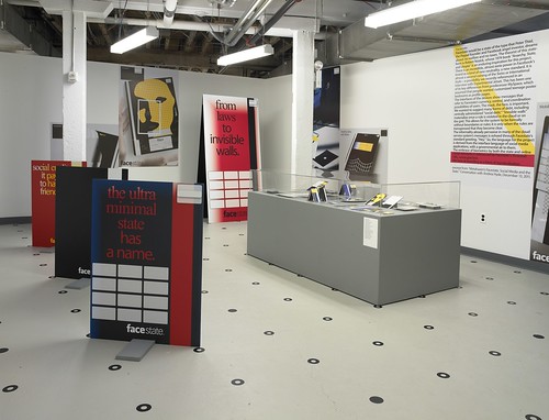
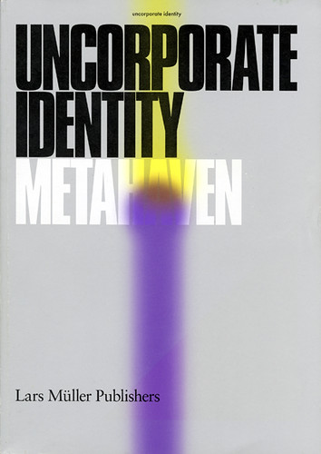
Lupton defined ‘notoriety’ in the context of Metahaven as ‘noteworthy with an edge’, as she introduced Daniel van der Velden (see ‘The Floating Signifier’ in Eye 53 and 'Borderline' in Eye 71) all the way from Amsterdam. Metahaven’s book Uncorporate Identity (Lars Müller Publishers, 2010) re-purposes design as critical research, while acknowledging its flip-flop role as handmaiden and / or thorny irritant to society and government. Van der Velden revealed Metahaven’s process; ‘making and writing, for us it’s all the same…we find deep links’. His concern that public events and discussions (‘such as this one’) are being replaced by ‘conversations in social media’ was illustrated by their installation Facestate, (above) commissioned for the exhibition.
Metahaven, Uncorporate Identity, Lars-Muller Publishers, 2009.
Lupton kicked off the Q&A by asking for speakers’ comments on ‘the designer as branded entity’. While The Stone Twins suggested that ‘personality’ and autonomy were the designer’s most precious commodity, Van der Velden challenged the myth of the creative individual; ‘98 per cent of design is complying to standards … and we should be worried that we get too autonomous and act like gods.’
Earls suggested a middle path; ‘as long as you have the respect and trust of the client, the subtext can work on different levels’, adding the snappy command, ‘Mine the Subtext’! The MGMT team confessed that clients ‘beat us up … we go through so many iterations, and in the end, everything is a collaboration,’ most often, however, in a good way.
Earls laid his cards on the table: ‘I consider design as an art form.’ He introduced the concept of ‘agency’: ‘Have a point of view, the way it looks is irrelevant but the agency of the designer is critical.’ He pointed to a lack of agency in design education, which strives for ‘appropriateness, and fitting in … instead, work should have a unique quality’.
Another question, about the link between research and making, prompted Van der Velden to admit that Metahaven started researching, ‘… so as not to get bored of design … then we realised we had no academic credentials, so we make what we want to make, from the gut!’
The Stone Twins were incensed by the thought of being ‘bored of design’, and reminded us that (in Tibor Kalman’s words) ‘graphic design is a means not an end’. [Kalman goes on to say: ‘A language, not content.’ (Perverse Optimist, Booth-Clibborn Editions, 1998).]
The Stone Twins’ parting shot was a piece of advice for an audience of designers wanting to make a mark and survive the rat race; ‘Shake hands with the devil; work in advertising, make some money and do your own projects.’ That the exhibition we were all there to see showcased a healthy percentage of self-instigated projects demonstrates that such a survival technique is flourishing.
The exhibition continues to tour; next stop Hammer Museum, University of California, Los Angeles, 30 September to 6 January 2013.
See ‘Always in Flux’, Steven McCarthy’s review of ‘Graphic Design: Now in Production’ in Eye 82.
Eye is the world’s most beautiful and collectable graphic design journal, published quarterly for professional designers, students and anyone interested in critical, informed writing about graphic design and visual culture. It is available from all good design bookshops and online at the Eye shop, where you can buy subscriptions, back issues and single copies of the latest issue. You can also browse visual samples of recent issues at Eye before You Buy.