
Monday, 2:36pm
25 June 2012
Let’s hear it for the hinting slaves

Phil Baines
Type Together
Eliot Jay Stocks
JAke Archibald
Florence Nightingale
Yves Peters
liz farrelly
New media
Typography
Type Tuesday: Ampersand Web Typography Conference 2012
When keynote speaker Phil Baines asked a full house at the second Ampersand Web Typography Conference, ‘Who’s a graphic designer? Who’s a web designer / developer?’, a show of hands revealed that three-quarters of the audience were web-based practitioners (up on last year), writes Liz Farrelly.
Ampersand is a two-way street though, a place for print-based, art-school-educated graphic and type designers to discover the special requirements of designing for the web, and for websters to learn about type, how to use it, and what the type foundries are doing to meet their needs.
Ampersand delivered on all fronts. If at times it felt like Type 101 or Web 101 – depending on which camp you were in – a bit of back to basics never hurt anyone. And, as Baines pointed out, ‘designers need to talk to one another’, so it follows that both camps should propagate a mutual understanding of parlance.
Top: Ampersand 2012’s playful ‘Swiss language’ version of their website. Below: Phil Baines delivers the keynote speech. Image by Ben Mitchell
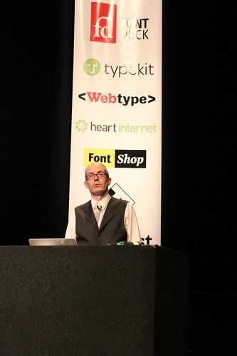
You would never have guessed that Baines, who told us that in 2011 he was an ‘outsider [who] wanted to learn, and did’, was a stand-in, at a few days’ notice, for big draw Erik Spiekermann. His ‘where are we now?’ reflections set the tone. Using his book Type and Typography (co-written with Andrew Haslam) as evidence, he suggested that web delivery was now synonymous with design and communication. In the 2002 edition, the web was dealt with in a one-column sidebar, ‘because it didn’t work the same way as graphic design so we didn’t know how to write about it’. Now, in the latest edition, it’s ‘embedded’.
Baines suggested that this moment parallels the situation, circa 1992, when graphic and type designers first achieved required results using digital technology – in other words, controlled the final output. Now that web designers are afforded all the typographic niceties that print designers take for granted, they too need to ‘use general type principles regardless of what work [they] are doing’, while remembering that ‘type is not typography’. He lampooned Google’s promise of ‘three quick steps to a good-looking website’ as wrong thinking, and cited the Government Digital Service’s Design Principles as good practice.

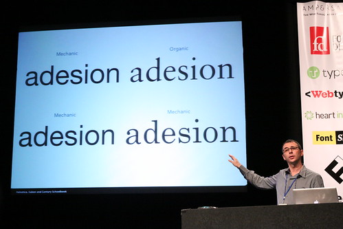
Above: Yves Peters offers a guide to selecting the right typeface. Image by Ben Mitchell
Yves Peters, who declared a fascination with type selection, advised keeping four criteria – form, historical context, cultural reference and function – in mind when you buy a typeface (‘If you disregard this, you’re in trouble’). Question what you want to do and why, he said; the tools are all there, thanks to OpenType. His statistics spoke volumes: whereas a decade ago a typeface contained 256 glyphs, now it can have up to 65,536 (that’s 256 squared). To this listener, it sounded as if Peters was expounding the virtues of the tried and tested typography principles, and the now almost lost knowledge of the sub-editor. His message: attend to the details.
Double-act Veronike Burian and José Scaglione, of the indie foundry TypeTogether, offered advice on matching typefaces, and recommended Robert Bringhurst’s The Elements of Typographic Style. Their ‘good’ and ‘bad’ examples illustrated a checklist for ordering hierarchy, creating various voices, and enlivening communications. A Jon Tan quote – ‘Fonts are wayfinding apps for emotions’ – hit the point home.
Above: José Scaglione of TypeTogether explains the art of typeface matching. Image by Ben Mitchell
Most of their bad examples were pulled from the super-pressurised world of newspaper design, they said, evidencing the lack of refinement, movement and interactivity in the web versions of most publications. As a ‘help strategy’, they urged web (and print) designers to contact foundries for advice and to explain what they need. Again, collaboration was stressed.
After lunch, three shorter show-and-tell presentations introduced in turn Douglas Wilson, director of Linotype: The Film, made thanks to the KickStarter funding platform with an equipment budget of $20,000 and Canon’s EOS 7D and 5D digital SLRs; Jason Smith of Fontsmith, designer of bespoke brand-building typefaces for TV (you’ve seen Channel 4’s): and consultant Laurence Penney, who put lines of code on screen but so clearly explained CSS fallback fonts, and how to get the exact glyphs you need, that his parting shot, ‘Go forth and subset’, raised a favourable murmur.
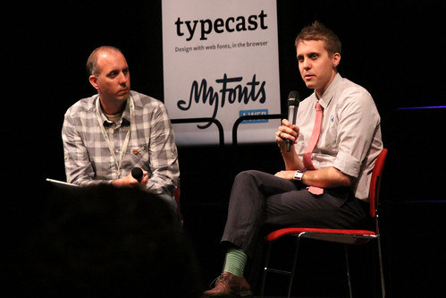
Above: Question and answer session with Douglas Wilson, director of Linotype: The Film. Image by Ben Mitchell
Luc(as) de Groot promised to talk about ‘the most boring subject in type design’ – hinting – but enlivened his explication with entertaining bon mots about studio life, Berlin, family and friends. What a pity, he said, that Spiekermann didn’t make it – he wanted to chat about how typefaces look great on a Mac but ‘jumpy and spotty’ on a PC. His argument was that typefaces should be optimised to perform on every operating system and browser. And how? By testing, checking and hinting: adding and subtracting, pixel by pixel, to achieve a smooth, solid and legible letterform at every point size, in order to counteract the aliasing caused by screen resolution.
De Groot likes to do things properly, and has a studio of ‘hinting slaves and trolls’ to help him. And the web designers thank him for it: he speaks their language, understands their issues, and provides functioning type solutions.
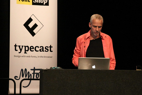
Above: Luc(as) de Groot enlivens ‘the most boring subject in type design’ – hinting. Image by Ben Mitchell
Next up, Jake Archibald, a web developer who makes it his business to understand how type works online, in order to optimise website performance, reduce loading time and figure out how each browser deals with typefaces. He gave us the ‘non-designer’s’ view: ‘When a good font is used, it’s subliminal; when it’s bad, you notice it.’ His infographics (remember he’s not a designer) were shockingly entertaining. Again, his advice was: test, test and test some more, and ‘avoid unnecessary downloads’.
Finally, Elliot Jay Stocks, publisher of 8 Faces, the must-have limited-edition type magazine: ‘I’m a web designer, so my stuff disappears: I started a print project to get away from browser bugs and it opened my eyes to all the stuff they can do with type in print.’ He suggested that ‘if we’re future-facing with CSS now, we’ll get better type sooner’ and put in a good word for Microsoft: ‘We’re always quick to bash Microsoft but they’ve done some great stuff for type.’
While Baines cited John L. Walters’ comment that last year’s conference represented web typography’s coming of age (made on this very blog), perhaps this Ampersand was less about celebrating achievements than about practical ways forward. Increasingly, websites are made by web designers not graphic designers, who have gone through an education without coding because their tutors didn’t teach it. If some web designers lack knowledge of type principles (that goes for some graphic designers too…), they’re figuring it out – hence this conference. It also behoves the foundries to meet them half way, and design typefaces with their needs in mind. Thanks to some pioneering geeks, in both camps, that’s already happening.
Above: the Ampersand 2012 website. Image by Paul Robert Lloyd.
Ampersand: The Web Typography Conference, 15 June 2012, Brighton.
Organised by Clearleft and compèred by its production director, Richard Rutter.
Eye is the world’s most beautiful and collectable graphic design journal, published quarterly for professional designers, students and anyone interested in critical, informed writing about graphic design and visual culture. It is available from all good design bookshops and online at the Eye shop, where you can buy subscriptions and single issues. Eye 82 is out now, and you can browse a visual sampler at Eye before You Buy. Eye 83 will be on press this week.