
Wednesday, 8:00am
1 January 2014
Noted #57
Publications from the British Council, Monika Bartels / FontWerk, Carter Wong, Pentagram and Thomas Manss
Here are a few publications that grabbed our attention in the last few weeks.
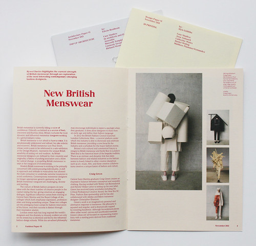
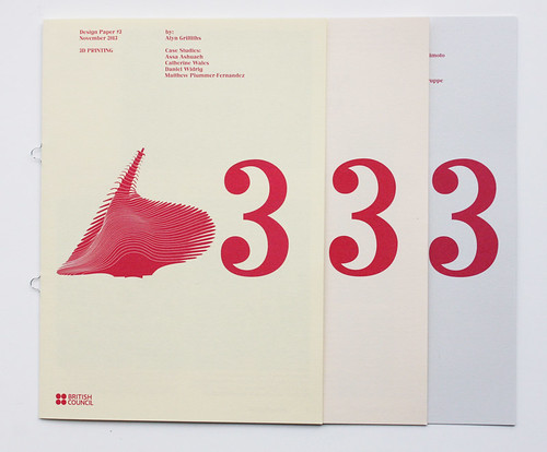
The ‘ADF Papers’, designed by Objectif, are a series of short essays and case studies compiled by the British Council to represent new directions in architecture, design and fashion. Design Paper #3 focuses on 3D printing and it’s ‘serious mark on the public consciousness’. Written by Alyn Griffiths, the case studies examine products by Assa Ashuach, ‘Project DNA’ accessories by Catherine Wales, Daniel Widrig’s Escapist couture collaboration with Iris van Herpen, and Matthew Plummer-Fernandez’s project which ‘explore[s] the connection between technology and social issues’. A digital version of the series can be downloaded from the British Council blog.
Spread from Fashion Paper #3 featuring menswear by Craig Green, Autumn / Winter 2013.
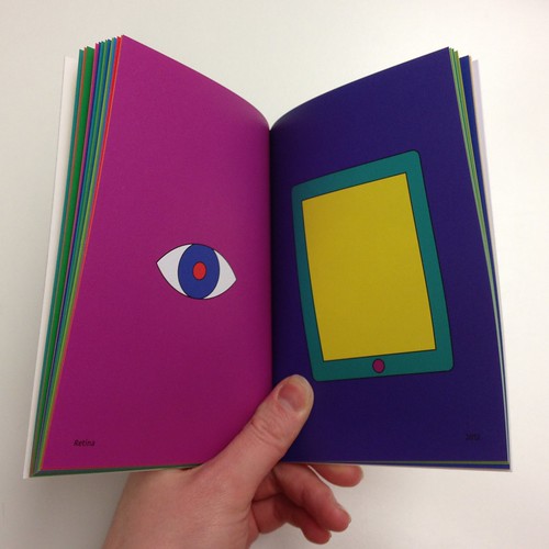
Top: spread from Thomas Manss & Company’s book XX.
The British Council’s ‘ADF Papers’, designed by Objectif.
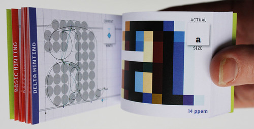
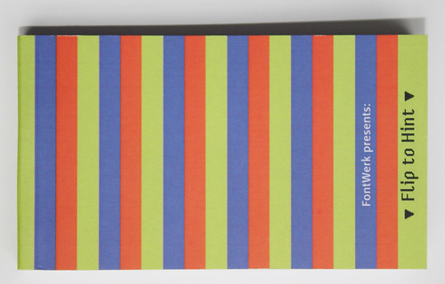
Flip to Hint by Monika Bartels of FontWerk is a ‘manual truetype hinting’ flipbook that shows the process of ‘hinting a single glyph from start to finish’: basic hinting and delta hinting. The tiny booklet demonstrates what the extensive process entails – setting instruction markers in letterforms to ensure legible text on low resolution digital screens – a kind of ‘design after the design’.
Flip to Hint flipbook by Monika Bartels of Fontwerk, which Bartels gave to the editor during ATypI (of which more later).
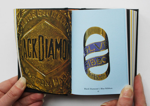
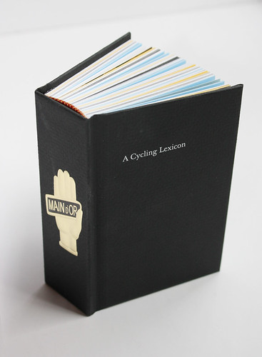
A Cycling Lexicon (Carter Wong, £20), by Phil Carter of design practice Carter Wong, and Jeff Conner, a headbadge collector and professor of biology in Michigan, is a thick small-format book filled with photographs of bicycle headbadges from some of the most famous cycling brands including Raleigh, Royal Enfield and Hirondelle. The headbadges – made from durable metals such as brass, zinc and copper – were roughly the size of two postage stamps and were used to differentiate cycling brands from one another ‘evoking both status and spirit’. The brands used images of stags (Eland, Elk), weaponry (Cadet, Challenge) and other familiar masculine icons – mythical warriors, knights, ferocious animals – as well as making regular references to taking flight. (See the review of Carter Wong’s 1057 in Eye 40).
A Cycling Lexicon is a thick small-format book by Phil Carter of the design practice Carter Wong and headbadge collector Jeff Conner.
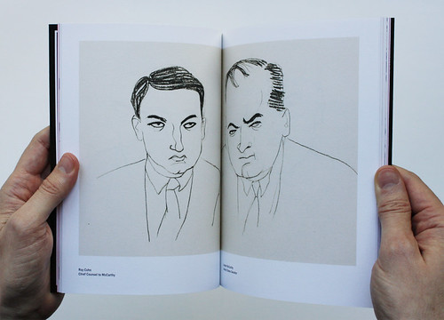
The most recent instalment of Pentagram Papers 43 is Drawing McCarthy – a collection of pen and ink portraits by Aline Simon Oberman, accompanied by essays from Victor Navasky, and the artist’s daughter and Pentagram partner, Emily Oberman. They capture the likeness of key characters from the 1954 court case United States Army versus Senator Joseph McCarthy, drawn by Simon Oberman while watching the hearings on television. The 36-day trial was the ‘first non-sports national event ever to be televised’ and Aline Simon Oberman’s drawings act as a ‘reminder that India ink can outlast the political smear’. The Pentagram Papers series was started in 1974, and is privately published for friends and colleagues of the firm. (See the Reputations interview with John McConnell in Eye 81).
Aline Simon Oberman’s drawings of Roy Cohn, the chief counsel to McCarthy, and Joseph McCarthy, the United States senator on trial in 1954, published in Pentagram Papers 43 Drawing McCarthy.
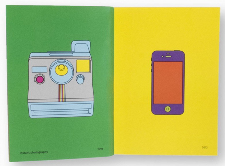
Thomas Manss & Company, whose clients include Foster and Partners, Fedrigoni, and the National Portrait Gallery, produced a colourful small book titled XX to document ‘the many things that have changed’ since 1993 when they opened their doors. The series of witty graphics illustrate differences such as data storage using floppy disks versus the cloud, research using books versus internet search engines and navigation using paper maps versus drop pins on mapping applications.
This page of Thomas Manss & Company’s book XX shows a shift in the general use of the term ‘retina’ between 1993 and 2013.
Eye is the world’s most beautiful and collectable graphic design journal, published quarterly for professional designers, students and anyone interested in critical, informed writing about graphic design and visual culture. It is available from all good design bookshops and online at the Eye shop, where you can buy subscriptions and single issues.