
Spring 1999
Typographica
Herbert Spencer
various designers
Kurt Schwitters
Alexander Rodchenko
El Lissitzky
Piet Zwart
Paul Schuitema
Henryk Berlewi
Max Bill
Herbert Bayer
Stefan Themerson
Franciszka Themerson
Ian Hamilton Finlay
Diter Rot
Josua Reichert
Alcopley
Richard Hamilton
Marcel Duchamp
Armin Hofmann
Karl Gerstner
Siegfried Odermatt
Marcel Wyss
Ken Garland
Markus Kutter
Dom Sylvester Houédard
John Furnival
Hansjörg Mayer
Wolfgang Schmidt
Edward Wright
Herbert Spencer’s magazine, a fusion of Modernism and eclecticism, was one of the most remarkable journals to emerge from British cultural publishing
Typographica is one of the most distinctive visual arts publications of the postwar period. It was published in London, in two series of sixteen issues each, from 1949 to 1967, when its editor, Herbert Spencer, and publisher / printer, Lund Humphries, took the decision to bring the magazine to a halt. By any standards it was a considerable achievement and one with very few close parallels in the art and design publishing of its time. Typographica is unusual not just for the consistency of its editorial vision but for its longevity, since this was a magazine that made, and was expected to make, no profit for its gentlemanly owners. Only 25 when he started Typographica, Spencer edited it, designed it, wrote many of the articles and kept it going for eighteen years, while pursuing a career as typographer, design consultant, author, editor and teacher that would establish him, at a precociously early age, as one of the more notable figures in British postwar typography and graphic design.
Typographica was never as typographically focused or as narrowly professional in its concerns as its choice of name might suggest. Spencer introduced British and international readers to trail-blazing modernists such as Kurt Schwitters, Alexander Rodchenko, El Lissitzky, Piet Zwart, Paul Schuitema, Herbert Bayer, Henryk Berlewi and Max Bill, but he also retained an interest in such traditional subjects as early horse racing programmes, tombstone lettering, printers’ stock blocks and the Royal Arms. From the outset, he included articles on abstract painting and book illustration. As the magazine developed, and Spencer grew in confidence, he began to expose his printer and designer readers to avant-garde material that fell well outside the usual remit and range of a ‘typography’ magazine: Stefan and Franciszka Themerson’s Gaberbocchus Press (see Eye no. 12 vol. 3); the word art of Josua Reichert; the abstract drawings of Alcopley; concrete poets Diter Rot and Ian Hamilton Finlay; Richard Hamilton’s typographic reconstruction of Marcel Duchamp’s Green Box.
In the more elaborate second series (1960-67) photography became increasingly central to Typographica, not only as a subject, but as a visual tool that allowed a new way of conceiving and ‘writing’ the magazine. This, too, was a Modernist idea, as Typographica implicitly acknowledged in 1964, when contributor Michael Middleton quoted László Moholy-Nagy: ‘The knowledge of photography is just as important as that of the alphabet. The illiterate of the future will be the person ignorant of the use of the camera as well as of the pen.’ Typographica was Modernist in a much broader and richer sense than its more typographically minded commentators tend to allow.
Encountered for the first time, the issues of the second series are highly seductive. The thick paper wrap-around covers have an instant, cool-to-the-touch appeal, a substantial and satisfying heaviness. The colour is vibrant and there is a simplicity and clarity to the pages that still looks contemporary and fresh. Coated and uncoated papers, thick sugar papers and delicate overlays are mixed together, sometimes in a single issue. Elaborate use is made of throw-outs, gatefolds, special bound-in insets and booklets attached to the body of the publication by a thread. Typographica’s compelling physical form, its visual and tactile rhetoric, was a persuasive part of its argument for a new graphic and typographic design. It was a designed object to a degree that few design periodicals achieve, particularly over such an extended period. To this day, issues of the magazine feature regularly in the catalogues of specialist booksellers and designers continue to track down copies and collect it.
In the second series, in particular, Spencer was engaged as a designer in a continuous process of graphic incorporation by which the visual material he showed was, to varying degrees, assimilated into the grain of the page, in some cases quite literally, so that it became a partly recontextualised component in the evolving work that was Typographica itself. This was achieved, as a rule, by eliminating the distancing frame formed by the real material edge of the object being displayed, so that, lacking definite boundaries, its image could form a tighter visual bond with adjacent imagery and, ultimately, with the composite page – the page’s edge became, in effect, its new boundary. Spencer subjected a wide range of graphic objects to this treatment, always achieving a considerable gain, in terms of his own page design’s impact, as a result.
In a historical review of Polish Futurism, published in Typographica new series no. 9, in June 1964, designs in red and black by Henryk Berlewi are reprinted actual size, but the original paper’s edge is not shown, while the original backgrounds have been approximated by Spencer with a mustard-coloured sugar paper that gives the designs a semblance of unity they may not, in actuality, possess. A concrete Poster poem by Ian Hamilton Finlay, in Typographica new series no. 8, is rendered typographically by Spencer, who also removed the poster-like border requested by Finlay, so that the page edge itself becomes the border of the poem. In a letter, Finlay responded warmly to the proofs, ‘especially of the poster poem, which is one of those lovely surprises – an idea actualised into something even better than one had dreamed of …’ He did, however, suggest that reinstating the border ‘would make it just perfect’. Spencer clearly did not agree.
‘Design
underfoot’, an article on manhole covers in Typographica new
series no. 7, is one of the most extreme examples of the way in which
graphic material is not simply incorporated but almost sedimented
into the page. It would have been possible to illustrate the subject
by photographing covers in situ in the street. Instead,
rubbings of the ornate discs are printed in flattening black outline
on a rough grey-brown sugar paper. Spencer unfolds a captionless
surface pattern, starting and ending with a single large cover and
moving through a series of group variations. The subject matter is
made visually arresting, using these techniques of graphic
amplification, whether the reader finds it intrinsically interesting
or not. Breaking free from the sometimes deadening effects of sober
art historical documentation, Spencer’s interpretations unreservedly
acknowledge their own highly contingent status as reproductions. An
illustration of a piece of graphic design is not the original –
however meticulously framed and labelled – any more than a painting
of a pipe is a pipe.
Unforeseen contribution
What is so interesting about Typographica in retrospect is that it constantly implies through visual and textual juxtaposition, as well as its highly personal and idiosyncratic mixture of subject matter, a fusion of commercial printing and aesthetic experiment that it can never fully articulate or resolve in its writing and commentary. These tensions are frequently manifest in the remarks made in the magazine and elsewhere by Spencer and his contributors. Beyond Typographica’s immediate impact and influence on close contemporaries, in the 1950s and early 1960s, Spencer’s preoccupations would eventually come to make a contribution that he could not have foreseen and, if he had, might well have opposed.
Since the 1980s, a fusion of commerce and the typographic avant-garde has of course come about to some extent, partly as a result of new digital technology which has given designers an unprecedented degree of typographic freedom. Spencer may have been constrained in his day, as Robin Kinross suggests in Modern Typography, by ‘prevailing views and institutional structures’, but his tastes, instincts and practice as an editor – if not his commentary and arguments – both anticipate and help to facilitate these developments. As the late Dick Higgins, American experimental artist and publisher, has observed, Typographica, ‘was not only extraordinarily elegant and handsome, but was also avant garde in the best sense of the term, a sort of harbinger of larger-scale interest to come’.
Spencer’s Pioneers of Modern Typography, first published in 1969, two years after Typographica’s demise, is a book very much in the magazine’s spirit. It brings together short illustrated profiles of many of the Modernist artists and designers previously published in its pages by Spencer. In the late 1970s, at the start of the postmodern period in British graphic design, Pioneers was filleted for ideas by young revivalist designers such as Malcolm Garrett, Peter Saville and Neville Brody, and a few years later by Why Not Associates. The typographic experiments of the 1920s Modernists, first seen by many British designers in Typographica, offered a liberating alternative model to the continuing dominance of the ‘idea’ graphics invented in New York in the late 1950s.
A reappraisal of Spencer’s work as editor and typographer is not only timely at this point but essential to explain and contextualise the far-reaching changes to typographic communication of the past ten to fifteen years, particularly as they apply to British design. The new ‘new typography’ of the last decade rejects the overt assumptions and teaching of Spencer and his like-minded postwar contemporaries, while seizing the possibilities for cross-fertilisation and the transgression of disciplinary boundaries that Spencer’s practice as editor of Typographica and author of Pioneers of Modern Typography had implied and prefigured but been unable to make explicit. As writers such as Andrew Blauvelt and Gérard Mermoz have argued, such possibilities can only be understood by taking a much less prescriptive view of typographic practice than has been typical of existing commentaries and histories, which tend to come from inside the design profession and serve to endorse and legitimise professional assumptions rather than to interrogate or expand them.
To establish the full significance of a publication that Spencer himself singles out as one of his most durable achievements, it is therefore necessary at times to read against the stated intentions and conscious interpretations of its editor. Spencer’s editorial obsessions and intuitively determined juxtapositions gave rise to possibilities and suggested meanings that he himself did not necessarily intend or predict. Typographica’s innovation was to presuppose, through these collisions – rather through than any elaborate theoretical statement – threads of aesthetic, intellectual and sometimes practical connection between its spectacularly disparate parts.
Spencer’s lack of
doctrinaire Modernism, for which he has been criticised by Robin
Kinross, is the very quality that makes his editorial eclecticism
possible. Like its contemporary, Ark, the Royal College of Art
magazine edited and designed by the college’s students (see Eye
no. 16 vol. 4), Typographica anticipates the emergence of a
fully postmodern sensibility in English art and design. And, as with
Ark, this is far from a fully conscious programme. ‘As a
reflection of this cultural “moment”,’ writes Alex Seago, ‘Ark
was most successful when it was intuitive rather than intellectual,
semi-coherent rather than didactic.’ In much the same way,
Typographica’s suggestiveness lies in its nature as a
‘construct’ in the fullest sense, as an exceptionally prescient
amalgam of writing, editing and design.
Contrapuntal variations
In Typographica new series no. 3, in June 1961, Spencer contrived a juxtaposition of articles which decisively established the magazine’s breadth of sensibility and range of interests, while encapsulating at a stroke the problematic richness of its treatment and view of typography throughout the second series. Ken Garland’s report on the ‘typophoto’ of the Swiss designers Armin Hofmann, Karl Gerstner, Siegfried Odermatt and Marcel Wyss is immediately followed in the issue’s flat plan by Richard Hamilton’s survey of the books of Diter Rot.
Garland (b. 1929), introducing his subject, explains that the integration of type and photo is ‘one of the prime functions, perhaps the prime function of the graphic designer’ and backs up the contention with a portfolio of examples in which photography and typography alike are subordinated to the architecture of the page. Hamilton, meanwhile, in his article, prefaces a short preliminary discussion of the varieties of typography with the reminder that typography is more a craft than an art. The typographer’s job, he advises, is ‘to present the ideas provided in the copy with sympathy and understanding. The best of typographers attempt no more, nor need they.’ Artists, however, can explore the visual form of the word, using type to ‘reinforce poetic ideas’ and ‘create messages as much pictorial as literary’. Hamilton is an artist with an unusually sympathetic view of design; but his concern here, before he moves on to discuss Rot’s use of type as a ‘medium of high art’, is to delineate roles and establish defined limits for the graphic designer, even if the activities of artists have sometimes left a few ‘dents’ in his typographic vocabulary.
The reader is left to make what he or she can of this juxtaposition. A continuity of interest and overlap of aesthetic concern is clearly implied by the articles’ joint inclusion, in such close proximity; such conjunctions do not happen by accident in a publication as carefully directed as Typographica in its second series. Yet both writers sound a note of caution that verges on being a disclaimer. Garland, equally anxious, on the design side, to establish clear limits to his discipline doubts that a ‘slap-dash shambles of unrelated types and photographs, however whimsical and evocative’, can be called a design; and this admonition is relatively mild compared to the routine diktats of the Swiss typography which is the subject of his article:
In fact, the book projects by Rot in Hamilton’s article show a comparable degree of technical rigour. Rot, says Hamilton, ‘manipulates the limitations of the mechanics of modern print to construct his aesthetic’. In Bok 1956-59, for instance, a single size of a single sans serif typeface is used, in lowercase only. By restricting the range of units and concentrating on the plastic as opposed to semantic possibilities of the type material, Rot achieves a series of contrapuntal variations which, Hamilton suggests, form an ‘Esperanto of the eye’ capable of universal comprehension.
Spencer achieves a contrapuntal variation of his own with the editorial material. The Typophoto / Rot pairing is mirrored in the issue’s flat plan by a second pairing. After Rot comes a primarily visual article of eleven pages about a series of advertisements and coloured wrappers for the Swiss daily newspaper National Zeitung designed by Karl Gerstner and Markus Kutter, whose work has already featured in Garland’s article. Gerstner and Kutter’s austere geometrical type constructions for the ads immediately bring to mind Rot’s type variations, while the folding pages used to show the wrappers are an elaboration, in material terms, of the folding pages included in the Rot article.
The final element of this carefully constructed editorial sequence is an article by Spencer on the American abstractionist Alcopley (Alfred Copley) whose drawings are a kind of wordless handwriting – ‘Controlled, deliberate, yet free of alphabetic and symbolic restrictions’ – that bears an obvious relation, despite the differences of aesthetic method, with Rot’s non-semantic concerns. The National Zeitung / Copley pairing restates and amplifies the design / art juxtaposition of Typophoto / Rot, but despite the consistently fluid articulation in Spencer’s design of these articles there is a much higher degree of formal divergence in the second pairing.
It would be three
decades before designers using digital design tools would arrive
independently at the possibilities of a non-semantic abstract
‘typography’ implicit in the drawings of an artist such as
Alcopley. That the formal implications of Rot’s work were not lost
on at least some of Typographica’s readers can be seen in
the book Graphic Design: Visual Comparisons (1963). Alan
Fletcher, Colin Forbes and Bob Gill make explicit the comparison
Spencer had implied through editorial juxtaposition by including two
examples by Rot first seen in Typographica alongside
professional designs from Britain, the United States, France, Italy
and Switzerland.
The liberated page
Throughout the second series Spencer continued to explore, in parallel, the two worlds represented by the editorial pairings in Typographica, new series no. 3. They co-exist as possibilities in its pages, but at this early point in British graphic design’s development nothing like a fusion is achieved. Fletcher, Forbes and Gill’s interest in Rot cannot be taken as typical of the concerns of a design community rapidly establishing its professional presence in the early 1960s.
Typographica new series no. 8 is nonetheless a key issue in the development of the magazine’s interest in the liberation of letter and page, and demonstrates just how far it had strayed, by 1963, from the conventional concerns of a typography and design publication. Earlier in the year, the exhibition ‘Schrift und Bild’ (‘Writing and art’) had moved from the Stedelijk Museum, Amsterdam to the Staatliche Kunsthalle, Baden-Baden, and Spencer included a review by Nicolete Gray in the issue. An ambitious and important survey, ‘Schrift und Bild’ featured among its 427 paintings, collages, photomontages and printed pieces examples by Braque, Klee, Schwitters, Léger, Apollinaire, Marinetti, Lissitzky, Werkman and Alcopley.
One of the new
artists singled out by Gray, Josua Reichert (b. 1937), was also
included in the issue, in an article by the writer and exhibition
organiser Jasia Reichardt. Reichert, a ‘printer-designer-artist’
based in Munich, was influenced by H. N. Werkman’s treatment of
typography as material for making visual poetry. Some of Reichert’s
compositions were produced on an antiquated press, others were
printed by spreading huge sheets of paper on the floor and standing
on old wooden letters originally used for making posters. In
Reichert’s homage to Werkman’s 1920s review The Next Call,
the overprinting of letters is so severe that their individual
outlines are obliterated, an acknowledgement by Reichert – suggests
Reichardt – that the ‘exchanges’ Werkman hoped to effect in his
review were not verbal in essence.
At the opposite end of the issue, balanced against Reichert, is a second excursion into the terra incognita of visual poetry, undertaken by dom Sylvester Houédard (1924-92) – Benedictine monk, scholar and creator of wordless ‘typestracts’ using an Olivetti typewriter. Houédard’s extraordinary essay on concrete poetry and Ian Hamilton Finlay (b. 1925), Scottish ‘poetoypographer’ – as Houédard describes the artist – is written in an orthographically peculiar and poetically compressed style that suggestively demonstrates, through a reconstructed prose, its subjects’ desire to contract and constrict language into constructive new forms of ‘semantic economy’:
‘Words: hard & lovely as diamonds demand to be seen, freed in space; words are wild, sentences tame them. Every word an abstract painting, read quickly in a phrase words get lost: in concrete, eye sees words as objects that release sound / thought echoes in reader … concrete poems just ARE: have no outside reference; they are objects like TOYS & TOOLS (toys can be tools), jewel-like concrete things-in-them-selves …’
In the mid-1960s,
the international concrete poetry movement, which had its
geographically confused origins in the 1950s (see Eye no. 20
vol. 5), drew increasing attention in Britain. For its exponents and
critics, concrete poetry was seen – as Houédard expresses it in
Typographica – as a ‘reincarnation of pre-WW/1
creativities in the post-WW/2 world’. Writing about ‘Type in art’
for Spencer’s Penrose Annual, Jasia Reichardt ends a
historical survey which includes the usual sources – Apollinaire,
Marinetti, Lewis Carroll’s ‘The Mouse’s Tale’ – with
examples of concrete poems by Diter Rot, Ferdinand Kriwet, Ian
Hamilton Finlay, John Furnival and Houédard. In 1965, her essay was
reprinted in the catalogue for ‘Between Poetry and Painting’, an
international survey of visual poetry organised by Reichardt and held
at the Institute of Contemporary Arts. Among the 48 participants were
Finlay, Houédard, Furnival, Edwin Morgan, Hansjörg Mayer and Josua
Reichert. The underlying basis, writes Reichardt, for this attempt to
document a ‘hybrid form of expression’ that eludes a single
accurate definition is the ‘idea that the poet is a designer (in
its widest context) of language’ and that this applies equally to
semiotic, semantic, concrete, visual, typewriter, phonetic, machine
and kinetic poetry.
Non-linear structures
Against this background of interest in the visual arts community, the later issues of Typographica return with uncompromising fascination to the liberation of the letter. A profile of Massin in Typographica new series no. 11 is prefaced by two reproductions, including one by Kriwet, from a series of Poem / Prints published by Finlay’s Wild Hawthorn Press. The following issue features a folded sheet from Diter Rot’s book-in-fragments for the Copley Foundation in Chicago, consisting of 112 folded and unfolded sheets of different sizes, fixed to a cardboard cover by a single staple. A demanding article in Typographica new series no. 13 on the austere serial patterns of Wolfgang Schmidt (1929-95), a Frankfurt graphic artist inspired by the pictures of Max Bill, does not reveal until its final sentence that Schmidt has also undertaken commercial projects, including the visual communications for the new Frankfurt underground.
As with photography
and the new typography, Spencer’s examination of the contemporary
liberated word was accompanied by historical investigations into the
genre’s precursors. In Typographica new series no. 15, Paul
Vincent and regular Typographica collaborator Edward Wright
analyse the achievement of the Flemish poetic innovator Paul van
Ostaijen (1896-1928), author in 1921 of the 153-page Bezette Stad
(‘Occupied city’) in which Wright identifies nine distinct
graphic techniques: ‘the graphic pattern’, he suggests, ‘is a
true notation of the sound, sense and rhythm’ of the Flemish
language. Spencer devoted nineteen pages of the issue to the
reappraisal of a poet virtually unknown at that point in the
English-speaking world.
In ‘Idéogrammes lyriques’ in Typographica new series no. 14, Stefan Themerson returns to the more familiar figure of Apollinaire to discover to what extent the poet himself was involved in the typography and printing of calligrammes such as ‘Il pleut’. Themerson’s article is notable for the care with which its layout brings together his commentary – like Houédard’s, his prose style is idiosyncratic – and the manuscripts and typeset poems, which are allowed to break into the text at the point where they are discussed, encouraging the reader to move fluidly from one to the other. The compositional method treats the visual image with something of the semantic logic seen in Themerson’s theory of ‘internal vertical justification’ in which lines of normally continuous prose are broken into shorter units and aligned vertically according to their verbal sense.
Typographica ends with the most radical contribution, in typographic and structural terms, ever published in its pages. The final article of the final issue, in December 1967, is an inquiry by Stefan Themerson into the contemporary meaning of Kurt Schwitters’ collage aesthetic, cast in the form of a ‘time-chart’ which flows horizontally from page to page, turning each spread into a single visual unit. Part essay, part autobiographical reminiscence, part diagram and part collage, the article defies conventional publishing categories. Themerson is here engaged, with effortless wit and exceptional imagination, in a new form of visual writing made possible by the history of typographic experimentation featured in so many issues of Typographica.
In ‘Kurt Schwitters on a time-chart’, design and writing can no longer be separated; they have fused to become a composite process. Typography has ceased to be a quiescent channel for orderly, sequential argument and become an active visual medium for the living complexity of thought. In the process, the bureaucratic conventions of postwar new typography, observed throughout the second series in Typographica’s own typography, are called into question and abandoned. The seamless professionalism of the page is breached by handwritten annotations and skewed by uneven lines of type and stray text running at angles. Multiple text paths and the fragmented nature of the page encourage readers to break with conventional patterns of reading and enter at any point. In this sense, Themerson’s time-chart prefigures the non-linear structures of the electronic book and interactive multimedia.
In his final editorial, Spencer reflects on the 32 issues of Typographica. They span two decades, he notes, ‘in which the practice and the techniques of typography have changed dramatically, in which technical developments have released typography from the restrictions and the discipline imposed by metal type, and have allowed it to become increasingly visual and less linear, less linguistic. The frontiers between graphic design, photography, and typography have dissolved; the marriage of word and image has been consummated.’
There is a sense in
Spencer’s words (understandable after almost nineteen years) that
with the cessation of Typographica, the story of word and
image, their marriage successfully ‘consummated’, has itself
reached some kind of resolution. It is a measure of Spencer’s
achievement as editor – and a sign perhaps of the slowness of the
gestation – that more than 30 years later so much of this
remarkably prophetic magazine remains pregnant with possibilities
still not entirely explored.
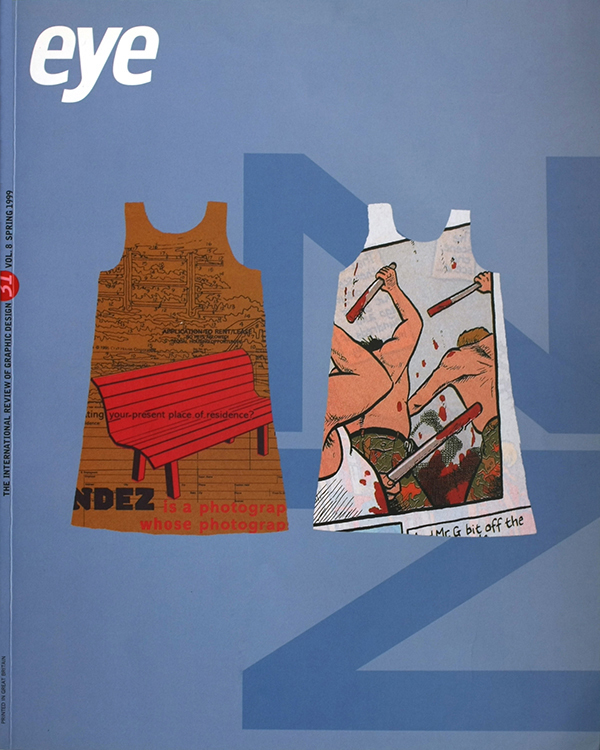
First published in Eye no. 31 vol. 8, Spring 1999
Eye is the world’s most beautiful and collectable graphic design journal, published for professional designers, students and anyone interested in critical, informed writing about graphic design and visual culture. It is available from all good design bookshops and online at the Eye shop.