
Feature: Typography

Return to the square
A chance discovery by some builders led to the adaptation and expansion of a 1930s alphabet by one of Switzerland’s foremost designers

Strategy of excess
Like a human algorithm, Hansje van Halem explores a huge number of variables until she finds the right ‘recipe’ for each project
Bram de Does: the king of (functional) swing
An insistence that technology should match design spurred typographer Bram de Does to create two of the twentieth century’s most beautiful types

Originality and inspiration
It may be unrealistic to expect that every new typeface will be unique and original, but giving up this ambition leads to stagnation
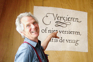
States of independence
The fragmentation of the type market has led to new ways of examining, acquiring and enjoying typefaces … and some confusion
The business of type design
The challenges of earning a living from type design, with honest, thoughtful responses from foundries worldwide
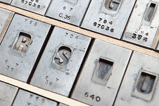
Last man casting
Rainer Gerstenberg is one of the few people in the world to cast foundry type, keeping alive a craft that was developed more than half a millennium ago
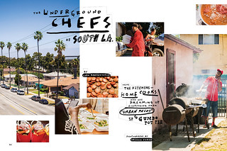
Tales from the West Coast
With its origins in ‘live journalism’ shows, The California Sunday Magazine achieves its narrative power through a cinematic approach to photography and type
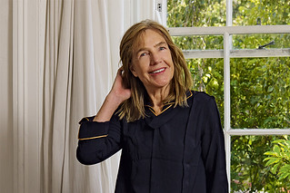
This woman’s work
Kate Hepburn’s design career, embracing pioneering magazines such as Spare Rib and Vole as well as comedy and rock’n’roll, is rooted in rigorous typography
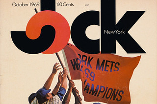
Lovable loser
A daring approach to sports journalism earned the short-lived Jock magazine a place in design history