
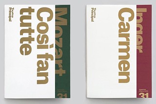
Feature: Typography
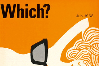
Two-colour haikus
Banks & Miles art directed Which? magazine, the Consumers’ Association’s flagship title and its covers. John Miles talks to Paul Harpin
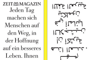
Double vision
Fast-paced, emotional, competitive, surprising – Germany’s ZEITmagazin is a print title for the digital age
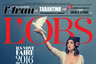
Liberté, égalité, typography
Serge Ricco, creative director of l’Obs, has shown this word-driven, left-wing French weekly the power of expressive type and images
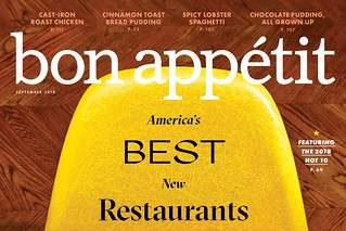
For the love of food and print
Michele Outland, creative director of Bon Appétit, also co-founded and designs the indie mag Gather Journal. Steven Heller reports
Looking at magazines looking at themselves
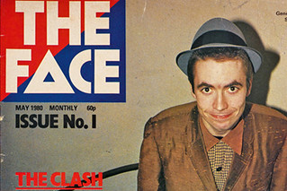
Five enormous, lavish books celebrate the achievements of five legendary titles: Harper’s Bazaar, Rolling Stone, New York, The Face and Octavo
Serious goals
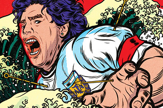
Art director Robert Priest turned editor to make Eight by Eight, an ambitious football title based in Brooklyn
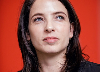
Reputations: Gail Bichler
‘Our content is hard to come by. You are designing in real time about world events. The freedom we have in service of these articles is a special opportunity.’
Systematic play
Using intuition, research and process, the work of Armin Lindauer and Betina Müller revitalises connections between art, design and science
Reputations: Atlas, Astrid Stavro and Pablo Martín
‘You have to be the orchestra conductor, taking control of all these elements and making them magically come together’
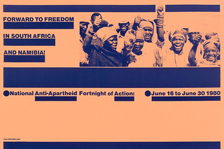
Exposing the menace
David King’s posters integrated type and image with power and uncompromising political commitment. By Rick Poynor