
Feature: Typography
Everyday people
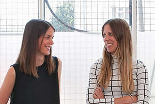
Emma Thomas and Kirsty Carter’s Apfel, A Practice for Everyday Life, brings design into the art world, and makes design an art
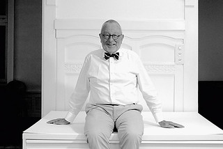
Business at the centre
An interview with Sascha Lötscher, managing partner of G+A
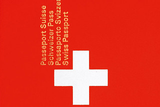
Fritz Gottschalk and the Swiss-Canadian connection
Gottschalk + Ash International spans more than five decades, a Swiss design studio with Modernist roots in Northern Europe and North America. Eye went to Zürich to meet the people behind the practice
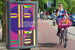
Designing with urgency
From politics to culture to business, Dutch studio Thonik strikes a balance between adventurous concepts and pragmatic resolutions

Art and ambiguity
The identity for Venice Biennale Arte 2019, designed by Melanie Mues, distorts type across a colourful three-dimensional grid
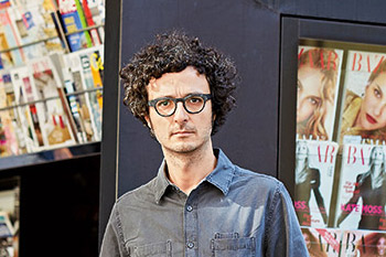
News cycle
Italian designer Francesco Franchi brings magazine finesse to the world of daily newspapers

Pay it forward
Rubén Fontana devised a system for teaching typography that is grounded in Argentina’s culture and politics
New bottle old wine
Drawing on the punches, matrices, specimens and smoke proofs at St Bride Library, Commercial Classics give nineteenth-century typefaces a new lease of life. By John L. Walters
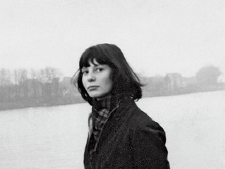
The enigma of Thérèse Moll
This young designer is credited with introducing Swiss typography to MIT
