
Feature
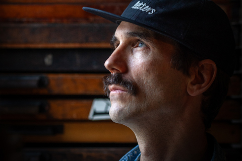
Dafi Kühne comes to town
A grey London February was enlivened by a visit from the Swiss
letterpress innovator. Report: Richard Ardagh [EXTRACT]

Films on tap
Founded in 2007 by Efe Cakarel, Mubi favours editorial design over marketing conventions to reach twenty million subscribers in 190 countries. By John L. Walters [EXTRACT]
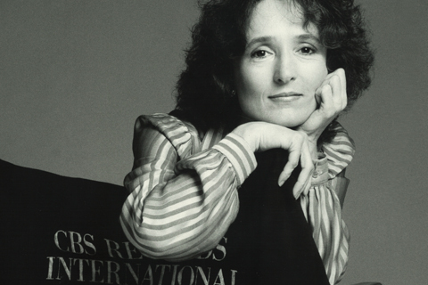
Henrietta Condak: Mistress of Masterworks
Working in-house for CBS, this prolific art director combined illustration, lettering, typography and photography to make a significant body of design for serious music. By Elizabeth Resnick [EXTRACT]
Reputations: Rob Saunders
‘We are in a moment of fascination with everything analogue, especially for designers who spend all day working on screens for screens. For them, it’s refreshing and mind-opening and inspiring in some magical way I can’t fully explain.’ Interview: Eric Heiman [EXTRACT]

Jacket required
A love of reading gives Jon Gray’s book
covers their edge. By Robert Hanks [EXTRACT]
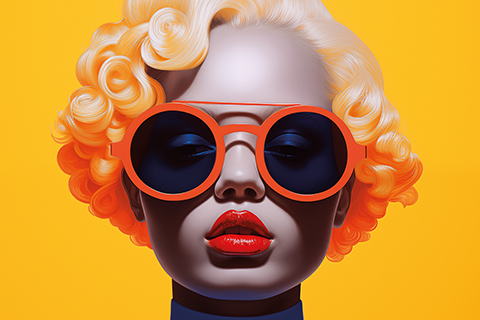
Ultra process
Tool, agent or end of days? John L. Walters asks designers and image-makers how and why they use visual AI and what this might mean for creativity

Baked in
Its ethical problems may be nothing new, but as ‘AI’ invades graphic designers’ workspaces, its excessive energy consumption, resource extraction and exploitation of creative labour need tackling head on. By J. P. Hartnett

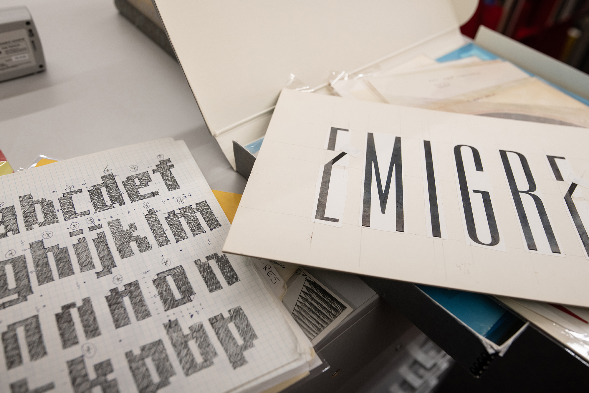
Where the wild type is
Working across record covers, logos, merchandise and stage design, Amaya Segura brings innovative typography to contemporary R&B, hip-hop and beyond. Interview by Holly Catford [EXTRACT]

Learning from Coney Island: Michael Doret and American lettering
When Norman Hathaway was asked to edit and design Michael Doret’s monograph, it was a chance to fill in some gaps in the history of illustrative lettering [EXTRACT]

Eye type reviews
Mark Thomson, Silvia Sfligiotti, Dan Reynolds, Robert Newman, Linda Kudrnovská, Bryan Edmondson
Six contemporary type reviews by Bryan Edmondson, Dan Reynolds, Mark Thomson, Silvia Sfligiotti, Linda Kudrnovská and Robert Newman