
Friday, 9:00am
22 November 2013
The power of type
Tony Brook
Zuzana Licko
Arthur Reinders Folmer
Toko
Vier5
Martin Woodtli
Götz Gramlich
Atlas
Rafa Giocoechea
Tom Pregiato
Reviews
Typography
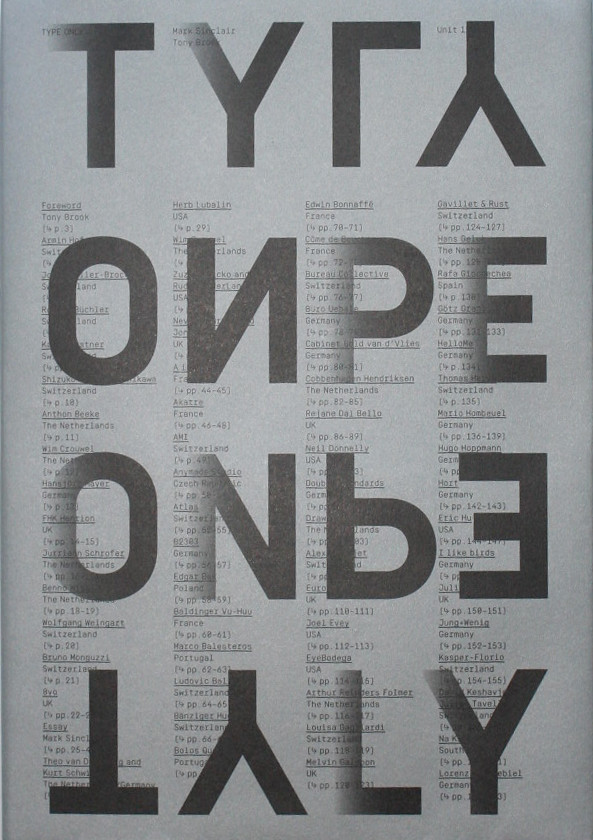
Type Only
Essay by Mark Sinclair. Edited by Tony Brook, Claudia Klat and Adrian Shaughnessy. Design by Spin. Unit Editions, £45
Unit Editions’ book Type Only documents graphic design – from the late 1990s to the present – that primarily uses typography to illustrate and communicate ideas, writes Sarah Snaith.
In the foreword, Unit’s Tony Brook writes: ‘The ever broadening use of type has resulted in innovative, occassionally bewildering designs – from the refined and cultured to the irreverent, bizarre and downright ugly.’
The book contains a wide selection of poster work, peppered with invitations, illustrations, magazine and book covers, flyers, campaign proposals, identities, pieces of signage and record covers, which demostrate significant shifts in approach and technology, many enabled by the digital revolution. A small selection of historic items ‘give a sense of lineage.’
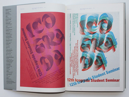
F. H. K. Henrion, two posters for the twelfth Icograda student seminar (UK), 1986, which uses the typeface Calypso.
Zuzana Licko’s bitmap fonts, designed and used from issue two of Emigre magazine, exemplify the impact of digital technology on graphic design. Mark Sinclair’s essay (following Brook’s foreword) quotes Licko from a 2007 interview: ‘In the late 1980s, the personal computer exploded the field of type design onto every designer’s desktop, and some took up the challenge.’ Sinclair’s essay frames the predominantly visual book by describing type as ‘both form for content and the content of form.’
Arthur Reinders Folmer, ‘Grid Fairy Tales’ artwork for lasercut wood panel, 2011 (left), and the poster ‘Typographic Noise’, 2010 (right).
Atlas, ‘Werk-und Atelierstipendien de Stadt Zürich’ poster, 2012 (left) and ‘Corpus Urbanis’ invitation, 2012 (right).
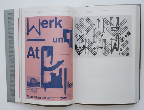
The shifts that came about after the digital revolution demonstrate experimental ebbs and flows towards and away from legibility, form and the expression of ideas using strictly typographic devices. Posters which stand out in the large-format book (appropriately wrapped in a typographic poster) are the monochromatic Giacometti flyer (2012) by Spin’s Claudia Klat as well as Arthur Reinders Folmer’s lasercut panel (2011) and ‘Typographic Noise’ poster (2010). More colourful highlights are ‘Metronomy: Radio Ladio’ poster (2010) by Côme de Bouchony, and Atlas’s ‘Werk-und Atelierstipendien de Stadt Zürich’ poster (2012).
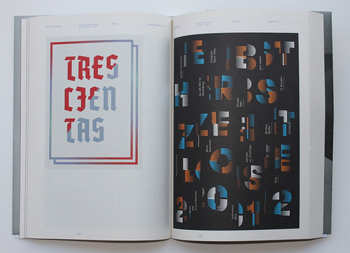
Rafa Giocoechea, ‘Trescientas Razones’ illustration, 2012 (left), and Götz Gramlich, ‘Herbstzeitlose poster’, 2012 (right), also featured in ‘Type specific’ in Eye 86.
The more surprising trends that surface in the book come from the mid- and late-2000s, where a return to an early-digital aesthetic can be seen in posters such as Martin Woodtli’s ‘VideoEx’ and Vier5’s poster for École des Beaux-Arts, both from 2008, as well as Tom Pregiato’s Anenon: Are You For Real (2011), among others.
See ‘Reputations: Tony Brook’ in Eye 86, ‘The magazine as laboratory bench’ in Eye 12 and ‘Type space’ in Eye 78.
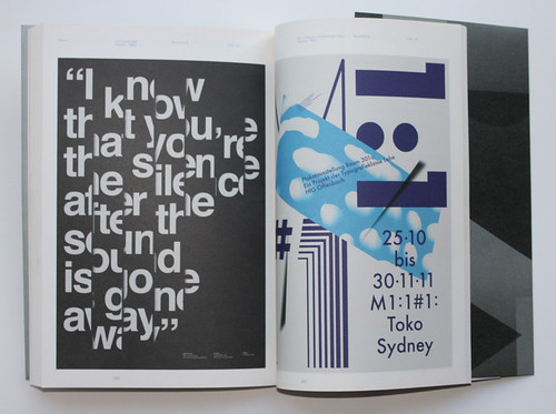
Toko, Lyric & Type poster, 2010 (left), and M1:1 poster exhibition poster, 2011 (right).
Sarah Snaith, design writer and editor, London
Eye is the world’s most beautiful and collectable graphic design journal, published quarterly for professional designers, students and anyone interested in critical, informed writing about graphic design and visual culture. It is available from all good design bookshops and online at the Eye shop, where you can buy subscriptions and single issues.