
Tuesday, 10:20pm
18 April 2023
Books received #53

Eye editors
Niklaus Troxler
Anthony Burrill
My Name is Wendy
Bureau d’etudes
Margaret Pearce
Book design
Design education
Graphic design
Information design
Posters
Typography
Big Type; the nature of data; match boxes from Singapore; and posters by Niklaus Troxler
In our latest edition of books received, we look at titles featuring typographically driven graphic design, match boxes from Singapore, posters designed by Niklaus Troxler, and Paul Kahn reviews a new book about data visualisation by Peter Hall and Patricio Dávila
Cover of Big Type! Graphic Design and Identities with Typographic Emphasis.

Big Type! Graphic Design and Identities with Typographic Emphasis from Counter-Print Books
With a cover available in three colourways, Big Type! Graphic Design and Identities with Typographic Emphasis is a title published by Counter-Print Books. The book gathers a collection of projects where lettering and type play pivotal role in forming visual language and communicating messages in an engaging and direct way. These projects demonstrate the power typography can hold in visually saturated environments, whether in physical or digital spaces.
The book explores type visually by organising featured projects in relation to various design strategies: scale, repetition, cropping, lettering, distortion and interaction. Woven in between the case studies are interviews with designers and agencies, who share their knowledge on the subject.
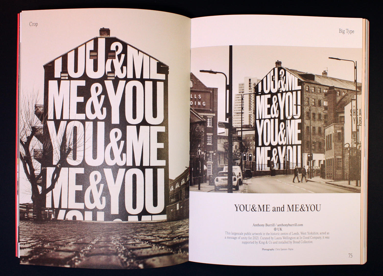
Spread from the ‘Crop’ chapter of the book featuring a large scale public artwork in Leeds (UK) by designer Anthony Burrill.
Spread from the ‘Condensed’ chapter of the book, picturing Within Magazine designed by My Name is Wendy Studio.

Cover of Critical Visualization: Rethinking the Representation of Data.

Critical Visualization: Rethinking the Representation of Data by Peter A. Hall and Patricio Dávila, published by Bloomsbury
Critical Visualization is more about the nature of data than its representation, writes Paul Kahn. Designers who ‘affirm the validity of the data and prioritize this data and the reading of this data over other data’ have to understand that data is ‘never truly neutral, nor purely objective.’ Using Situationist analysis and Actor Network Theory, colourfully illustrated by Marc Ngui’s figures, Peter Hall (see ‘Surfing or special effects? Design Inquiry’ in Eye 54) and Patricio Dávila argue that uncritical visualisation reproduces colonial power structures, marginalises disenfranchised populations, and fails to confront the political distortions of the data being visualised.
To challenge established power structures, critical visualisation collaborates with the community whose data is being visualised. They reproduce work by Data4Change, Iconoclasistas, and Bureau d’etudes to show this direction. They also present designs by Margaret Pearce, whose mapping of indigenous placenames throughout Canada are a wonder to behold. But all visualisation is a card trick for which the dealer has some ethical responsibility: ‘Visualization performs a paradoxical role of making visible selected aspects of data drawn from our reality, while simultaneously making invisible the way the data was produced. How this dual role of giving voice and silencing is ethically carried out is part of the mandate of a critical visualization practitioner.’ Now you see it, now you don’t.
Paul Kahn, information designer and lecturer at Northeastern University, Boston
See also: ‘The pandemic that launched a thousand visualisations’ in Eye 101, ‘Visual systems of life and death’ in Eye 101, ‘Information and emancipation’ in Eye 98 and ‘Covid visualisations: 2023 update’ on Eye blog.
Margaret Pearce, Coming Home to Indigneous Place Names in Canada, 2017.

Detail of Government Mondial by Bureau d’etudes, 2013.

Cover of Striking! Advertising Matches from Singapore

Striking! Advertising Matches from Singapore, co-published by In Plain Words and Temporary Press
This pocket-sized, bright, and charming book co-published by In Plain Words and Temporary Press presents a collection of more than 350 advertising match boxes from Singapore, each reproduced at its true size. An introduction by Justin Zhuang gives historical context to their role as an advertising medium, as well as their cultural significance. Reproduced with neon inks, the book captures numerous designs for restaurants, theatres, shopping malls, hotels and coffee houses between the 1970s and 90s.
The ephemera was sourced from the Singapore Graphic Archives and then grouped according to different categories. Seven chapters group boxes according to the eye-catching lettering and typography, which include location or architectural details, feature literal representation of services and products, or were inspired by the international style.
Spread with matches from Ming Court Hotel, featured in ‘A Cultural Feast’ section of the book, focusing on restaurants serving international cuisines in Singapore.

Spread featuring location-led examples of matches, with examples from Hotel Supreme (right) and Tai Seng Restaurant in Outram Park (left).

Cover of Niklaus Troxler featuring his poster from 1992 titled Tote Bäume – Dead Trees. It was originally created at the invitation of the UN Conference on Environment and Development in Rio de Janeiro.

Niklaus Troxler (Poster Collection 34) from Lars Müller
Niklaus Troxler is the latest in Lars Müller’s useful series of books about posters from the Museum für Gestaltung in Zürich. Troxler has a strong claim to be the jazz lover’s favourite Swiss poster designer: in 1975 he founded a festival in Willisau that remains a magnet for jazz musicians and fans worldwide. This slim volume juxtaposes Troxler’s legendary jazz posters with work for clients (including the Olma agricultural fair, Knie circus, Geneva International Motor Show) self-initiated political manifestos. An essay by philosopher Daniel Martin Feige (author of Musik für Designer) puts Troxler’s structured improvisations in context.
Spread with posters by Niklaus Troxler: Anthony Cox Quartet Featuring Dawey Redman, 1992 (left); and OM hört auf!, 1982 (right) .

Spread featuring Troxler’s cultural posters. Left page: Schlussfeier in Basel, 1991 (top left); Ouverture du 700ème, 1991 (top right); 61e Salon de l’Auto et Accessoires Genève, 1991 (bottom left); Fest der vier Kulturen, 1991 (bottom right). Right page: Olma St. Gallen, 1988.

Eye is the world’s most beautiful and collectable graphic design journal, published for professional designers, students and anyone interested in critical, informed writing about graphic design and visual culture. It is available from all good design bookshops and online at the Eye shop, where you can buy subscriptions and single issues.