
Friday, 1:00pm
25 September 2026
Books received #65
various designers
Karlssonwilker
Hjalti Karlsson
Jan Wilker
Design education
Typography
Identity
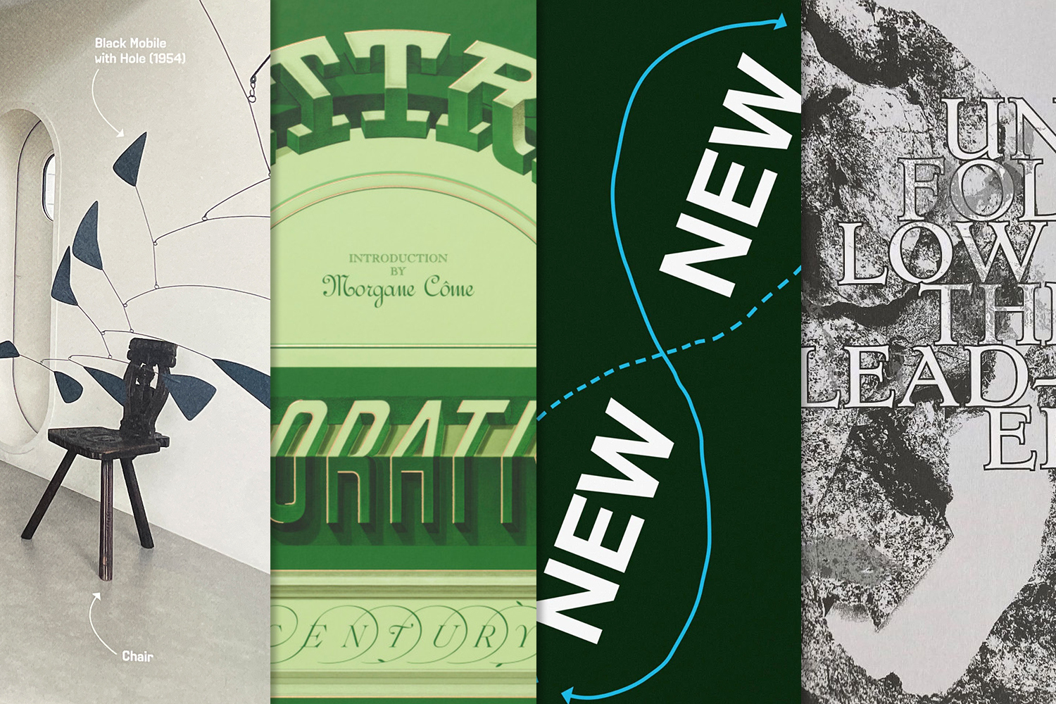
Four titles: Finding an Identity for Calder Gardens; Lettres Décoratives; New New Typography; and Unfollow the Leader
In this edition of ‘Books received’, the Eye team looks at a range of publications, including Karlssonwilker’s creative process for the Calder Gardens brand identity; a survey of letterforms and alphabets by French sign painters from the nineteenth and twentieth century; a look into the shifting landscape of typographic principles; and student perspectives regarding the canon in graphic design.
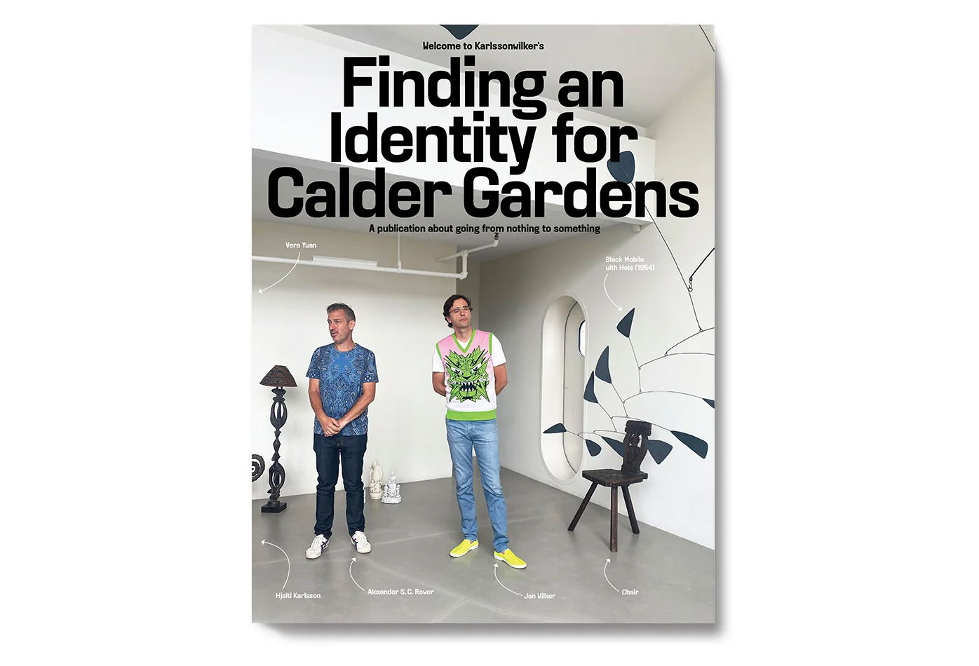
Finding an Identity for Calder Gardens (Lars Müller Publishers). By Karlssonwilker inc..$30 (paperback) CHF35 (hardcover)
Available in hardcover and paperback, Finding an Identity for Calder Gardens, maps the creative process of the renowned New York-based design studio Karlssonwilker Inc. for the creation of the brand identity for Calder Gardens, a new institution that is dedicated to the work of influential American sculptor and Philadelphia-native Alexander Calder (1898-1976). Over the 140 pages (in the paperback) and 192 pages (in the hardcover), this publication includes the studio’s many ideas in collaboration with the foundation, along with visual references, sketches, mockups, keynote presentations, documentation of site visits and an interview with the president of the Calder Foundation, Alexander S. C. Rower.
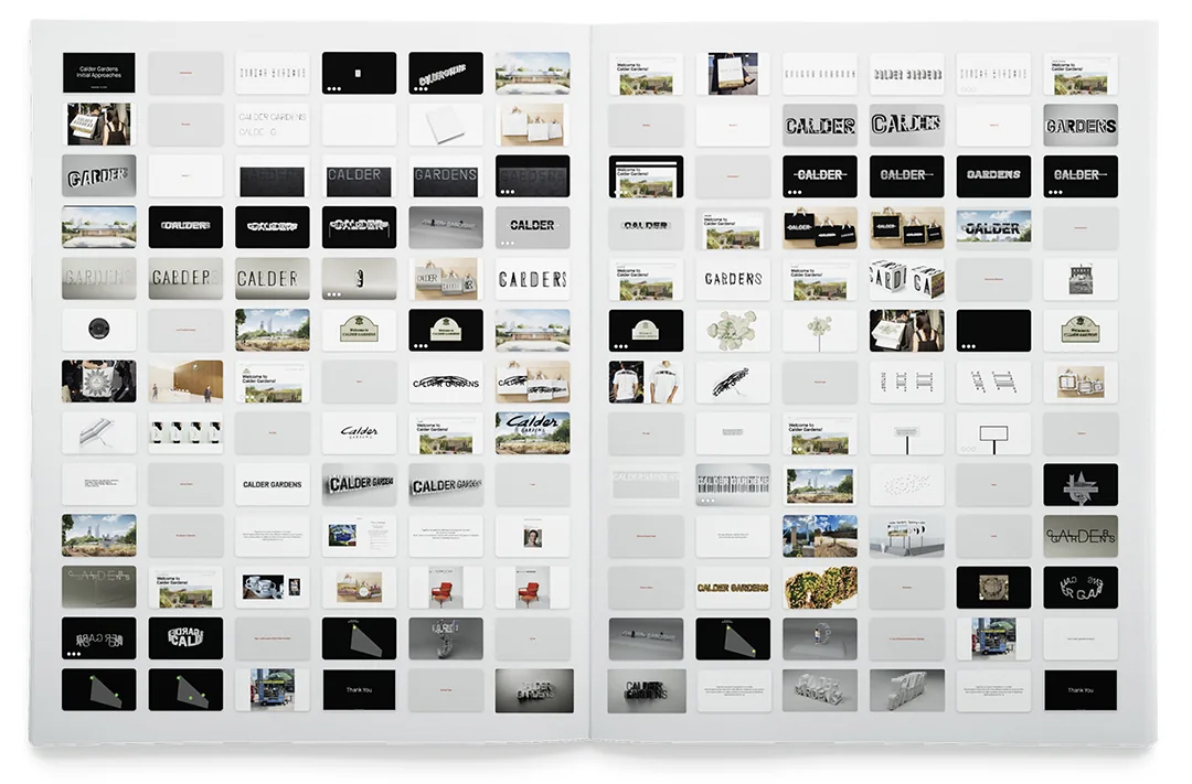
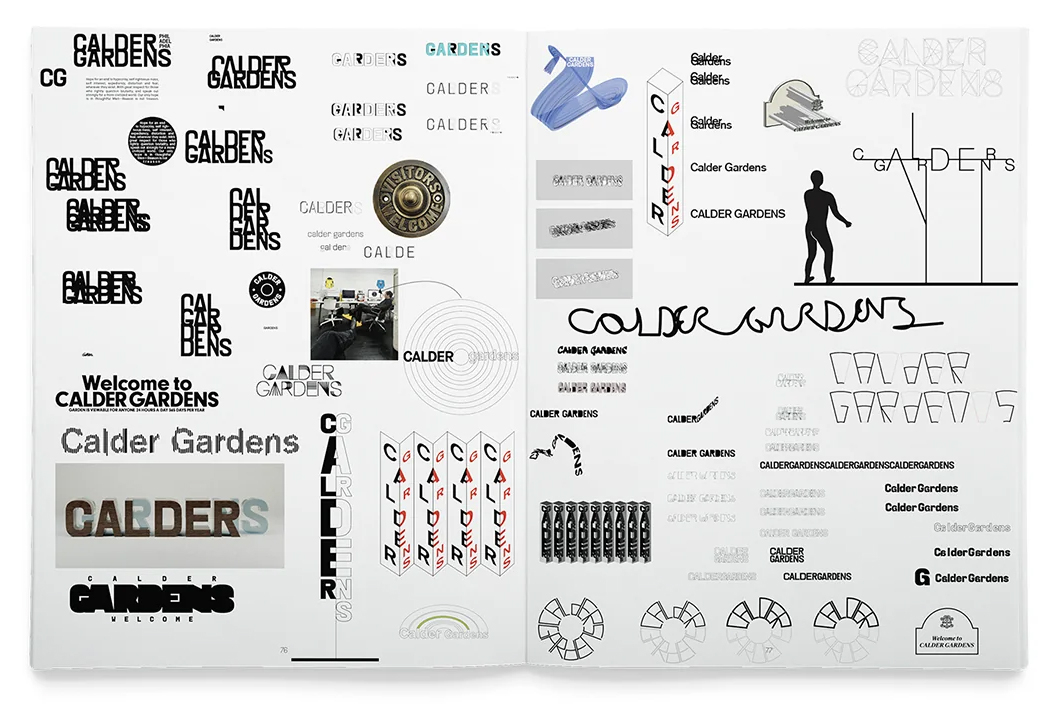
A spread from Finding an Identity for Calder Gardens featuring a selection of roughly twenty approaches Karlssonwilker Inc. shared at their first meeting with the Calder Foundation on 16 November 2023.
Top. cover.
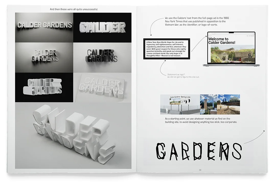
A spread showing outdoor sign ideas for Calder Gardens on the left and various ideas for the logo and material selection on the right.
Founded in 2000 by graphic designers Jan Wilker and Hjalti Karlsson, with Vera Yuan joining as partner in 2020, Karlssonwilker Inc. provides an insightful look into their design methodology and process for a vast array of components for the Calder Garden identity. With the subtitle ‘A publication about going from nothing to something’, the book has a tone that does not take themselves too seriously. For example, in a spread showing a potential option for outdoor signage, the caption reads, ‘For a few hours Hjaiti was convinced this was a masterpiece.’
A mockup of a Calder Gardens sign, that doubles as a concrete bench from a variety of angles, created by Karlssonwilker Inc.
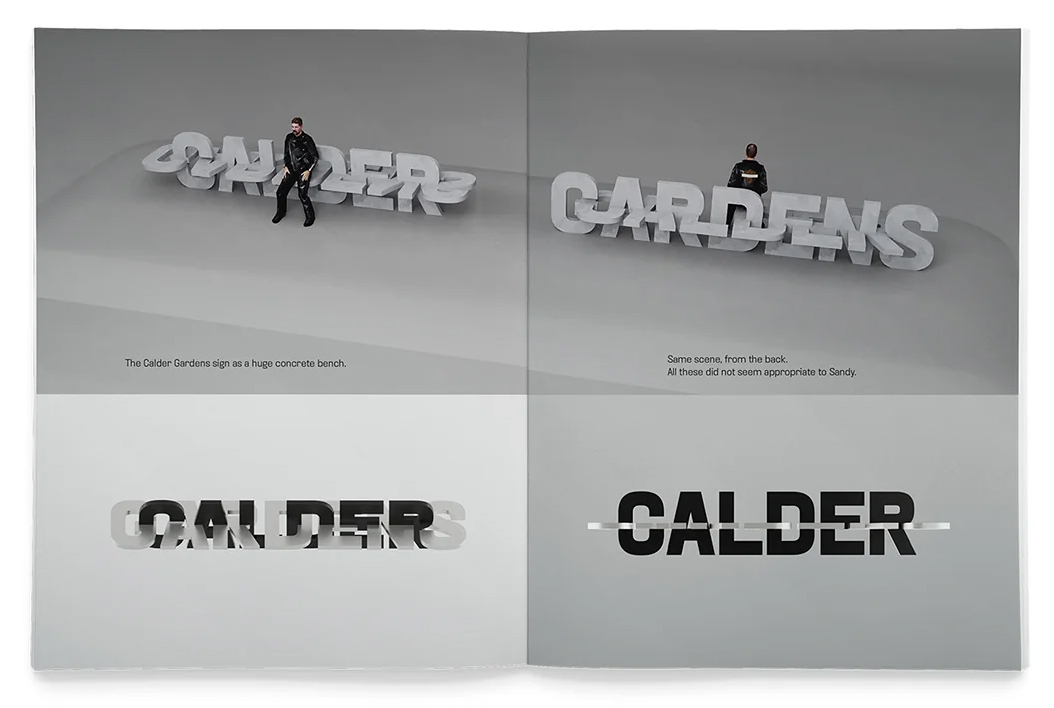
The publication uses what Karlssonwilker Inc. refers to as their ‘house font’, the typeface they created called KWINC Grotesk, and was printed on Holmen TRND 70gsm for the interior. Throughout the different sections, the studio walks the reader through the stages of the project, from the first meeting at the Calder Foundation, to the second meeting in Roxbury, Connecticut, visiting Calder’s house and studio, all the way to the twelfth presentation to the Calder Gardens Board at the Barnes Foundation.
A spread from the publication featuring a wide range of sketches, some shown to the client and others not shown.
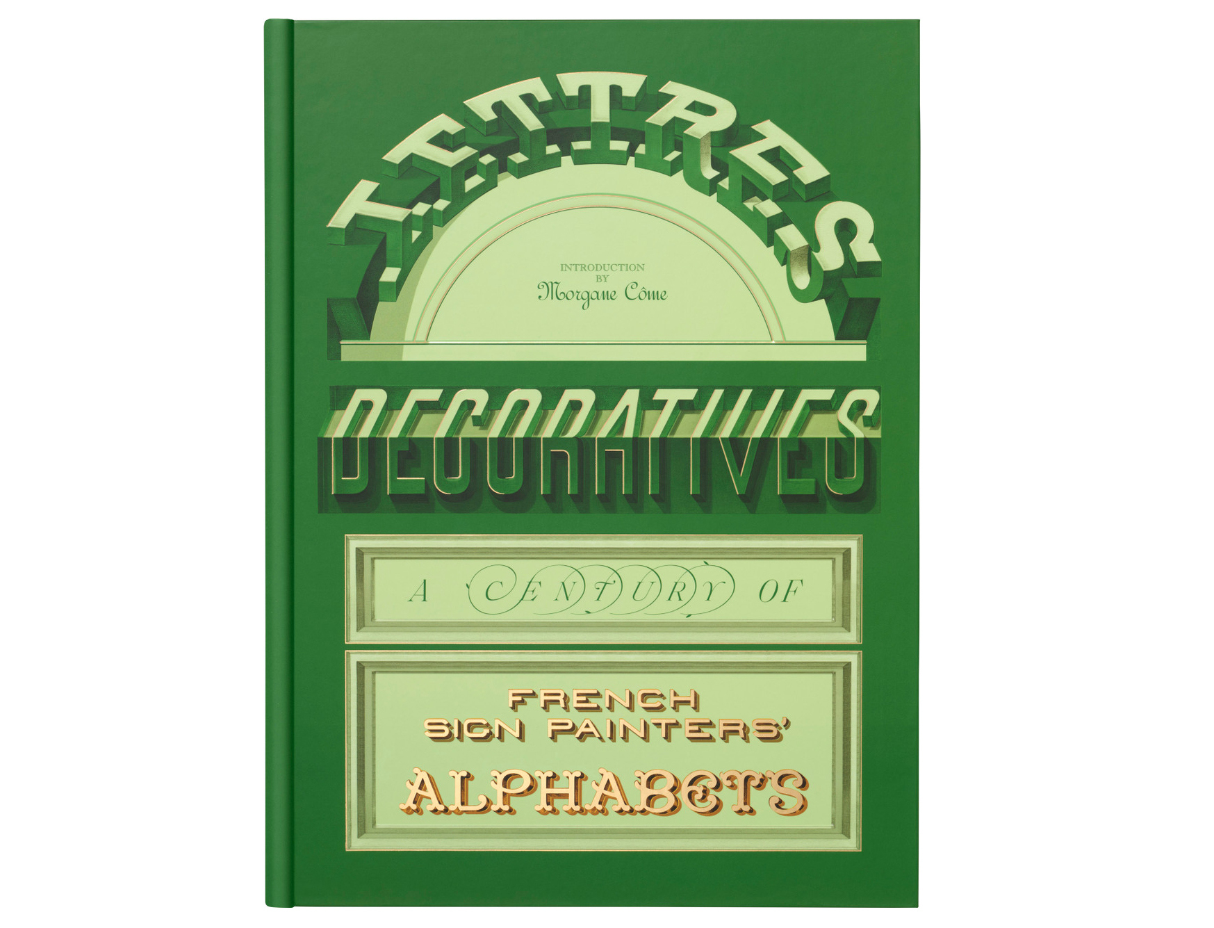
Lettres Décoratives: A Century of French Sign Painters’ Alphabets (Letterform Archive). Introduction by Morgane Côme. $65
Beginning with a fascinating introduction by contemporary French sign painter Morgane Côme, this sizeable publication features a colourful array of alphabets and letterforms from hand-painted signs in France during the nineteenth and early twentieth centuries. With twelve portfolio selections, the publication includes more than 150 plates from lithographic albums, which were printed during the peak era of sign painting.
The stunning full-page historic image of nineteenth-century Paris on the first spread of Lettres Décoratives shows myriad painted signs in a long-exposure photograph. Top. Cover of Lettres Décoratives.
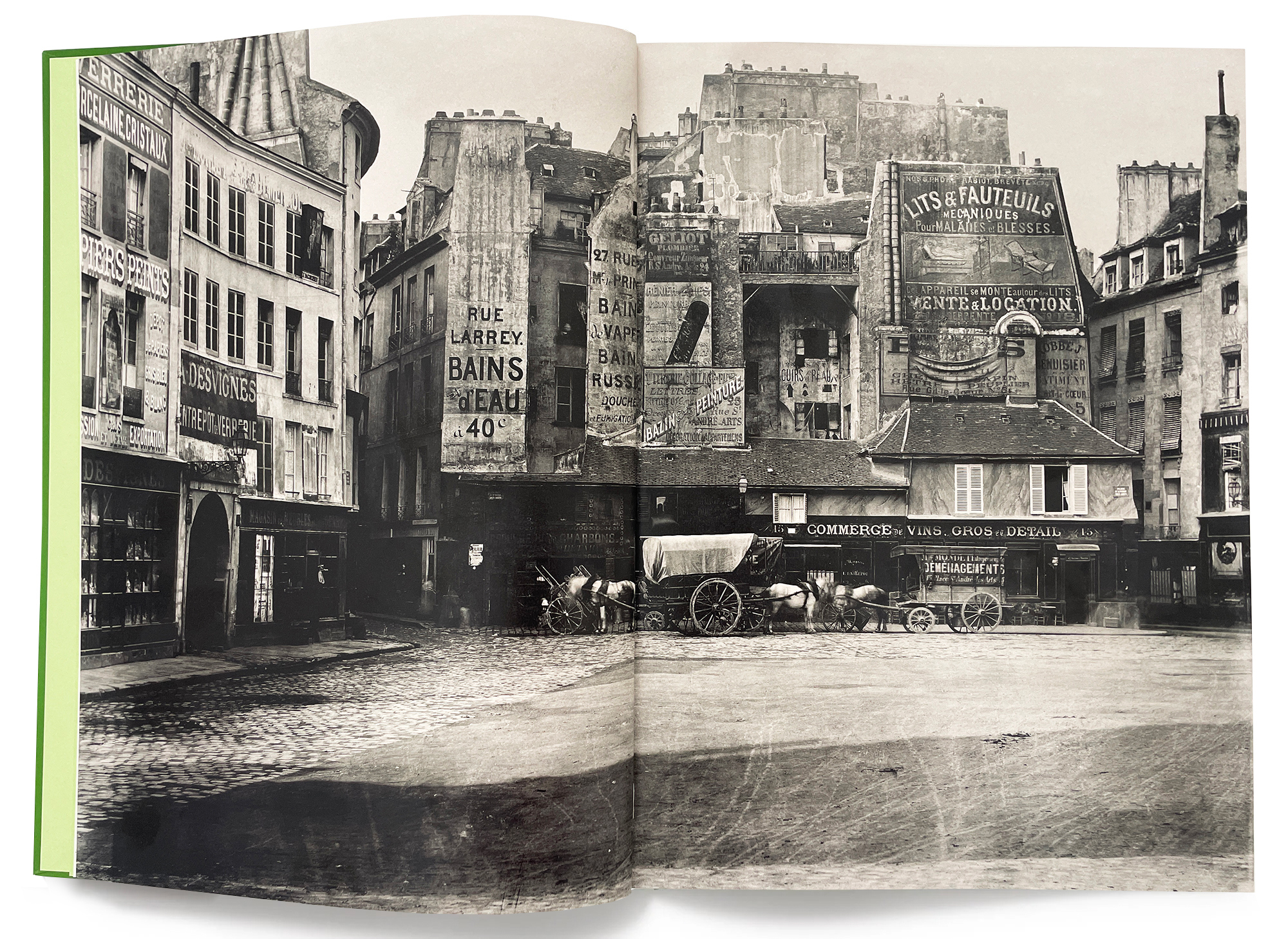
Côme includes a 25-page introduction called ‘Rediscovering a two-hundred-year-old craft’, with citations and footnotes, in which she discusses the transatlantic revival of the craft of sign painting. Walking the reader through the historical aspects of the craft – from the transition of pictorial signs to painted letters after the rise of public literacy due to the invention of Gutenberg’s press, to the founding of institutes in Brussels dedicated to the art of decorative painting – Côme documents this resurgence with visuals that punctuate the historical elements of the craft and efforts to keep sign painting alive and well.
A spread from the publication featuring lithographic model letters by decorative painter Nicolas Glaise, originally published in 1882. Below. Another spead of Glaise’s work from the 1882 manual Building Painter's Album: Elementary Studies. Bottom. A spread featuring Art Nouveau letters by decorative painter E. Mulier from 1903.
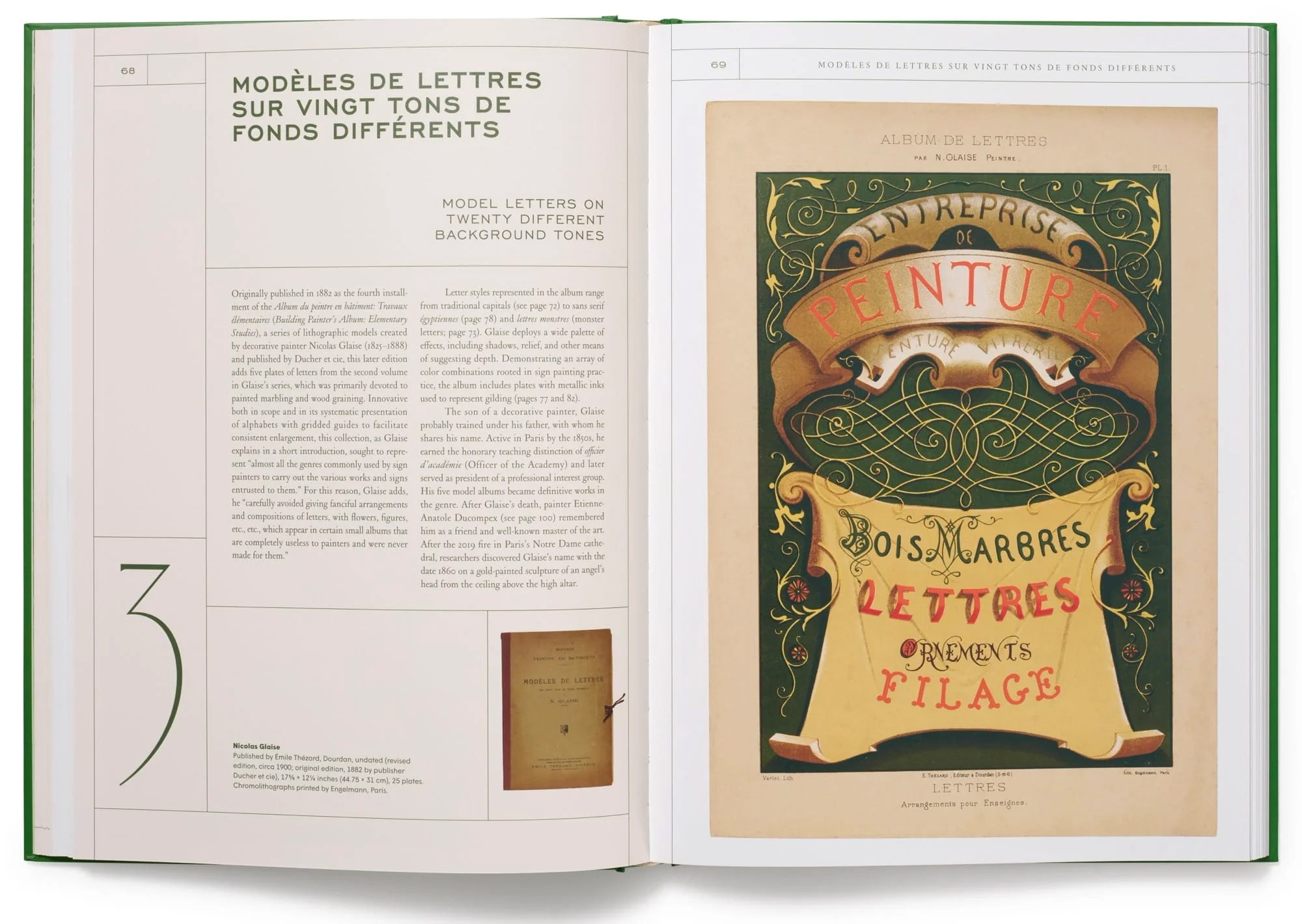
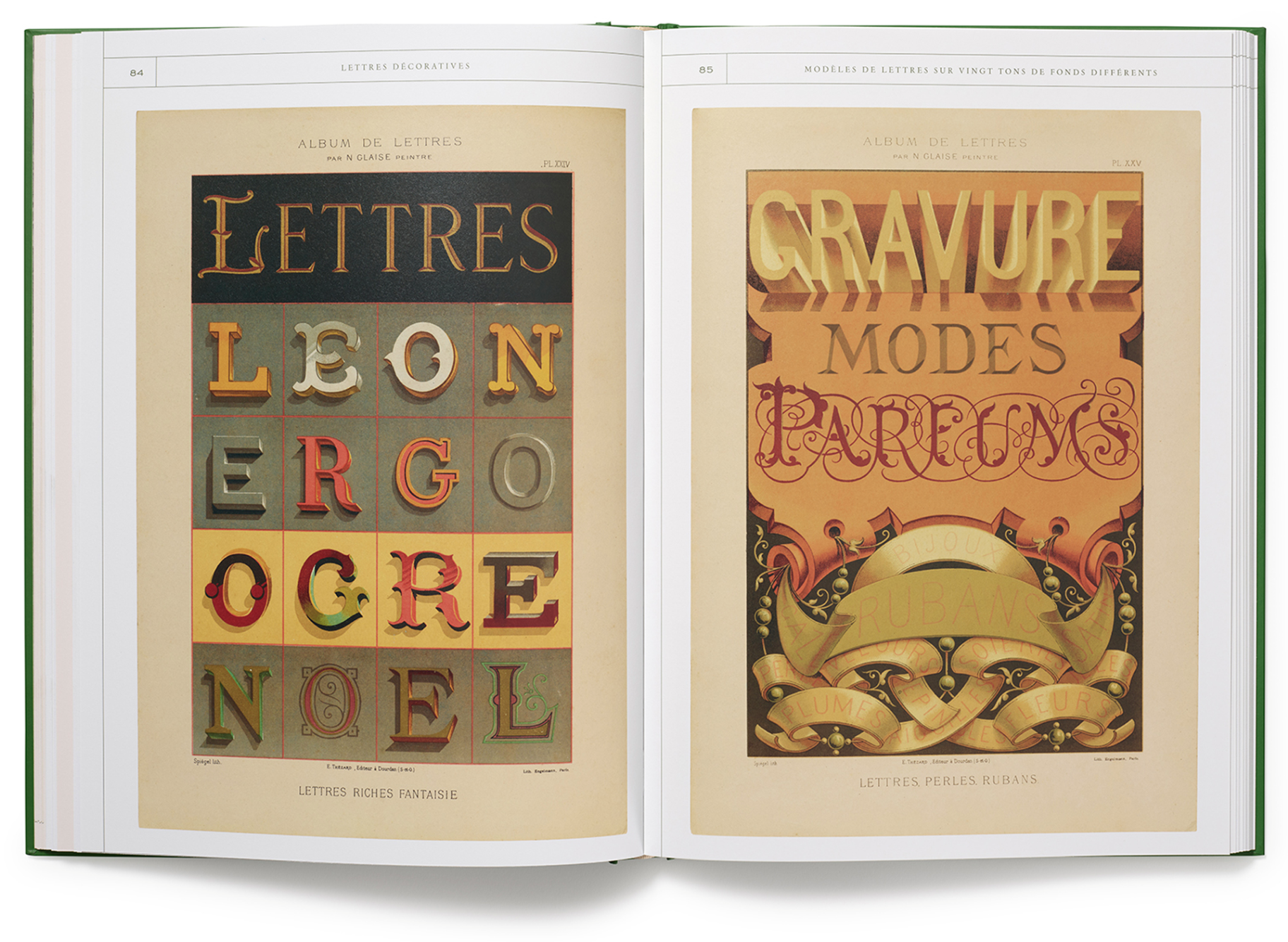
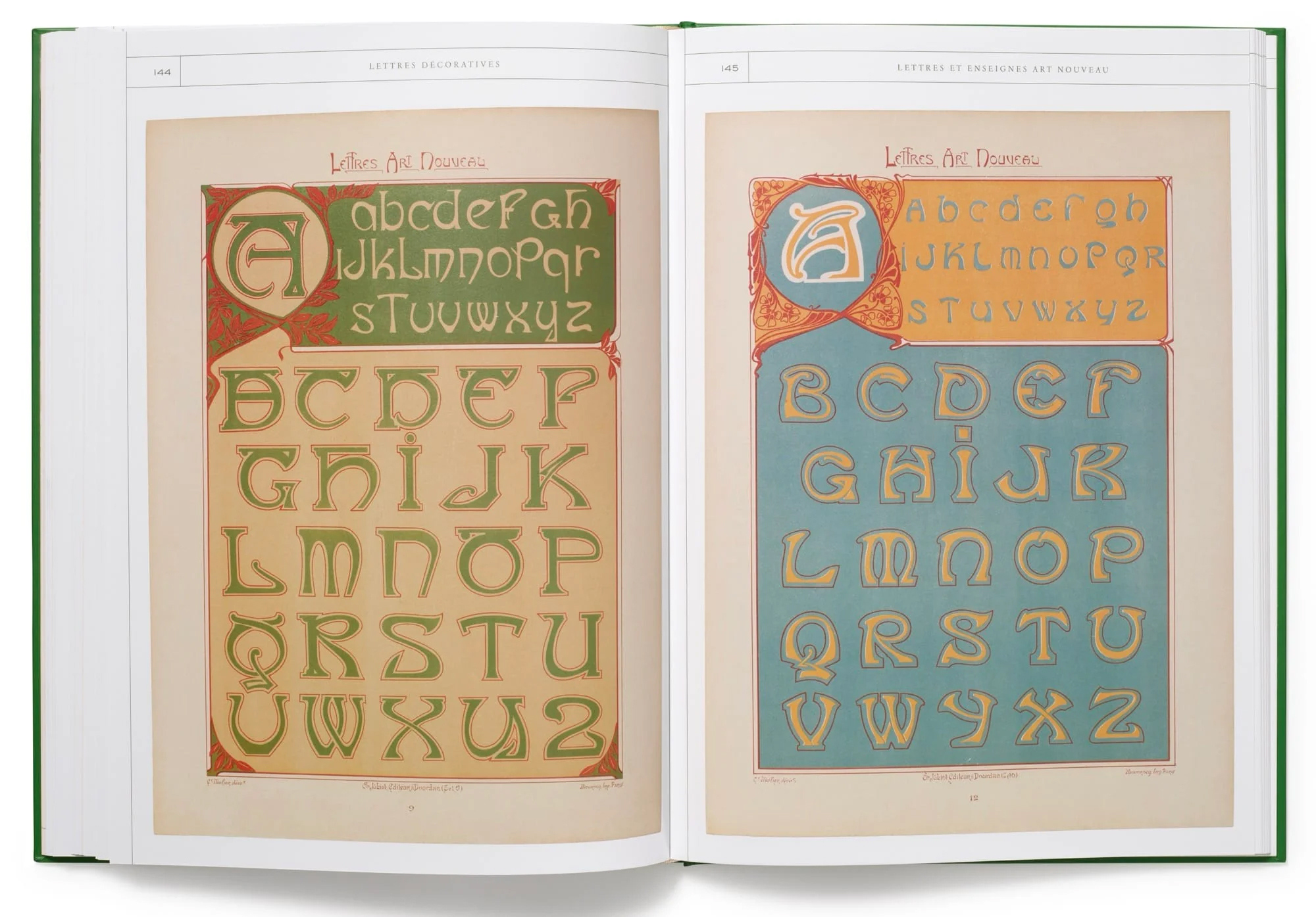
The featured letter templates and albums of painted letters from historical lithographic albums are set in chronological order with examples by decorative painters Jean-Jacques Petit, Honoré Opin, Georges-Adolph Bisiaux, Pierre Chabat and many more. The extracts include a range of styles, from serif to script to three-dimensional ornate type, with many colourful examples popping off of the page. For more about Letterform Archive, see the Reputations interview with founder Rob Saunders in Eye 108.
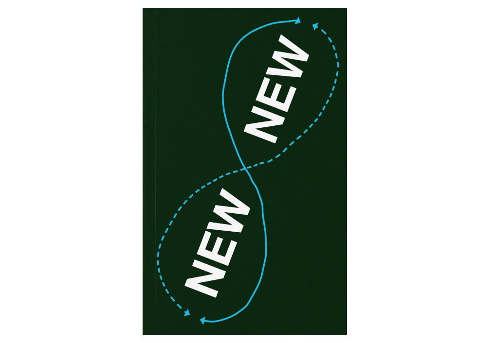
New New Typography: Adventures in Transborder Typography (Sorry Press). By Matter of (eds.). €25.
Posing the question, ‘Are we stuck with the established typographic principles of the twentieth century?,‘ New New Typography aims to shake up established paradigms surrounding typography and look through an expanded (and more inclusive) vocabulary. The introduction starts with a discussion of the systematic typographic principles proposed by Jan Tschichold in ‘The New Typography‘ more than 100 years ago, and brings in an open-ended re-examination of typography principles, with a proposition into trying new ways of viewing and engaging with typography and testing the boundaries.
Spread featuring an introduction into the concept of new ‘New Typography‘. Top. Cover of New New Typography.
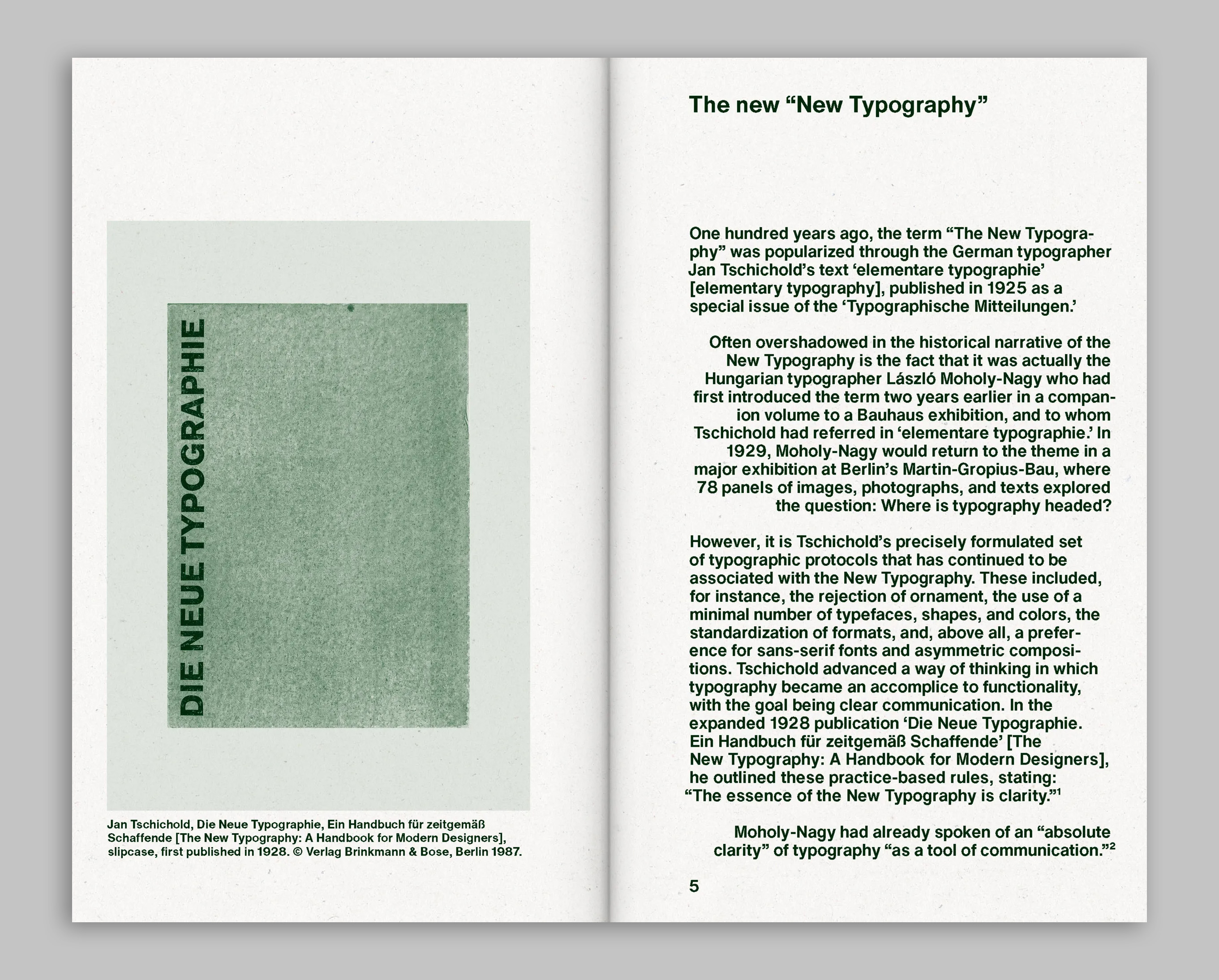
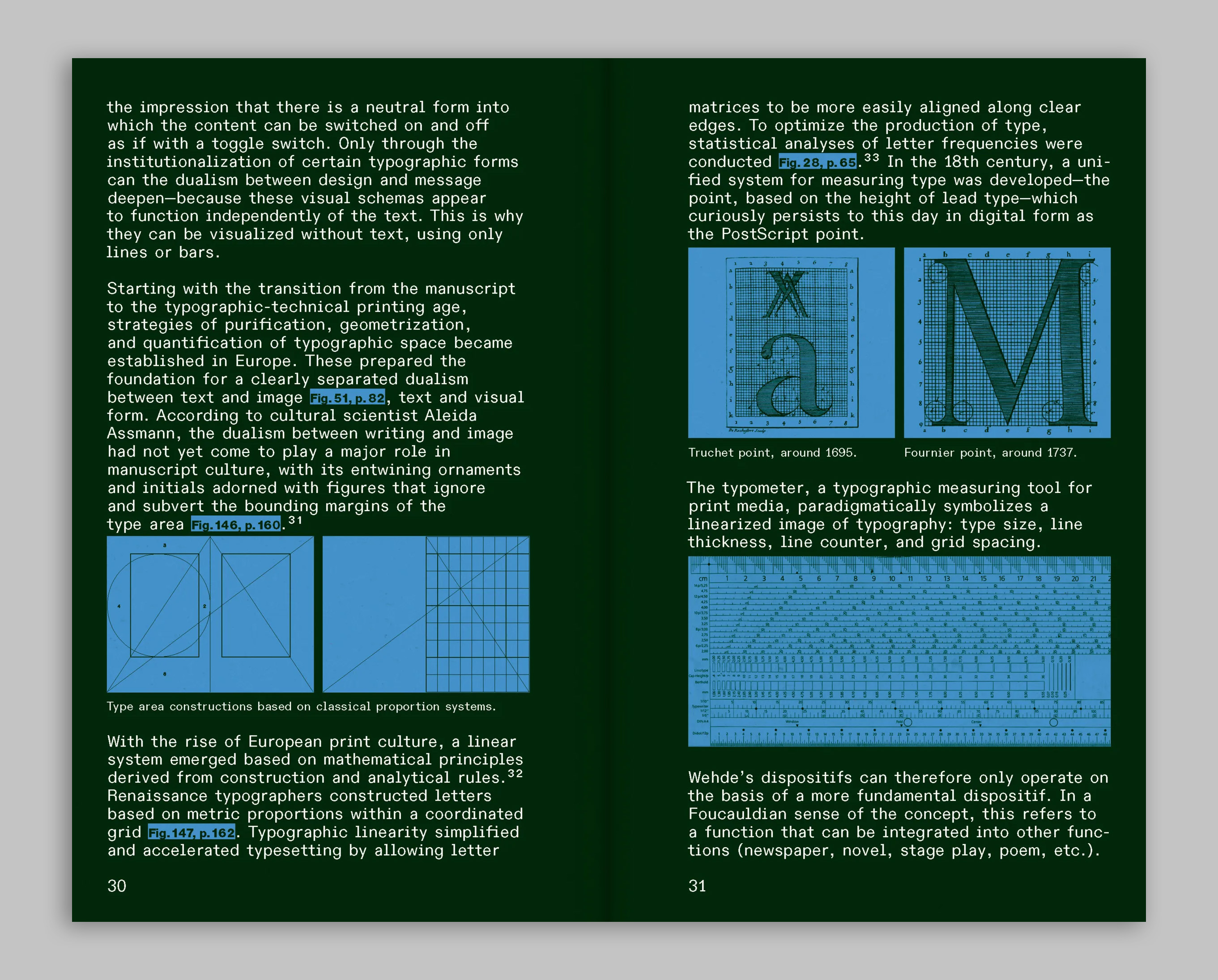
Edited by Matter of, a design studio based in Stuttgart, the 250-page publication includes a multitude of figures and six theoretical proposals named ‘Translinear’, ‘Transdimensional’, ‘Transmodal’, ‘Transmedia’, ‘Transcultural’ and ‘Transdependent’, which were shaped after many conversations with key voices on the subject of typography. The publication contains works and thoughts by Bye Bye Binary, James Langdon (see ‘Chaos and confidence’), Johanna Drucker (see Eye 18), HAL Typefaces, Eye columnist Rick Poynor, TypeTogether (See Eye 109), Sophie Kraft and Studio HanLi, among others.
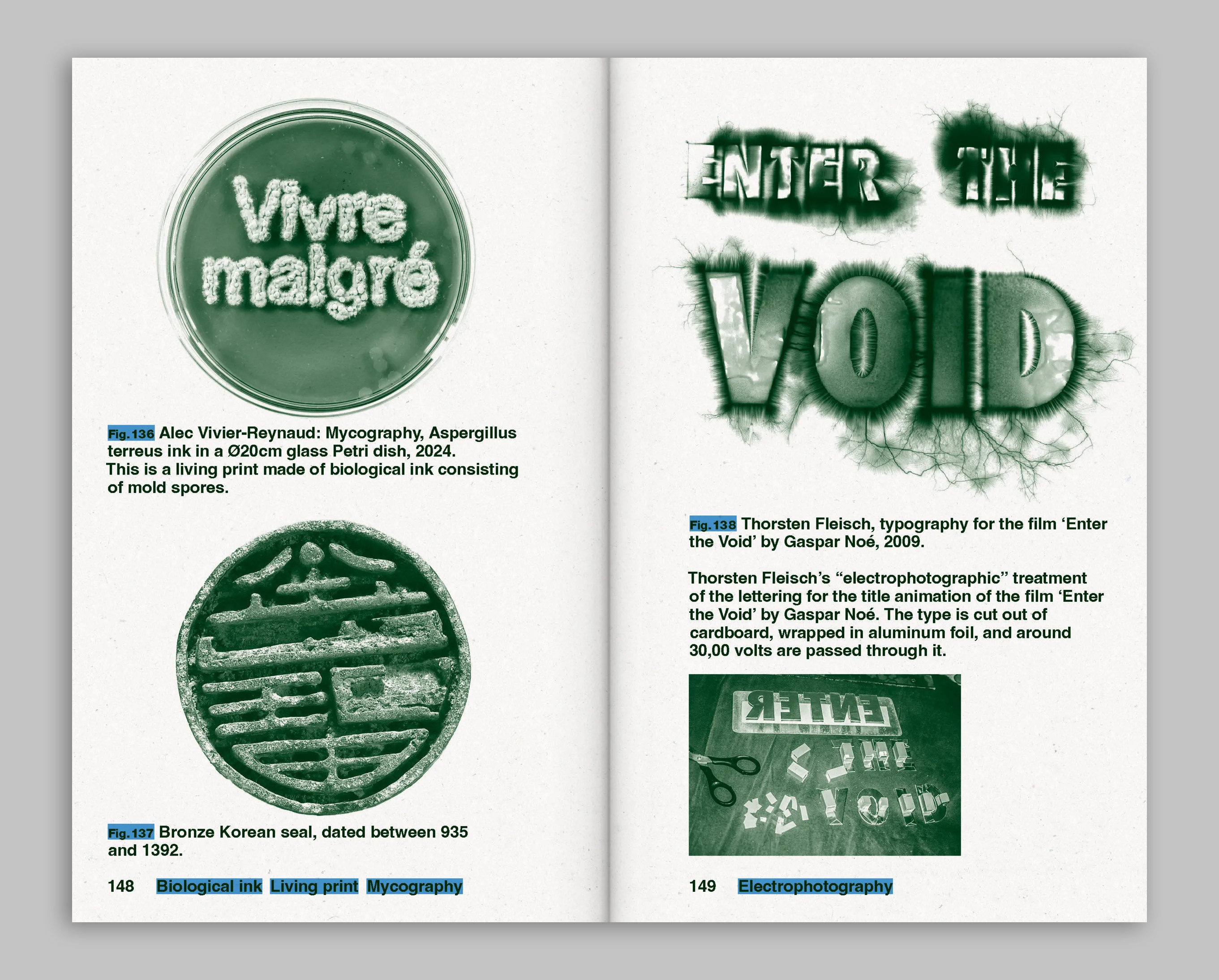
A spread from the ‘Translinear‘ proposal‘. Below. A spread from New New Typography in the ‘Transmodal‘ section that investigates a variety of approaches to type: through biological ink consisting of mould spores to an ‘electrophotographic‘ treatment to lettering where 30,000 volts were passed through cut-out type.
A spread featuring the last page of the ‘Transcultural‘ proposal along with an image of the Rosetta Stone from 196 BC., which allowed historians to read ancient Egyptian hieroglyphic writing for the first time.
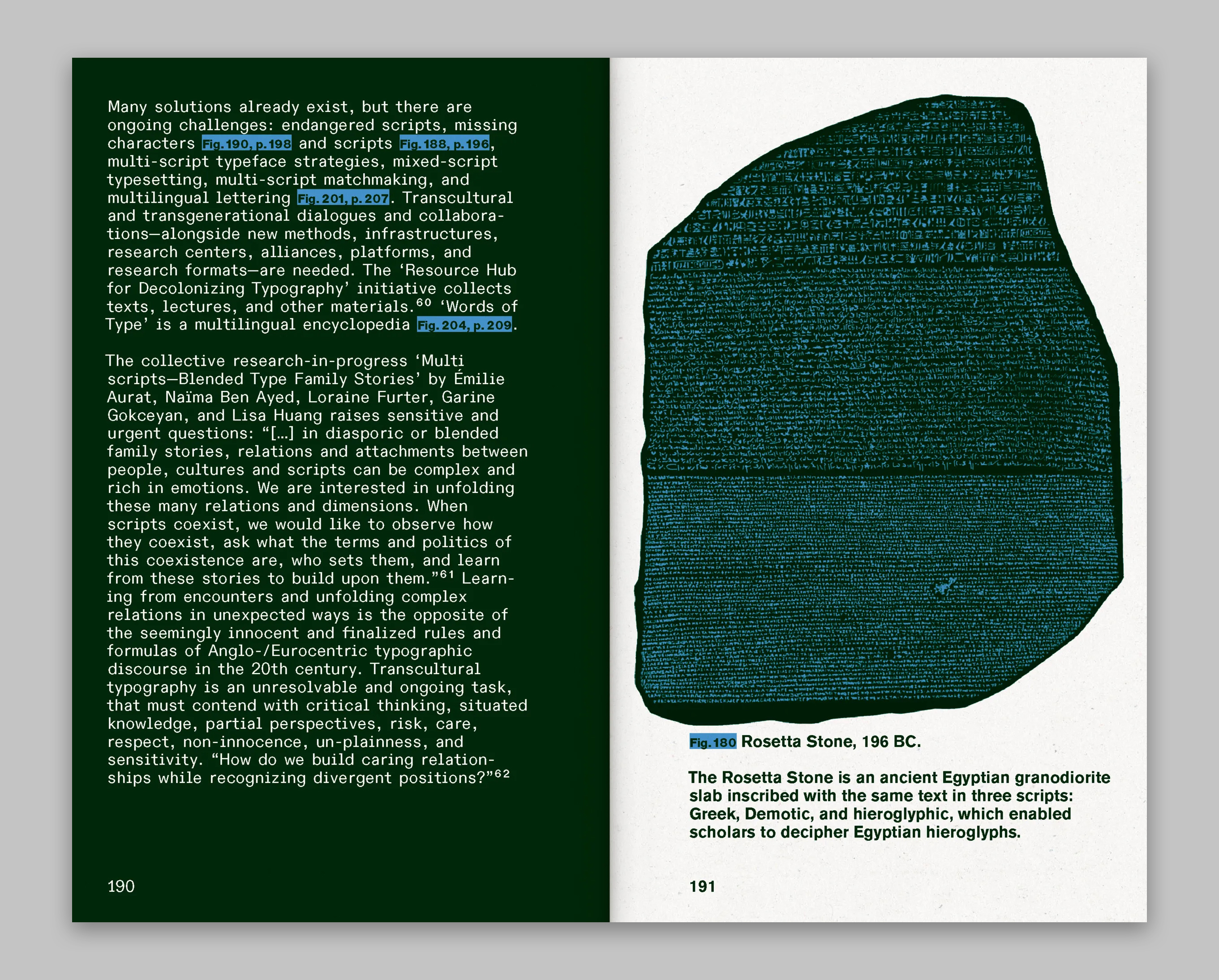
Over 250 pages, many texts feature key phrases, such as ‘line as form’, ‘dialogical layout’, ‘diagrammatic’ and ‘fluid letterform’, set in highlighted blue text that helps guide the reader into the idea of the new (new) vocabulary that Matter of is proposing.
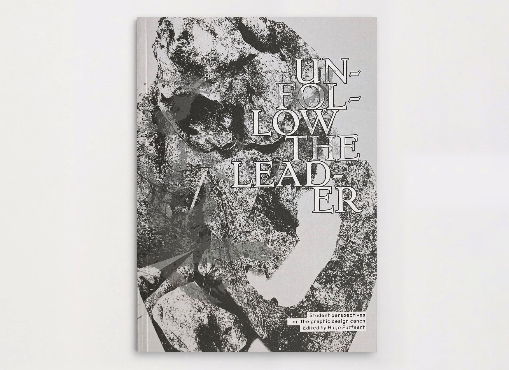
Unfollow the Leader: Student perspectives on the graphic design canon (Not Yet. Publishers). Edited and designed by Hugo Puttaert. €25.
Compiled by graphic designer, curator, educator and writer Hugo Puttaert, Unfollow the Leader reflects on what design means today and the ever-evolving role of the graphic designer. The introduction by Puttaert, in both English and Dutch, recalls texts such as British design critic Rick Poynor’s Obey the Giant and British designer Ken Garland’s manifesto ‘First Things First’, both which encouraged a critical eye on the duty and responsibilities of designers. He also discusses the influence of fast-paced changes in the digital realm, such as social media and artificial intelligence and encourages the opportunity for deeper ‘reflection, experimentation and a critical practice’.
A spread from Unfollow the Leader featuring Hugo Puttaert‘s ‘Critical reflections‘, including photos from lectures by Rick Poynor and Icelandic designer Siggi Eggertsson. Top. Cover of Unfollow the Leader.
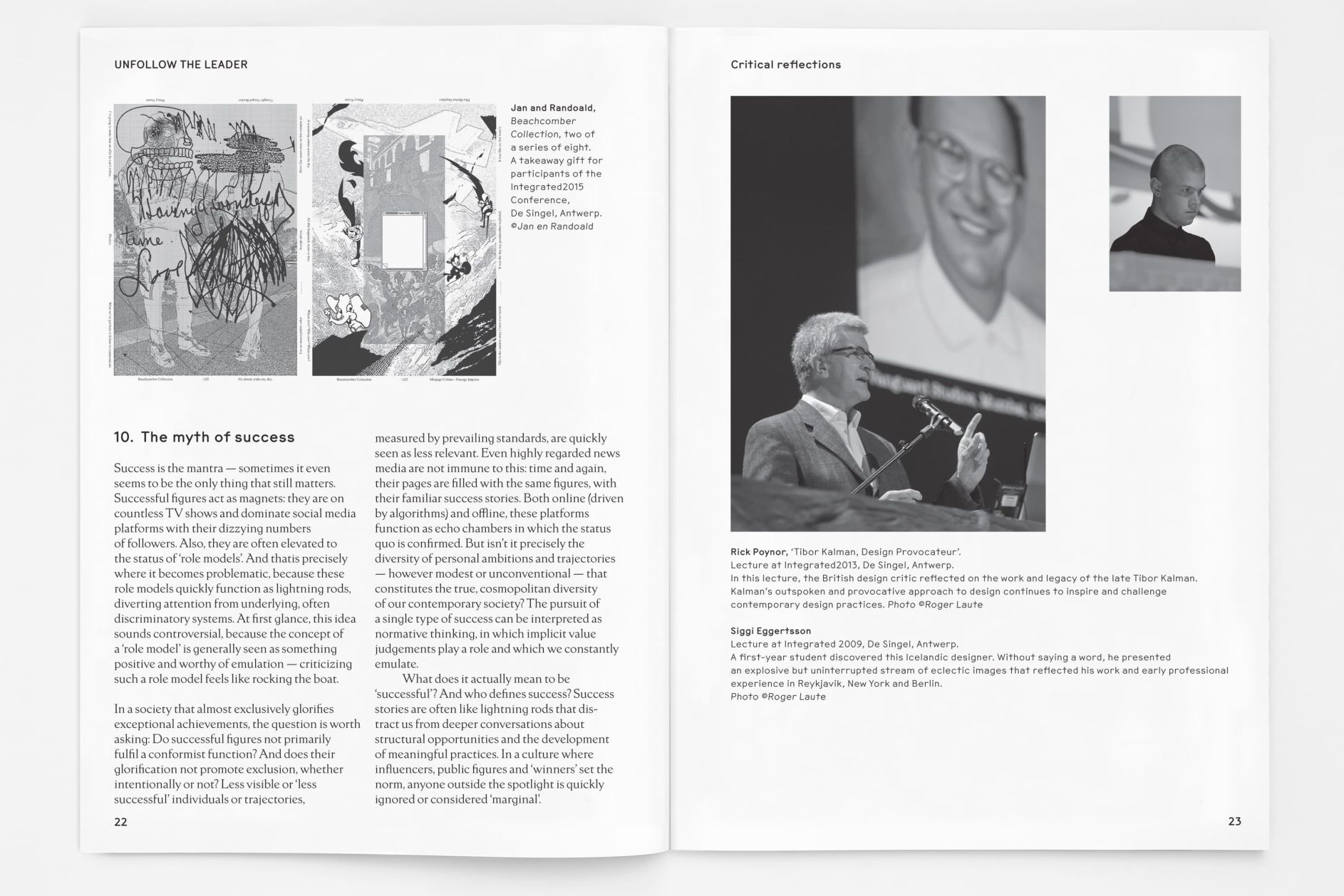
With more than 200 pages, the book also features twelve short excerpts written by Puttaert, such as ‘The tangle of the canon’, ‘Practice- or customer-oriented’ and ‘I research, therefore I am’. The book is rooted in work by Puttaert’s students from Sint Lucas Antwerpen, School of Arts, responses to different prompts proposed by Puttaert. This student work is chaptered out by projects taking on different forms, most inspired by different designers from ‘recent design history’.
A spread from Unfollow the Leader from the ‘Hey, Reader‘ chapter that features work designed by H. N. Werkman and Sean Loring.
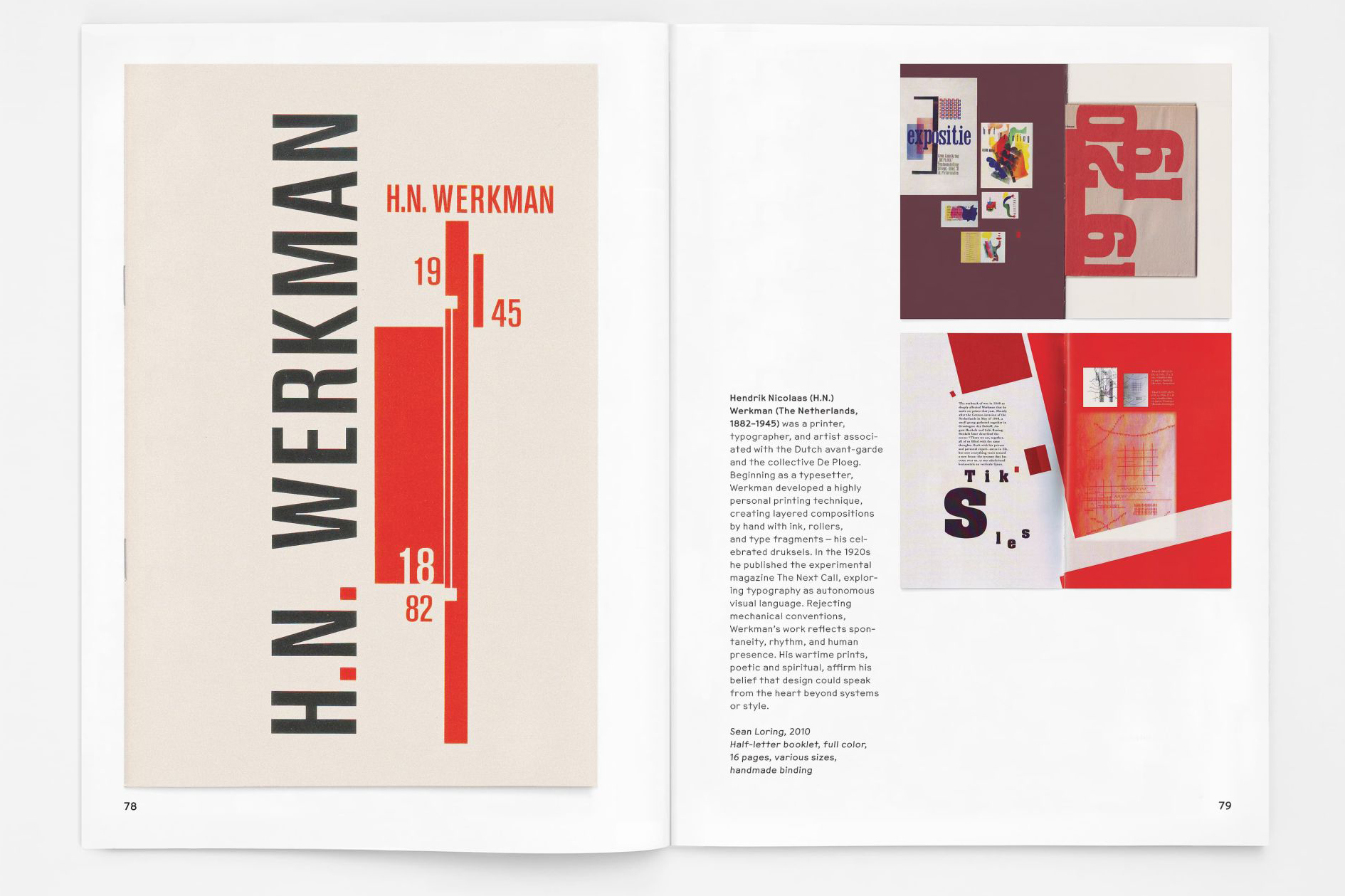
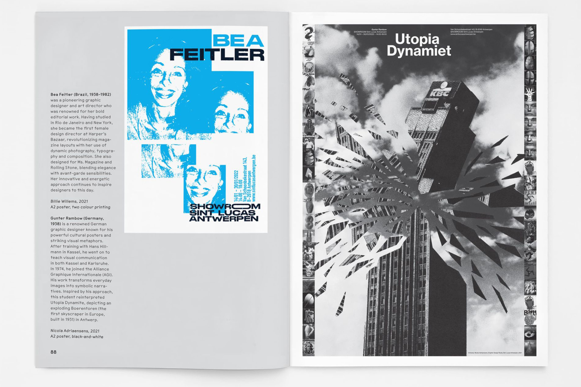
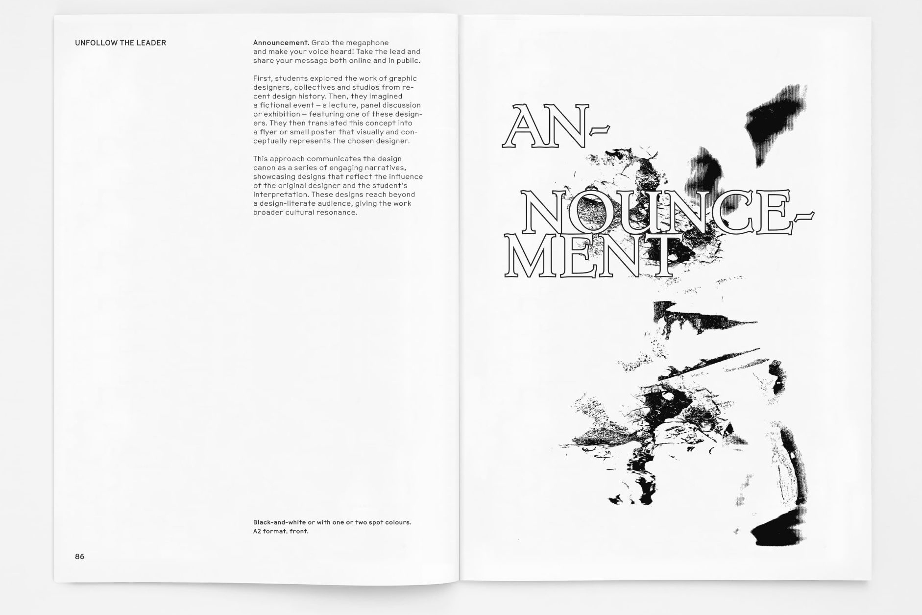
With five chapters based off the assigned projects, the first chapter features a reader – prompting the creation of an easily reproducible A5 reader with reflection into how the students might visualise and narrate recent design history. The second chapter titled ‘Announcement‘ prompts a small poster that serves as an announcement for a fictional event inspired by work an influential graphic designer’s work. The chapter ‘Dazibao’ (a large-scale wall poster in China used for public communication) asks for a large poster to be displayed in public spaces that draws on the idea of Dazibao.
A spread featuring student work from the ‘Announcement‘ chapter, featuring an A2 poster by Billie Willems highlighting a fictional event with Brazilian designer Bea Feitler (1938-82) on the left and an A2 poster by Nicola Adriaensens promoting a fictional event with German designer Gunter Rambow (b.1938). Below. The spread introducing the ‘Announcement‘ chapter.
Eye editors, London
Eye is the world’s most beautiful and collectable graphic design journal, published for professional designers, students and anyone interested in critical, informed writing about graphic design and visual culture. It is available from all good design bookshops and online at the Eye shop, where you can buy subscriptions and single issues.
Links
Finding an Identity for Calder Gardens, Lars Müller Publishers
Finding an Identity for Calder Gardens, Karlssonwilker
Lettres Décoratives: A Century of French Sign Painters’ Alphabets, Letterform Archive
New New Typography, Sorry Press
Unfollow the Leader: Student perspectives on the graphic design canon, Not Yet. Publishers