
Monday, 12:00pm
12 August 2013
In your face
Louise Fili
Spencer Charles
Book design
Graphic design
Illustration
Reviews
Typography
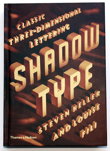
Shadow Type: Classic Three-Dimensional Lettering
By Steven Heller and Louise Fili<br>Designed by Spencer Charles and Louise Fili Ltd<br>Thames & Hudson, £24.95<br>
Right now, 3D cinema is enjoying a second flush of activity, with immersive, fantastical movies such as Monsters Inc. 3D, Avatar and Pina, writes Andrew Robertson.
The first time was that 1950s moment when the film industry, anxious to compete with the TV revolution, decided that adding an extra dimension and a bit of swordplay (or scissors) to films like Kiss Me Kate and Dial ‘M’ For Murder would bring audiences flocking back to the cinema.
Specimen pages from Letters and Lettering by Paul Carlyle, Guy Orling and Herbert S. Richmond, 1938.
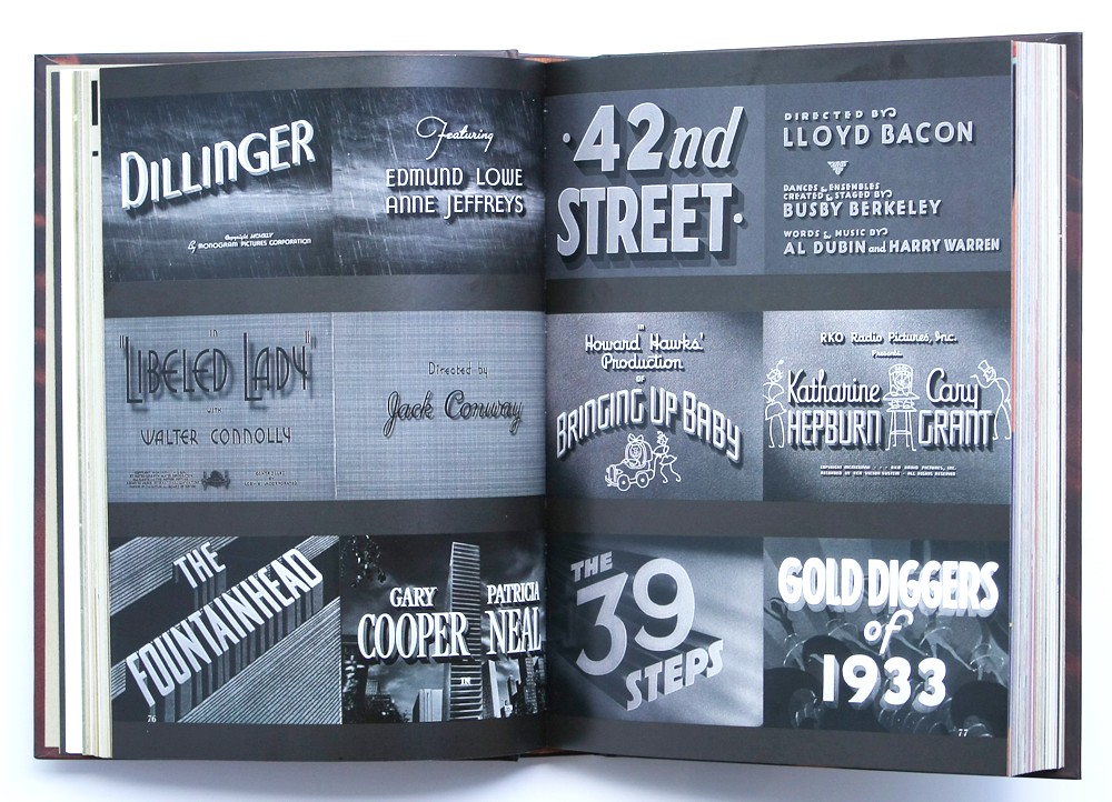
Top: Film titles for Dillinger, 1945; Libeled Lady, 1936; The Fountainhead, 1949; 42nd Street, 1933; Bringing Up Baby, 1938; The 39 Steps, 1935; The Gold Diggers of 1933, 1933.
But you could argue that 3D’s origins date back to the earliest days of the talkies, when movies such as 42nd Street and Dillinger announced their presence with in-your-face three-dimensional lettering.
Steven Heller and Louise Fili show three spreads of movie title cards in their book Shadow Type, whose six chapters are packed with examples from the US, Italy, Germany, France, Britain and elsewhere. There are shopfront signs, magazines covers, fruit-crate labels, books, brochures, billboards and endless type specimens from foundries such as Barnhart Brothers and Spindler’s, Deberny et Peignot and Stephenson Blake.
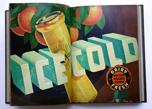
Tin sign for Mission Orange Drink, ca. 1940.
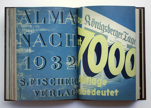
Left: cover of Almanach, designed by George Salter, 1932. Right: an advertisement for the King Tageblatt tabloid newspaper, 1930.
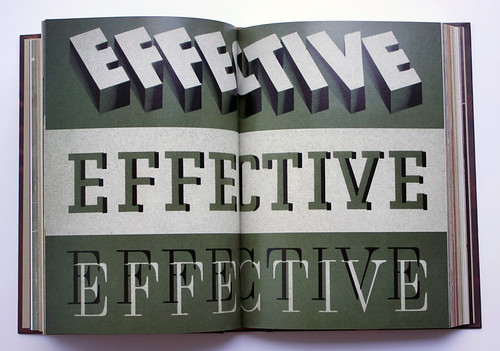
The focus here is on artwork that creates the illusion of dimensionality, and the shadow is the chief means through which the effect is achieved. The authors trace dimensional type back to the second half of the nineteenth century in the US, when the demands of advertising provoked a demand for display type that could shout above the hubbub of the second industrial revolution.
Left: cover of Gebrauchsgraphik magazine, 1934. Right: ‘1000 Kinos’, advertisement for film advertising, 1927.
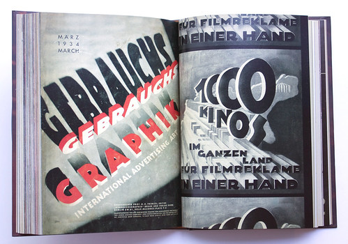
Type with shadows, and other optical effects prefigured neon signs, but they also implied mass and volume, and monumental letters such as the logo for 20th Century Fox and the 1927 ‘1000 Kinos’ ad (above) had a clear parallel with the more bombastic architecture of that period. (The titles for The Fountainhead turn up as well). Heller and Fili describe shadow typefaces as ‘typographic trompes l’œil’ and there are many demonstrations of ingenuity with colour, shading, cross-hatching, airbrushing and photographic techniques from a time when ‘shadow’ was not something you could select from a pull-down menu.
Like the same authors’ Scripts: Elegant Lettering from Design’s Golden Age (see ‘Love letters’ in Eye 80) everything shown in the book is from their own collection – the mind boggles at the quantity of material in the Fili-Heller household. All the examples are from the 1890s to the 1950s, with just a few exceptions – the cover, the title page and spread, an elegant pastiche of 1930s monochrome movie titles and a similar final page with just the word ‘fin’.
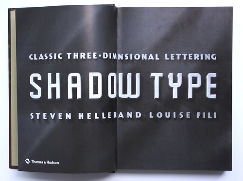
Title page of Shadow Type.
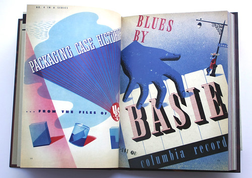
Left: ‘Packaging case histories’, advertisement for USP&L, 1937. Right: Blues by Basie album cover, designed by Alex Steinweiss, Columbia Records, 1944 (see Eye 76, music design special).
Cover design by Louise Fili and Spencer Charles.
Andrew Robertson, design writer, London
Eye is the world’s most beautiful and collectable graphic design journal, published quarterly for professional designers, students and anyone interested in critical, informed writing about graphic design and visual culture. It is available from all good design bookshops and online at the Eye shop, where you can buy subscriptions, back issues and single copies of the latest issue.