
Wednesday, 10:00am
14 October 2026
Type on a summer’s day
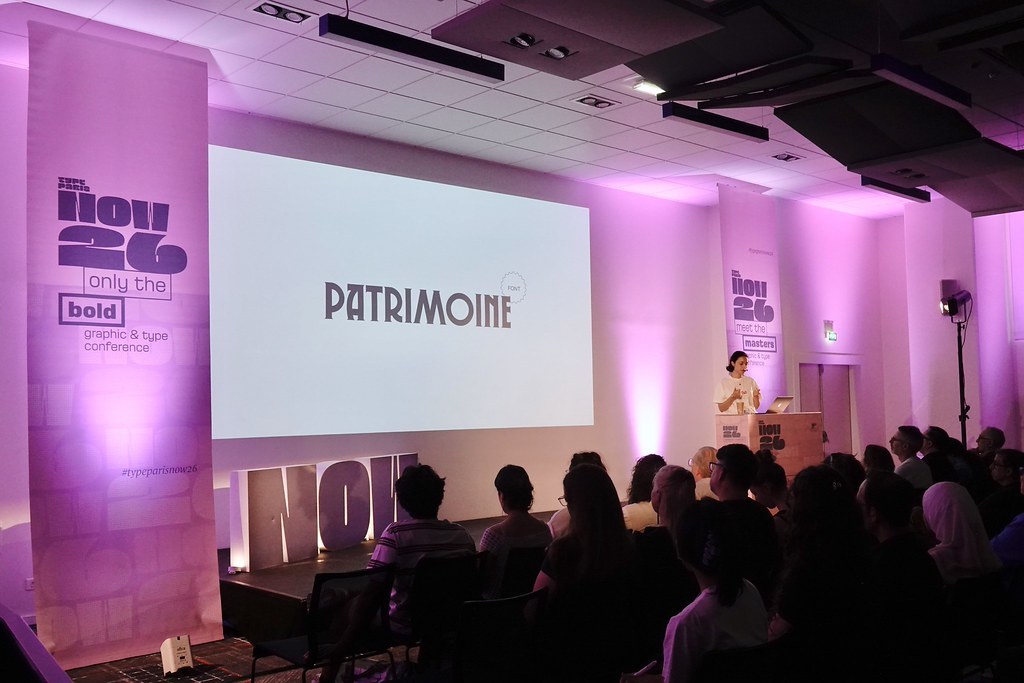
Type Paris: Now 26
Saturday 30 May 2026 Novotel Paris Vaugirard Montparnasse, 257 rue de Vaugirard, 75015 Paris, FranceType Paris 2026 presented an exhilarating and thought-provoking patchwork of type and graphic design from start to finish
Type Paris, held on 30 May 2026 in the basement of a Montparnasse hotel was presented and largely organised by its founder and presiding spirit Jean François Porchez (see ‘The ABCs of J-FP‘ in Eye 45). J-FP welcomed us in fluent English for the benefit of second-language speakers from 36 different nations and a handful of grateful Brits. Véronique Marrier, keeper of the CNAP (Centre national des arts plastiques / National Centre for the Plastic Arts) followed swiftly to introduce herself and the first speakers. CNAP is a French governmental department for ‘arts plastique’ within the Ministry of Culture that supports creative communities – a model one wishes more countries would emulate.
Marrier introduced a talk by young French designer Marie Carrasco on the theme of ‘No time, no budget’. Carrasco, who has no formal design education, took us through several projects with self-deprecating charm, such as a cancelled commission for SNCF (the French railways) originally based on classic travel posters. Refusing to be disheartened, she had turned her research into Patrimoine, a typeface she describes as ‘Art Deco with a twist’. Genuine projects for the E. Leclerc supermarket chain and a partnership between Apple and Canal + followed. Her final message? ‘Don’t wait to be good!’
Marie Carrasco presents Patrimoine – ‘Art Deco with a twist’.
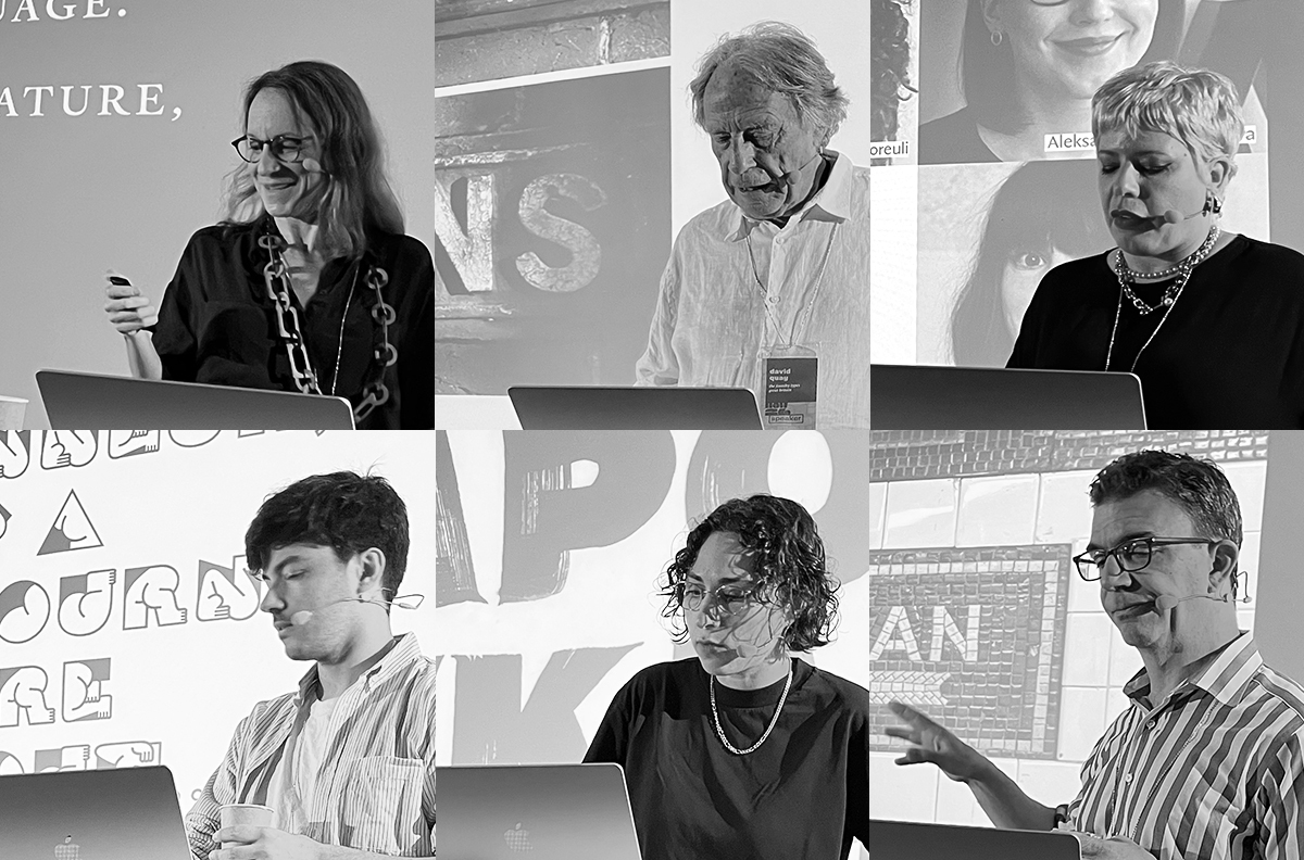
Top (L-R). Speakers Astrid Stavro, David Quay, Flavia Zimbardi. Second row. Mathieu Réguer, Hélène Marian, Tobias Frere-Jones.
Filipe Carvalho (Portugal), scheduled to be the second speaker, could not attend, so his place was taken by Mathieu Réguer. Réguer is the type designer behind Marianne, the ubiquitous French state typeface commissioned by 4uatre, launched in 2020. Réguer prefaced his talk with some theory: he said that in art you can analyse a painting by how it deals with ‘Time, Space and Light’ – here he asked us whether we could analyse type by assessing the elements ‘Read, Write and Build’. Regarding Marianne, 4uatre asked him for a typeface that would become a ‘building block’ for government departments. Réguer asserted his belief that ‘the state is not a brand’ adding that ‘it’s not the typeface or design that makes an identity, it’s the people building it.’
Mathieu Réguer.
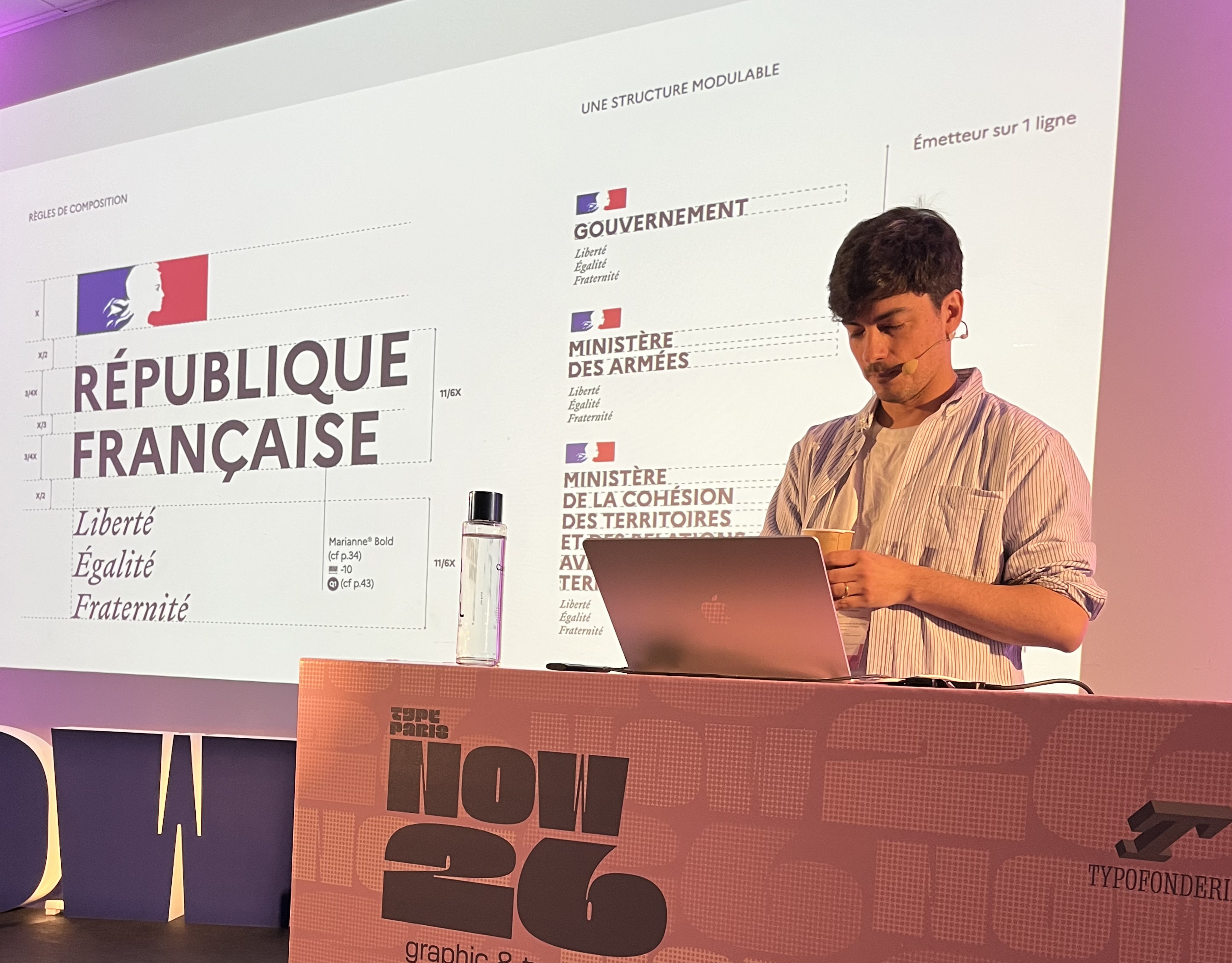
To demonstrate this last point, he showed the way that Marianne was deployed for Covid-19 announcements, as the pandemic affected the public and private realms. Réguer showed myriad examples of Marianne in use, both officially and also unofficially and satirically. Marianne led him naturally to another typeface project, Azimut. This was a collaboration with two colleagues (Benjamin Blaess and Julien Priez), a type family for the city of Strasbourg: three ‘borderline stencil’ fonts in roman, italic and bold. To demonstrate their ‘dysfunctional’ typeface, the trio invited poet Yoann Thommerel to create new work and set Dan Reynolds’ essay ‘A Thousand Details’ in Azimut. Réguer declared that Azimut is not designed to compete with commercial foundries, but is instead a gift from Strasbourg to the rest of the world: it can be downloaded for free from azimut.strasbourg.eu.
Hélène Marian presents ‘From hand to handles, an improvised path through letters’.
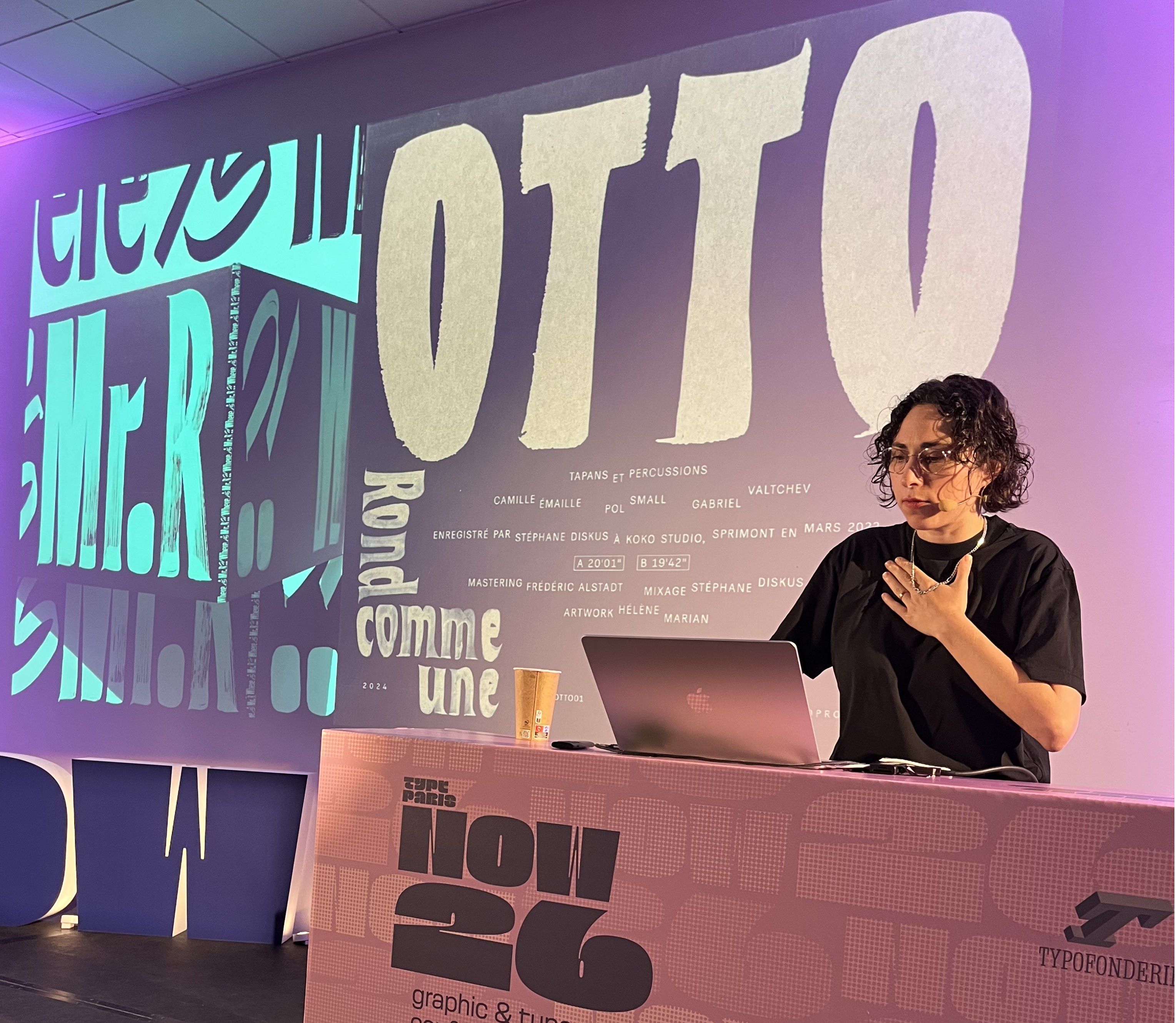
Next on stage was French type designer Hélène Marian with ‘From hand to handles, an improvised path through letters’. Marian demonstrated with wit and grace how her work with experimental music informs her approach to letterforms. She often works ‘live’ with brushes and paints at festivals and also does low-budget jobs for small independent labels. ‘Working freehand reveals the physical nature of the tools,’ she said, adding that it also allowed her to get outside the studio. The hand-made work has an improvisational relish that you can also see in PVC, the type family she designed for Production Type. Marian finished the talk with images of NaN Archy, an extensive and attractively glitchy variable type family that stretches from ultra-wide to skeletally thin. Marian’s intention was to retain some of the artefacts – the ‘spots and stains’ – of the design process that originally brought the fonts to life.
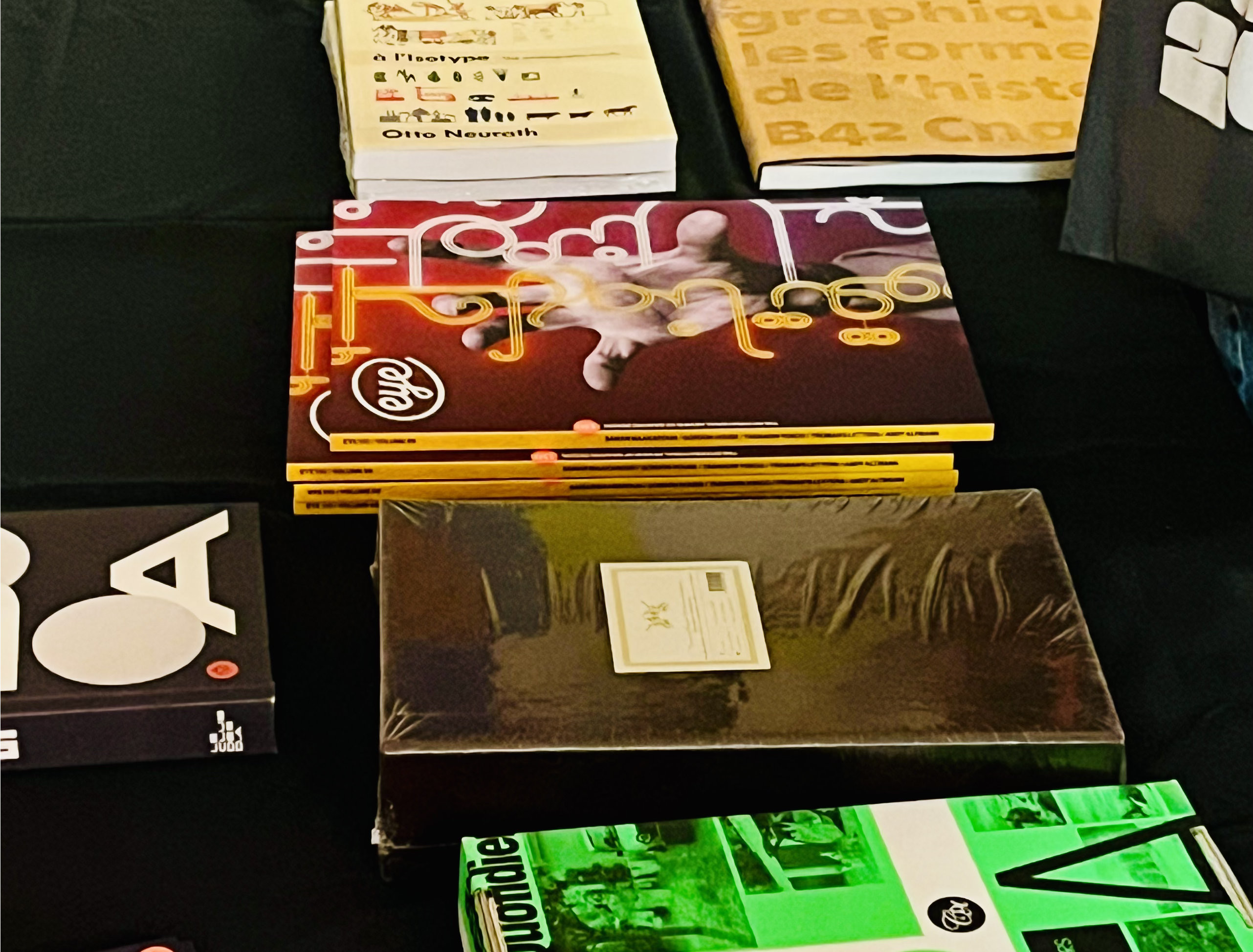
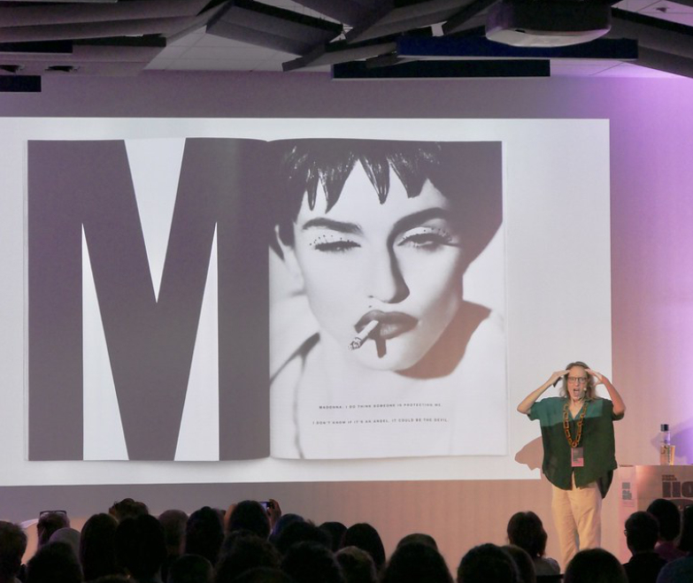
During the coffee break there was time to browse the stalls run by publishers Slanted and B42 – the latter kindly sold a fresh stack of Eye 110 issues on our behalf. The next session began with Astrid Stavro (see Eye 95), introduced by Paris-based creative executive Rachel Gogel. In a presentation titled ‘Inkling’, starting with several biographical images, personal anecdotes and stories, Stavro talked about the impression that Tibor Kalman’s design for Interview magazine made on her, long before she studied design, and the influence of teachers, writers, publishers and printers, including a warm reference to letterpress maestro Alan Kitching (See Eye 15 and Eye 74).
Astrid Stavro with Interview spread about Madonna.
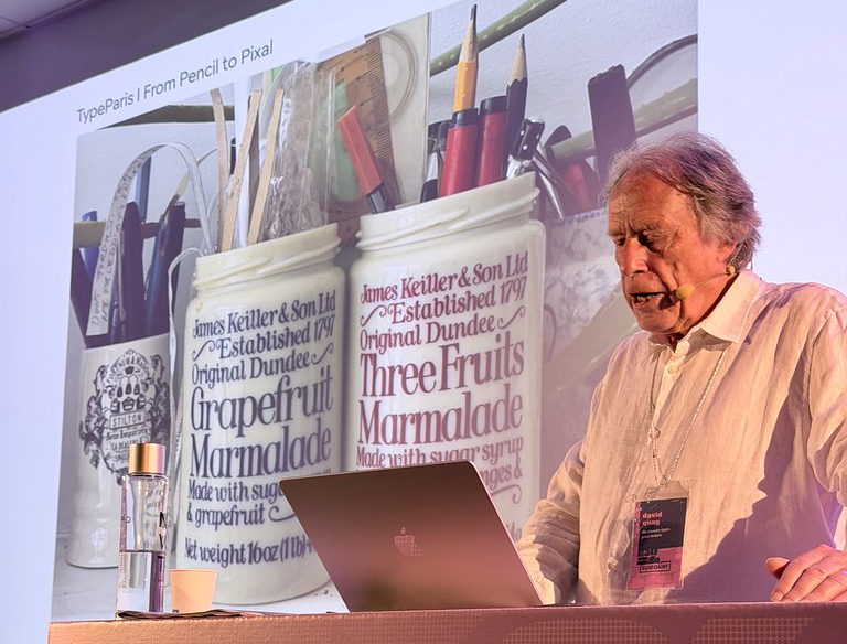
Stavro was followed by David Quay of The Foundry Types, whose talk ‘Type for life, from pencil to pixel’ also explored early memories, including Wild West posters, the Johnston font on London Underground signs at Earl’s Court station and the ornate lettering on the outside of the Black Friar pub (see ‘London Letters’ in Eye 91). In 1983 Letraset (see Eye 86) commissioned Quay to design typefaces after seeing his freelance book designs. In the late 1990s Quay set up Foundry – ‘possibly the first digital foundry in Europe’ – with the much-missed Freda Sack (1951-2019). Quay took us through some recent projects, including Kade (‘Quay’ in Dutch), based on the lettering on Dutch tug boats, and his ongoing Kingdom, named after the middle name of his ‘childhood hero’ I. K. Brunel. Quay describes this as ‘a font for the people’ and he is promoting it with an ingenious newsprint specimen designed by Jim Sutherland.
David Quay presents ‘Type for life, from pencil to pixel’.
After Quay’s slot, Gogel introduced Martine, the agency led by Justine Suillaud, who studied branding and Margot Retif, who studied typography with Porchez. The French duo gave a presentation named: ‘Your brand has a type. How typography shapes our brand’s personalities’, illustrated by their work on various hotels and on women’s health brand Jeen.
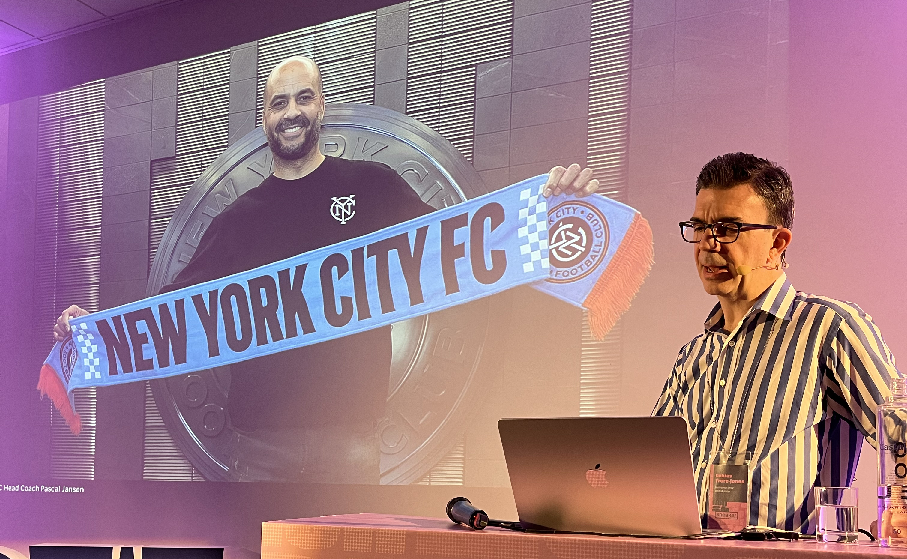
After a break for lunch, it was a relief to be back in the air-conditioned conference hall. The outstanding presenter of this high-quality day was Tobias Frere-Jones, who concentrated our attention on his four-person studio’s commission to design a typeface system for New York City Football Club. In his talk ‘Of Subways & Offsides’ Frere-Jones took care to credit all his colleagues – especially Swiss designer Nina Stössinger – for their contributions. Frere-Jones talked us through their letterform research on the subway, which he describes as NYC’s town square: ‘It’s where everybody has to go.’ Their extensive research into several different forms of subway lettering created a backbone for the NYCFC typefaces: Express, designed by Frere-Jones, and Local, designed by Stössinger.
Tobias Frere-Jones presents ‘Of Subways and Offsides‘, about his studio’s typeface system and crest for New York City Football Club.
Swedish type designer Carolina Laudon, a former ATypI president, introduced the next sessions, which began with the quirky work of Özge Güven, Turkey. Güven’s talk was titled ‘Design as a playground’ and included a typeface project based loosely on characters and details from Lewis Carroll’s Alice in Wonderland.
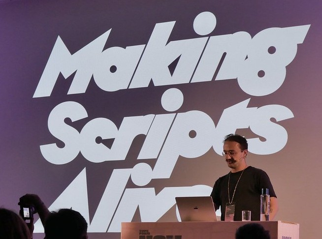
Léon Hugues’s talk ‘Making scripts alive’ was highly technical, compelling and amusing, focusing on Toast, a script typeface originally based on his own handwriting. Much of Hughes’ practice is rooted in calligraphy. His font Noggle was prompted by the question of what might happen if he ‘asked a sans serif to behave like a script’.
Léon Hugues.
German presenter Friedrich Althausen then introduced type designer, Flavia Zimbardi, from Rio, Brazil, who asked, ‘What if the work is the resistance?’
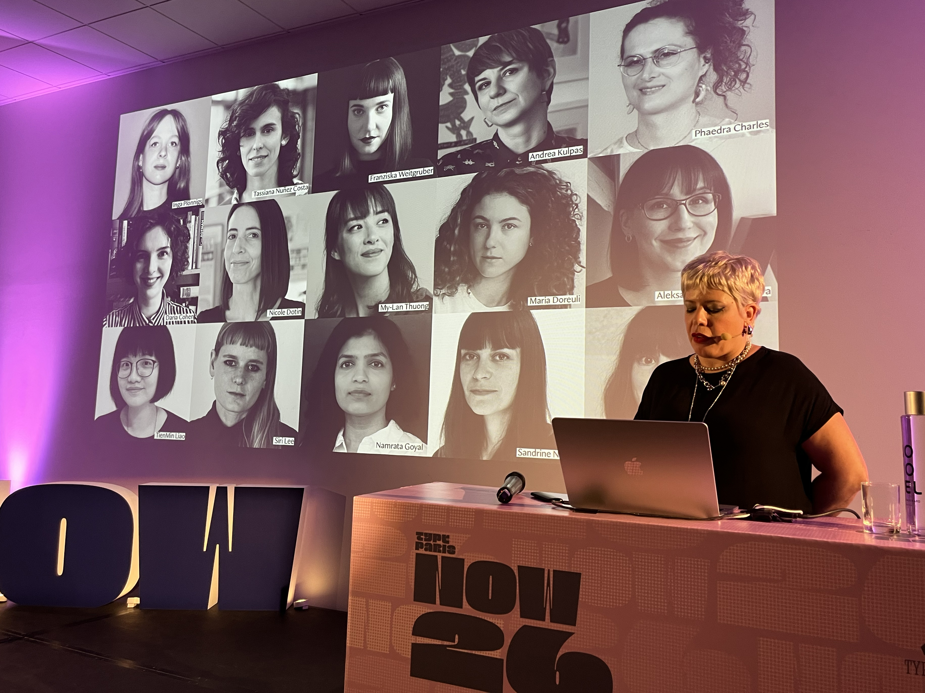
Labelling herself ‘Latina … queer … above all … human’, Zimbardi spoke forcefully for more female representation in type design, drawing on varied experiences of working in São Paulo, the US and Berlin. Zimbardi’s own typefaces include Octavia, inspired by Film Noir titles, and Jobim, inspired by Vendôme. ‘Designers have more agency than we have been taught to believe,’ she declared. Asked in the Q&A session what habits she would have us change, she replied: ‘Use more typefaces by women!’
Flavia Zimbardi pays tribute to a legion of women type designers.
Two members of Golgotha: ‘When blockbuster meets auteur’.
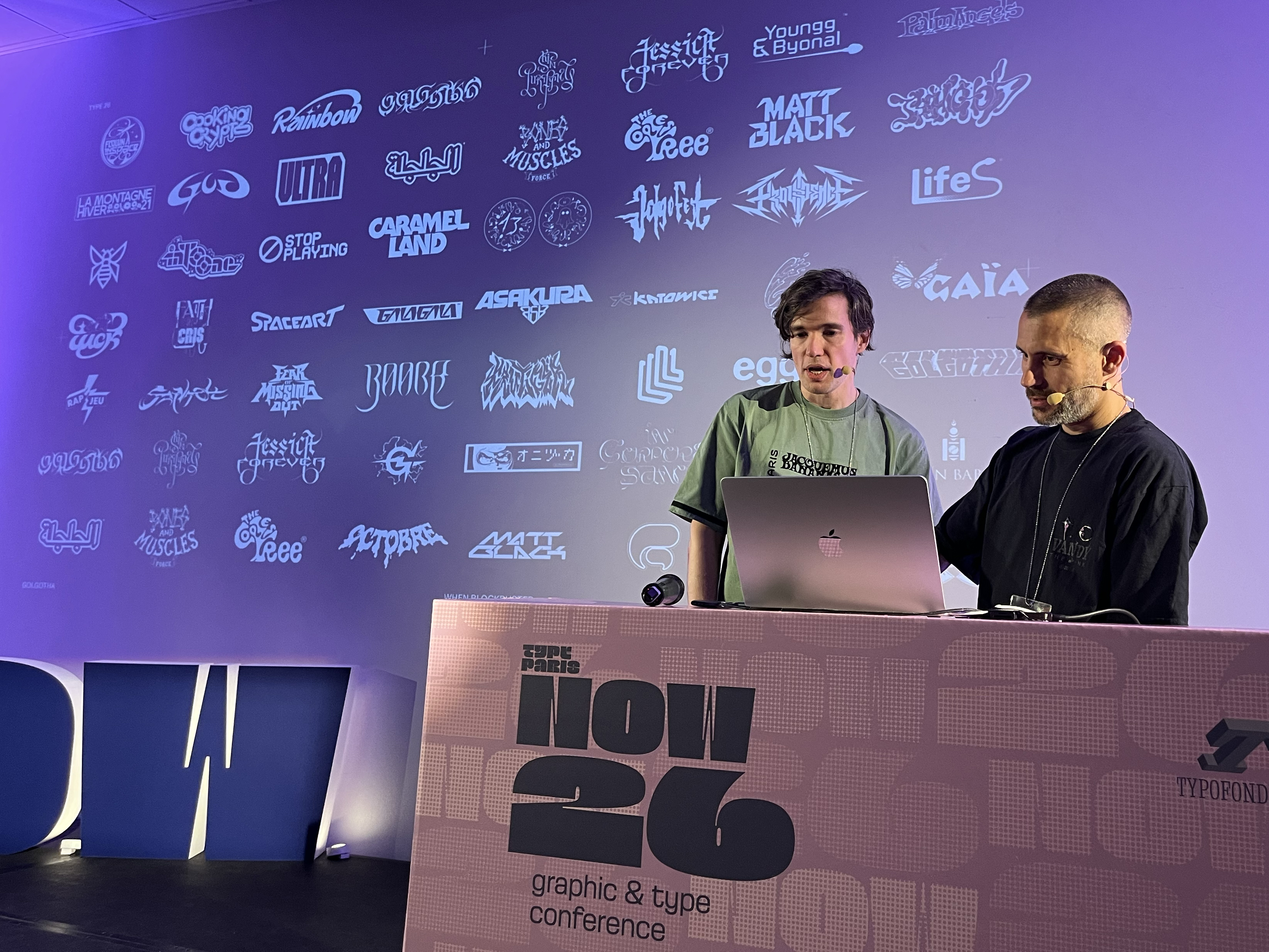
Two members of the French trio Golgotha (Antoine Aillot, Marvin De Deus Ganhitas and Guillaume Hugon) presented their sprawling portfolio in ‘When blockbuster meets auteur’, which demonstrated their affection for ‘popular / trash culture’.
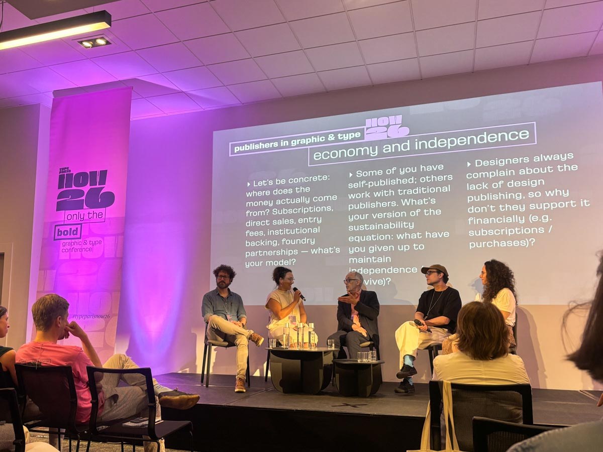
At the end of a long day (in which not a single presentation ran over), there was a panel discussion moderated by the aforementioned Rachel Gogel, along with Julia Kahl (Slanted, Karlsruhe, Germany), Alexandre Dimos (B42, Paris), author Elliot Jay Stocks (Bristol, UK, see ‘Books Received #64’) and yours truly, representing Eye.
Once Jean François Porchez had wrapped up the day, we repaired to the sweltering rooftop bar, from which we could glimpse the Eiffel Tower and hear the hooting car horns and cries of victory made by celebrating Paris Saint-Germain football fans as they rampaged through the city.
By John L. Walters, Eye editor, London
The panel discussion with (L to R) Elliot Jay Stocks, Julia Kahl, John L. Walters (Eye), Alexandre Dimos (B42) and Rachel Gogel, moderator.
Flavia Zimbardi pays tribute to a panolpy of women type designers.
Eye is the world’s most beautiful and collectable graphic design journal, published for professional designers, students and anyone interested in critical, informed writing about graphic design and visual culture. It is available from all good design bookshops and online at the Eye shop, where you can buy subscriptions and single issues.