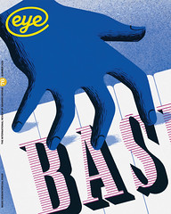
Summer 2010
Sound and vision
the editor
The Light Surgeons
Yeast
Alex Steinweiss
Big Active
Ronald Clyne
United Visual Artists
Storm Thorgerson
Given the visceral feelings stirred by music, it’s time we found new, meaningful associations between music and design.
Think about design for music, and record covers spring to mind. That’s understandable: graphic design has borne witness to an extraordinary canon of independent work over the past 70 years, from 78rpm record ‘album’ covers (the invention of Alex Steinweiss in 1938), via the pantheon of classic vinyl sleeves (an endless list that includes David Stone Martin, Reid Miles, Roger Dean, Hipgnosis, Barney Bubbles, Peter Saville, etc.) through to contemporary CD packaging by Tom Hingston, Farrow, Sagmeister Inc., Yes and Chris Bigg. But there has always been a multitude of ways to combine sound and music: in an age of digital dissemination and extravagant audiovisual performances, album covers are just one part of a music design story that goes back more than a century, and will continue to be relevant long after records have died.
In my 2007 article ‘Reason and rhymes’ (Eye 63) I wondered whether ‘sleeve design might prove to be a historical blip in the long history of music design’. The thought was prompted by a conversation with The Bays, an influential and internationally popular group of improvising musicians who have never made a record. They take a philosophical and practical stand against making products that can be sold (and therefore counterfeited, pirated or otherwise ripped off); their stance is that music is about experience rather than shopping.
The Bays were ahead of their time, but theirs was a direct and pragmatic response to a shift in music’s economic basis. At the same time as a generation came to regard recorded music as something to be shared ‘like water’, they were also spending money on clubs, concerts and festivals. In common with most live acts, The Bays use their website and mailing list to engage directly with fans. The lesson for designers, already absorbed by smart agencies such as Big Active, was that design for music was shifting away from products towards … everything else: identity, branding, ‘creative management’, social media, live promotion, video, animation, Web design.
The shops that used to sell albums are dying (prompting a recent international ‘Record store day’) and music companies are shrinking and / or evolving. The commercial downsides of digitisation now affect every kind of digitisable content, from print to movies to product design. Yet music is all around us, and as visually charged as ever. Designers who once saw music as a first love they would have to abandon are finding new ways to put images and sound together. Practitioners with an audiovisual aesthetic are at a distinct advantage in the worlds of animation, multimedia and film: witness the success of one-time sleeve designer Al McDowell (see Eye 60) as a Hollywood production designer. Just as music and sound design add emotion and meaning to the visual language of cinema, images enhance our ability to understand and feel music. ‘Magic,’ as Fred Deakin puts it.
So there are many good reasons, commercial and cultural, why designers should continue to take music design seriously as a discipline, and there are many examples of committed, music-oriented practices, from veterans Stylorouge through Young Monster to La Boca (winners of the 2010 Art Vinyl award for their Muse cover). But it goes further. Music, as a predominantly non-verbal, non-visual form, connects with all of us at a deeper, more emotional level.
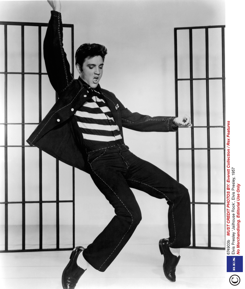
Yet the popular music of the past century has always relied upon strong images, from the dancefloors of Harlem to the eye candy of YouTube. The biggest stars’ appeal has always been visual well as musical – take the Beatles, for example. They created a unique look early in their career, and found the best collaborators to help them evolve through a series of remarkable band ‘images’. The lesson (which they had learnt from Elvis and Little Richard), was quickly absorbed by rock and pop stars, from David Bowie and Kraftwerk to Lady Gaga and Rihanna, via Grace Jones and Prince. Many performers created a graphic ‘look’ that could be read in an instant: Roy Orbison’s shades, Frank Zappa’s beard, Kiss’s clownish make-up, La Roux’s quiff.
In the 1960s, Britain’s art schools became a crucible of visually driven music, partly because of the freedom they gave budding musicians – such as John Lennon and The Who’s Pete Townsend – to make music while ostensibly studying art. And artists and art theorists had a direct influence on their impressionable students. (Prof. Roy Ascott, of Ealing, where Townsend attended, is credited with introducing notions of cybernetics and feedback into pop via The Who, who swallowed and regurgitated several art movements in a handful of hit singles.)
Some of the most powerful music images of the rock era are perpetuated through its ephemera: fanzines, club flyers, photography, concert and fly posters, books, newsprint, magazines, film, video and costume design – Madonna’s pointy Jean-Paul Gaultier corset, as a graphic image, sticks in the mind longer than her generic album covers. Music photographers, stylists and art directors have taken significant roles in the story of visual music, creating visual identities for big solo artists that frequently outlast the mediocre sleeves imposed by marketing departments. The internet has given fresh impetus to the more visually striking artists of yesteryear, who vie with new talent via the scratchily level playing fields of YouTube and Flickr. This has prompted some young bands to compete on similar terms: Storm Thorgerson’s unforgettable images for Biffy Clyro are not so much album covers as graphic signifiers that can be recognised within a fraction of a second during a Google image search.
Not all musicians feel obliged to become a visual icon, however, or have the personality or cheekbones to carry it off. And though there are examples of classical musicians who have cultivated distinctive personal ‘images’ (Erik Satie and John Cage spring to mind), for most composers the potential for audiovisual expression lies within the music itself, to be revealed as ballet, music theatre or opera, seen in the late nineteenth century as the most complete realisation of total artwork (or Gesamtkunstwerk). Some of the most revolutionary and significant works of the early twentieth century had their origins in ballet, in particular Sergei Diaghilev’s astonishing period as artistic director of the Ballets Russes, early in the twentieth century. Diaghilev had the flair and wit to put radical designers and image-makers together with revolutionary composers to create ‘total theatre’. He commissioned work by Stravinsky, Chanel, Picasso, Matisse and Nijinsky, and his productions of The Rite of Spring and The Firebird heralded the sound and look of the new century, looking both forwards and back to more physical and rhythmic modes of expression, heralding the jazz age, and a long phase of musical entertainment in which the audience – the consumers of music – would increasingly favour the eye over the ear.
The live experience
Late in the twentieth century, the kind of spectacle customary in opera and film became the norm for touring bands such as Pink Floyd, Earth Wind & Fire, Pet Shop Boys and the Rolling Stones, for whom John Pasche’s original ‘tongue and lips’ logo has grown to epic, inflated proportions. Even minimalistic electronic bands such as Kraftwerk, whose 1970s tours used little more than a crumpled screen and a B&W slide projector, upped the ante with a dazzling light show while hardly changing the actual music. Massive Attack, a loose collective whose founders prefer to stay in the shadows, hired UVA (see interview ‘Attacked by music, type & light’) to create live shows that spoke to an information-saturated audience.
In the 2000s, practices such as Yeast, The Light Surgeons and UVA have emerged to apply digital, graphic methods to create spectacle in live performance. In the rock, pop and indie arena, every other band feels obliged to provide some sort of visual experience, whether it’s a real-time mix of the musicians projected on to screens, or a more ambitious visualisation of the music, of the kind practised by Robert Seidel or Robert Hodgin (see Eye 70), currently working with Peter Gabriel.
Yet more often than not, the results are underpowered or generic; even visually sophisticated artists such as Brian Eno (This Is Pure Scenius! at May’s Brighton Festival) or Nils Petter Molvaer find it hard to provide a visual accompaniment that sustains interest throughout a 90-minute concert.
Some of the most effective concert presentations are relatively lo-tech, even when they employ a visual language that started on screen. Norwegian band Jaga Jazzist’s work with designers Yokoland for their recent One Armed Bandit album and tour used the simple resource of slot-machine icons. Anthony Burrill’s sets for Acid Washed (see Eye 75) turn the hard-edged imagery of his videos into hard acrylics. And the collaboration between Danish band Efterklang and design duo Hvass&Hannibal that began with their popular YouTube animations now covers designs, stage sets and costumes (for their orchestral collaboration Parades) that echo the stylised design of the Diaghilev era.
Visualisation programs can provide some acts with low-budget spectacle, but these work better in short form. One of the most lauded recent examples is the interactive calligraphic microsite (requires Flash) for Labuat’s ‘Soy Tu Aire’. ‘We imagined a conductor moving the baton with her hands,’ says Rafa Soto of Herriaz Soto Co, who devised the site with fellow art director Roman Rodriguez and programmer Jordi Ministral of Badabing!. ‘We wanted to create a tool that allowed us to represent the different intensities of the song,’ adds Soto, ‘similar to that of a Chinese paintbrush.’ Intimate experiences like this, which can be enjoyed on a laptop or iPad using headphones, are perhaps the natural successor to the involvement fans used to feel with twelve-inch sleeves, as something to dote on.
In the present time, record companies are less keen to fund the artfully directed, cinematic videos of MTV’s heydays, by directors such as Chris Cunningham (Björk) and Michel Gondry (Kylie), notwithstanding outrageous exceptions such as Lady Gaga’s extended promo for ‘Telephone’. ‘What’s visually rich about music now is flamboyant American pop,’ says Stylorouge’s Rob O’Connor, citing Beyoncé and Rihanna. ‘Even the videos look a bit cheap because more money’s going into live performance.’ However O’Connor welcomes the end of needlessly extravagant pop videos: ‘When a feature film has to destroy a small country to make an impression, I’d rather see a good performance.’
Major artists such as Prince, Metallica, Beyoncé and Kanye West, are now obliged to make shows that deliver the three-dimensional goods to their waiting fans. The shift back to live experience can be also seen in the eruption of gig posters (see ‘Grab the hook’) and the emergence of companies such as Don’t Panic, who use the energy of club promotion to make a brand, turning their bag of flyers into a poster pack. Consumer brands such as Red Bull and Beck’s beer have made overtures to music design, with projects such as Beck’s ‘Music Inspired Art’, a competition which invites alternative cover designs. The company has inverted the music design equation by asking rock musicians to ‘design’ beer labels, coralling acts such as Hard-Fi and Ladyhawke to put their marks on beer bottles (an aspect of celebrity culture also enacted in fashion and furnishings).
Graphic collateral
Album sleeves came into being when physical carriers for music were a necessity. Music is made of sound waves, the sonic manifestation of a real time performance, so any visual element has to come from the performer’s person, the instruments in use, the stage or space in which the music is made, or from a synaesthesic representation of the sounds being made. After this comes the graphic collateral: printed posters, flyers, programmes. There are other bits and pieces: the sheet music, the libretto, the score (which come before the music can be heard), and the moving and still photographs and other visual representations, plus written descriptions and transcriptions, which can only take place after the music has sounded.
Whether or not there ever was a ‘golden age of sleeve design’, many ‘classic album covers’ are fêted for their contents or notoriety rather than their formal qualities. Yet throughout the history of record-sleeve design there have been pockets of excellence – strong label / art direction partnerships seen in Impulse, Blue Note (see Eye 01), Factory, 4AD, Rune Grammofon, Touch; image-makers who have special relationships with performers (Antony Price, Russell Mills, Jean-Paul Goude, Tomato); designers with a feeling for music (Jim Flora, Frank Olinsky); wild cards (Stephen Byram, see Eye 42, Stanley Donwood) and bold, counter-intuitive leaps of visual delight (Hipgnosis, Tom Hingston). Stylorouge’s Rob O’Connor says: ‘A good record cover to me as a punter, is one that looks like the artist has had a big involvement in … I don’t want to feel like I’m being sold an image by a third party, like a design agency!’
Famous and successful sleeves can vary drastically in their design function, from representing the content, through interpretation and information to something closer to art (see ‘Pack shots’ in this issue). But if you regard music design as a branch of editorial design, there is plenty more that can be done. This ‘editorial’ aspect of music design is sometimes overshadowed by the creation of image, brand and spectacle, but information and interpretation remain an essential part of our enjoyment of music.
The past ten years have seen an explosion of elaborate books and packages which add value to the music carrier, usually a CD skewered somewhere in the hard covers, with photographs, essays and other information. The Wilco Book (edited by Dan Nadel and designed by Paul Buchanan-Smith) is an example, as are Kim Hiorthøy’s multilayered Money Will Ruin Everything volumes for Rune Grammofon. Manhattan Research Inc., a double CD-book about electronic music and ‘audio branding’ pioneer Raymond Scott designed by Piet Schreuders (see Eye 32), demonstrates the way design can shape a complex music project through sure art direction and diligent research. Harry Smith’s booklet for his influential Anthology of American Folk Music (Smithsonian Folkways), is an early example of what editorial music design can do. Painstakingly laid out in uppercase letters and enormous black numbers, Smith’s handmade book explains the plot of ‘John Hardy’ in the telegraphic language of American subeditors: ‘John Hardy held without bail after gunplay’; while the index includes eccentric entries such as: ‘Bible history quoted on record’, ‘Murders mentioned on record’ and ‘Tuba, records featuring’. The legacy of Smith’s work lives on in the music of performers ranging from Bob Dylan to Nick Cave.
Editorial music design is about more than writing and wordy credits. The best examples employ art direction and design in similar ways to other sectors: in the use of iconography, the pacing of documentary photographs or the simple yoking together of visual and textual materials that put the listener in the best frame of mind for the music contained within.
Ronald Clyne’s sleeve designs for Smithsonian Folkways from the 1950s to the 1980s form a body of work largely omitted from the canon of graphic design – until championed by Warren Taylor of The Narrows in Melbourne and by the publication of Unit: Design / Research 01 – Ronald Clyne at Folkways (Unit Editions). Clyne’s challenge, working in-house to tight budgets and schedules, was to find an editorial design framework for music and sound recordings that ranged from gospel and electronica to spoken word and steam engines. (Tony Brook of Unit Editions presented a selection of covers at the St Bride conference.) You can see a similarly empathetic approach in the booklet designs of Barbara de Wilde, John Gall, Doyle Partners and ECM’s Sascha Kleis (see ‘One man brand’), whose ability to place essays, lyrics, portraits and mini-photo essays in a meaningful and entertaining sequence adds value to the listener’s experience of the albums they design.
Such work usually depends on a reasonable budget, a sympathetic client, interesting content and a belief in the literate listener. Independent bands who release their music on their own labels and sell large quantities of CDs at gigs (such as Stylorouge clients Show Of Hands) are beginning to take design more seriously than many supposedly mainstream companies. In theory, the ‘editorial’ approach to music design should become the dominant mode on the internet, which has already provided huge amounts of information to enhance our understanding, enjoyment and attachment to music. Yet the dominant online music outlets – stores, band sites, radio – are still in the process of re-inventing themselves. Some need it more than others: Blip.fm’s graphic identity is kitsch and uninviting, while the functional mess of MySpace feels like the sticky digital equivalent of a bad rock venue.
Graphically, the musical Web is dominated by brands such as Last.fm, iTunes and Spotify, which still draw on album design to signify the tunes you listen to. Websites such as The Quietus and Any Decent Music?, which are reshaping the way listeners discover new music, still use the square icon of a record to identify music, as does SoundCloud, though the site’s use of visible waveforms is a welcome, functional innovation.
Given the potential emotional and visceral power stirred by music of all kinds, can we now look forward to some new and genuinely meaningful association between sound and vision? After a century of music in which design for record sleeves grew, exploded, crashed and burned, there’s plenty to celebrate, but nothing to regret. We may come to see the death of the album as a liberation. Let’s welcome the birth of an era in which entertainment, culture, technology and commerce can demand (and get) more from music design than ever before.
First published in Eye no. 76 vol. 19.
Eye is the world’s most beautiful and collectable graphic design journal, published quarterly for professional designers, students and anyone interested in critical, informed writing about graphic design and visual culture. It is available from all good design bookshops and online at the Eye shop, where you can buy subscriptions, back issues and single copies of the latest issue.