
Feature: Visual culture
They made Canada
Working against the clock, with virtually no budget, Greg Durrell made a design documentary that shows how European immigrants created Canada’s visual identity

Return to the square
A chance discovery by some builders led to the adaptation and expansion of a 1930s alphabet by one of Switzerland’s foremost designers

Strategy of excess
Like a human algorithm, Hansje van Halem explores a huge number of variables until she finds the right ‘recipe’ for each project
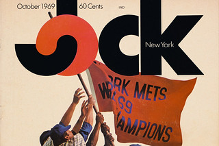
Lovable loser
A daring approach to sports journalism earned the short-lived Jock magazine a place in design history
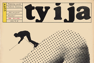
Pulling back the curtain
Published by the Communist Women’s League, Ty i Ja [You and I] was an ambitious 1960s title that brought the outside world to its Polish readers
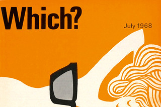
Two-colour haikus
Banks & Miles art directed Which? magazine, the Consumers’ Association’s flagship title and its covers. John Miles talks to Paul Harpin
Double vision
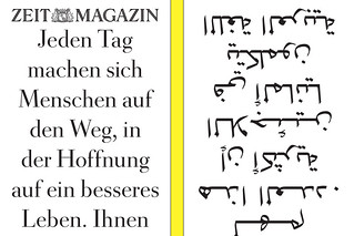
Fast-paced, emotional, competitive, surprising – Germany’s ZEITmagazin is a print title for the digital age
Liberté, égalité, typography
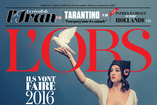
Serge Ricco, creative director of l’Obs, has shown this word-driven, left-wing French weekly the power of expressive type and images

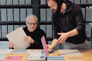
Reputations: David Driver
‘That was the buzz one got about publishing. What do people want? Where are the gaps in the market? You wanted it to push boundaries … give people information that they never possessed before.’ Interview by Martin Colyer
Looking at magazines looking at themselves
Five enormous, lavish books celebrate the achievements of five legendary titles: Harper’s Bazaar, Rolling Stone, New York, The Face and Octavo