
Feature: Typography

Another frame for the news
The redesign of RTL Nieuws makes a radical break with the conventions of television news graphics, crossing the now fluid boundaries between broadcast and online.
In the right place
In this extract from his book, Gerald Cinamon explains how he brought integrated book design to Penguin – first at his kitchen table in the 1960s; later as chief designer
An Atlas of Typeforms
As a sidebar to ‘Quiet man of letters’, Simon Esterson talks about his early encounters with this celebrated book by Alan Bartram and James Sutton
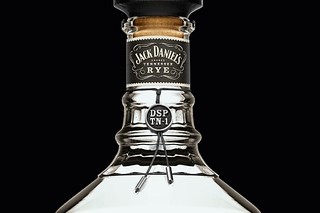
Process and poetry
Stranger & Stranger and Fernando Gutiérrez tell Paul Keers about the ways in which bottles and labels communicate the intangible (and occasionally imaginary) character of wine and spirits
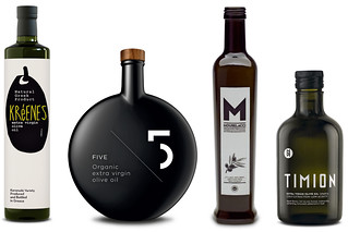
All about oil
The olive oil industry is helping to revive the Greek economy – and designers are at the heart of this success.
Luxury of less is more
‘Roundhead’ Sean Perkins explains North’s designs for restaurateur Alan Yau and the St Pancras Hotel
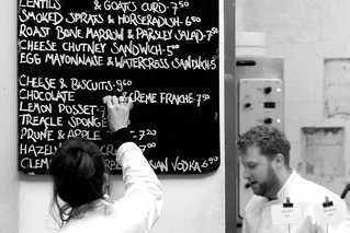
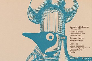
Design that disappears: the blackboard at St John
Asked to nominate a favourite item of information design, illustrator Paul Davis had no hesitation in naming the bar menu blackboard at St John restaurant in Clerkenwell, with its ‘nose-to-tail’ philosophy of serving authentic food
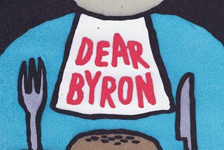
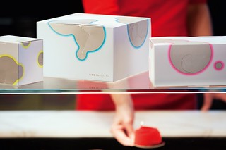
Burger, fries, no logo
With ‘nothing to show and nothing to say’, Ben Stott’s ‘anti-branding’ helped turn the Byron restaurant chain into a multi-million pound brand.
Reputations: Louise Fili
‘Most restaurants are not used to dealing with designers, so I ask lots of questions. It’s being able to talk about colour, texture or architectural details. All I need is one element to latch on to that can make the logo work.’

Rub-down revolution
A generation before home computers, Letraset’s dry transfer lettering made desktop typography possible – and gave a small group of type designers new insights into letterform construction through the art of stencil-cutting