
Opinion
Typography,
John L. Walters
The notion that graphic design is fundamentally a creative business, a form of art undertaken…

Critique / Photography,
Rick Poynor
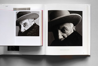
Mysterious equipment, unknown officials and arcane activities combine in a photobook that is testament to the art of selection and editing.
Photo Critique By Rick Poynor
Features
Sarah Snaith
The ethos behind the Hall of Femmes series is to pass down stories, advice and experiences to a new generation of female art directors and designers
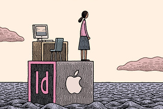
J-P Hartnett
Industry-standard tools – Apple computers, Adobe software – have created astonishing new possibilities for graphic designers. But is this liberation, or a new kind of imprisonment?

Sophie Thomas
At every stage in the lifecycle of a package, design can add complications for recycling. Finding solutions requires industry-wide collaboration
Catherine Dixon
In these information-saturated, cash-strapped times, David Pye’s concept of ‘workmanship’ has much to teach us
Ed Park
A work of deep emotional power, or a set of elaborate pranks? A new book that recreates 100 iconic photographs raises multiple questions, writes Ed Park

Anna Lisa Reynolds
‘I wanted to discover if there was any value in simplification, in terms of legibility, and only research could tell me. This is where the science comes in; I needed numbers!’
Ferdinand P. Ulrich
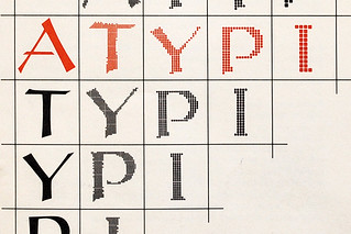
In the summer of 1983, a Stanford seminar became a milestone in the long transition from craft to code
John L. Walters
Paul McNeil and Hamish Muir are graphic designers who construct typefaces through mathematics, systems and experimentation, pushing hard at the boundaries of alphabetic form
Madeleine Morley, Gerald Cinamon, John L. Walters
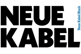
Kabel, Rudolf Koch’s eccentric, geometric 1920s typeface, has been revived as a 21st century type family by Marc Schütz. By Madeleine Morley, with extracts from Gerald Cinamon’s book about Koch
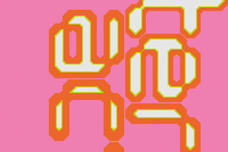
Jan Middendorp
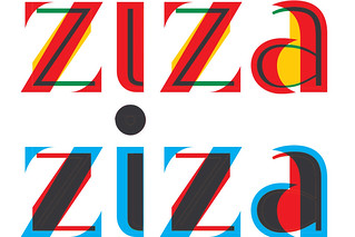
For the past decade or so, Mark van Wageningen has been investigating the possibilities of adding colour to the conventional black-and-white universe of digital type design, resulting in work that is both thrilling and evocative
Jason Godfrey, Dan Adams, John L. Walters
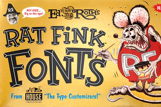
Type foundry House Industries – the subject of a hefty new monograph and a retrospective exhibition near Detroit – champions the joyful vulgarity of United States graphic arts. Jason Godfrey and Dan Adams pay tribute
Andrew Robertson, Richard Krzyzak
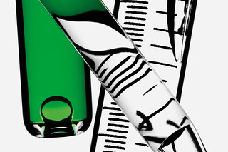
The photography of Robin Broadbent takes still life photography to minimalist extremes
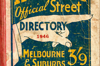
Stephen Banham
In Melbourne, more than a century ago, a ‘printer’s fist’ inadvertently became one of the earliest corporate identities